Data Visualization for Marketing Campaigns and to increase Sales

Anirban Saha

Dashboard for Vrinda Store's Annual Performance 2022
This Excel Dashboard has been created based on the raw data of Vrinda Store in 2022.
On the Excel Dashboard, the followings data are shown by different charts/ metrics:
1. Order vs Sales (Column Chart)
2. Order Status (Pie Chart)
3. Orders based on Age and Gender (Column Chart)
4. Yearly Top 5 Sales by States (Line chart)
5.Orders through different channels (Pie chart)
6.Sales: Men vs Women ( Pie Chart)
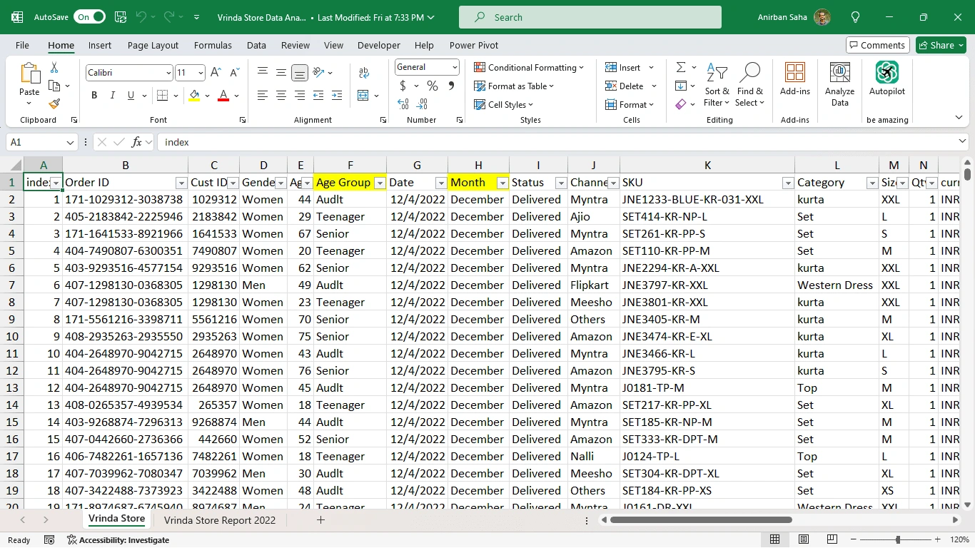
Raw Data
Like this project
Posted Oct 6, 2024
Anirban created insightful Power BI visualizations that helped a marketing firm identify key trends, leading to a 25% increase in campaign effectiveness.
Likes
0
Views
1