Explainer Video for Databank's Website
Luis Andrey Ramirez Chavarria
Overview
Databank is a service designed for management teams within organizations, helping them improve and optimize how critical data such as contracts, patient records, and forms is structured, managed, and accessed.
This project was developed as the hero video for Databank’s website, with the goal of giving visitors a clear and immediate understanding of what Databank does and how it approaches data management.
Context and Challenge
Before this project, Databank did not have a clearly established visual or communication direction. Explaining their value relied heavily on abstract descriptions, which made it difficult for potential clients to quickly understand what the service offered.
Databank is not a tangible product but a service built around systems, processes, and data. Translating data optimization into a compelling visual story required balancing clarity and engagement. This was made more challenging by the lack of existing brand guidelines, meaning the video also needed to help define a visual language that could be reused across future communication assets.
Insight
The key realization was that abstract concepts did not need literal representation to be understood. Instead of visualizing data realistically, the project embraced abstraction.
Simple shapes, bright colors, and repetition became a way to communicate complex ideas intuitively. Data could be represented as collections of dots or modular elements, making invisible systems feel structured, organized, and approachable. This approach allowed the video to communicate clearly without overwhelming the viewer.
The resulting tone is professional and calm, positioning Databank as a clear and reliable solution.
Production Approach
The video was designed as a communication piece rather than a traditional product demo. Motion, color, and rhythm were used to explain ideas step by step, building understanding gradually instead of presenting everything at once.
Because there were no strict brand constraints, design and animation were developed together, allowing visual decisions to directly support the narrative. A consistent system of shapes, transitions, and timing was used throughout to create cohesion and trust. Sound design was treated as an integral layer, reinforcing motion and giving the piece a polished and intentional feel.
Internal Impact
The Databank team responded very positively to both the process and the final result. Beyond serving as a hero video, the project helped establish a visual direction for the brand. After delivery, the team requested additional visual pieces that followed the same style, confirming that the video became a foundation for future communication.
Results and Outcomes
This project is important in my portfolio because I took ownership of the entire process, including design, animation, and sound design. It demonstrates my ability to translate abstract, service based concepts into clear and engaging visual stories while helping shape a brand’s visual language from the ground up.
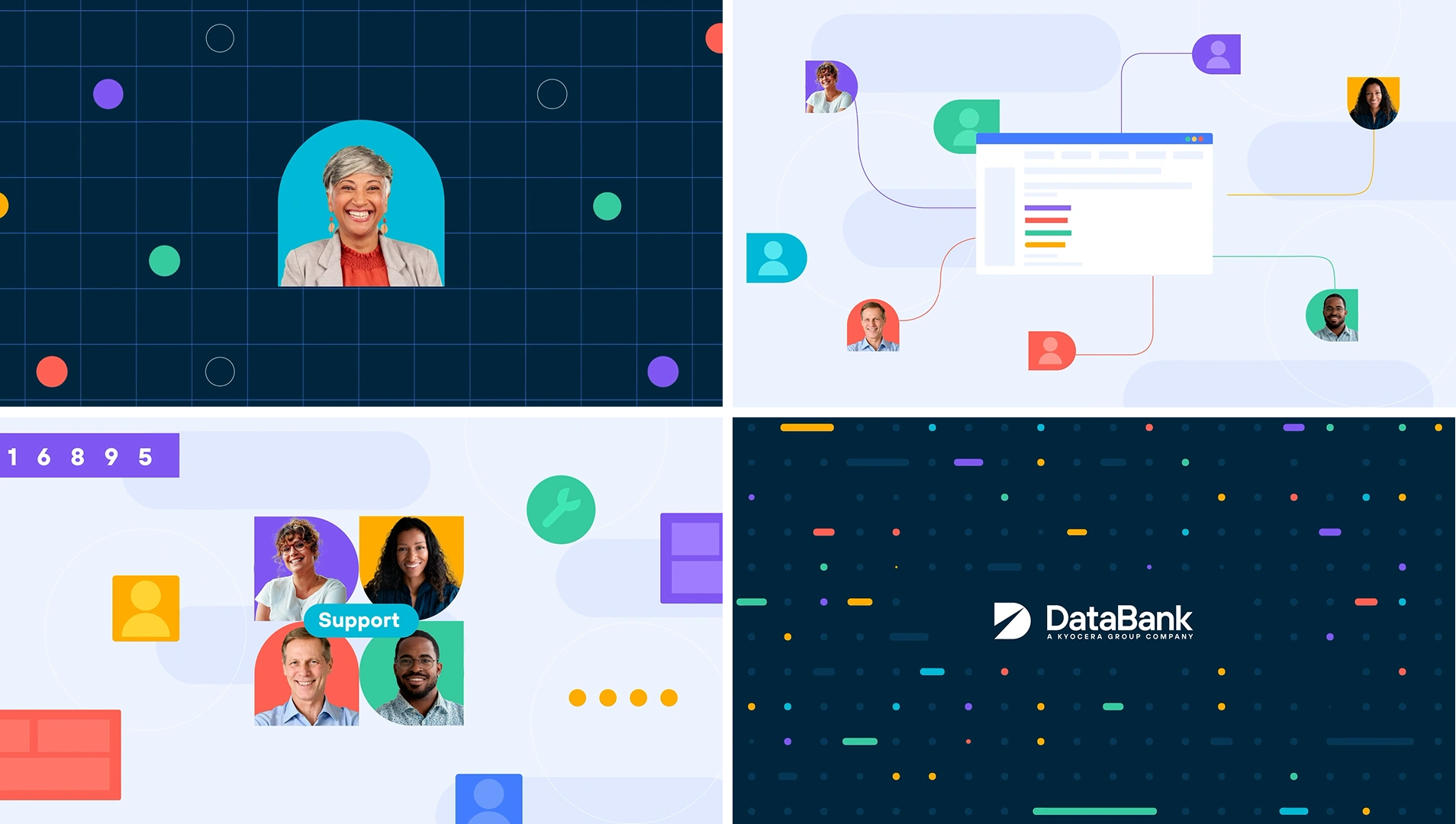
Styleframes for the video
Like this project
Posted Feb 4, 2026
Explainer video for Databank, translating complex data management services into a clear, calm, and engaging visual language through motion and sound
Likes
0
Views
26
Clients
Databank