Built with Rive
Carhuntr Search Animation | Built with Rive
David Fabiyi
Background
Carhuntr is an app for car enthusiasts and buyers who want to navigate the market straight from their phone. Sounds cool, right? But there was a problem. After setting up alerts, users were getting confused and dropping off. Imagine this: you download an app, you set up your first alert because that’s what it told you to do, then boom! silence! No signal, no confirmation, no nothing. You’re just staring at the same screen like, “So… did it work?” That little gap of uncertainty was enough to make people bounce.
Challenge
The client reached out because they wanted that experience to feel alive. They didn’t just want a plain “loading…” icon; they wanted something that says, “Hey, we’re actually searching the market for you right now.” Something that keeps the user engaged, reassured, and at the same time reminds them of the brand. Because in product design, silence is deadly. If the system doesn’t talk back, the user leaves.
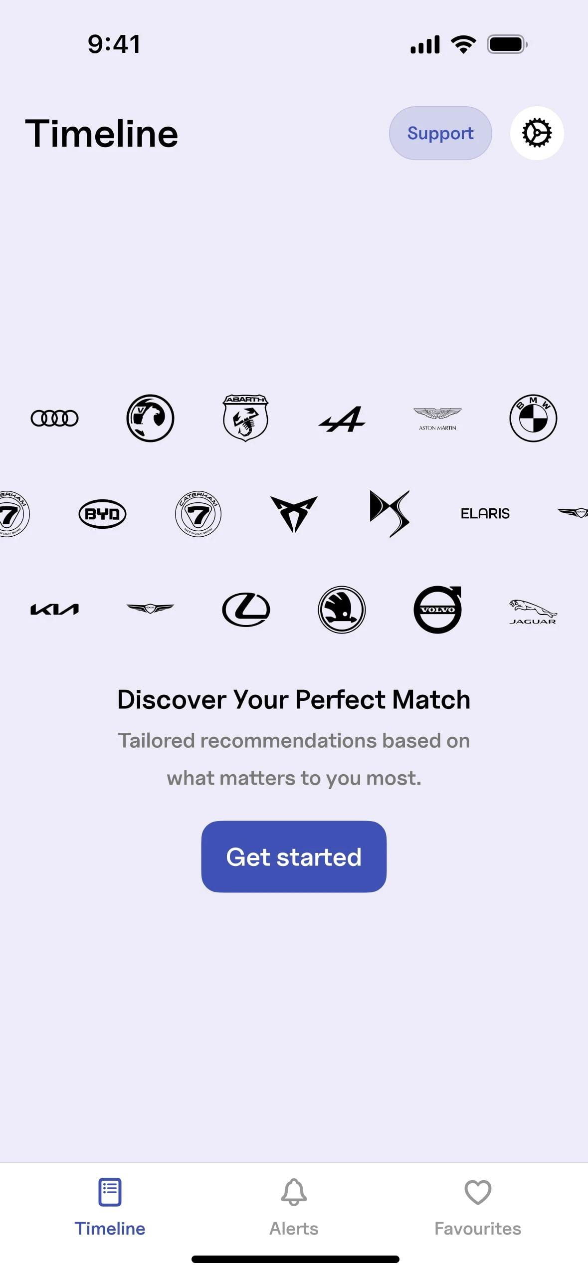
The screen initially
Solution
So here’s what I did. I put the app’s logo at the center, and gave it a heartbeat, literally. A pulsing effect that breathes life into the brand. From that pulse, blue concentric circles ripple outward like a radar scan. It’s simple, but it communicates “we’re searching.” Around that radar, I floated icons that represent the parameters of the search like location, fuel, engine, transmission. Not random decoration, but a subtle message: the app is analysing all these factors in real time for you.
The end result? Instead of a dead screen that kills trust, users now see movement, rhythm, and purpose. It’s not just “please wait,” it’s “Carhuntr is working for you.”
Other Ideas Explored
Like this project
Posted Sep 11, 2025
Bringing clarity to Carhuntr with motion that signals life in every search an animation that assures users their hunt is active, responsive, and in motion.
Likes
0
Views
13