Rethinking the Internal Accounting App
Murathan Biliktu
Project Summary:
The Makromek team hired me to design the internal accounting and inventory software that they were developing. Their primary motivation was to reduce the budget for several services.
During the design process, I discovered and managed to solve a critical issue caused by a subtle UI element in the previous software, resulting in significant cost savings for the company. I also reduced the clutter of software features that were unnecessary to them.
Reading data is much easier with the new information-oriented design implementations, which reduces the time spent reading data with the old software.
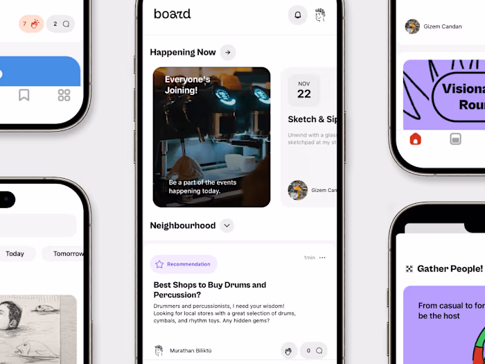
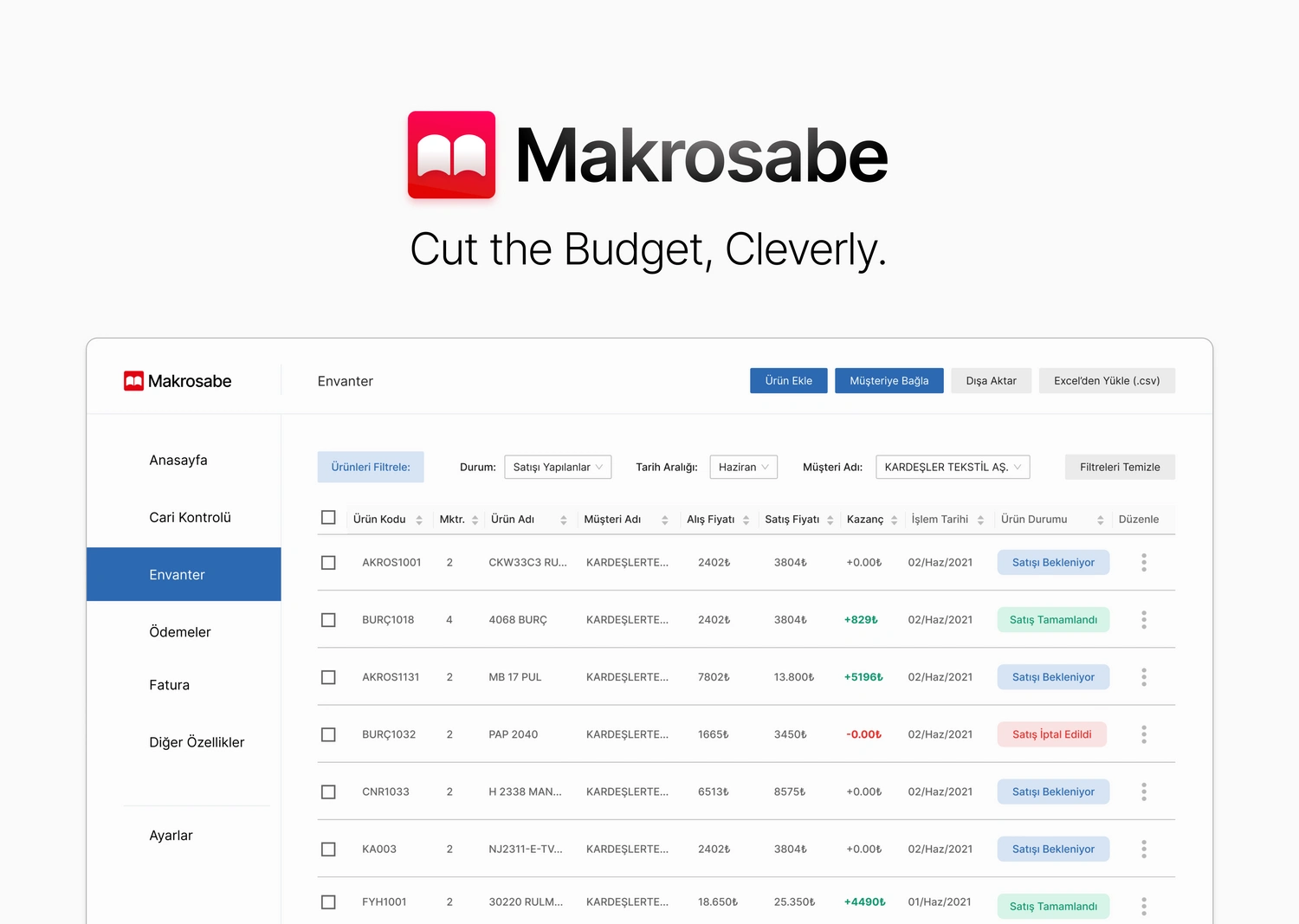
Makro Sabe? What is Makrosabe?
Makrosabe is essentially a custom software designed specifically for Makromek employees to address accounting needs and track inventory. This name was chosen by the entire team; it is playful and stands for Makro + Muhasebe (accountant).
1- Identifying the Question:
I went to the office as often as I could (COVID times), mostly to observe the work environment and learn from the employees how they go about doing their regular work. Employees were interested in what I'm doing, and they were generally helpful and curious. Because of our connection as a team, I was able to provide the best design solution with passion.
They explained how they used the old software, and I bombarded them with questions. I learnt the shortcuts they use and the ways they created to overcome the software's pain spots, which ultimately helped me design the software.
Simply put, they needed a detailed and easier way to manage inventory, and a way to organize, a current account control and generate invoices.
2- Software Features: Simple, but Impactful
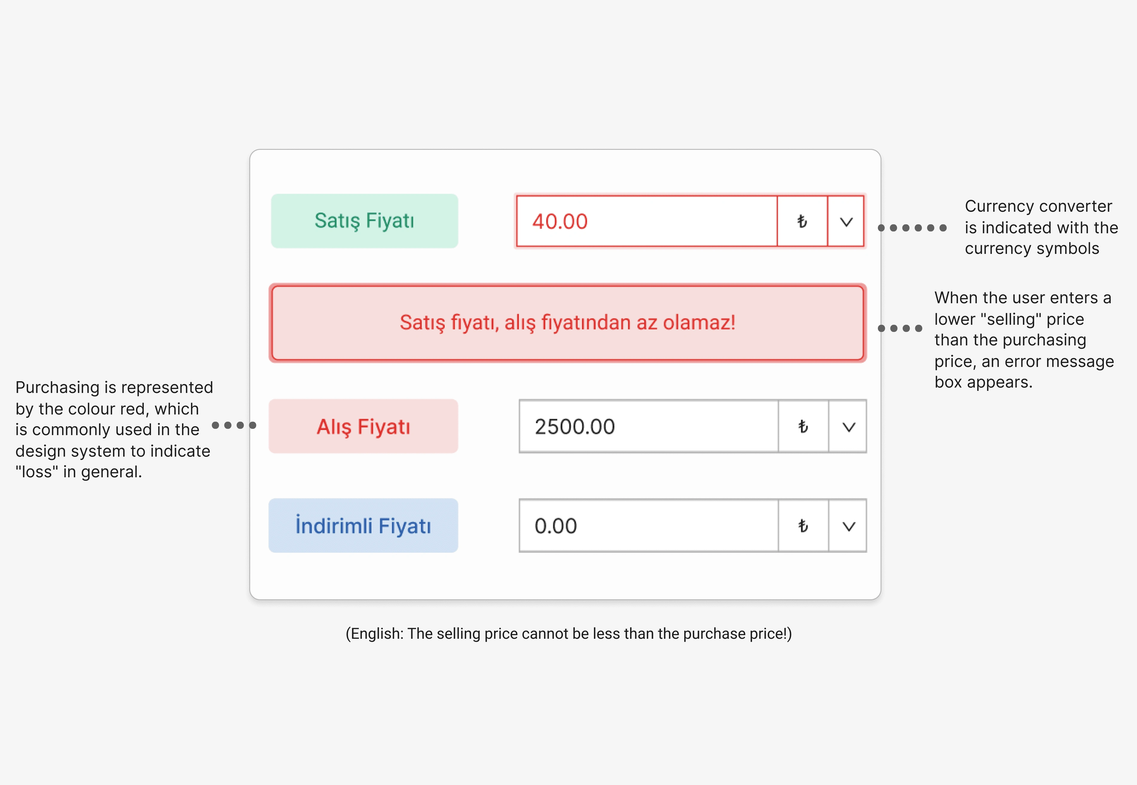
Interestingly, in one of our conversations, some of the employees mentioned how they occasionally enter an incorrect selling price that is lower than the initial price they paid for the product, which results in a loss.
As seen above, old software UI lacks any visual distinction. Everything looks to be the same, making it easy to misread and make mistakes after a while.
So while I’m designing the inventory, to eliminate this problem I separated the selling price (green) and purchasing price (red) sections with colour codes. When a user tries to enter a lower selling amount than the purchasing price they can’t add the item to the inventory and a message box pops up to explain the error.
If they want to sell a product at a lower price than the purchasing price they can use the discounted prices (blue) section so they don’t get an error message since it is not allowed to sell a product at a lower price than the purchase price.
The currency conversion in the old software was too complicated and took up too much space, so I placed a currency sign next to the input field to make it clear if a product is sold/bought in multiple currencies.
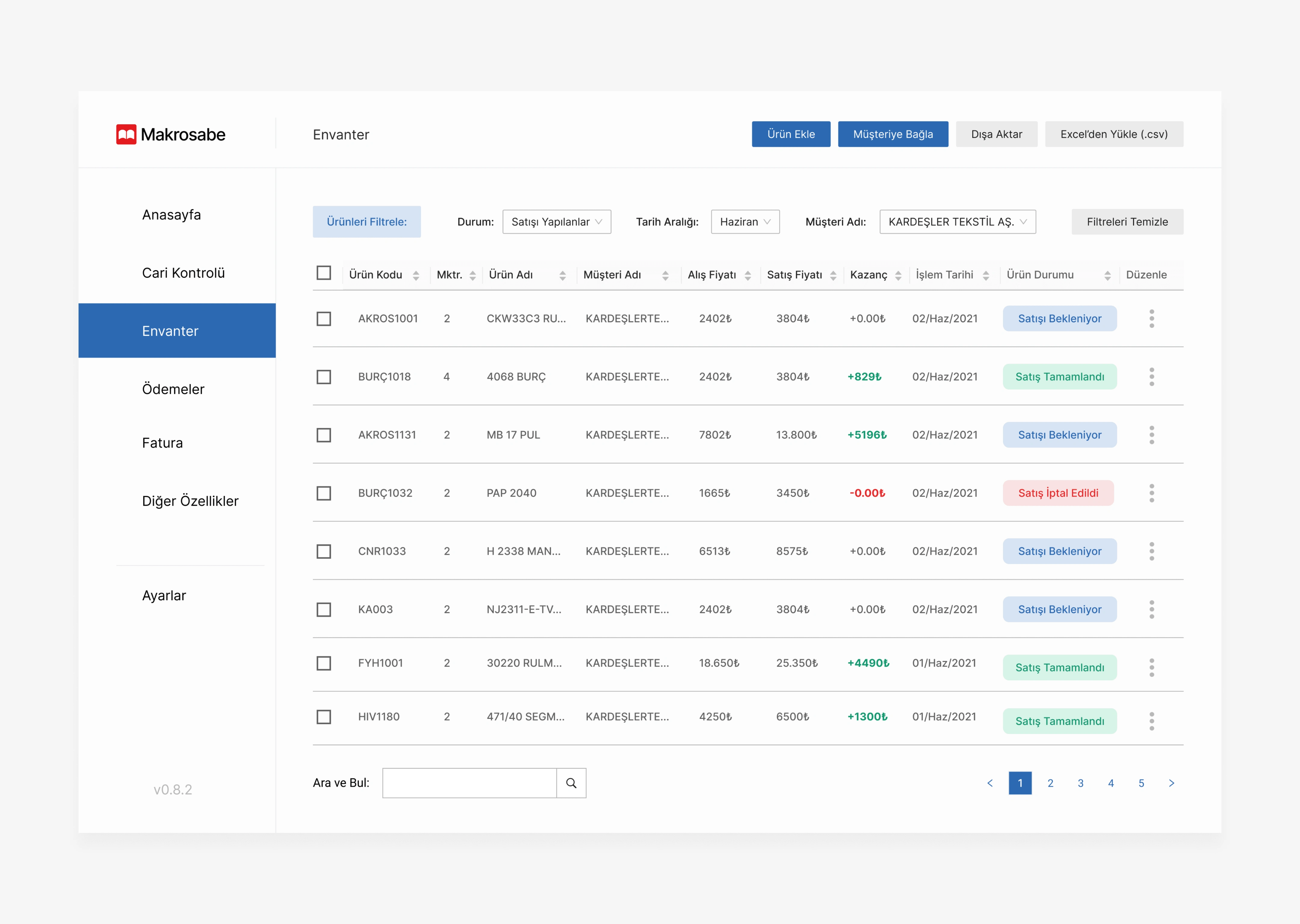
The Inventory is presented as a list that displays the information about the items that are important to track to the company and it can be filtered with three different filtration choices. Users can add new item entries easily and we have also introduced the ability to import and export Excel files (.csv) by request.
Profit (green) and loss (red) are shown in bold-coloured type to indicate to the user how the business is performing and what to look into. We have included a status tracking function, and an item's state is represented by its colour (look for the ones with "Satış" in the image above).
3- Resistance and Adaption
During the earlier versions of the software, I noticed some resistance when using the app. Our design was oversimplified compared to the old software.
As we added more "complex" data to the app, employees appeared to be more willing to use it. This, I assume, is because they have spent their entire career working with overly complicated and conventionally unappealing software.
Instead of forcing them to conform to my “ideal” standards, I adapted to them and made the most optimal design choices that benefited them.
Because of this finding, familiarity and ease of learning were my two major priorities during the design process.
4- What did we Achieve, What’s the future like?
We reduced the possibility of revenue loss by preventing users from entering a lower selling amount than the item's original cost and adding an error message to explain what went wrong.
We created the most suitable software for the company's needs and removed the features they didn't need from the previous software.
With the new information-oriented design, reading important data takes less time and effort.
Like this project
Posted Jul 6, 2023
The Makromek team hired me to design the internal accounting and inventory software that they were developing.
Likes
0
Views
15