Identity, Mobile App and Website design for a Fintech Brand
The Birth of Swiftmonie — A UX Case Study

Imagine a world where financial boundaries dissolve, where every African freelancer, entrepreneur, and individual has the power to manage money effortlessly across borders. This isn’t just a dream; it’s the vision behind Swiftmonie. As one of the minds behind the design of this revolutionary fintech solution, I want to take you on our journey from a mere concept to a reality.
On this project, it was a fulfilling experience working with Abdul Hamza. As a UX Designer deeply passionate about creating solutions that make a real difference, I embarked on the journey to co-create Swiftmonie.
Swiftmonie is looking to help individuals receive cross-border payments, convert it to their local currency and withdraw the funds to their local bank accounts quickly and fast. The idea is to make the experience simple, easy to understand, no hidden fees or surprises!!
The Genesis
Our story began not in a boardroom, but from personal experiences. Conversations with peers and personal encounters with the limitations of existing financial services ignited a spark. We asked ourselves, “Why should financial borders limit African potential?” Thus, Swiftmonie was born — a tool designed to empower, a solution crafted out of necessity.
Understanding Our Audience: In-Depth User Research
To create a tool that truly resonates with our users, we dove deep into their world. We conducted interviews with individuals and freelancers from Nigeria to Kenya, from graphic designers to developers, as much as we can. Our interviews were mainly centered around:

Key findings/insights
Their stories were eye-opening. Here’s what we found from our interviews:
“I just want to receive payments without losing half of it to fees,” said a photographer from Ghana.
A developer from Kenya mentioned, “It’s not just about receiving money; it’s about feeling secure and in control.”

Relating our findings with users
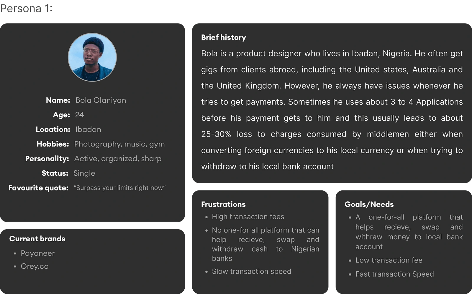
Persona 1
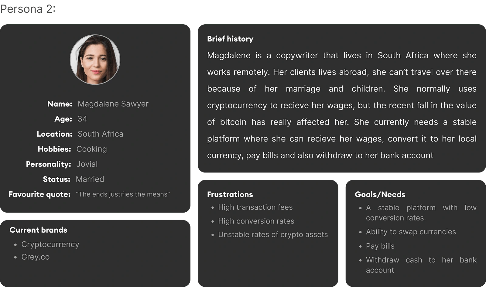
Persona 2
Competitor Analysis and Market Gap Identification
We did some research on platforms that some of our interviewees were familiar with to find opportunities and found these:
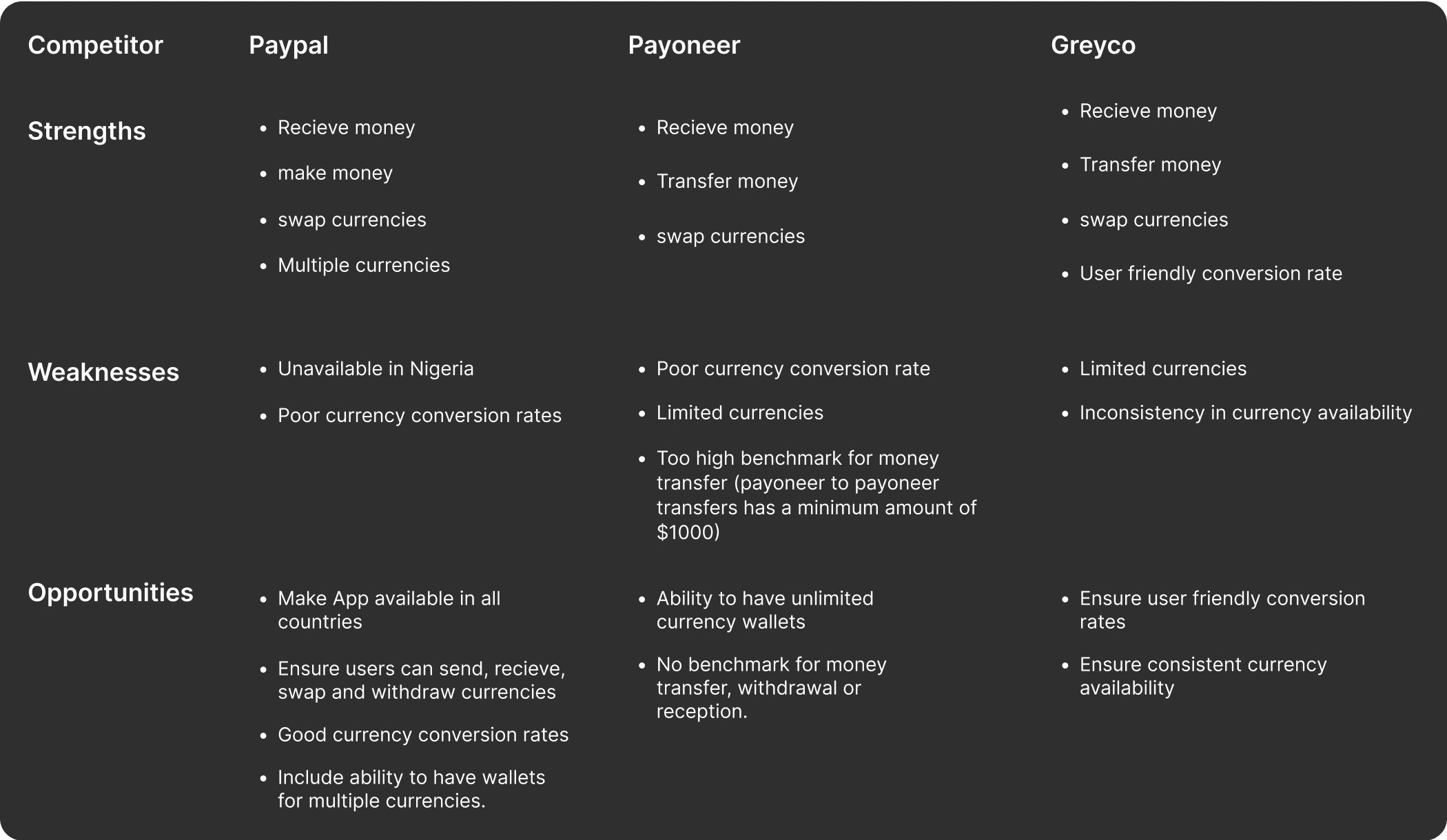
Competitive analysis
Our analysis revealed a glaring gap — most fintech solutions weren’t designed with the African user in mind. International transaction fees were exorbitant, and the user experience was often lacking.
Feature Prioritization for Maximum Impact
Based on our research, we categorized features that we wanted to incorporate into the app based on the impact it will have on the users. We then made the most picked features as top priority for our version 1.
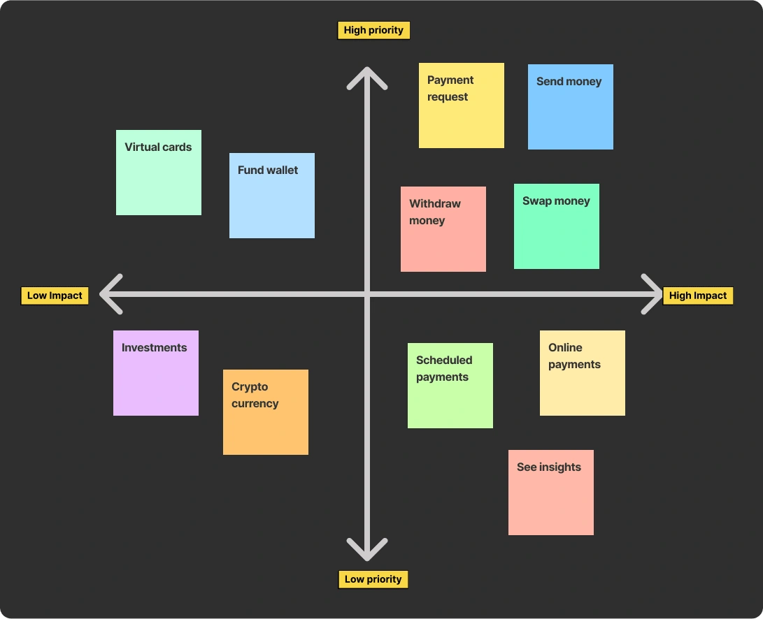
Feature prioritization
Every feature in Swiftmonie was a result of meticulous prioritization. We focused on what mattered most to our users. Features of this application will include:
Send money
Request payment
Pay bills
Online payments
Swap currencies
Withdraw funds
Low-cost transactions
Multi-currency support
Robust security measures
The Brand Identity
Our design process was iterative and empathetic. We started with the brand look and feel. I spearheaded the development of the brand identity for Swiftmonie. This involved crafting a visual language that resonated with our audience — from logo design to selecting a color palette that stood out in the crowded fintech space.
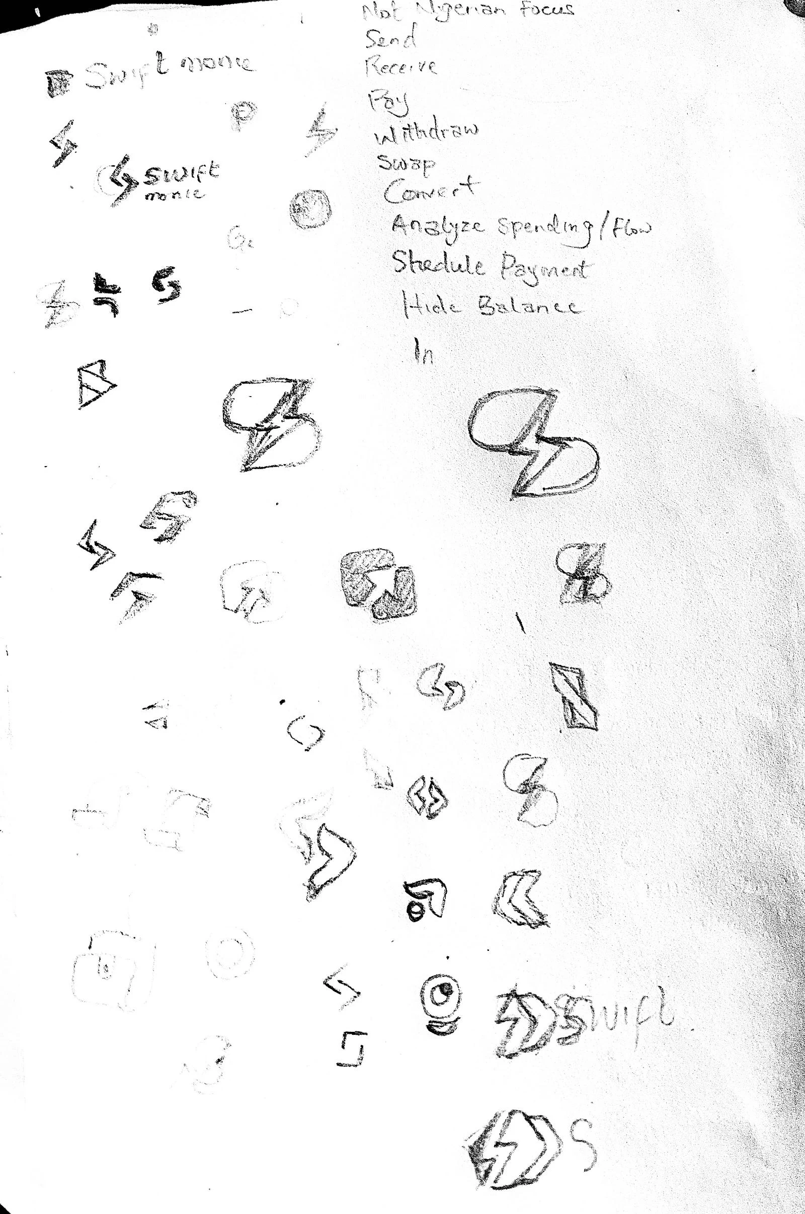
Logo Ideas sketches
The design decisions were informed by research into existing products and target audience. After several iterations, a logo was selected and the rest of the identity was also developed. You can view design here.
Logo animation
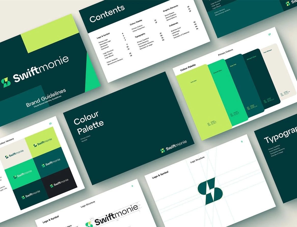
Brand book
The App design
Once we agreed on the features we wanted in our version 1, we proceeded to synthesize the mobile app design. First, we came up with a user flow that works, and proceeded to basic wireframes, constantly refining them based on feedback from potential users. The goal was to make Swiftmonie intuitive, reliable, and inclusive.
User flow — Task flow
We created a user flow to map out the entire user experience from the initial point of engagement, which ultimately shaped the high-fidelity design to be truly user-centered and aligned with the project’s goals.
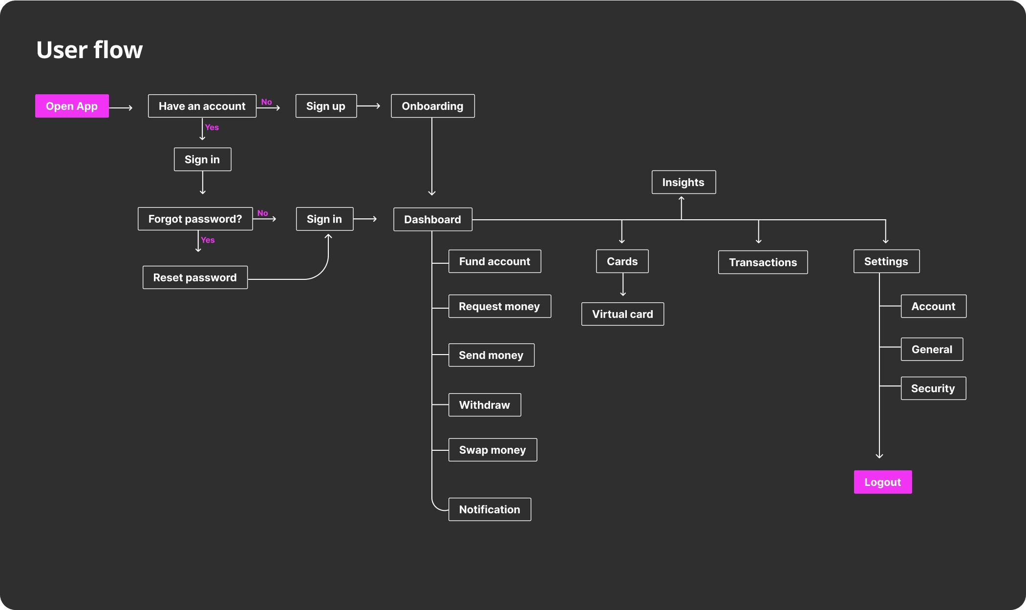
User flow
To further understand the pages we needed to have, we broke down the userflow to user tasks and created task flows for them.
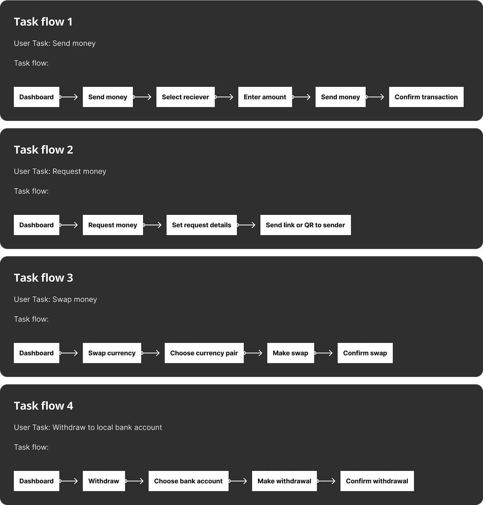
Mobile app task flow
Lo-fi wireframes
After coming up with the flows, we started creating lo-fidelity wireframes to test the flows and make iterations where necessary
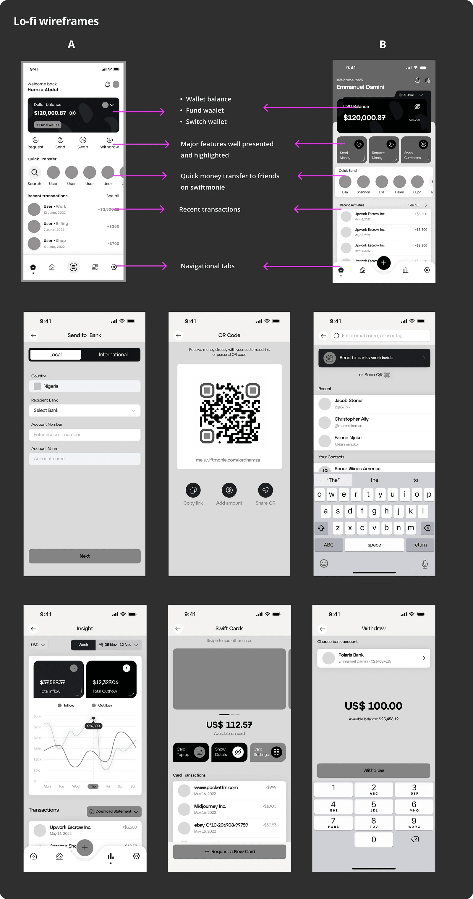
Wireframe design
Concept testing
We had a couple of friends help us test out the wireframes and made updates based on the feedback we got.
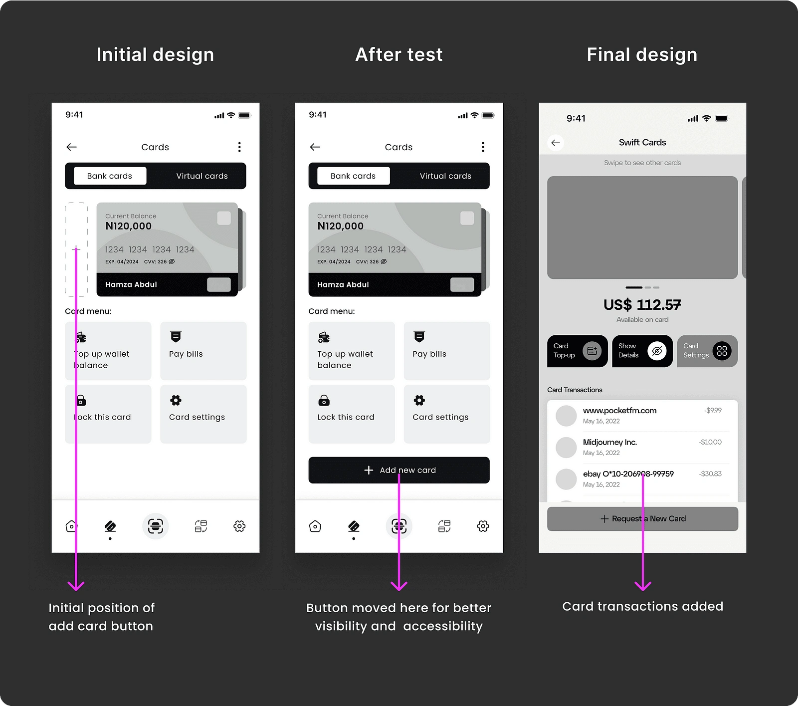
Wireframe design review
Crafting the final design
Once we created the Hi-fi design, and prototyped it, we went through another round of testing. This time, we had more users test out the prototype. It was a gratifying feeling to have users give positive feedback. I must confess, it wasn’t all sweet review but the complaints were minor and we were able to implement them in no time. So I call it a WIN 👍
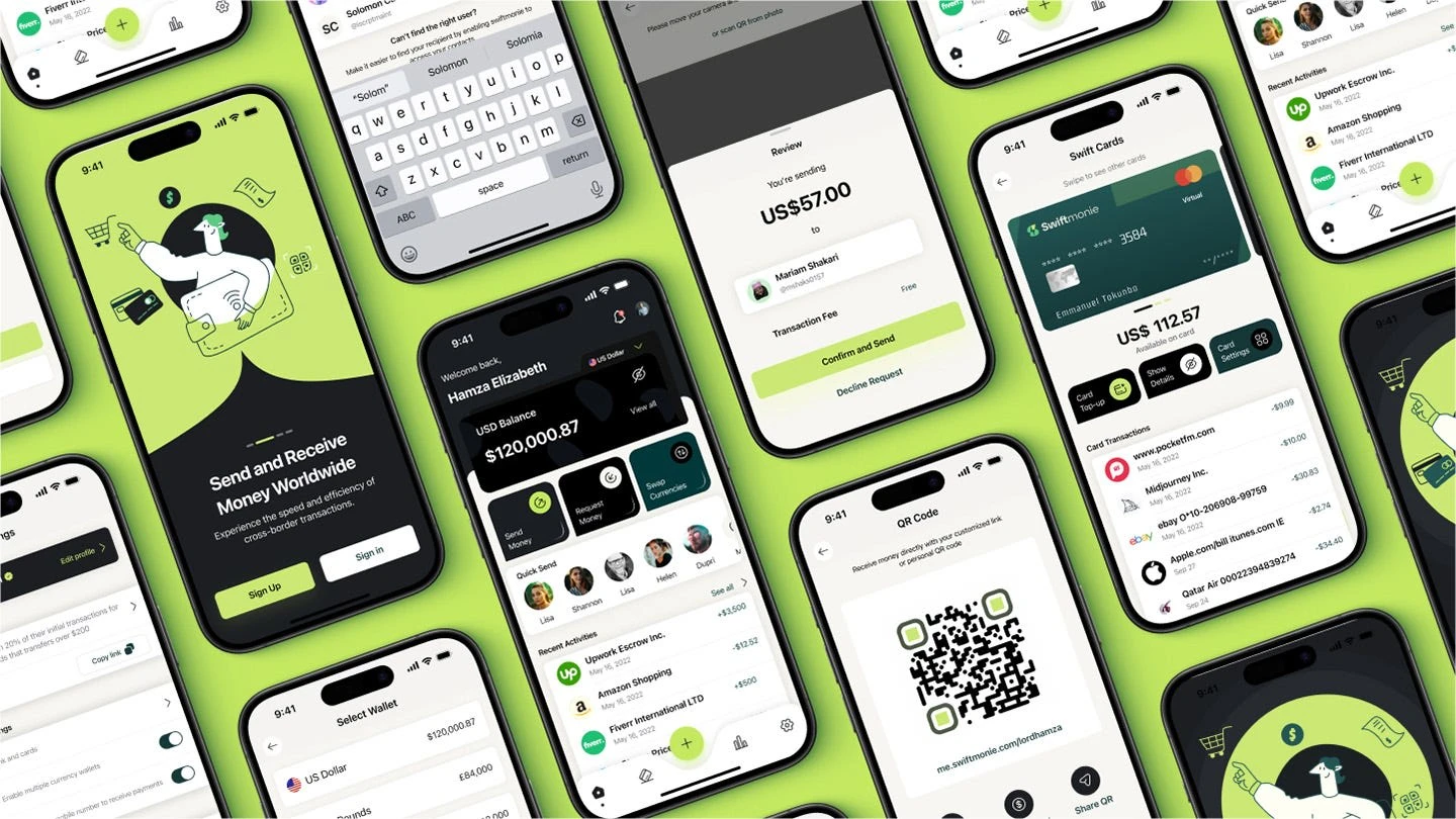
Swiftmonie mobile app
We didn’t stop there. We also moved on to design the Swiftmonie website. The focus was ensuring that our web presence mirrored the app’s user-centric approach, providing a seamless and informative experience for visitors.

Swiftmonie Website
The website was not just a digital brochure but a portal that offered potential users a glimpse into the ease and capability of Swiftmonie.
Have a look at the remaining part of the case study here
Challenges and Overcoming Them
Our journey wasn’t without hurdles. Jumping into the project was quite easy, but when we started to ideate, considering it’ll be a solution that involves handling money transactions, we had to look into navigating regulatory landscapes and ensuring top-notch security.
At the time we started the project as a side project, I had other projects running simultaneously. That affected the pace of the project as I only had a few hours to commit weekly. We broke down the tasks into their smallest units and assigned them. Making sure that everyone is held accountable while hitting our weekly goals was imperative. I believe that we all did a great job at keeping each other motivated through the tough times and spent enough time celebrating victories as well. Each challenge was an opportunity to learn and grow. Our team’s resilience turned obstacles into stepping stones.
Reflective Summary
The Swiftmonie project was a holistic design experience for me. It pushed the boundaries of my skills in UX/UI design, branding, and web design. Each aspect of the project, from the app to the website and the brand itself, was an opportunity to create something impactful and meaningful.
And that’s a wrap! I hope you enjoyed my TED talk…LOL. Thanks again for reading! I would appreciate your feedback.
Want to have a discussion? shegzico@gmail.com
Like this project
Posted Oct 1, 2024
Developed a brand Identity, mobile app and a one-page website that puts the brand on the competitive map.

