Scalable Service Design for Contact Centers

Fred Tranfield


A component system in Figma and an AI-assisted research pipeline turned service design for 51 contact centers from a bespoke slog into a repeatable production line.
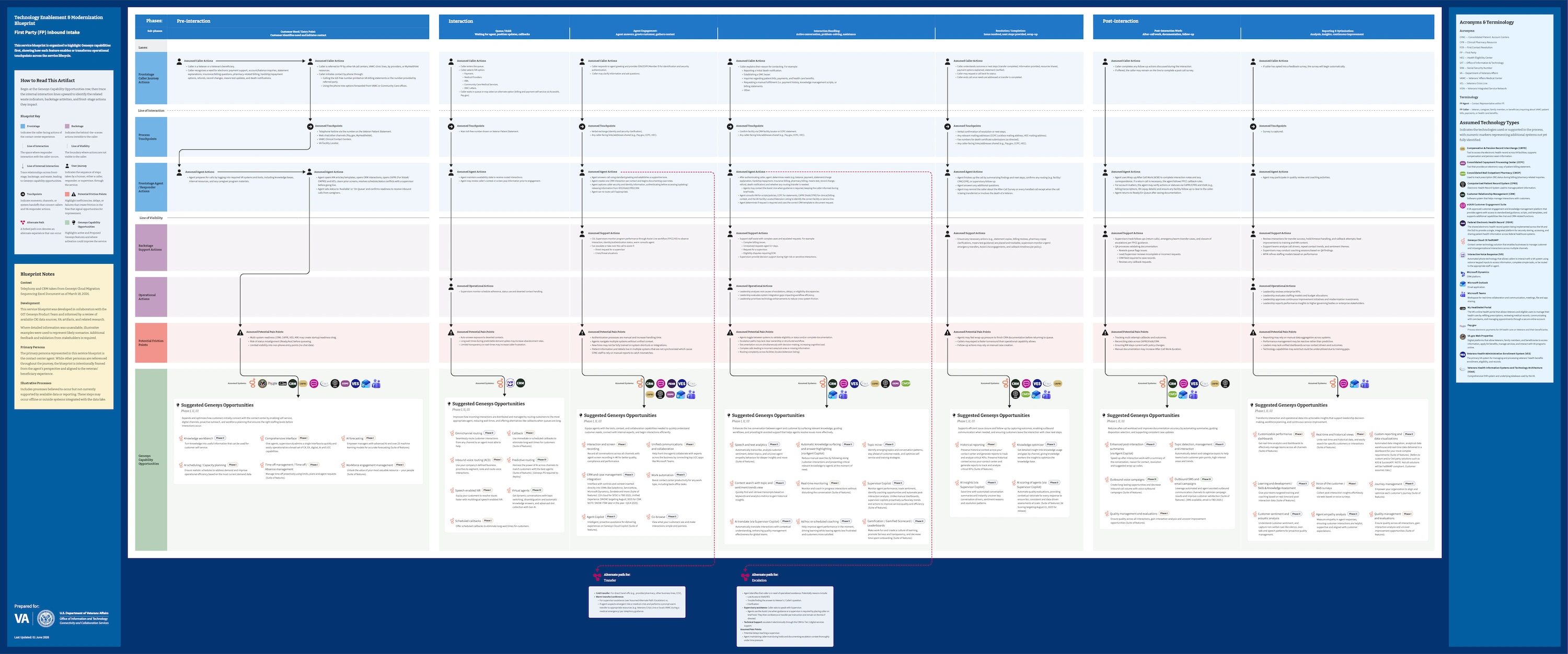
An agent-perspective service blueprint, aligned to the beneficiary journey — capability opportunities mapped to the friction they resolve.
Overview
The problem & scope
VA leaders needed a consistent view of how every contact center operated before consolidating 1,000-plus toll-free numbers into a single front door. Our team's job: document each center through three complementary artifacts.
51 contact centers · 153 artifacts
Role & duration
Service Design Specialist, LMI — I led the production design and implementation of the business-process hierarchies, value-stream maps, and service blueprints. I also built the Figma component system and, during a temporary research staffing gap, developed an AI-assisted workflow for turning source material into structured blueprint content.
Twelve people, in two-to-three-person groups per artifact type, with a data researcher spanning all three and scoring how far each center's calls could shift to self-service. The earlier designs came from a teammate; I was brought on to take them to production. A separate group handled Section 508 accessibility remediation, and I tracked the pipeline that kept every artifact moving without collisions.
Constraints
No site visits — discovery ran on excavated documents, telemetry, and web research. So the artifacts admit their own uncertainty: dotted borders for unconfirmed elements, "illustrative" where evidence ran out. The legend owns what we don't know, so stakeholders can trust what we do.
The scale ruled out one-off design — dozens of centers, three artifacts each, one fixed deadline. So I built the kit: reusable components, variables, templates, and production controls, so the team could work fast without rebuilding each artifact from scratch. I ran Figma to its limits and built around what it couldn't do.
When the research track went short-handed, I stepped in on research alongside the team, then returned to design lead. It's why one person ended up holding the design system, the research pipeline, and the production process in the same head.
The team worked at arm's length from the VA for months — no direct access, just documents. That broke late: a stakeholder answered the draft artifacts, and the interviews we'd been reaching for finally opened.
Honest by design — the blueprint distinguishes documented processes from illustrative ones, so stakeholders know which is which.
Process
Research at a distance
During my stint on research, I built a four-part workflow on the VA's approved AI: extract the evidence, generate the artifact content, check for anything added or missing, and log what research couldn't answer. That gap log became a deliverable in its own right — it made uncertainty visible instead of letting it disappear inside polished diagrams.
The Figma system
I built a variable-driven Figma system that gave every contact center a consistent blueprint structure while letting the content set its own layout. Each center is a variable mode — switch modes and labels, dimensions, and row heights update across the whole artifact. It reduced production time by approximately 81%, from four hours per blueprint to 45 minutes.
Supporting it: roughly 20 components per blueprint, more than 100 technology icons, and nine variable collections.
Figma variables: Switching the contact center mode updates content and reflows the full blueprint.
The font rescue
After 34 value-stream maps completed Section 508 remediation, we discovered that an SVG export had silently substituted the wrong typeface. Reflowing the layouts would have invalidated the completed remediation. I prototyped a scripted fix with AI, validated one, ran the rest on VA-approved AI. Half a day instead of a week and a second remediation pass.
Before: incorrect serif font.
After: the approved sans serif font, layout intact.
Artifacts
Each center gets three artifacts. The hierarchy shows what exists, the map shows where it breaks, the blueprint shows what could help. I'll walk one — Loan Guaranty Service, the VA's home-loan program — across all three.
Business Process Hierarchies
What exists. The hierarchy organizes six lifecycle phases across four levels of detail, with icons identifying processes already supported by the modernization platform. I took the early templates to production grade — a hierarchy that reads clearly at executive level and holds up across every center.
The Business Process Hierarchy — the inventory. Six lifecycle phases decomposed to discrete process elements.
Value Stream Maps
Where it breaks. The maps show a high-volume inbound service journey across separate technology and agent lanes. I designed the visual system so stakeholders could distinguish system delays, handoff issues, and staffing constraints at a glance; a teammate then applied the system across production.
The Value Stream Map — the flow. One high-volume stream, split into technology and agent lanes.
Service Blueprints
What could help. The experience, framed from the agent's perspective — in a migration, the agent is where platform and human meet. Friction points stack above a row of capability opportunities, each linked by an interaction line to the pain it resolves. This is where the Figma component architecture earned its keep, and where I returned as production lead.
The Service Blueprint — the experience. Frontstage, backstage, and the capability opportunities that connect them.
Enterprise opportunity maps
In the final phase, I led the design of enterprise opportunity maps showing where self-service could absorb contact center demand. The underlying tierability analysis — how far each center's calls could shift to self-service — was rigorous but too dense for executive review, so I translated it into the blueprint's visual language. I call it humanifying.
The redesigned maps made the scoring easier to scan, compare, and use in modernization discussions.
The enhanced opportunity map — an in-progress deliverable from the engagement's final phase. Dense tierability analysis, redrawn in the blueprint's visual language for an executive reader. (Some details obfuscated for confidentiality.)
Outcome
All 153 artifacts are built and moving through final review and Section 508 tagging, with delivery closing out this summer.
The systems are what made that pace possible. Blueprint production: four hours down to 45 minutes. A font failure that should have cost a week cost half a day.
The delivery of the draft artifacts did something we didn't expect: they opened the door we'd been knocking on. After months without direct VA access, a stakeholder saw the work, and the interviews we couldn't get started coming through.
None of this was solo. The team was diligent, genuinely collaborative, and a pleasure to work alongside — the kind of group that makes hard work feel light. Much of what got built got built because the working relationships were good.
The throughline: whatever the material — Figma variables, AI prompts, a PDF that won't reflow — I build the system that makes the work scale, and makes a complex service legible to the people who decide its future.
Like this project
Posted Aug 30, 2026
Designed and implemented scalable service design systems for 51 contact centers.