Built with Framer
Offcube (Framer Landing Page)
About Offcube
Offcube is a micro-design service that helps companies make their website’s main section (the hero section) look better.
This part is super important because it helps attract visitors and can even lead to more sales.
Offcube has worked with some of the biggest brands, and their redesigns have helped increase conversions by 20%.
You can visit the site here : offcube.co
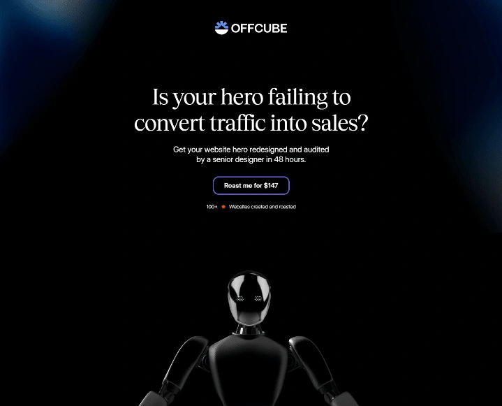
Hero Image
Requirements
Offcube needed a fresh and modern design for their website.
They wanted the landing page to stand out because it’s responsible for bringing in 80% of the site’s conversions.
They also wanted the site to be easy to use and look great on both computers and phones.
A 3D robotic theme was needed to stand out in the market.
Framer was required to be used for the development.
My Work
I redesigned Offcube’s landing page to make it more eye-catching and user-friendly. I made sure the design was clean, clear, and focused on what’s important.
I also developed the website in Framer to work smoothly on all devices, from desktops to smartphones.
The design I created helped Offcube stand out and made their service easy to understand.
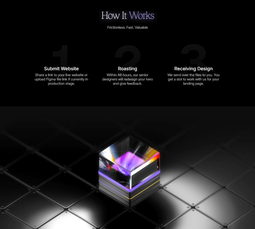
How It Works Section with 3D Animation
3D Scenes
I included 3D scenes in the hero section to make it more engaging and fun to look at.
These 3D elements made the website more interactive and visually appealing, which helped catch visitors’ attention.
The result? Offcube saw an increase in conversions right after the redesign, showing how effective the new design was.
Like this project
Posted Oct 21, 2024
I redesigned Offcube's landing page with clean visuals and 3D scenes, boosting engagement and leading to higher conversions across all devices.
Likes
2
Views
62

