MOSSBANK — Maple Syrup Identity & Label System

Charles

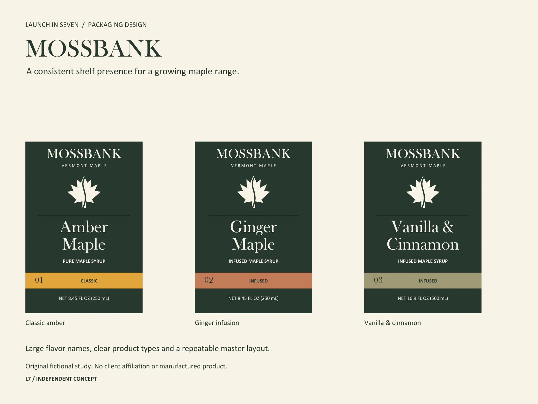
A growing product range needs a recognizable family and an easy way to choose the right flavor. MOSSBANK is an independent fictional packaging study exploring that balance across classic and infused maple syrups.
The system combines a restrained wordmark, an original maple-and-river emblem, generous flavor typography and consistent positions for product type and volume. Names and numbered variants distinguish products alongside the color bands.
The longest flavor name uses the same type sizes as the shorter names. Three front-label specimens were checked at nominal 65 × 95 mm geometry and in compact screen previews. The private vector PDF includes 3 mm bleed and embedded typography. This is layout/preflight evidence, not a physical print proof.
For a production project, the agreed deliverables can include identity refinement, a master label system, SKU adaptations and editable vector/PDF handoff. Final files depend on supplied dielines, approved product and required copy, the printer’s specification and proof approval.
Have a product range that needs a clearer identity? Message me with your current labels, SKU list and packaging sizes to discuss a fixed scope.
Original fictional study by Launch in Seven. No client affiliation, manufactured product or sales result. Public images show the design proof; reusable source remains private. Created with original vector artwork and Python/ReportLab.
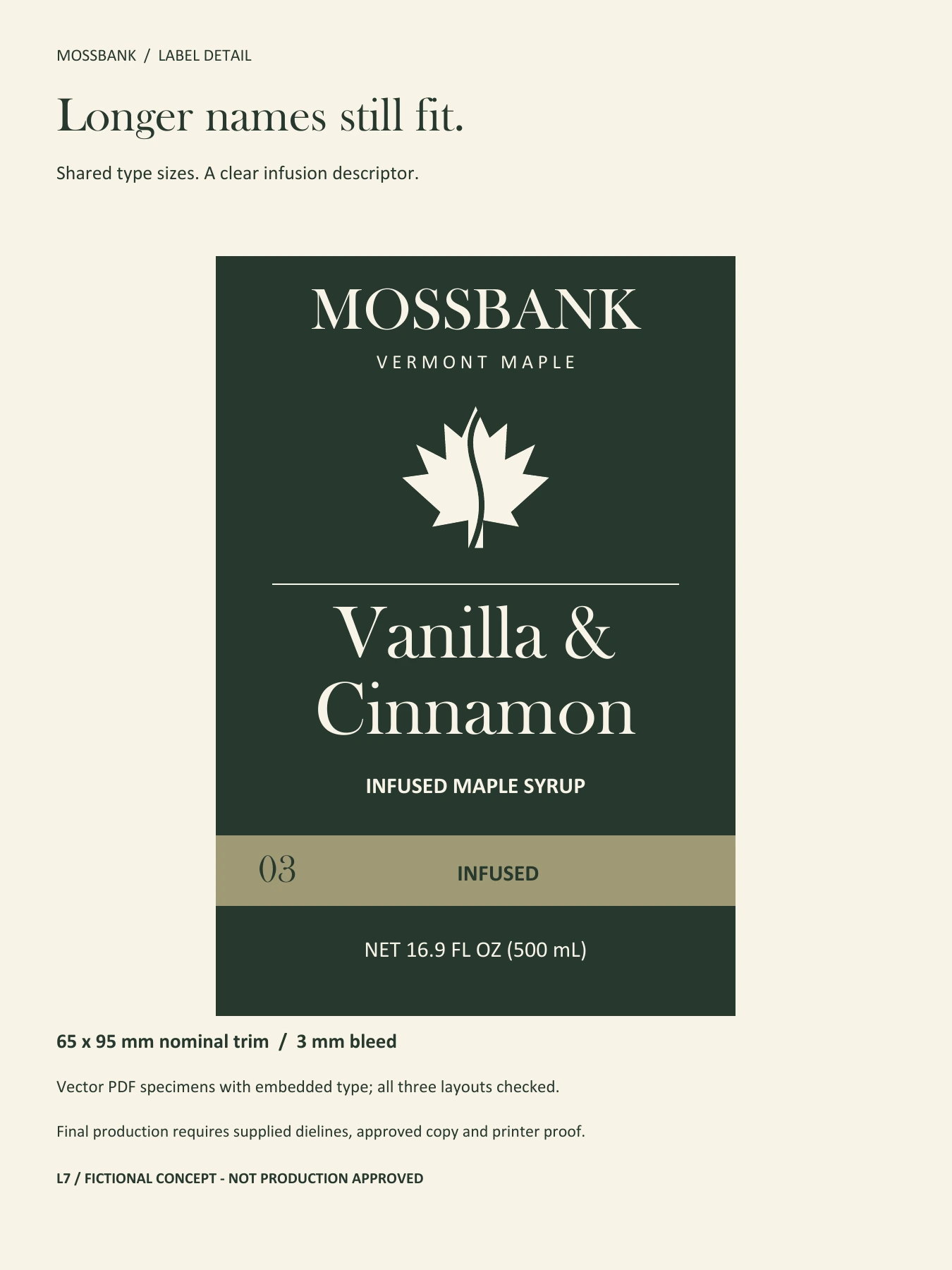
Longest-name variant with the same type scale. Fictional front-label concept; final production requires printer approval.
Like this project
Posted Sep 20, 2026
Fictional maple-syrup identity and three-SKU label system, with consistent flavor hierarchy and vector PDF preflight.
Likes
0
Views
8