Techeagle - Rebranding
Techeagle - Rebranding
They say 'Good things take time' and it took us 547 days.
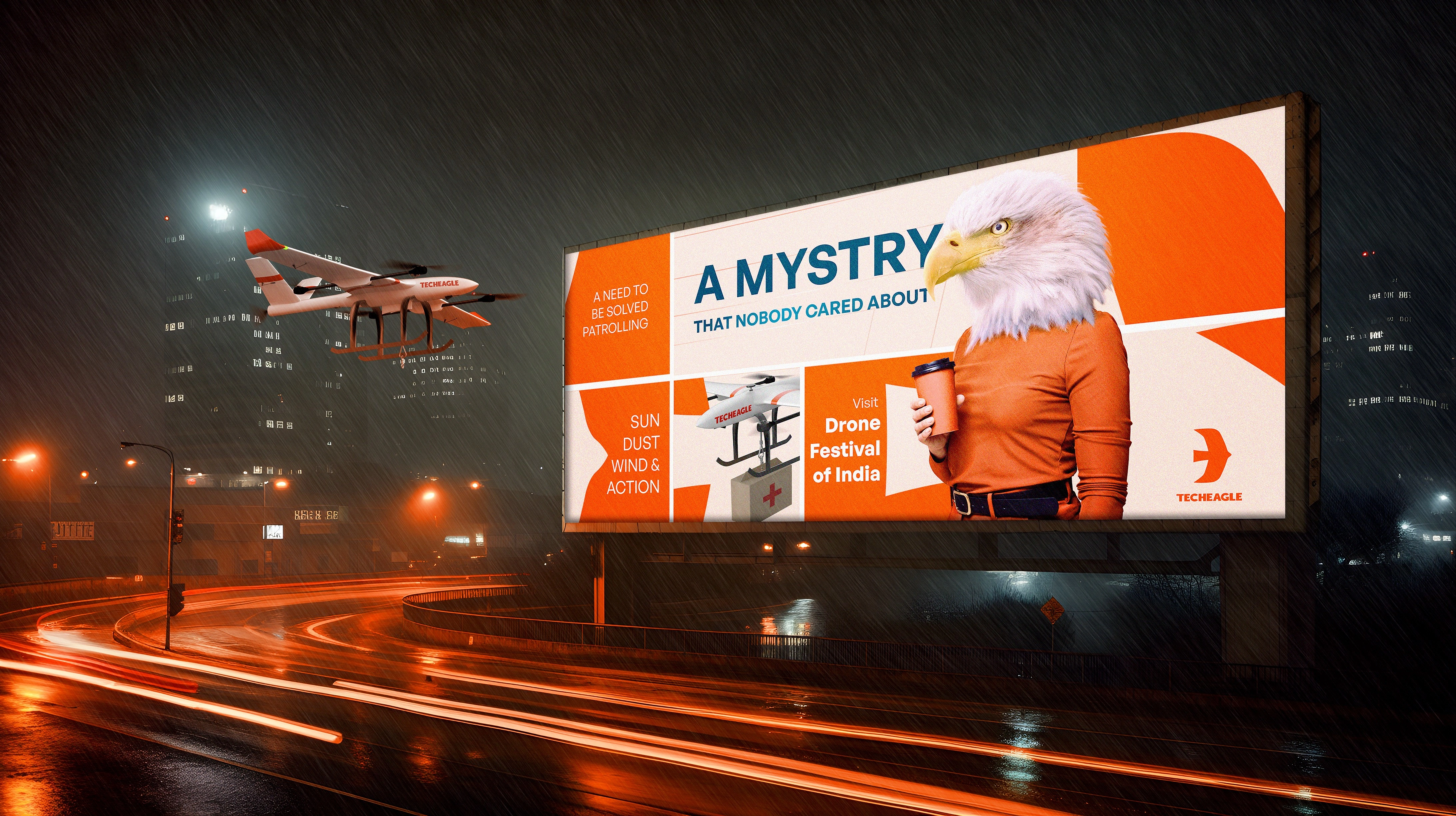
Our journey started with research. We spent months gathering briefs and studying everything from the history of aerospace to the colors used in aircraft designs. We examined the shapes of countless birds, knowing nature could offer the best lessons. Much of our time was spent creating mood boards and refining ideas, ensuring that every element of the new design had purpose and meaning.
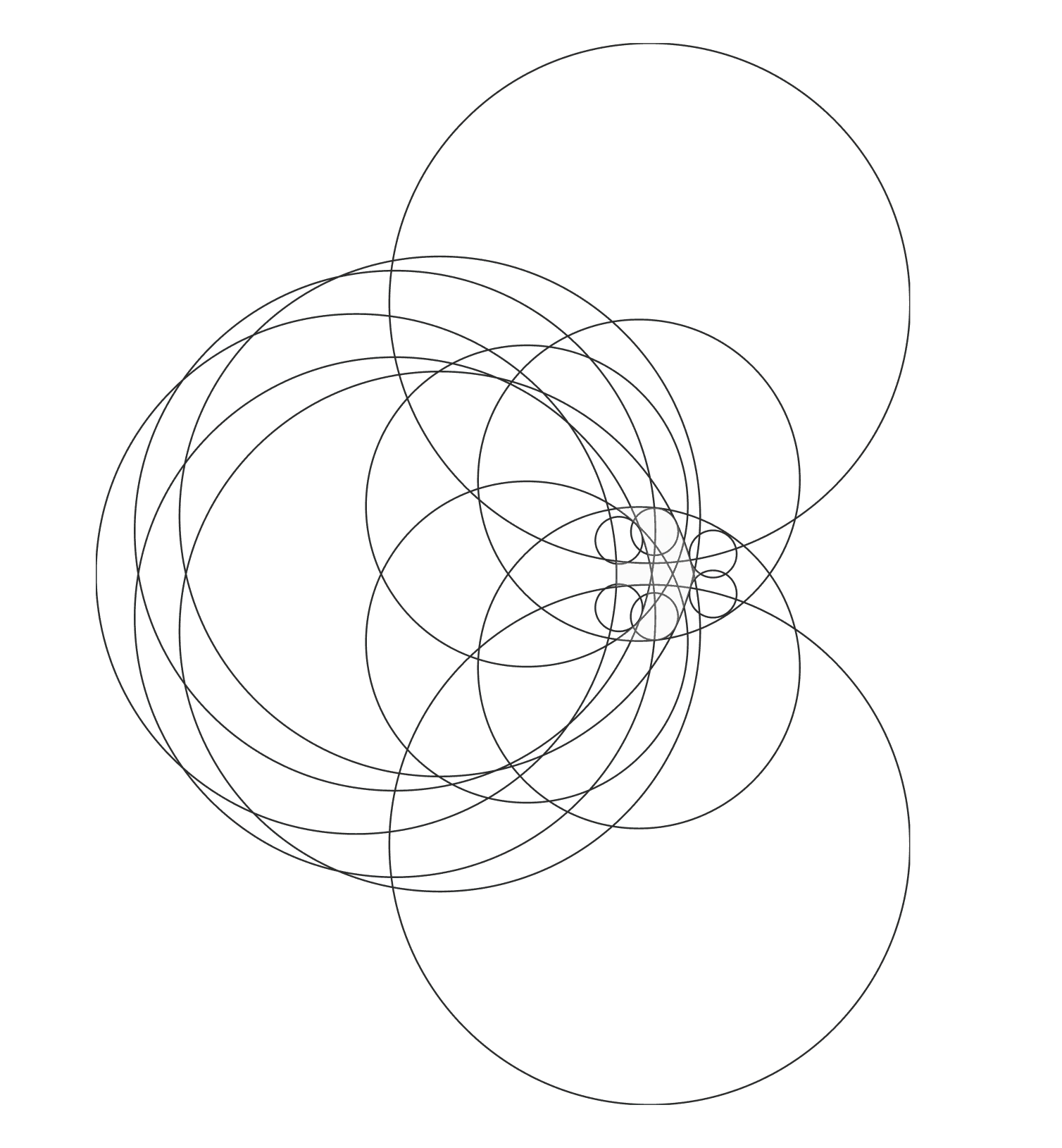
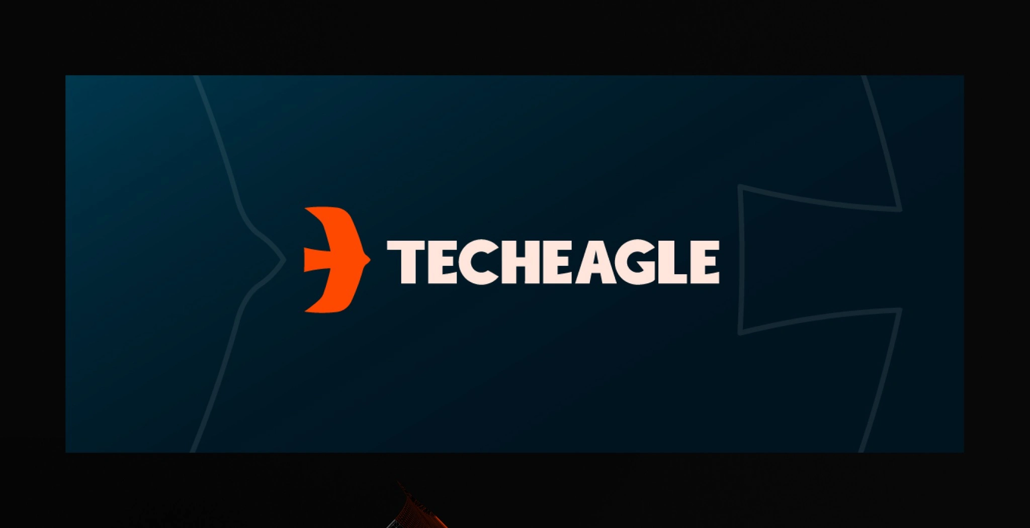
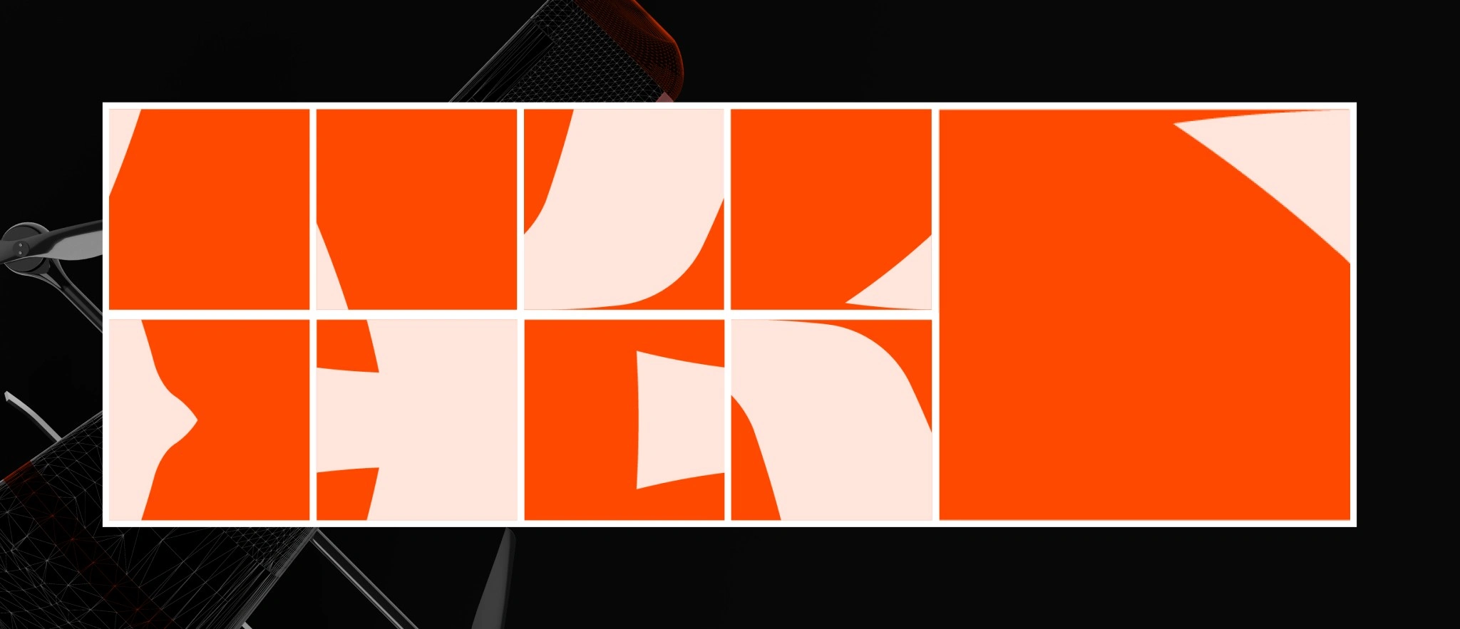
The new logomark was crafted using golden ratio circles. This approach kept the design simple, balanced, and scalable, while still being visually unique and aesthetically appealing. One of the most beautiful aspects of this logo is how it reveals different elements the closer you look. Every section of the logo contains sharp edges, slanted lines, and curves—symbolizing the speed and innovation of modern technology. Yet, when viewed as a whole, it maintains a sense of stability and strength, just like an eagle in flight. The golden ratio played a key role in balancing these contrasting qualities, making the logo both intricate and grounded.
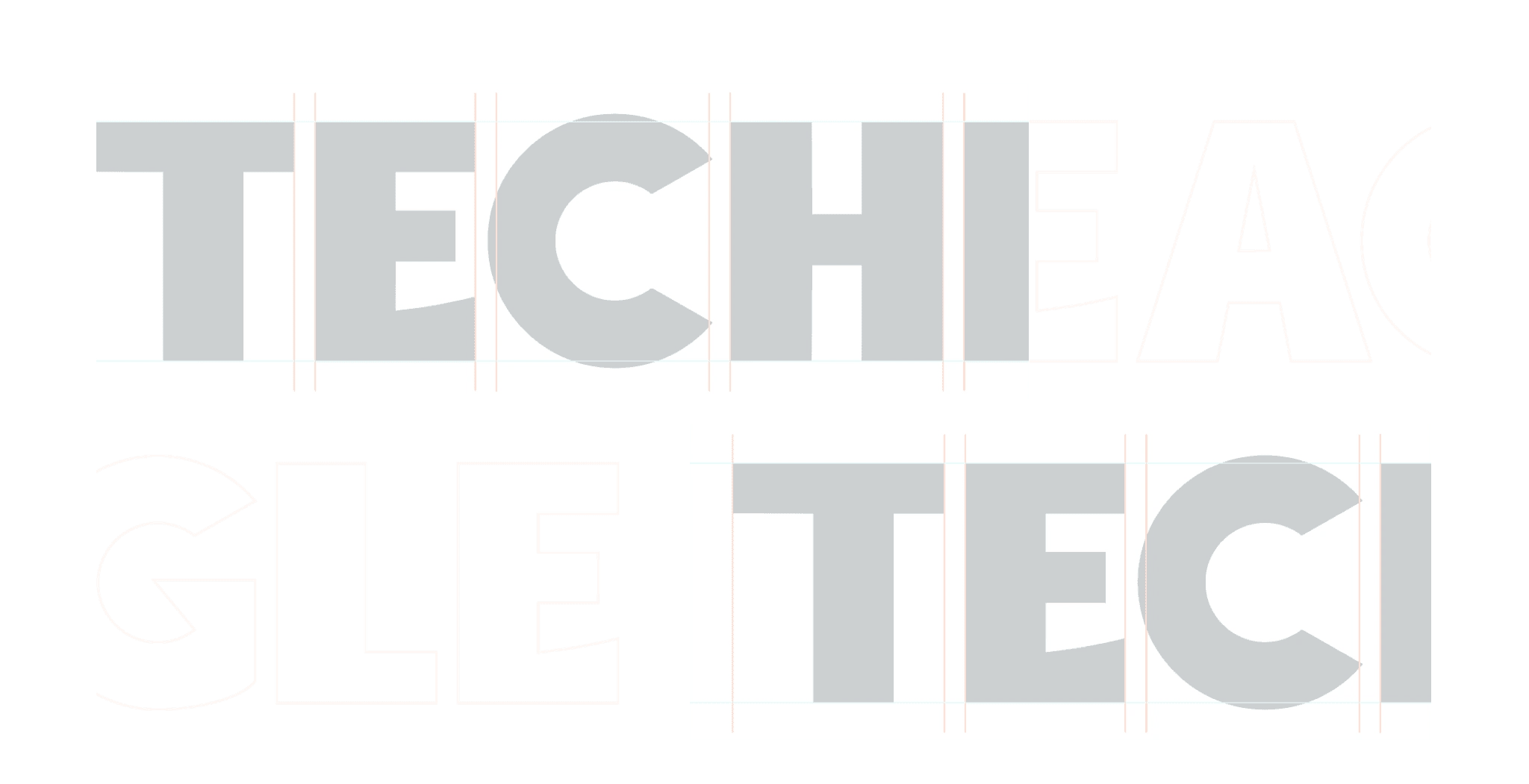
To complement the logomark, we designed a custom semibold sans-serif font from scratch. The font mirrors the characteristics of the logo, creating a cohesive brand identity that feels modern and clean.
For the color scheme, we selected Midnight Teal and Soft Peach as the primary colors. These shades reflect professionalism and trust, while the accent color, Sunset Orange, adds a touch of energy and boldness.
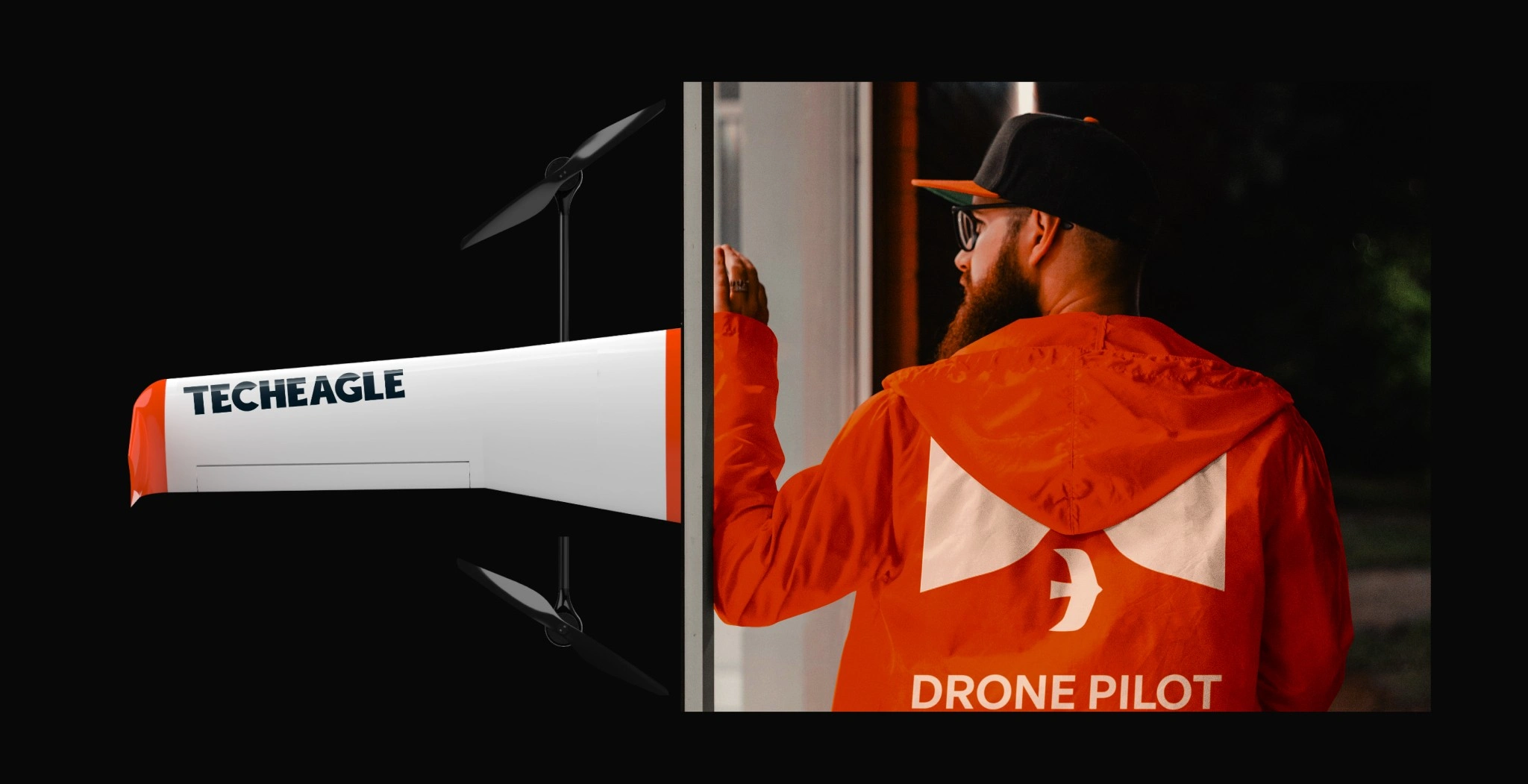
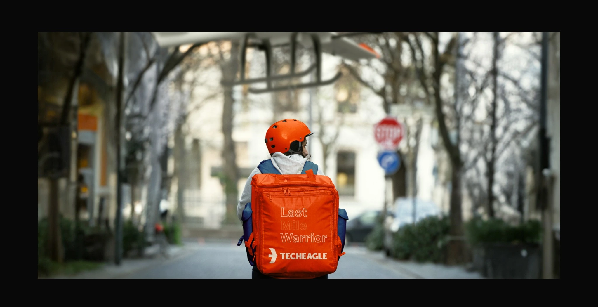
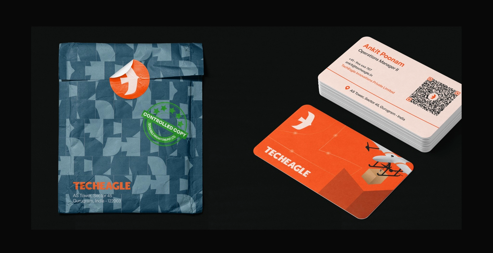
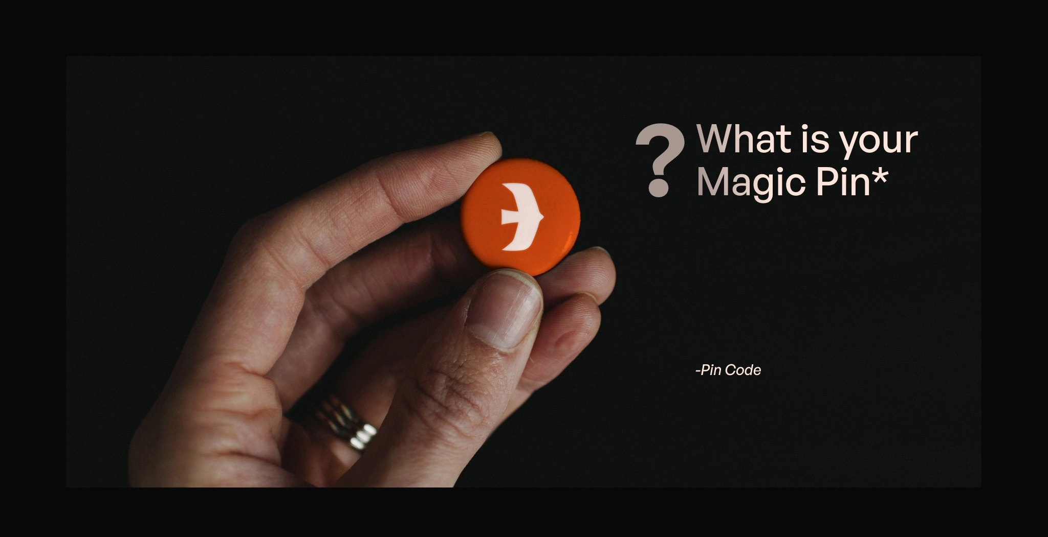
When we began the rebranding project for Techeagle, we knew the current logo wasn’t doing justice to the company’s vision. The old logo, while detailed, was filled with thin lines and complex shapes, which made it difficult to scale and use effectively across various mediums. For a drone delivery company, scalability is crucial—after all, their product flies in the sky. A logo that couldn’t scale well wasn’t suitable for a company so closely tied to aerospace.
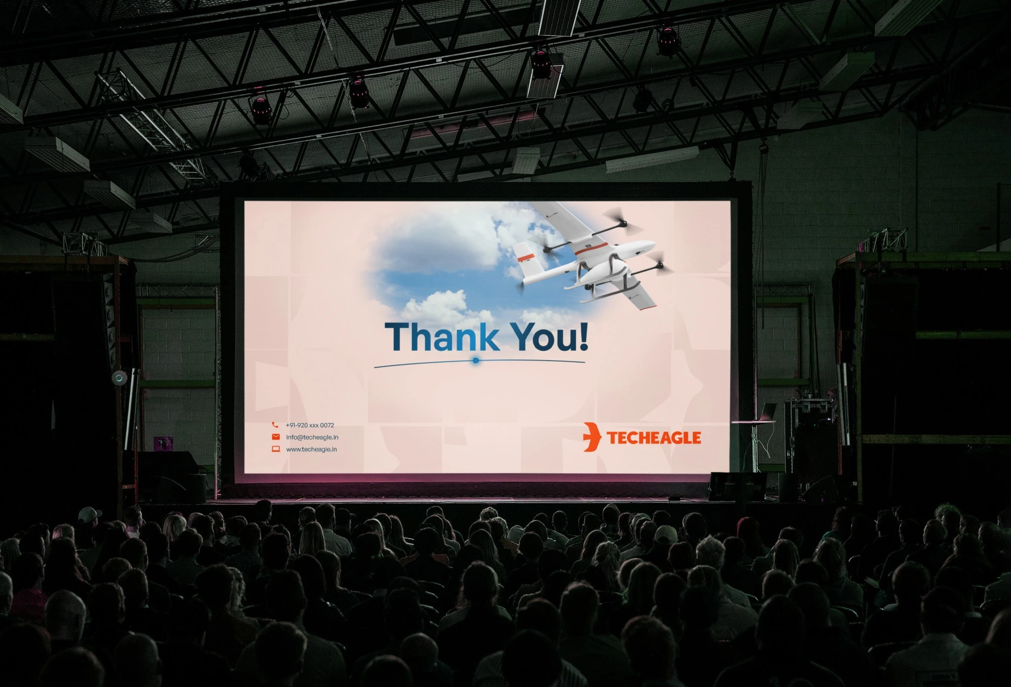
Through this rebranding, Techeagle’s identity became not just a logo, but a symbol of modern innovation, rooted in nature and designed for the future of drone technology. We transformed a complex, limiting design into one that is timeless, versatile, and ready to take flight.
Team
Adarsh Goyat, Anshul Vasishtha, Amogh Tiwari and Vikram Singh.
Role
Creative Director and Designer
Like this project
Posted Oct 11, 2024
Adarsh is a creative director, designer and a storyteller with experience of 4 years working in fast paced startups.
Likes
0
Views
1


