One of the main challenges was maintaining consistency across v…
OCT 2024
FIND YOUR NEW FAVORITE BOOK
PROJECT TYPE
SCOPE
Services
TOOLS
The problem
Goodreads, while highly popular, suffers from an outdated design, a cluttered interface, and low contrast, which can be visually overwhelming. Many users expressed frustration with the outdated interface, the lack of clear navigation.
why does it matter?
The goal of this redesign was to solve these usability issues, modernize the interface, and make the app more intuitive and reader-centric, as the users struggle with inconsistent elements, and hard-to-find actions.
I followed Nielsen's 10 Heuristics to perform the evaluation, and several key issues emerged.
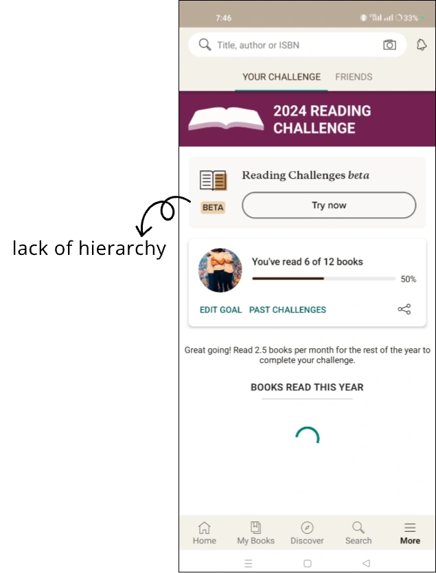
I observed varying button types, text hierarchy, and spacing, making it hard for users to identify interactive elements.
Inconsistent UI elements
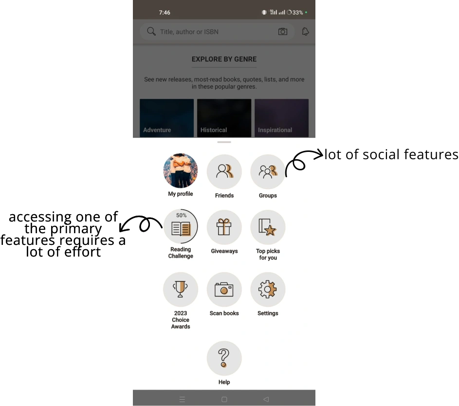
The presence of many unnecessary social features (adding friends, following others) cluttered the interface, detracting from the book discovery experience.
Overloaded with social features
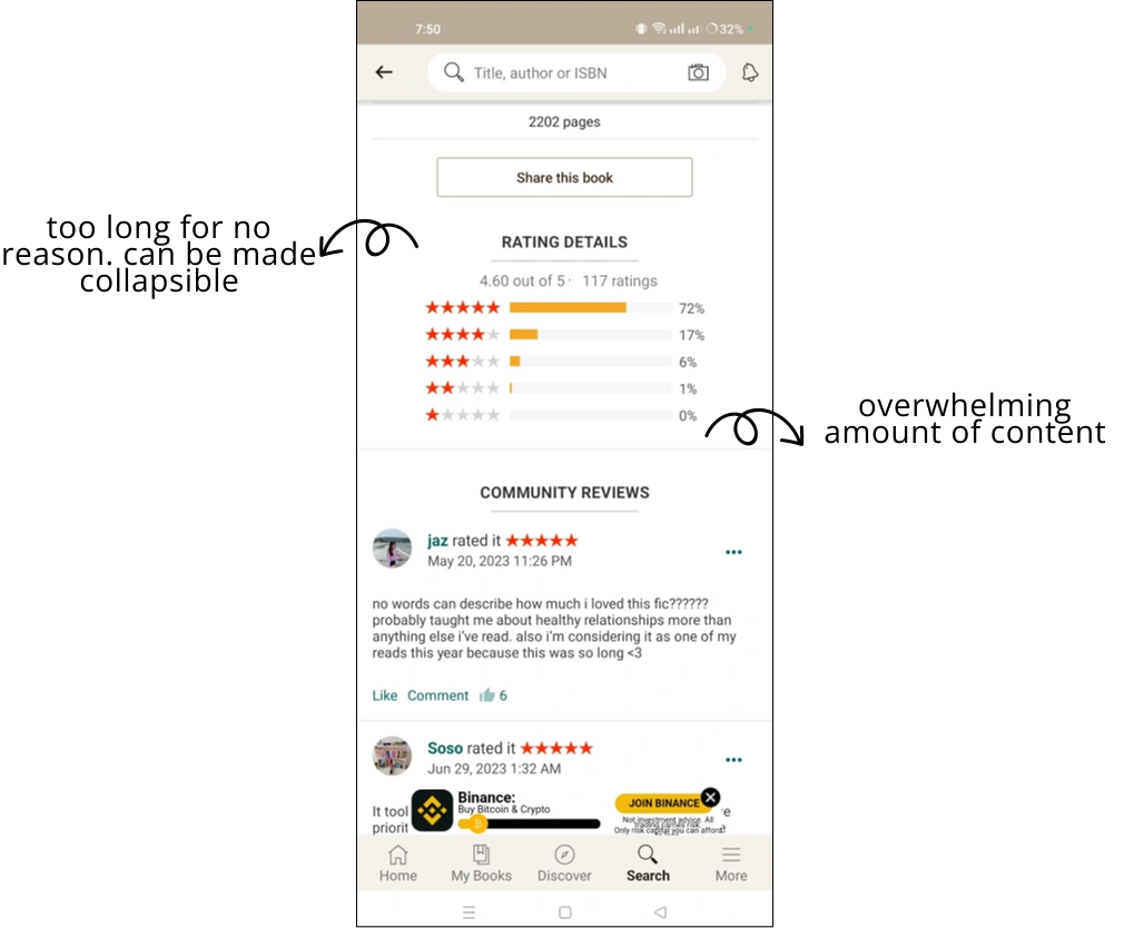
Hidden information
Important elements such as recent searches and key actions were hidden, forcing users to remember where they had seen them.
From the user research, I derived specific goals to simplify the interface, provide better personalization, and improve discoverability of books.
Modernize the visual design and give the app a minimal yet cozy feel.
Improve navigation by making actions easier to find and simplifying the layout.
Declutter the interface by reducing emphasis on social features.
Focusing more on the app’s primary function—discovering, tracking, and reviewing books.
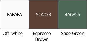
For the color palette, I wanted to retain elements of Goodreads' original branding but with a modern, warm twist. I chose espresso brown, off-white, and sage green, creating a high-contrast, inviting, and cozy vibe that aligns with the app’s theme of books and reading.

For typography, I used Poppins for headings and Open Sans for body text. These choices were driven by the need for readability and visual hierarchy. Following Apple’s iPhone guidelines ensured a clean and consistent user experience across all devices.
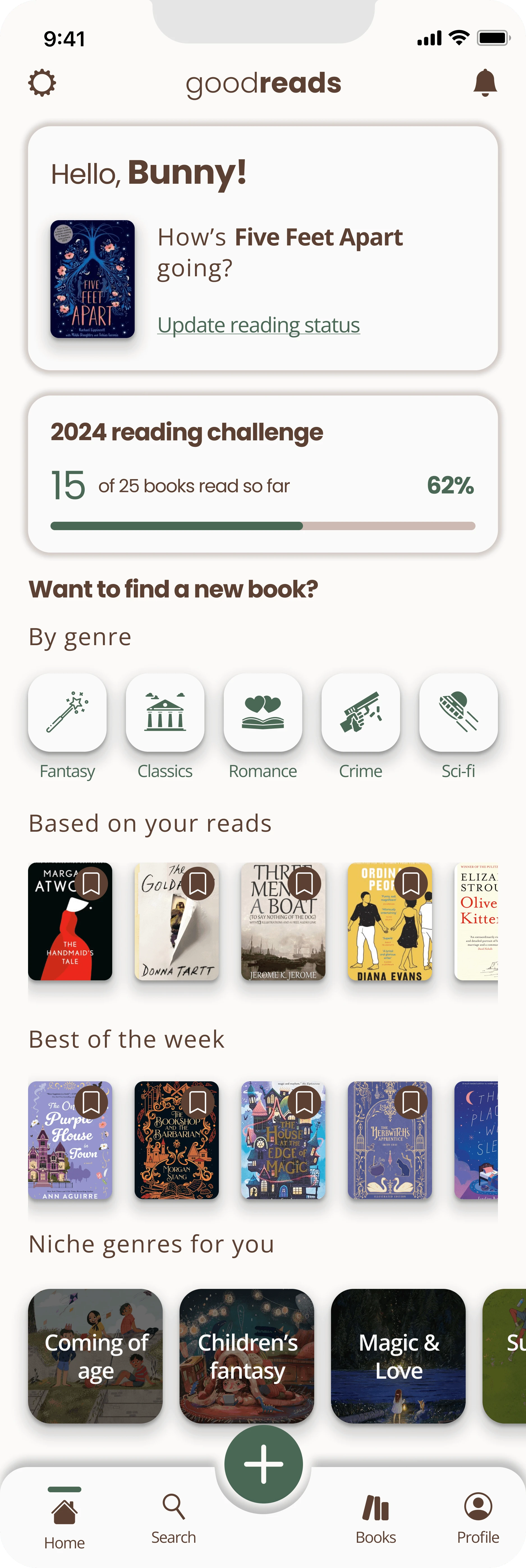

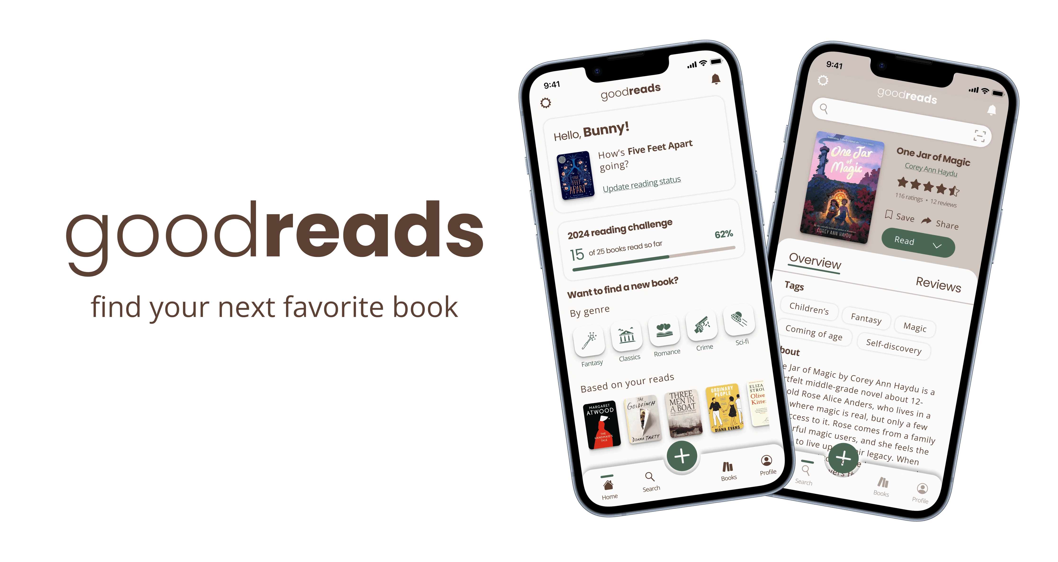
The new home page gives users immediate access to what matters most—current reads, reading challenges, and personalized book suggestions. I also added a section for discovering books by genre and top weekly picks, eliminating the original focus on social features.
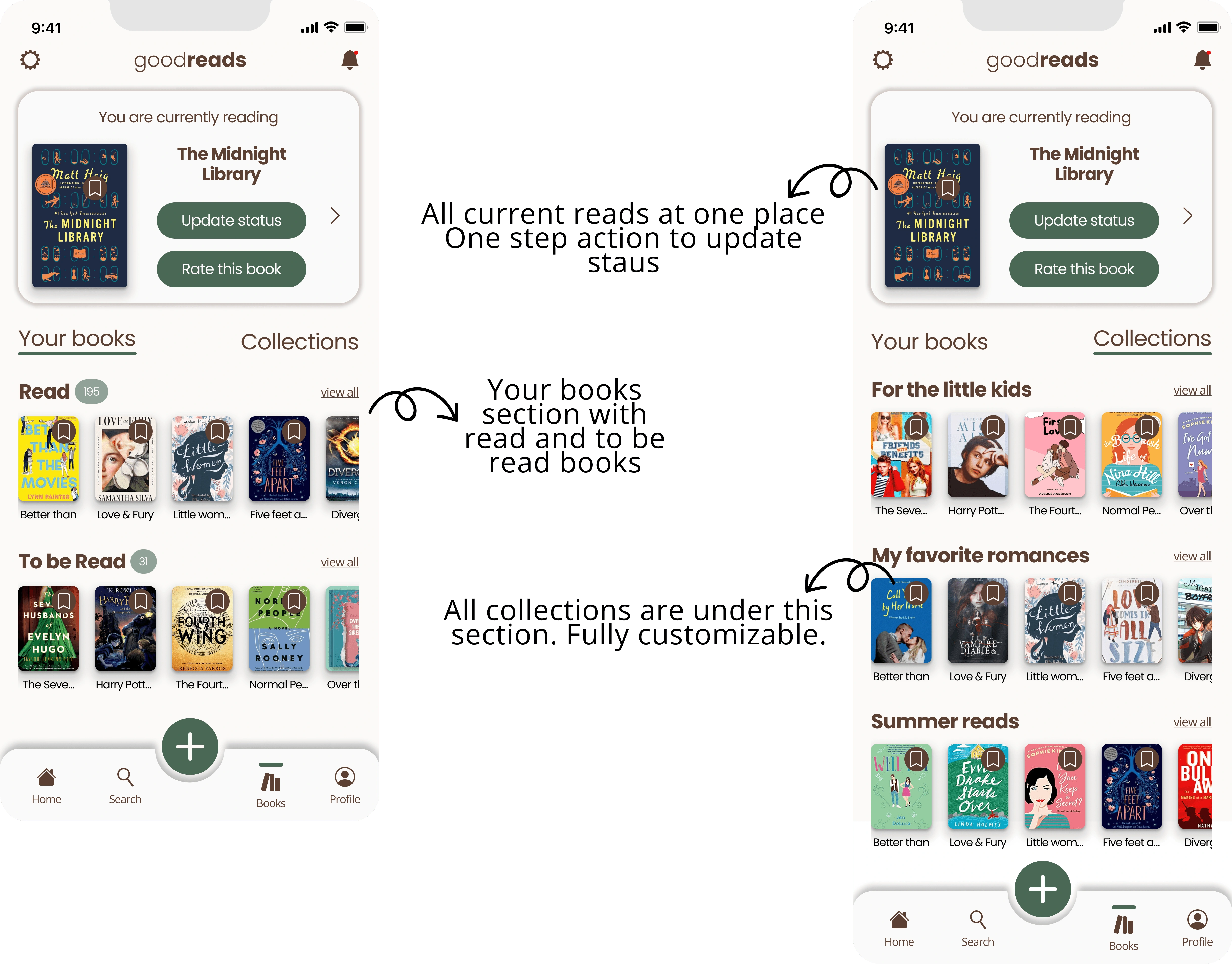
This page displays all of users’ current reads, with quick options to update status or leave a review. The page also neatly organizes books into "To Be Read" and "Read" sections, along with saved collections.
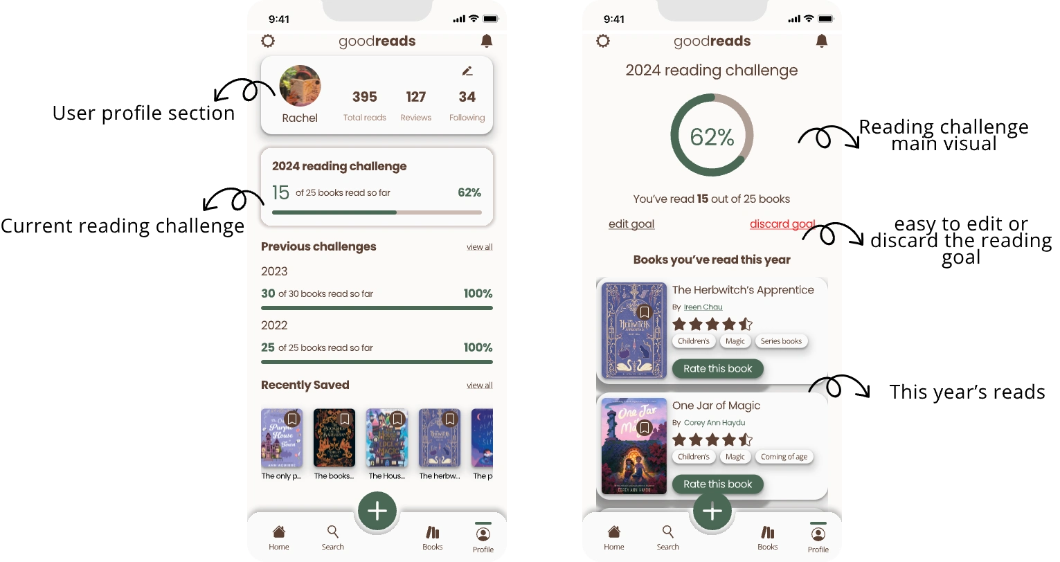
Redesigned to highlight the user's current reading challenge, previous challenges, providing an overview of their reading activity in a clean layout. The revamped page features a donut chart displaying progress towards the reading goal. Below, a list of books read this year is shown.
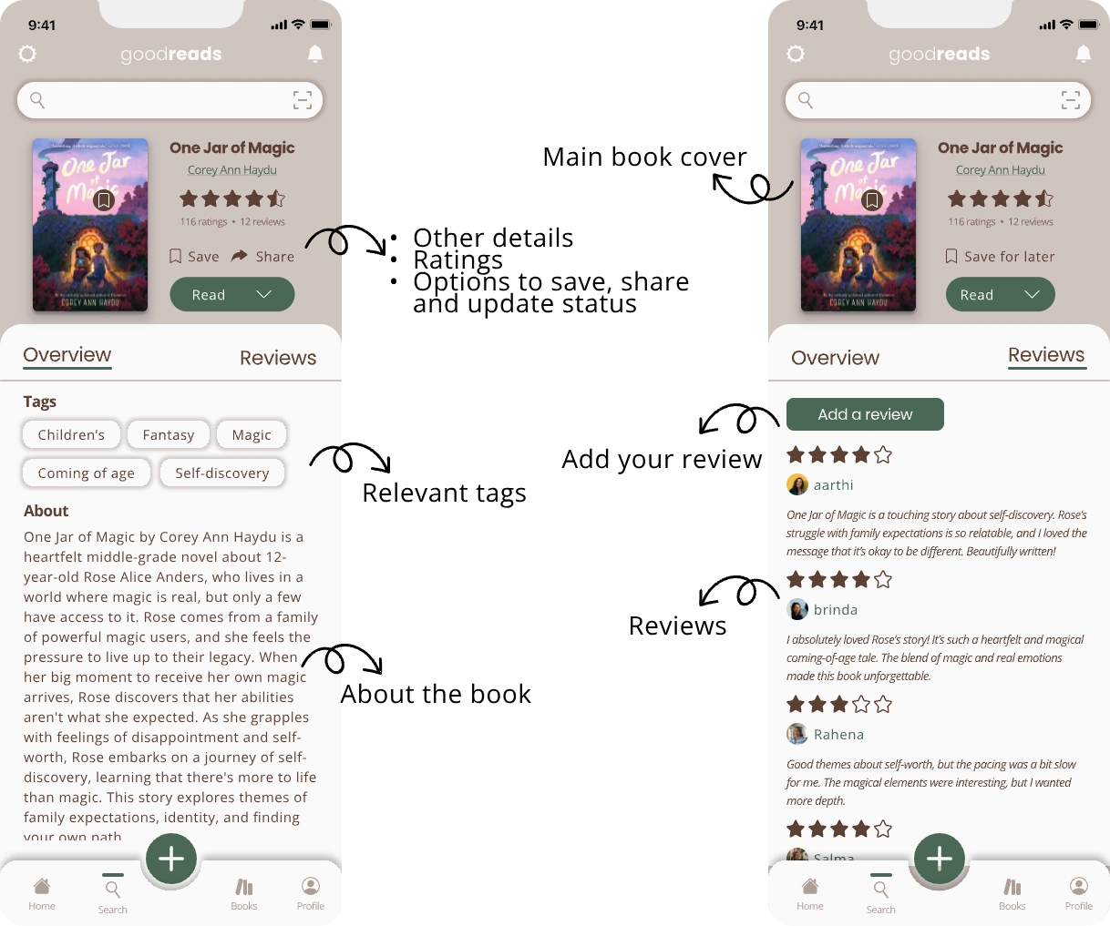
I emphasized clarity and ease of interaction. The redesigned page features a large book cover, key details (author, rating), and relevant tags, with sections for an overview and user reviews.
One of the main challenges was maintaining consistency across various screens while reducing the clutter from unnecessary features. To solve this, I removed redundant social features and refocused the design on book discovery and personal reading progress. Creating a minimal yet cozy aesthetic also required careful selection of colors and typography that would support readability and contrast without overwhelming users.
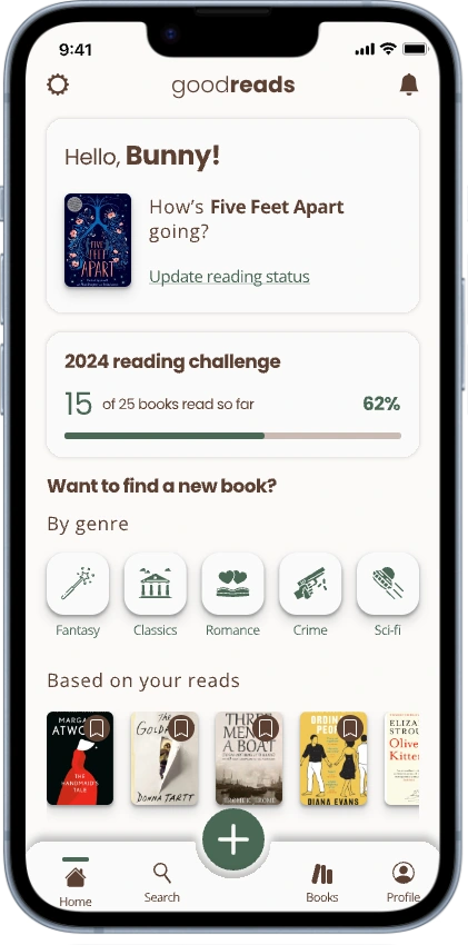
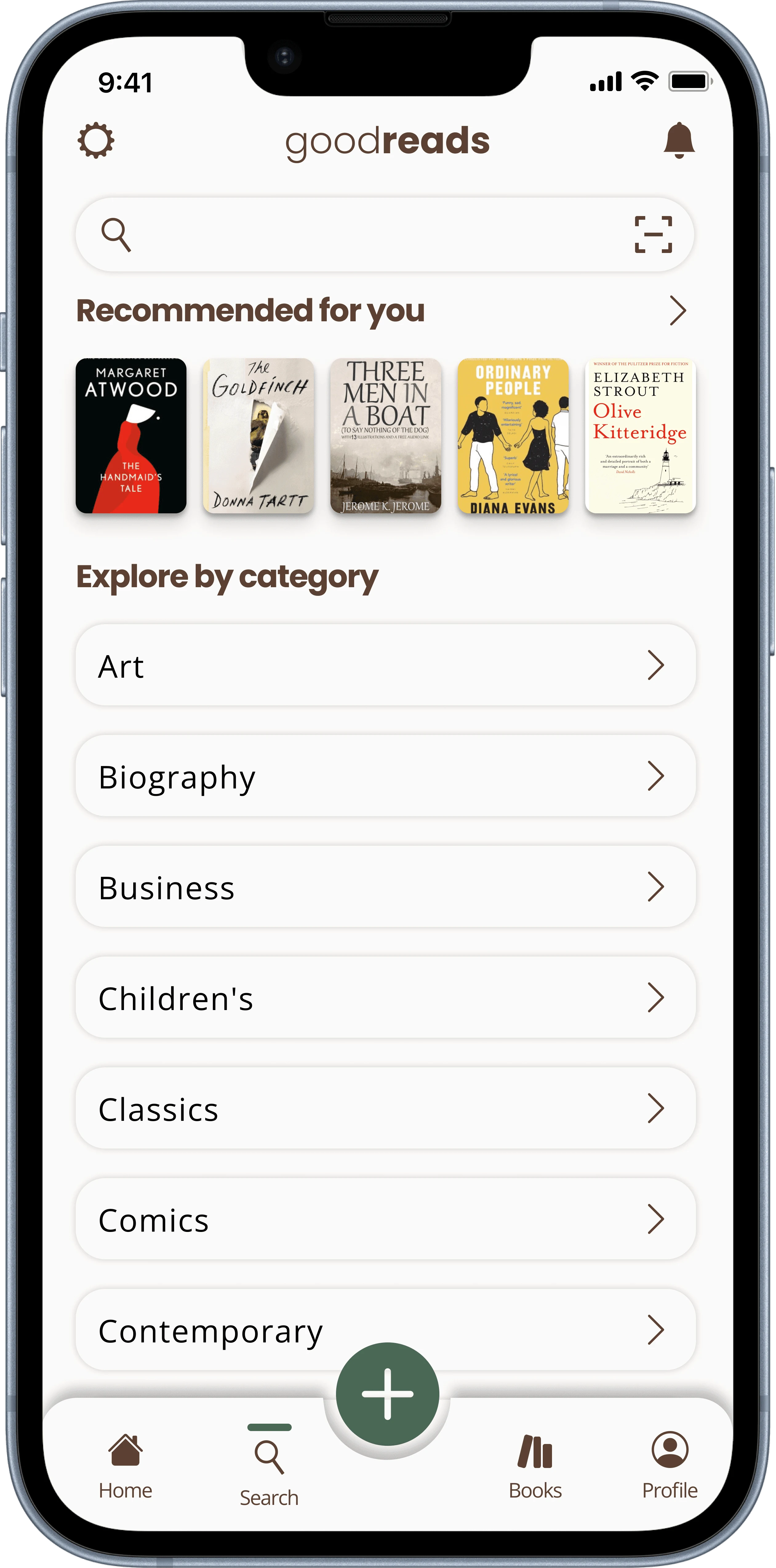
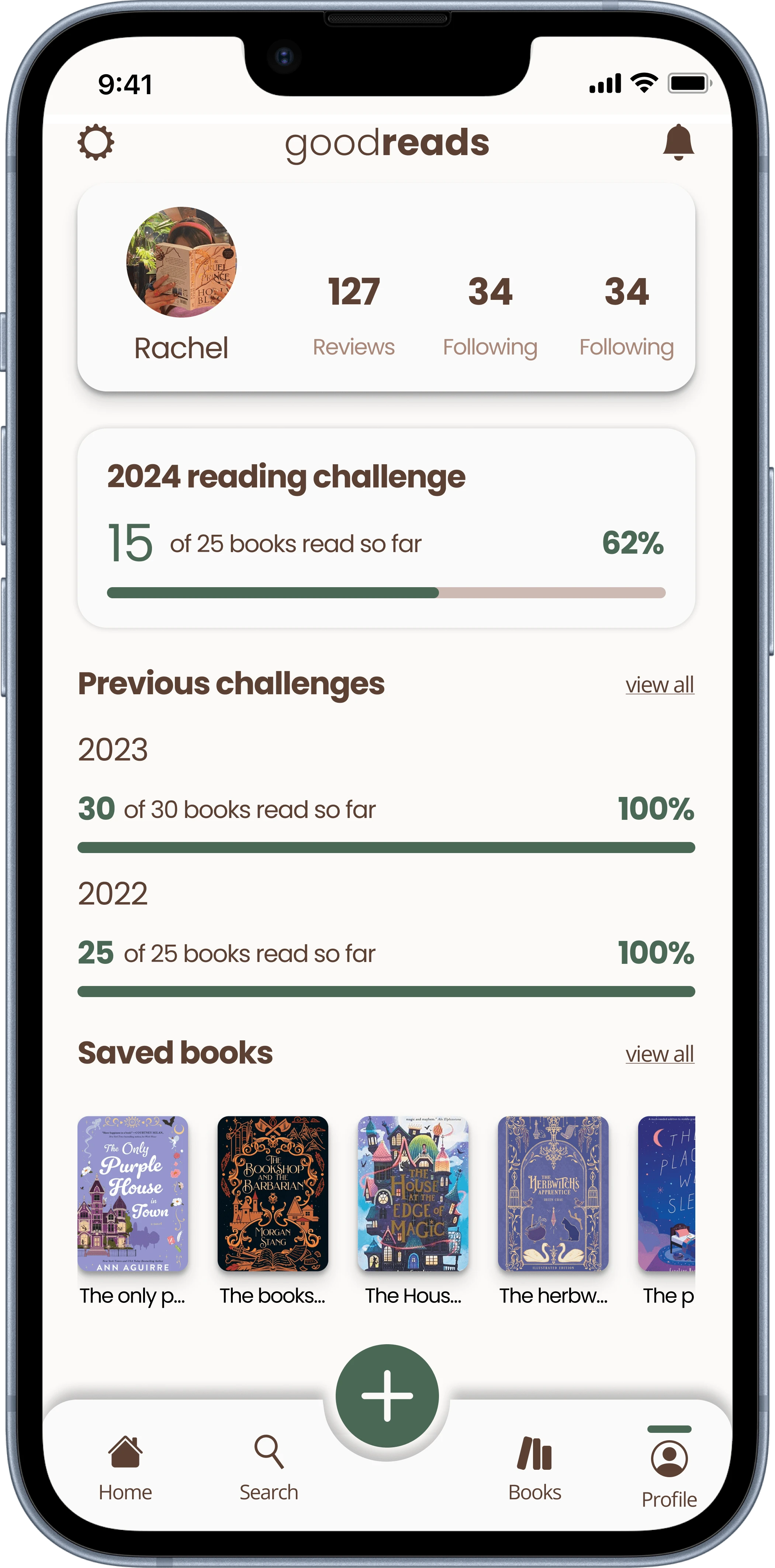
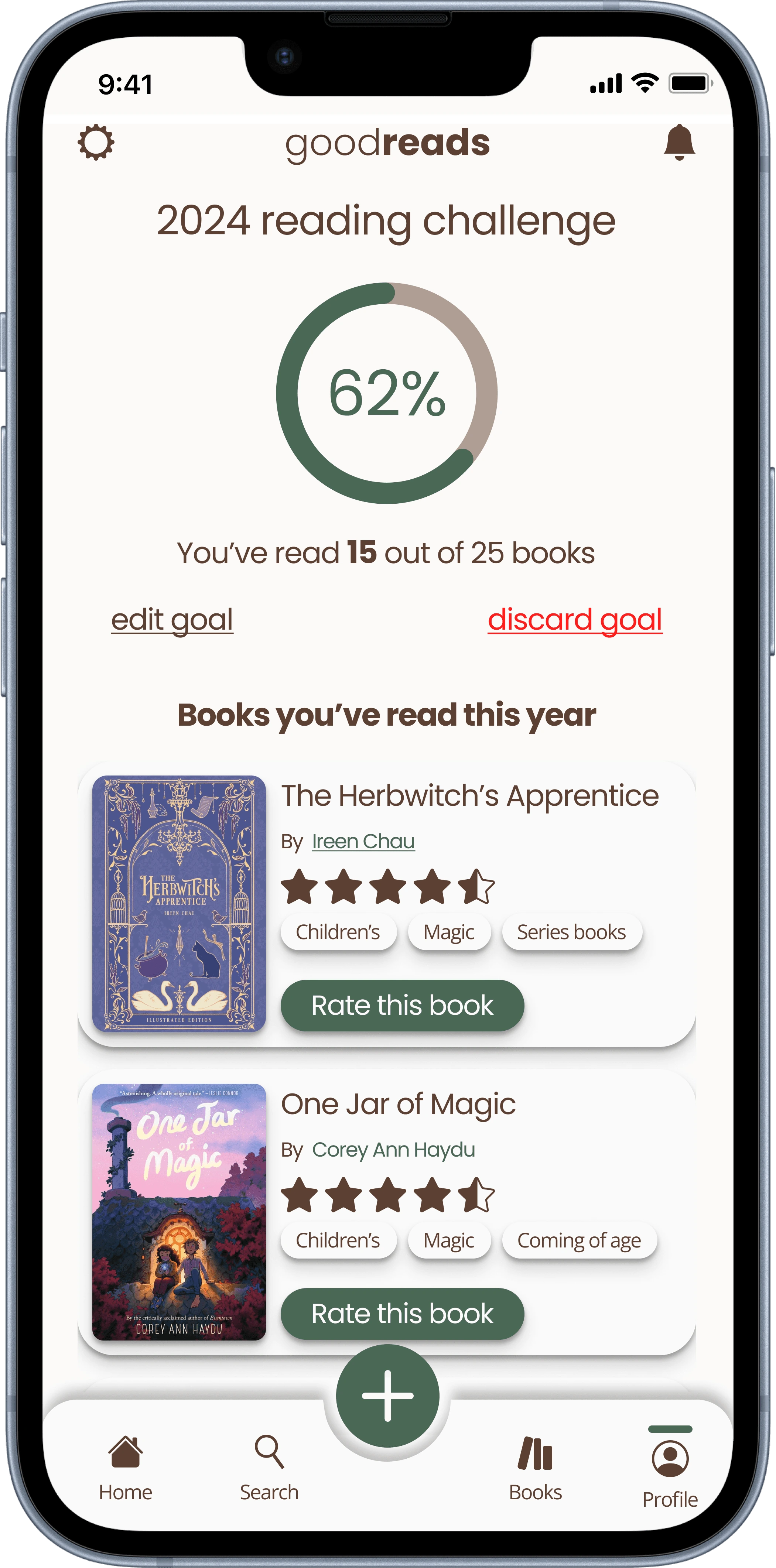
The redesigned Goodreads app tackles key issues like outdated design and poor navigation, creating a cleaner, more intuitive user experience. By improving visual consistency, navigation, and personalization, the app now makes book discovery and tracking easier and more enjoyable. The refreshed design, with its cozy and modern feel, better aligns with user needs and enhances overall usability.
Let’s collaborate!
PORTFOLIO @ 2024
Like this project
Posted Nov 21, 2024
UX/UI designer creating intuitive, user-centered digital experiences with a focus on seamless usability and engaging visual design.
Likes
0
Views
25

