BIZZ Gums | Some Products Need a World, Not a Website. by Alessandro CofoneBIZZ Gums | Some Products Need a World, Not a Website. by Alessandro Cofone

BIZZ Gums | Some Products Need a World, Not a Website.

Alessandro Cofone

Alessandro Cofone

BIZZ Gums | Some Products Need a World, Not a Website.

The Problem
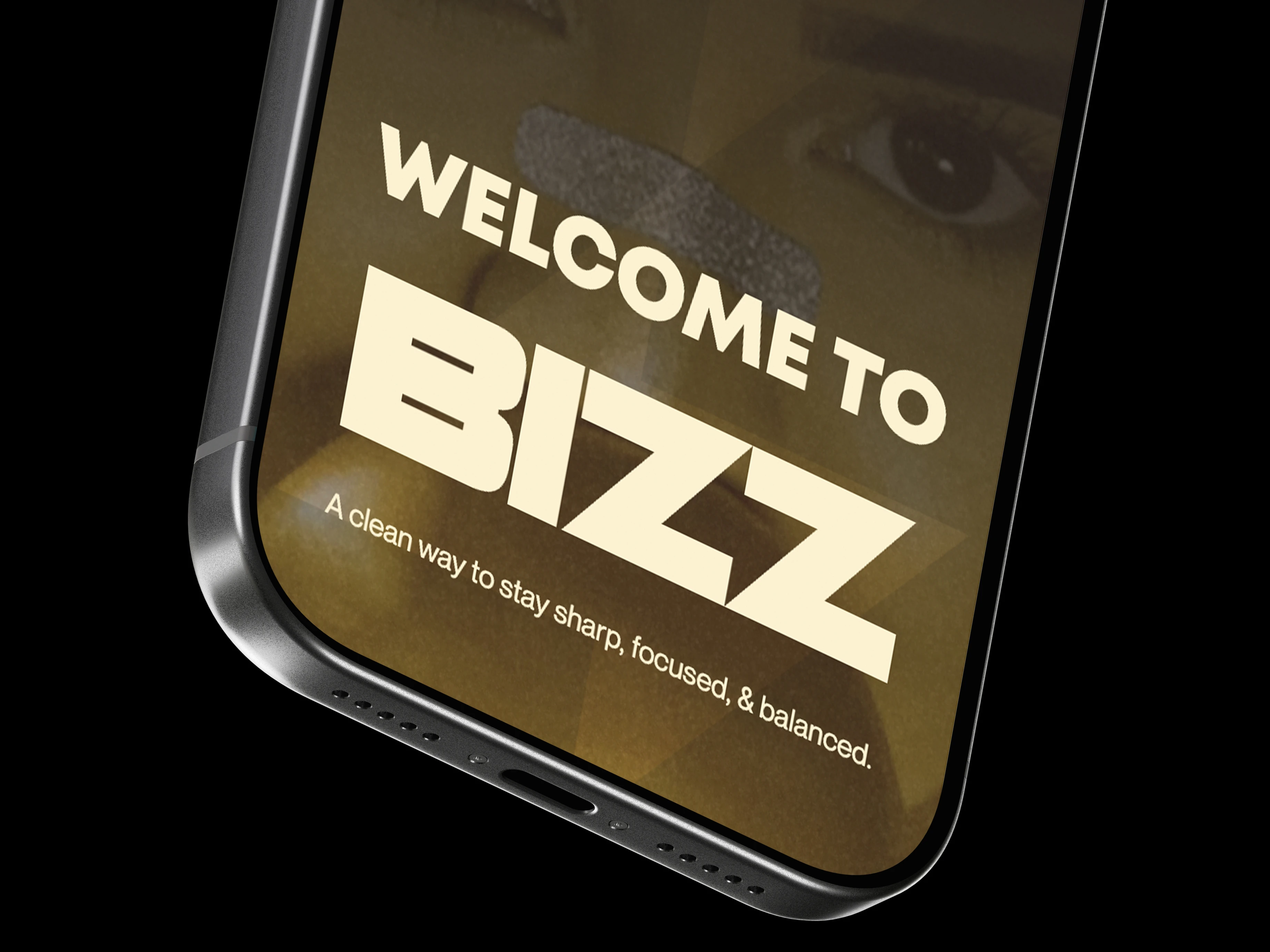
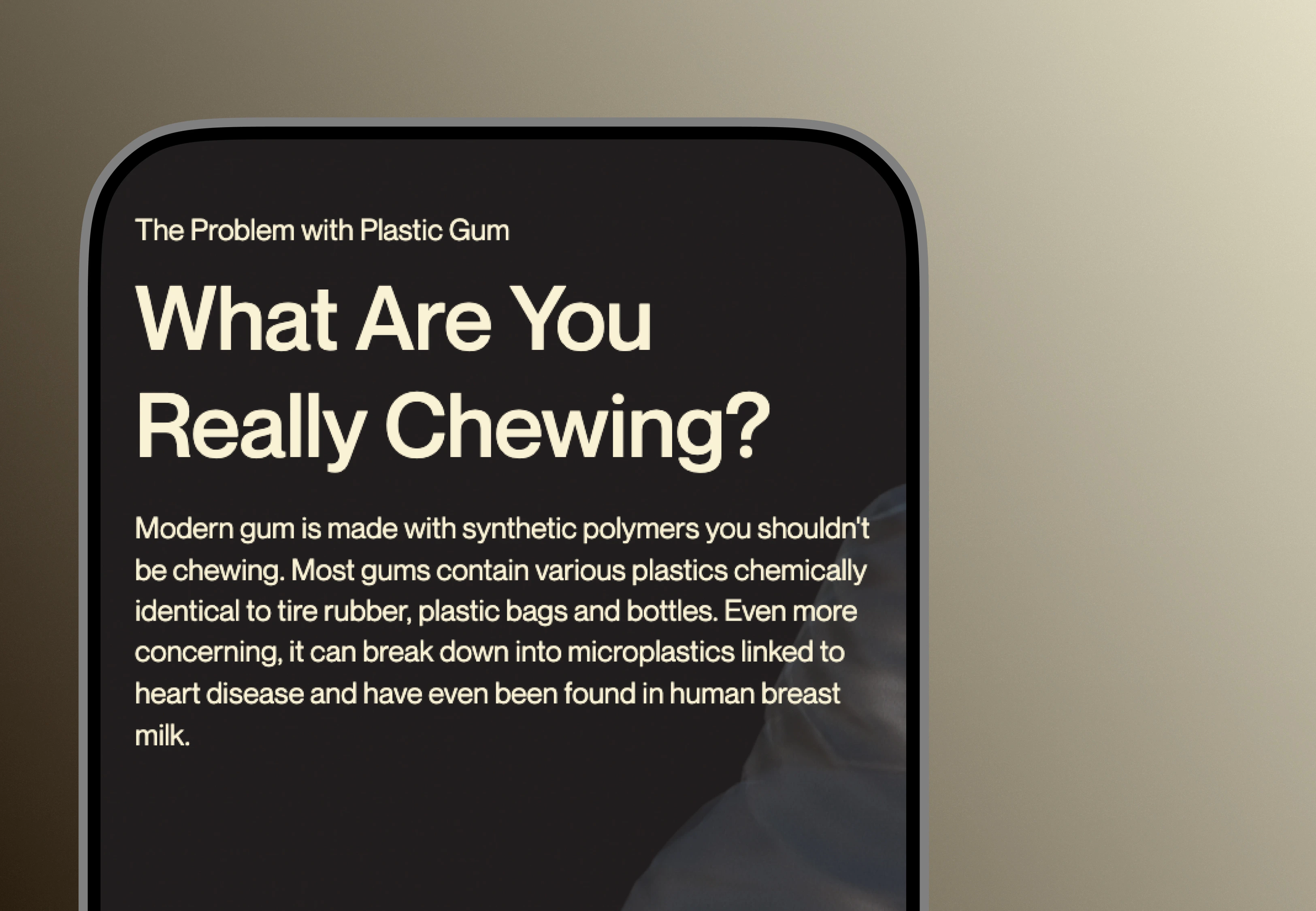
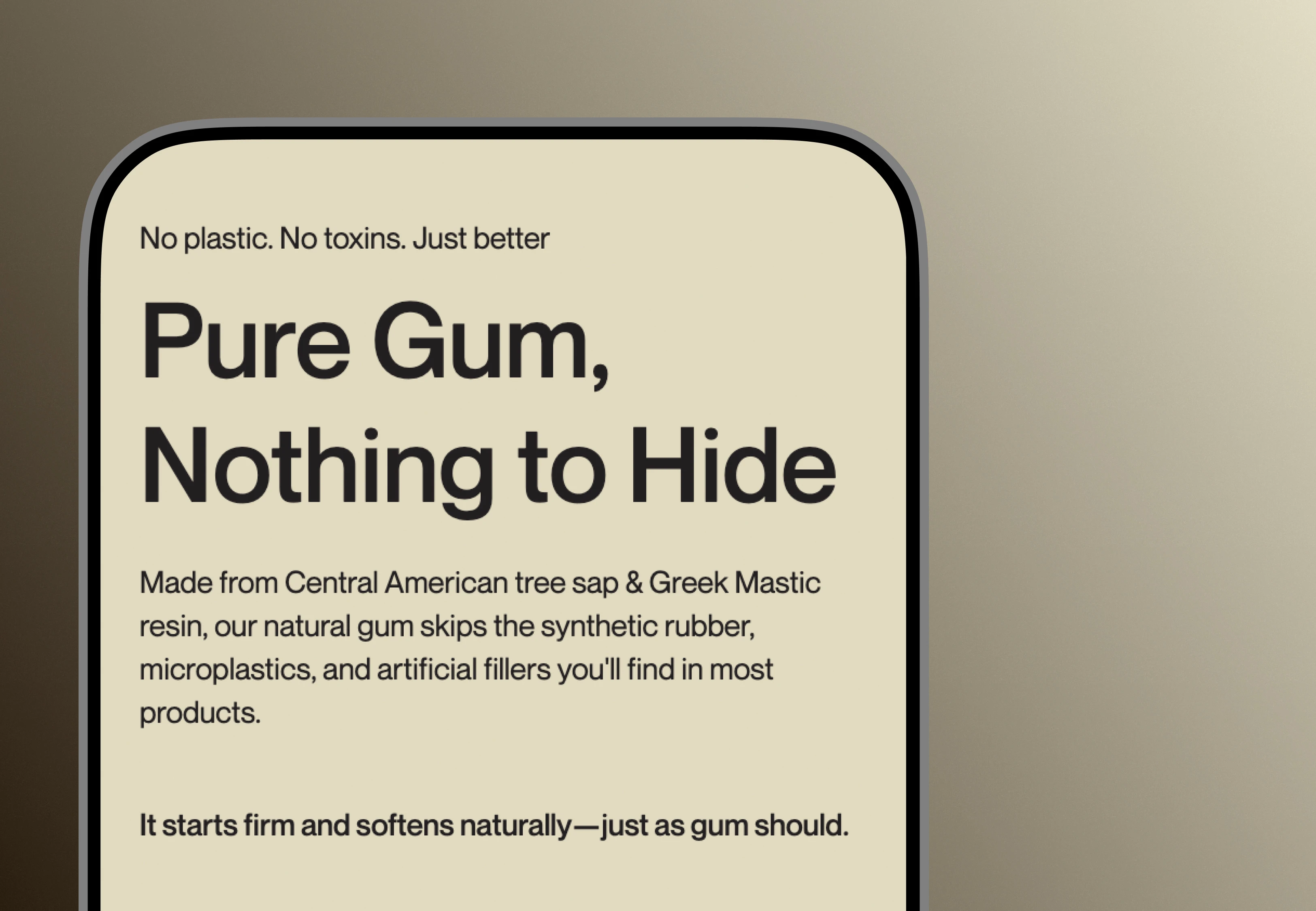
Walk the nicotine gum aisle and everything looks like medicine. Pharmaceutical packaging, the unspoken assumption that buyers only care whether it works. BIZZ wanted out of that aisle with a genuinely clean formula, no microplastics, no synthetic binders. Our brief was to make that difference land without drowning the page in ingredient lists and wellness platitudes.
So this was two problems wearing one coat. A design problem and a credibility problem. Buyers had to grasp what's wrong with conventional gum, see the formula's transparency for themselves, and feel both of those things inside an experience as premium as the product. A hero image over a feature grid would have sunk the positioning before the first sentence.
And there was a wall in the way. The standard Webflow-to-Shopify embed slaps a generic storefront template onto the page at checkout, which shatters the brand environment at the precise moment a buyer has decided to spend. Holding the experience together through that moment wasn't a nice-to-have. It was the commercial hinge of the whole build.

The Approach

Engineer the Environment. Then Put the Product in It.
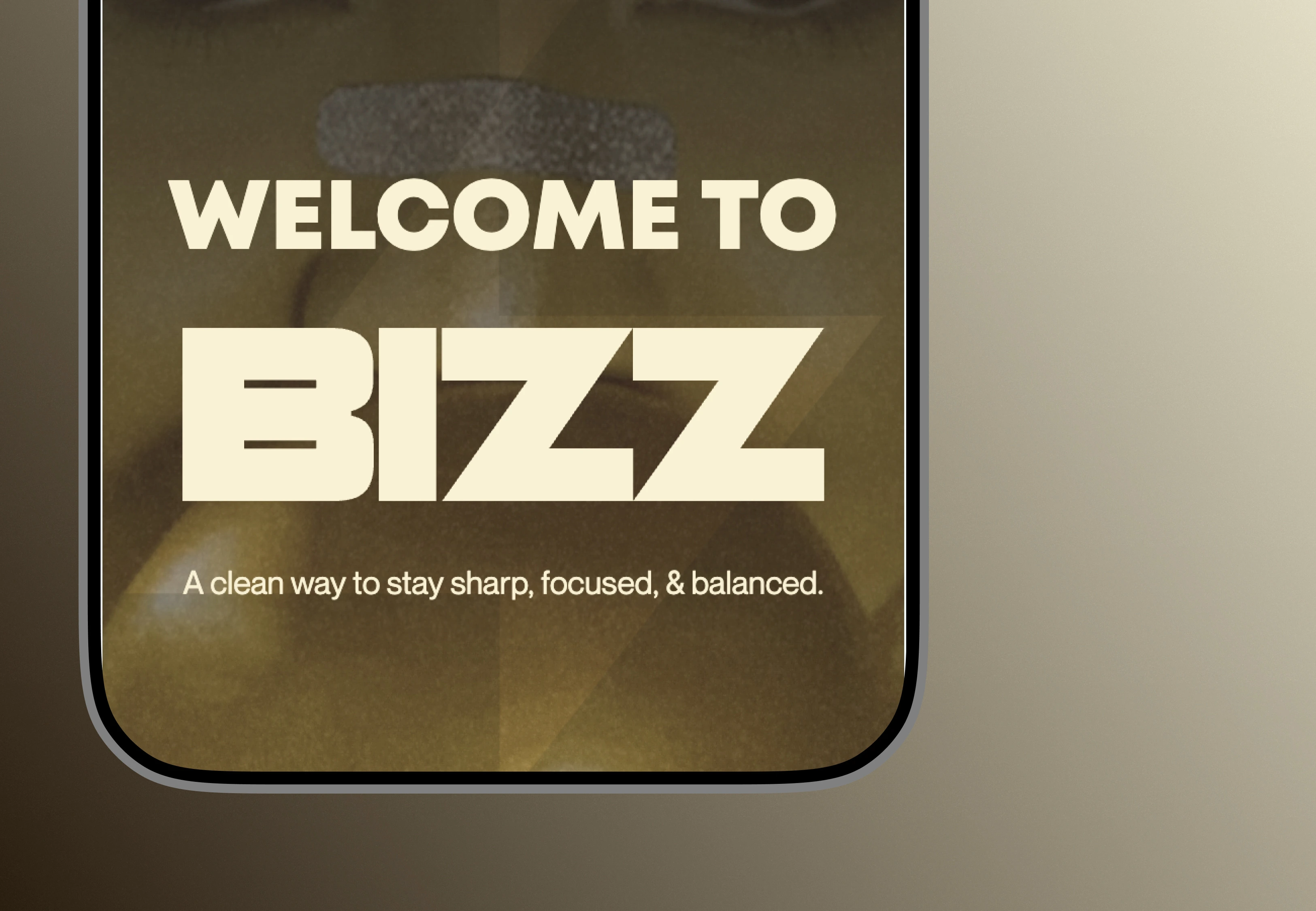
We settled one thing early. The site would not explain the product. It would let you feel the product first and understand it second. Everything grew from that.
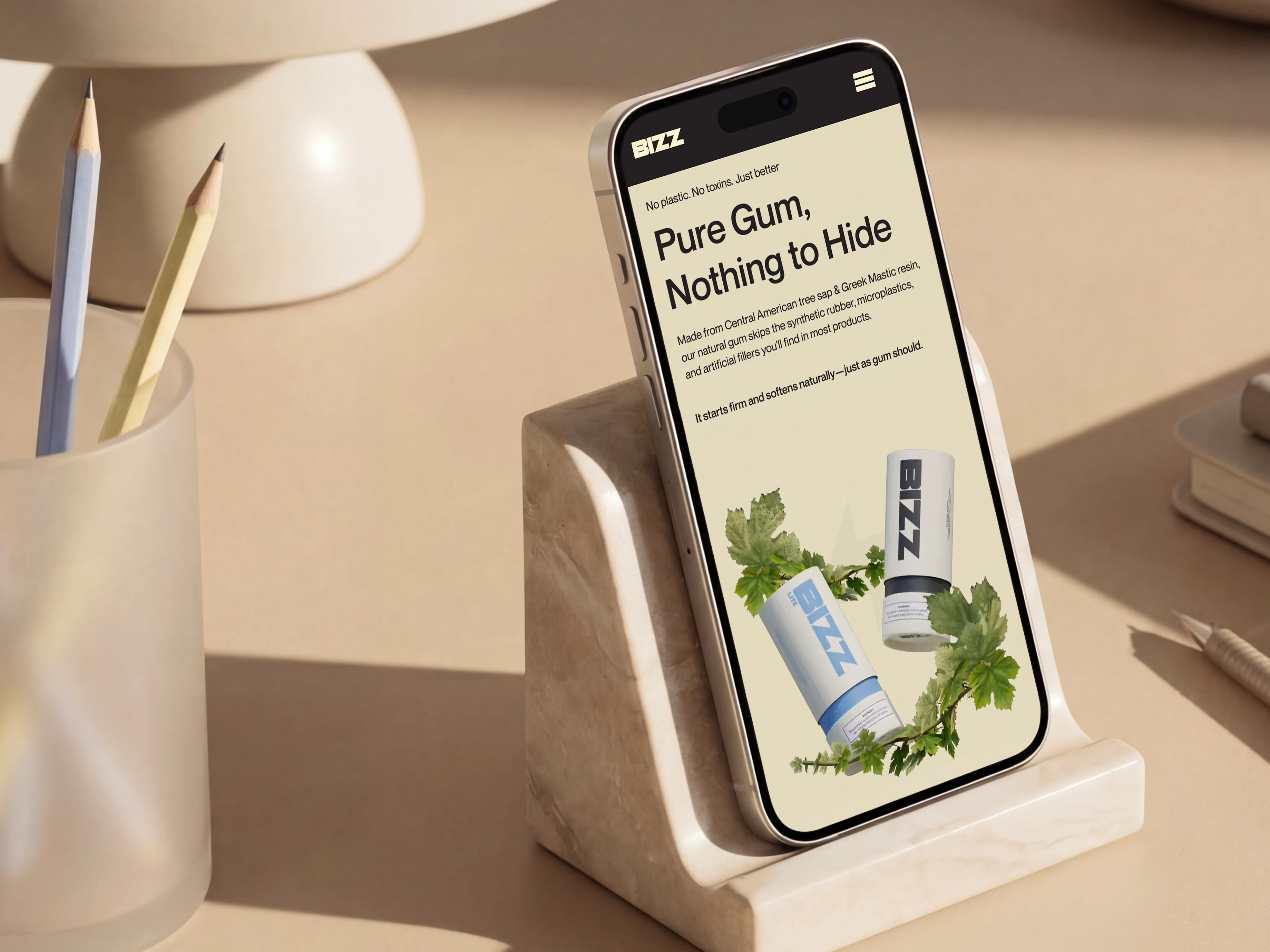
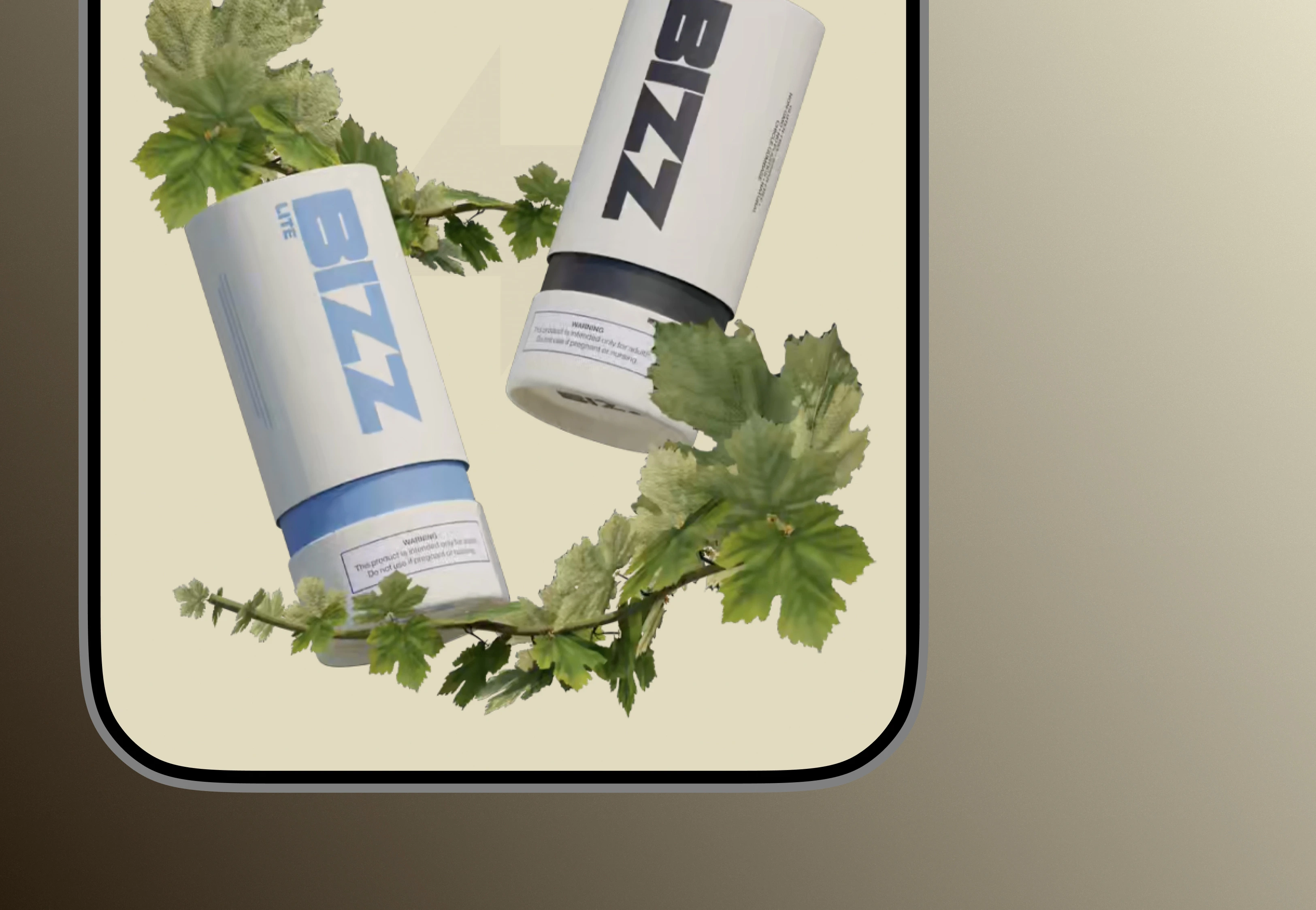
We designed two environments, one for BIZZ and one for LITE, each built as a visual metaphor for how that formula actually feels. Flavor rooms, in effect, giving the product spatial presence in the browser rather than parking it on a shelf. The 3D came out of Blender and shipped as pre-rendered imagery, video, and Lottie animations instead of live in-browser models, which let us keep the visuals cinematic while keeping the page light. Every asset was built against a mobile performance budget from day one: compressed, optimised, loaded only when needed, so Core Web Vitals stayed protected on the product pages.
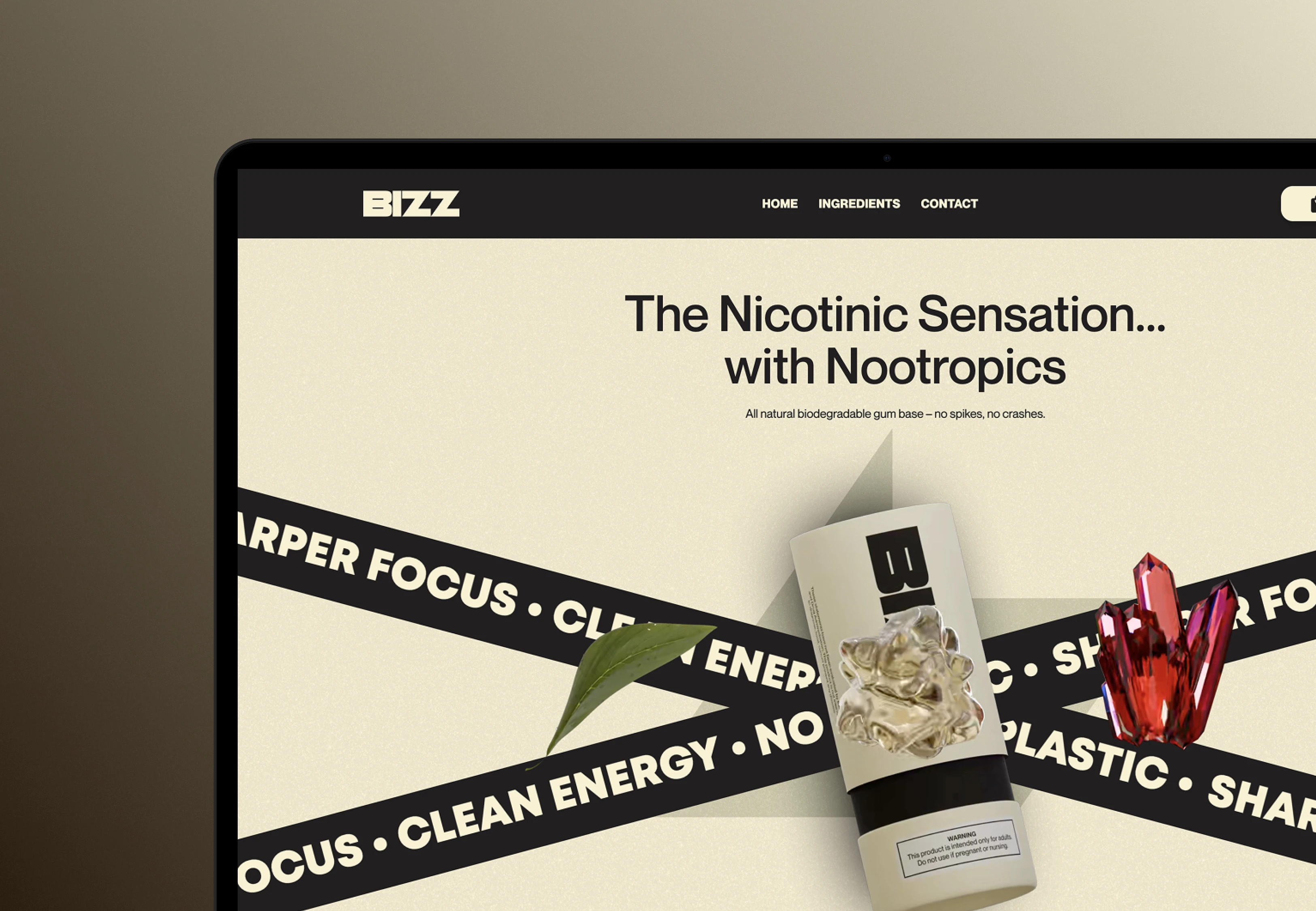
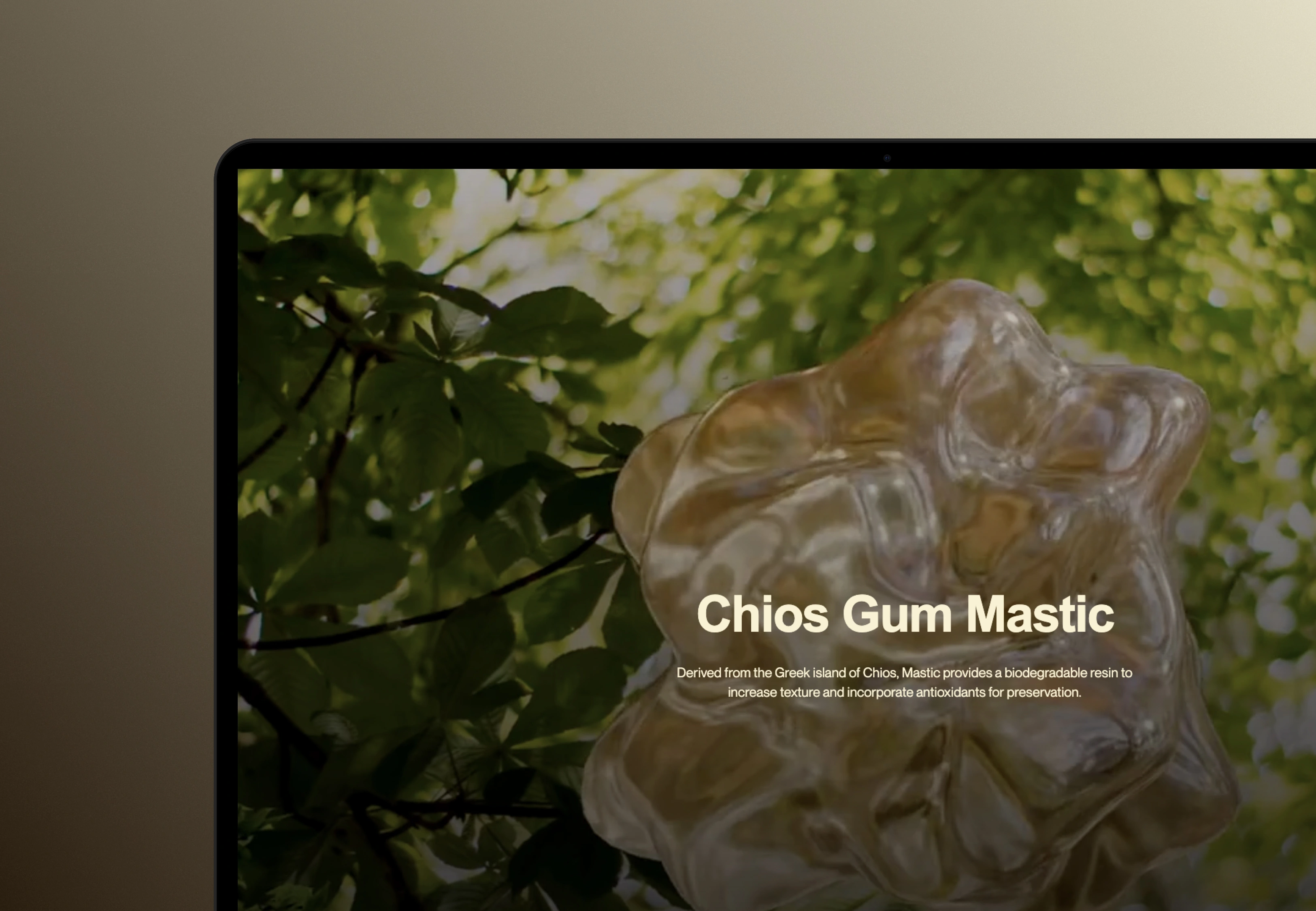
The 3D didn't stop at the rooms. It went down to the individual product moment. Photorealistic ingredient renders showed the formula's transparency in a single frame where a clinical spec panel would have killed the mood outright. Floating pack animations tracked scroll position. Layered motion sequences walked the story from problem to product to purchase. Nothing on the page moved by accident.
Scroll and stagger choreography, built in Webflow, carried the arc between the immersive sections and the ingredient-transparency content. The design system kept the rendered environments and the Webflow layout layer visually continuous, so crossing from one to the other read as a single product rather than two builds taped together.
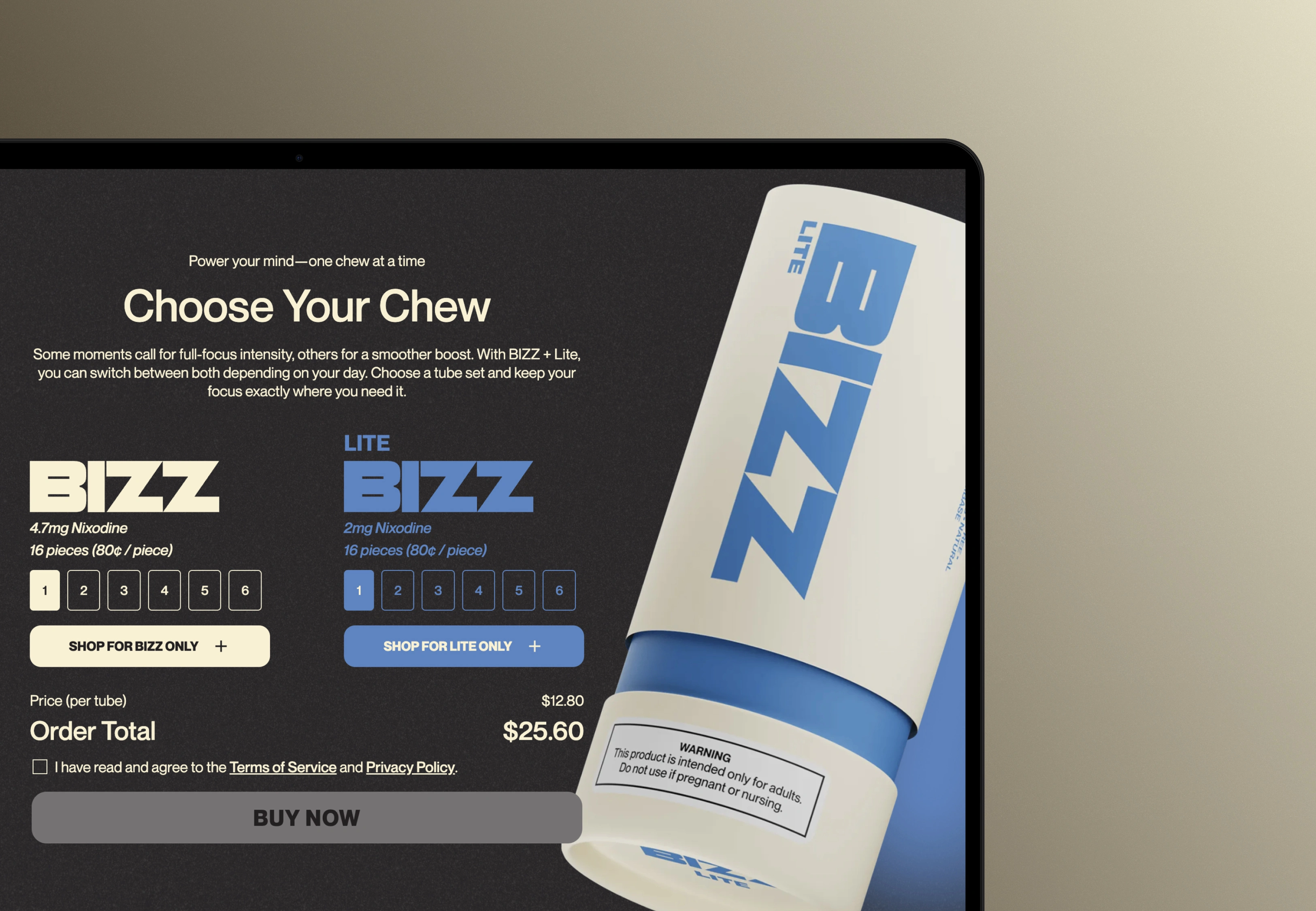
The Shopify side existed to protect that continuity straight through checkout. Custom product components inside the Webflow environment pulled live inventory from Shopify's Storefront API, so add-to-cart and checkout both fired inside the BIZZ brand context. Skipping the standard embed entirely kept the visual system intact at the exact point where buyers usually drop, and turned the checkout into a designed part of the experience instead of a stock template bolted on at the finish.

What we Built

Flavor Room Environments: Two rendered worlds, one per variant, giving BIZZ and LITE their own sensory character before a word of copy.
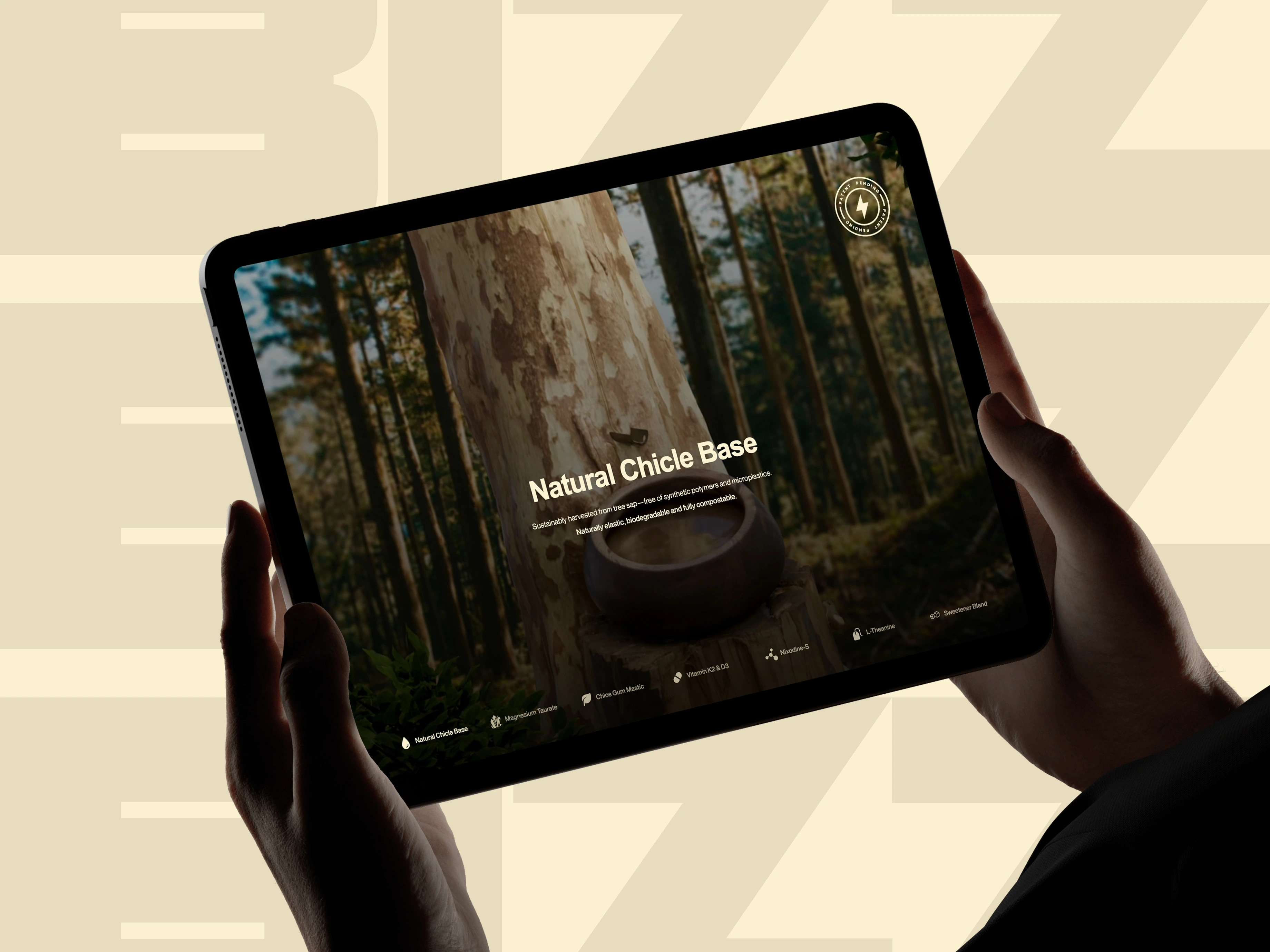
Photorealistic Ingredient Renders: Cinematic imagery that carries credibility through visual detail, with none of the clinical language the category falls back on
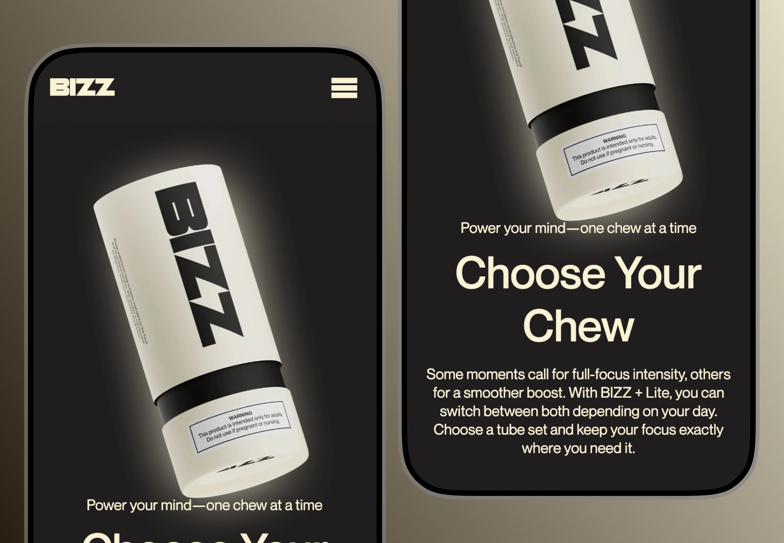
Interactive Pack Animations: Product motion tied to scroll position, so every scroll earns its moment.
Shopify Checkout Integration Purchase intent preserved from first scroll to final confirmation.
Scroll-Driven Narrative Architecture: A story the visitor uncovers by moving through the page at their own pace.

The Results

A product that commands premium. A website that commands the same.
The site finally matched the product behind it. Those immersive environments handed BIZZ a visual language that nothing else in the nicotine category has, and parked it firmly among premium consumer goods, well off the pharmaceutical shelf. Visitors met it first as an object with presence and character, and only after that as a thing to buy.
The transparency architecture, built on cinematic renders rather than spec sheets, answered the credibility question while keeping clinical language off the page. People worked out what made BIZZ different by exploring the visuals, which cut the mental friction of a careful purchase in a category where doubt is the starting position. The Shopify integration held the brand together through the purchase path and erased the experiential break that normally shows up right at the highest drop-off point. On mobile, the rendered environments came in under acceptable LCP thresholds and the checkout tested clean of conversion-impacting friction.
Like this project

Posted Sep 24, 2026

The Problem Walk the nicotine gum aisle and everything looks like medicine. Pharmaceutical packaging, the unspoken assumption that buyers only care whether it works. BIZZ wanted out of that aisle with a genuinely clean formula, no microplastics, no synthetic binders. Our brief was to make that difference land without drowning the page in ingredient lists and wellness platitudes. So this was two problems wearing one coat. A design problem and a credibility problem. Buyers had to grasp what's wrong with conventional gum, see the formula's transparency for themselves, and feel both of those things inside an experience as premium as the product. A hero image over a feature grid would have sunk the positioning before the first sentence. And there was a wall in the way. The standard Webflow-to-Shopify embed slaps a generic storefront template onto the page at checkout, which shatters the brand environment at the precise moment a buyer has decided to spend. Holding the experience together through that moment wasn't a nice-to-have. It was the commercial hinge of the whole build.