Freire & de Paula
Grate Studio

Legal stability as a value proposition
Freire & de Paula Advocacia was founded in Salvador with a mission to give companies predictability in an ever-changing and complex regulatory landscape. Aiming to broaden its reach, position itself as a boutique firm, and engage with larger clients, the leadership realized that its brand no longer reflected this ambition. It needed an identity that conveyed stability, competence, and a forward-looking vision—and that is where the partnership with Grate began.
During the discovery phase, two non-negotiable pillars emerged for the team: trust, the bedrock of any lasting legal relationship, and clarity, the ability to translate laws and contracts into accessible language. These values converged into a guiding purpose for the entire project: to provide stability and predictability through specialized legal counsel.
To fulfill that promise, we mapped the client journey and turned these insights into practical experience guidelines: clarity when explaining the consequences of each decision; synergy that turns the client into a strategic partner; and tailor-made services that respect individual circumstances. In a market where large firms increasingly rely on automation, Freire & de Paula’s differentiator lies in its human, personalized service—delivering legal predictability through deep knowledge of each client.
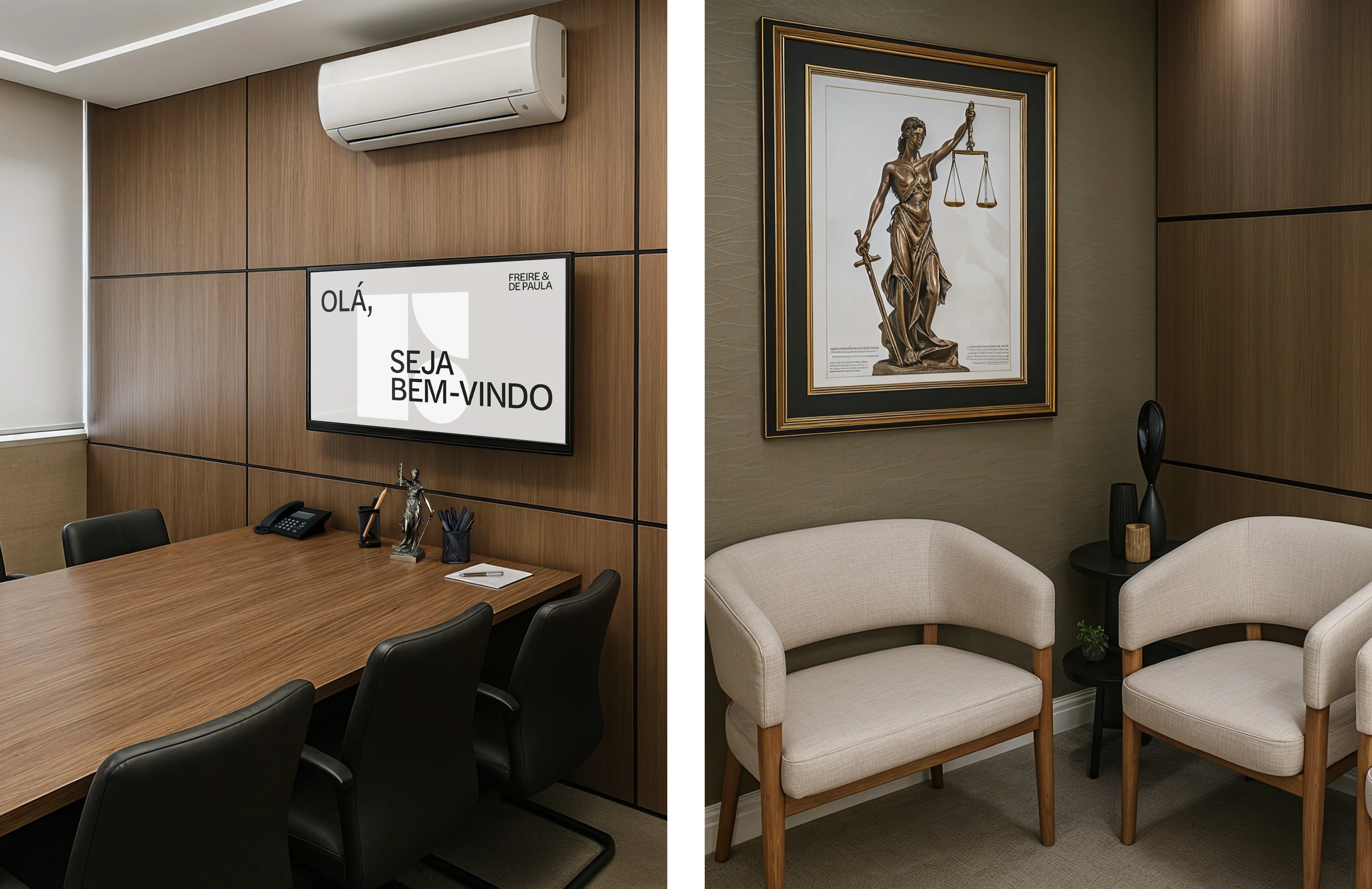
A balance of solidity and approachability
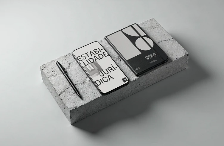
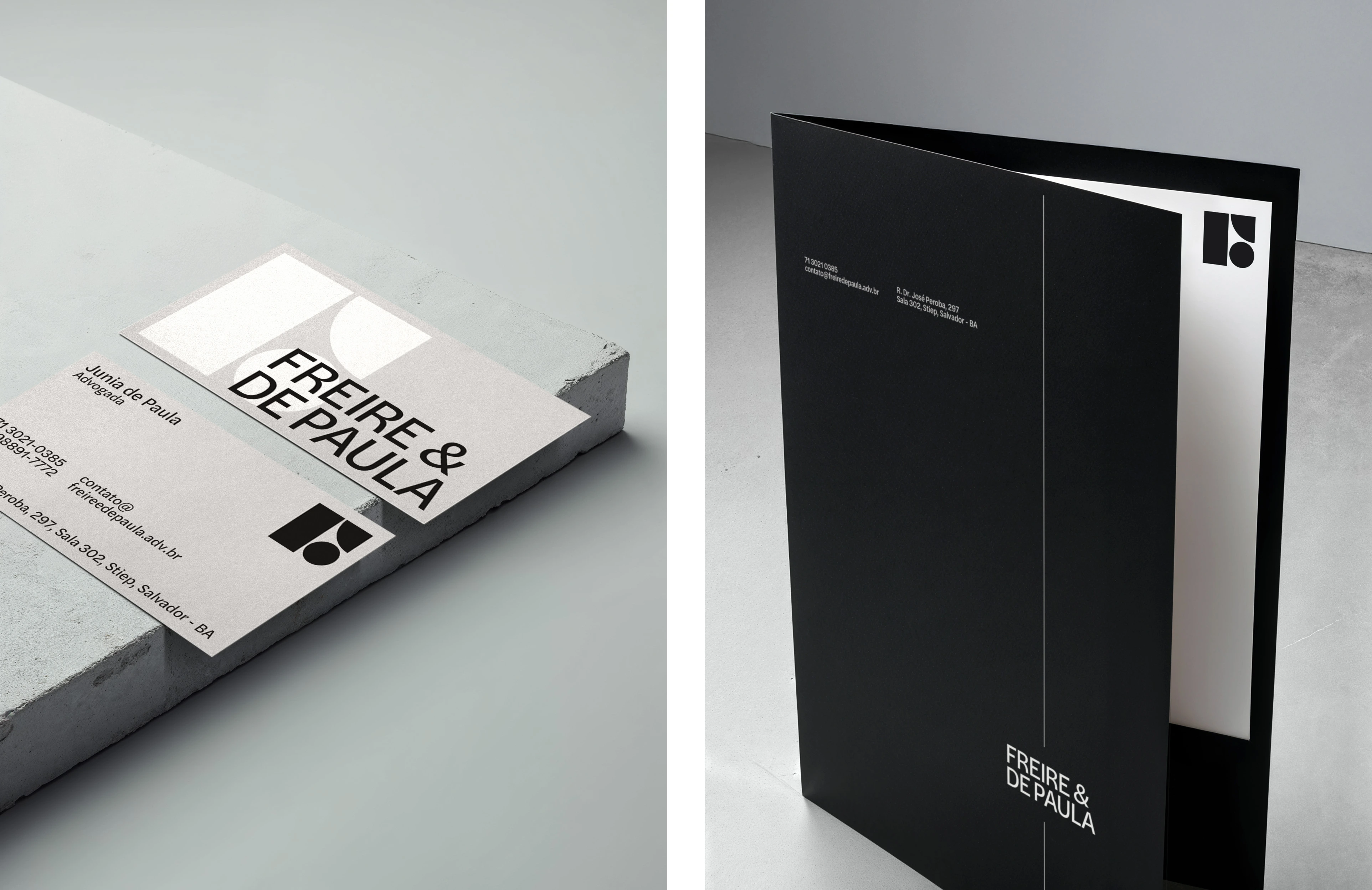
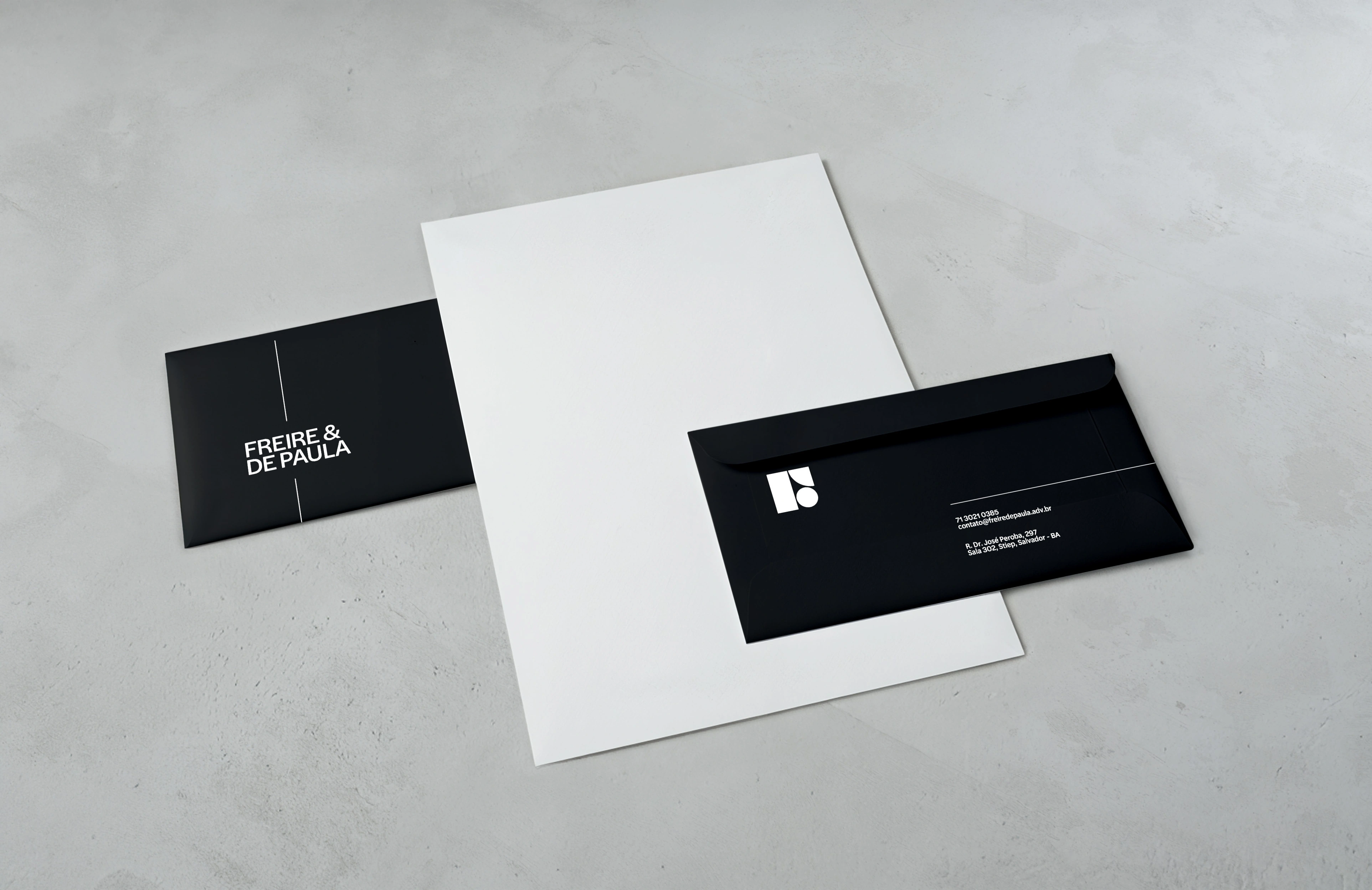
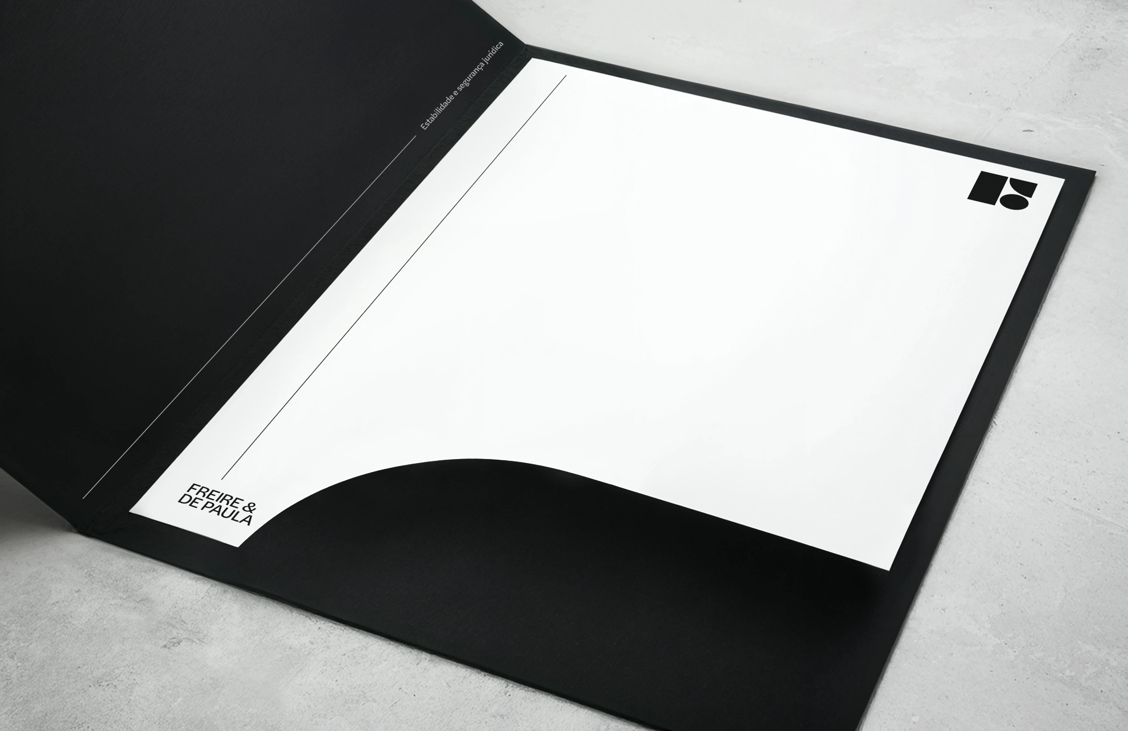
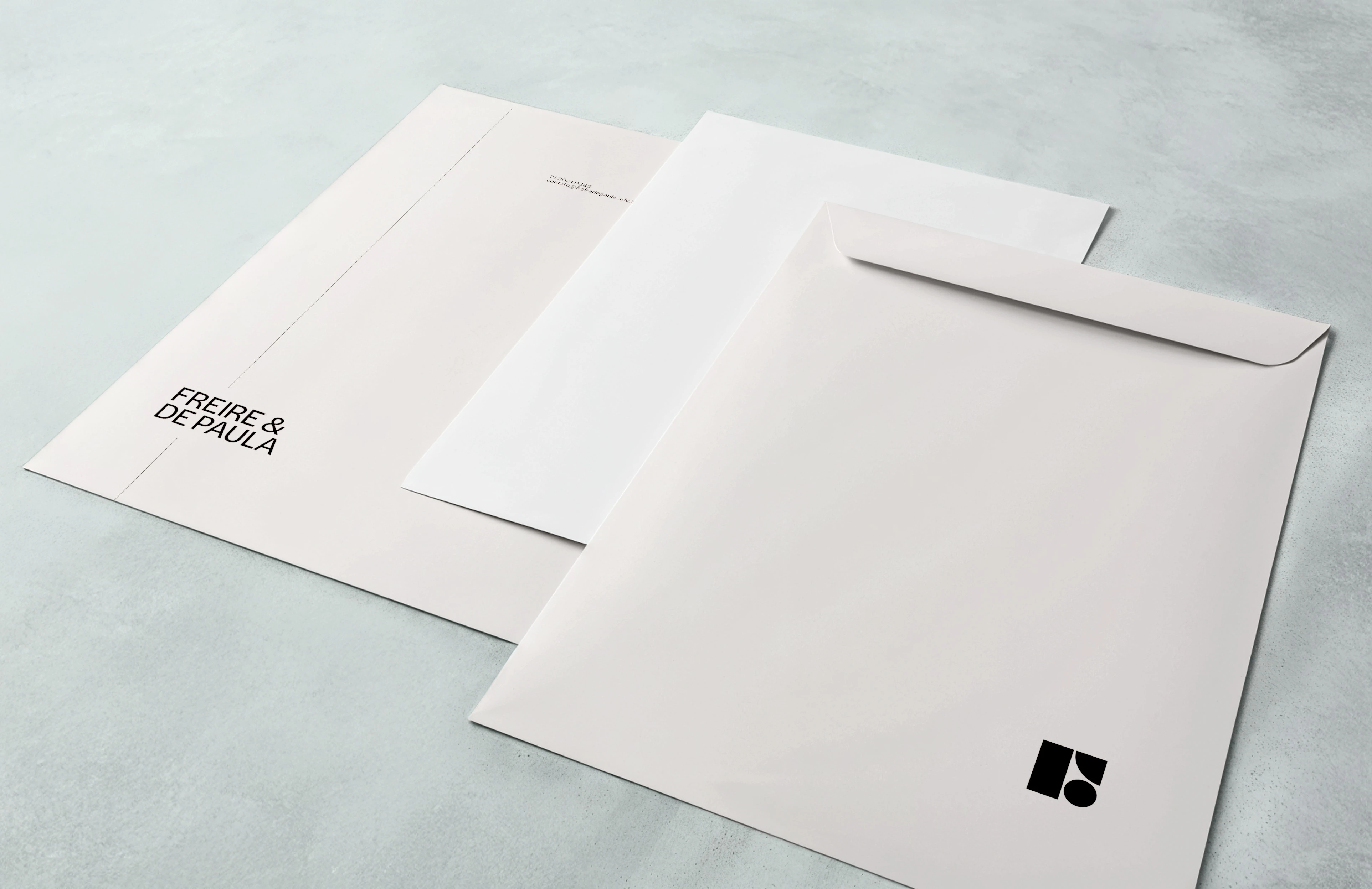
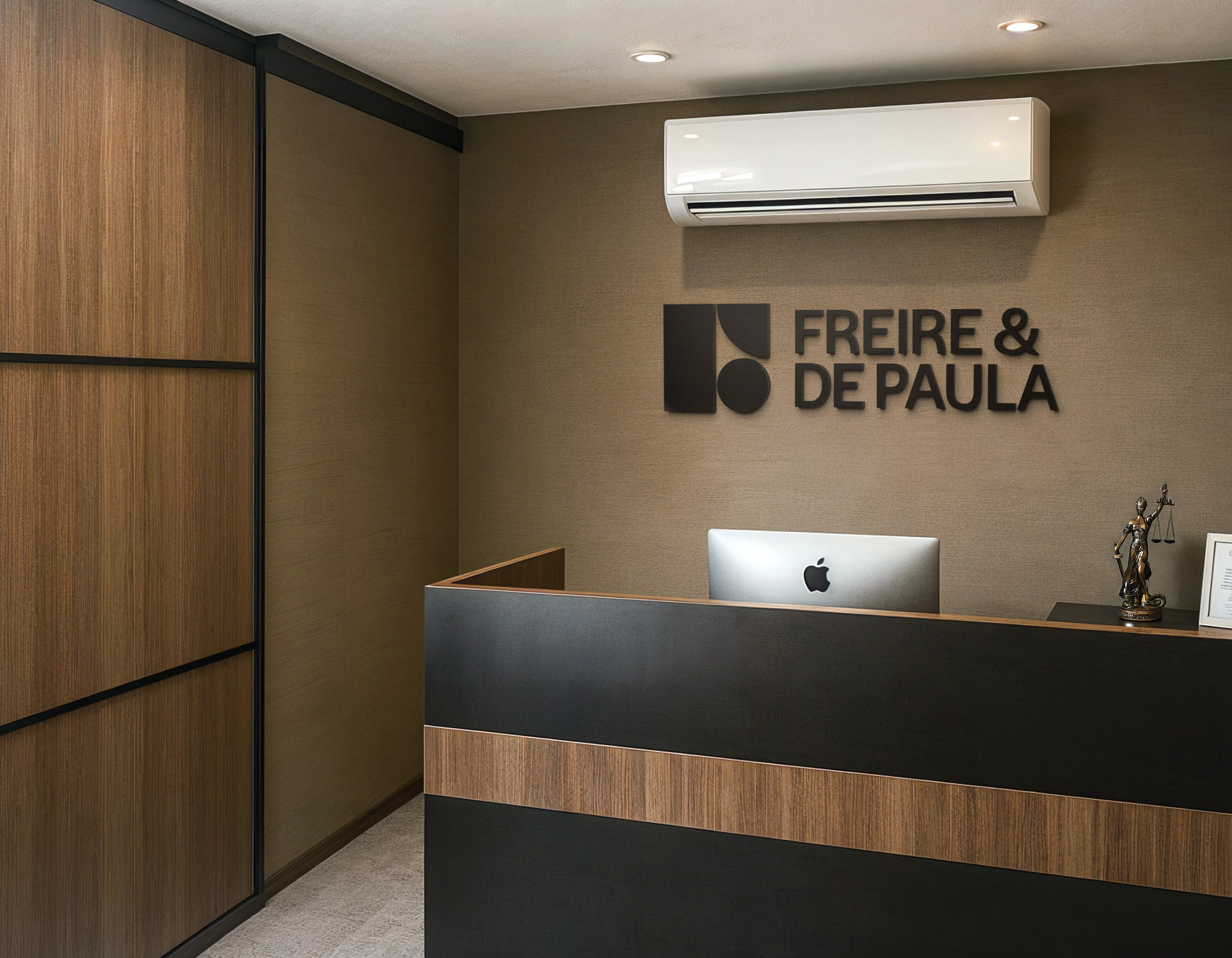
To materialize this positioning, we adopted a palette driven by two contrasting shades of gray: Arion Gray, representing authority and solidity, and Athens Gray, a warm taupe that lends a human dimension to the brand. The logo—an abstract arrangement of geometric shapes—forms a memorable “F” monogram, reinforcing the notion of parts that fit together with precision.
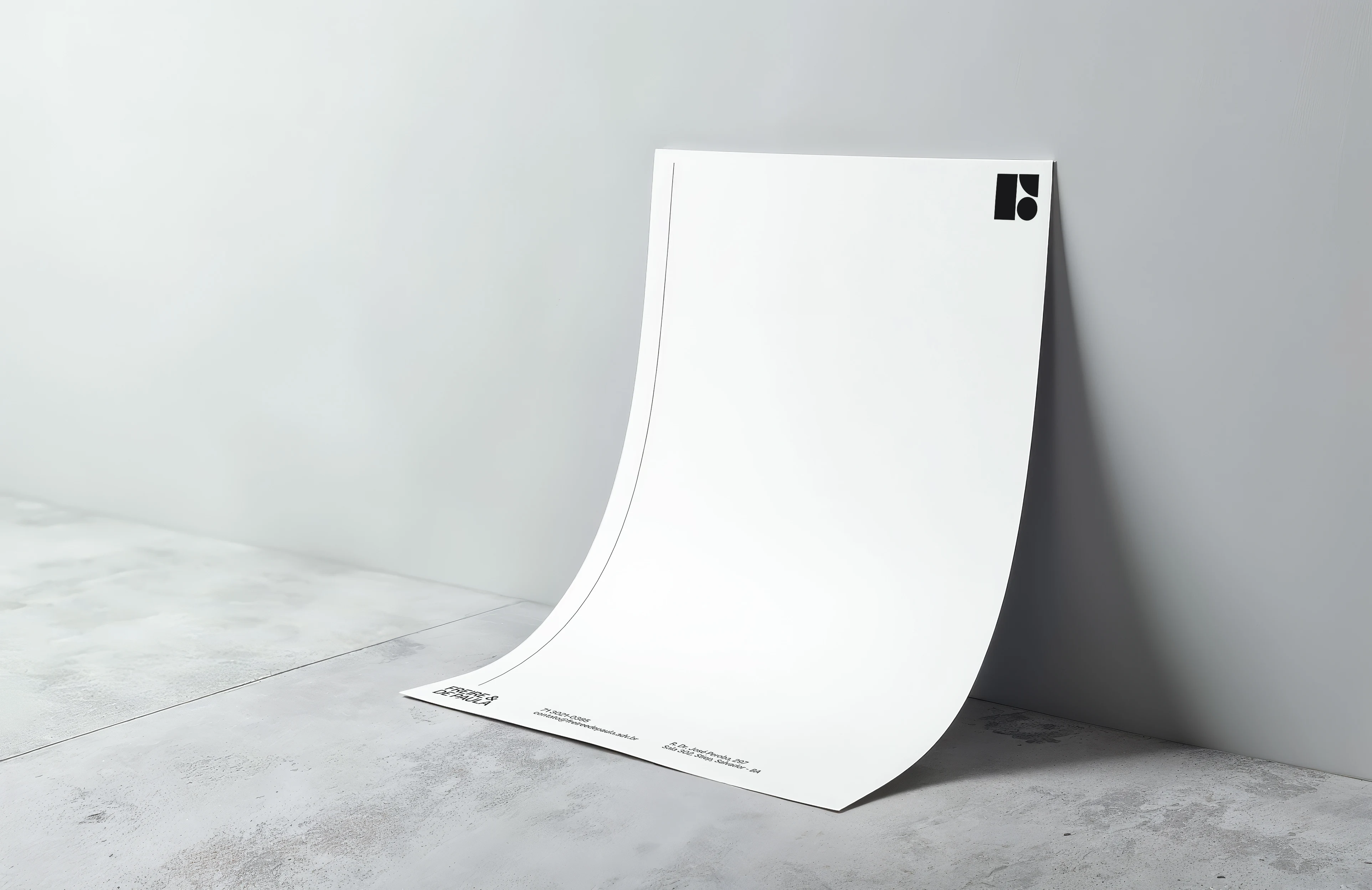
Halyard Display, a contemporary grotesque typeface with high legibility and just the right amount of personality, sets the pace for headlines and longer text bodies. Completing the visual system, a continuous line—drawn from the vertical and horizontal moldings in the firm’s physical space—runs through print and digital pieces. This minimalist stroke establishes rhythm, highlights essential information, and underscores the idea of a secure path, guiding the viewer’s eye through each composition.
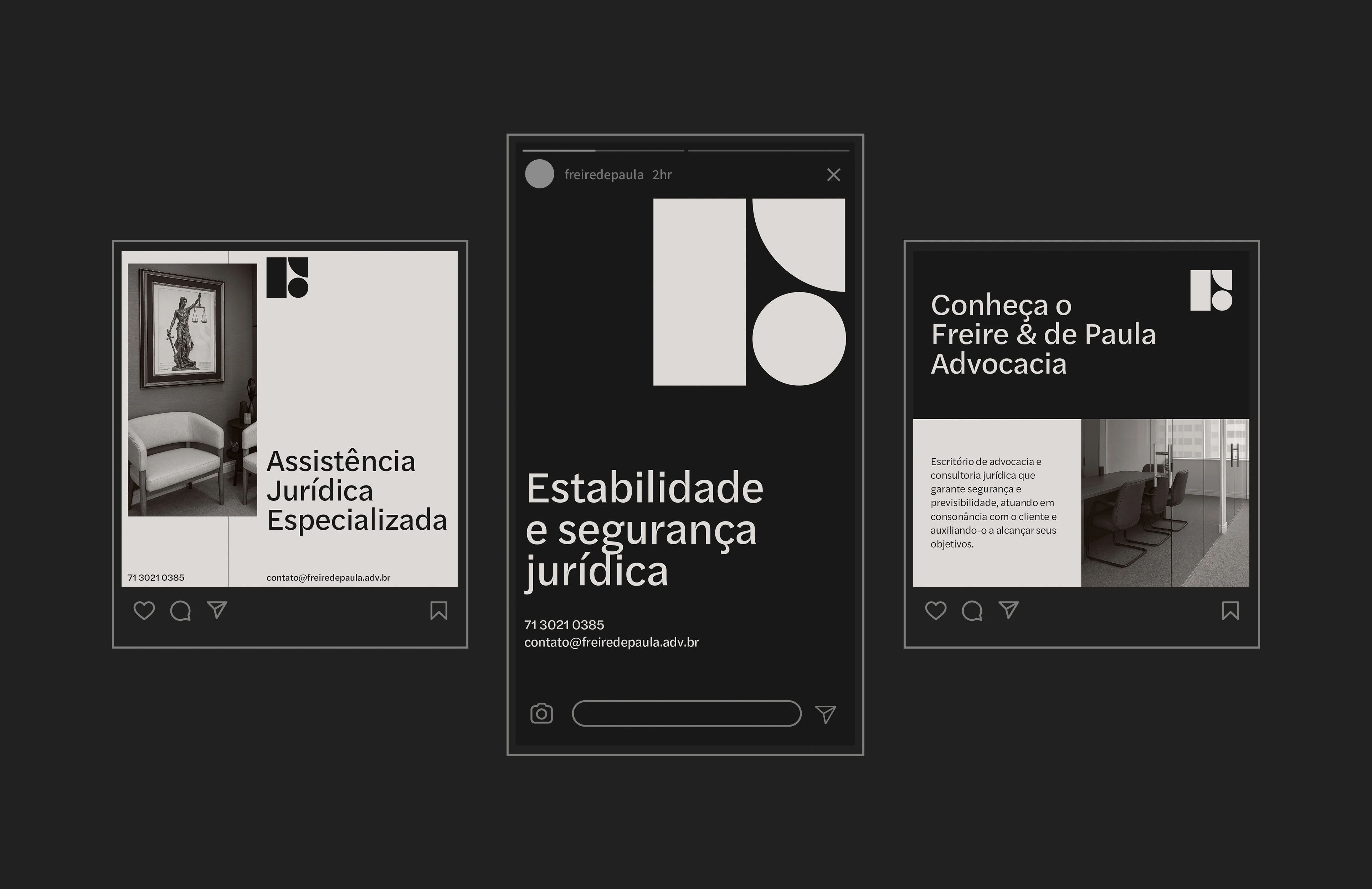
In practice, the graphic language unfolds in two complementary approaches, underscoring the sophistication-versus-proximity duality that drives the firm. On one side, minimalist layouts use a neutral palette, the monogram, and the guiding line with generous whitespace to signal understated sophistication; on the other, bolder compositions contrast geometric blocks with expanded type, creating immediate impact and bringing the message closer to clients’ dynamic realities.
This coherence extends to the verbal realm. Writing always employs the active voice, favors action verbs—“ensure,” “guide,” “structure”—and steers clear of jargon that might alienate the reader. Communication is further shaped by three complementary tones of voice: assertive, optimistic, and transparent.
Assertiveness appears in direct headlines that reveal the service’s core benefit; optimism emerges in messages that celebrate legal victories or highlight prevention opportunities, always using words that reinforce growth and partnership; transparency shows in the careful explanation of technical terms, the contextualization of risks without alarmism, and the clear presentation of alternatives and implications. Whether in emails, reports, or social posts, the logical flow follows a problem-consequence-solution structure, ensuring the client understands the proposed path before making a decision.
With its new brand platform, Freire & de Paula now positions itself as a hub for preventive legal consulting, ready to engage with major companies while retaining the closeness of a specialized boutique. The streamlined visuals, paired with a narrative centered on predictability, have laid a solid foundation for the organic growth the partners envision. More than a simple aesthetic refresh, the project delivered a cohesive story strong enough to support the firm’s ambition of becoming the local benchmark in corporate legal advisory.
Like this project
Posted Oct 8, 2025
Creation of a brand identity that conveyed stability, competence, and a forward-looking vision for the Freire & de Paula law firm.