SafeMind

Christian Braimah


SafeMind
Support That Understands Your Story
Challenge
International students and newcomers encounter a specific set of mental health hurdles that traditional platforms often fail to address. The primary obstacles include navigating deep-rooted cultural stigmas surrounding therapy, overcoming language barriers that hinder emotional expression, and managing the intense isolation or homesickness that comes with relocation. SafeMind was designed to bridge these gaps by creating a specialized environment where professional support is both accessible and culturally nuanced.
Visual Design & Branding
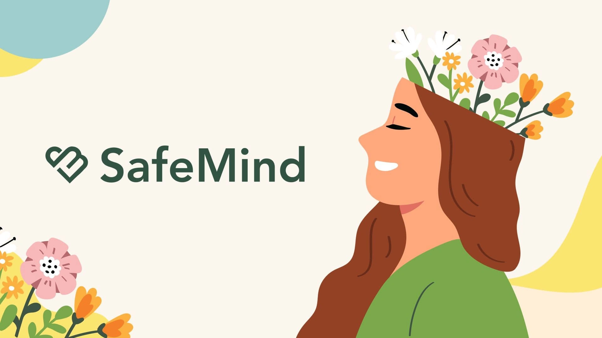
The visual identity is anchored by a custom logo that merges the letters "S" and "M" into a heart, representing the intersection of safety and mental care. To move away from the cold, clinical feel of traditional healthcare apps, I utilized a diverse and vibrant color palette paired with playful illustrations. These human-centric elements, combined with emoji-based interactions, transform the brand into a welcoming, approachable, and emotionally resonant companion for users in transition.
Features
The platform prioritizes connection through an intelligent matching system that pairs users with therapists of similar cultural or linguistic backgrounds. Beyond clinical care, SafeMind offers anonymous community circles for peer support and a bilingual interface to ensure users can communicate in their most comfortable language. By integrating low-friction tools like emoji-driven mood tracking and culturally-sensitive onboarding, the app lowers the barrier to entry for those hesitant to seek formal help.
Upload in progress...
Your video file is being uploaded. The currently loaded video is the source file.
Reflection
Designing SafeMind reinforced the idea that true accessibility requires deep cultural empathy rather than just technical functionality. This project taught me how to leverage "Design for Belonging" to turn a daunting medical process into a supportive human experience. It served as a vital lesson in how thoughtful branding and intentional feature sets can dismantle systemic barriers and foster a genuine sense of security for vulnerable populations.
Like this project
Posted May 23, 2026
A mental health platform designed for international students that addresses cultural barriers.