NECTAR LOCUMS - Brand & Web Design
Moosa Qaisar
1 collaborator
Nectar Loucms
Nectar Locums came with no visual identity, no logo, and no design direction, just a name and a goal: to build trust between locum healthcare professionals and hospitals that rely on them.
The task was to create everything from zero. We started with a logo sprint, exploring what the brand could stand for and how it should feel in a space often defined by sterile visuals and generic blue tones.
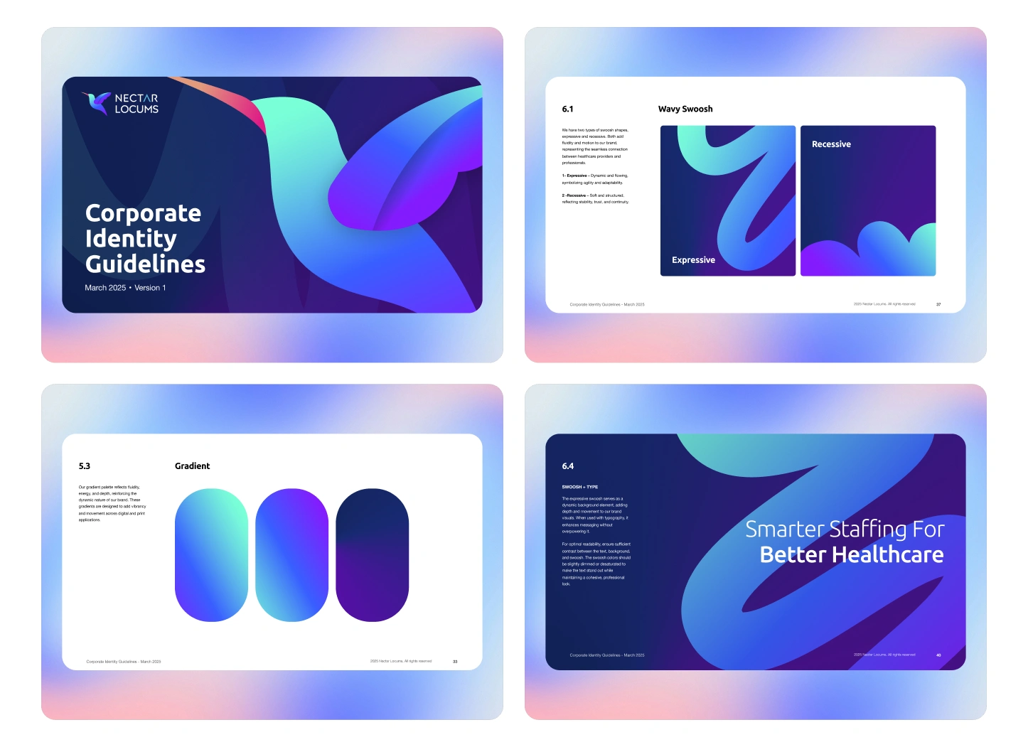
Logo Sprint and Exploration
We started with a logo sprint to define the visual personality of the brand. The goal wasn’t perfection—it was range. We explored multiple visual territories that could express both trust and care:
Geometric structures symbolizing precision and stability.
Organic shapes suggesting empathy and humanity.
Hybrid forms combining both to represent balance.
Each direction was tested in color and context, small UI cards, stationery, and mock layouts, to see how it behaved in real use.
Through rounds of refinement, we landed on a clean mark built around a loop and droplet motif, representing connection and care. It was simple, recognizable, and flexible enough for digital and print applications.
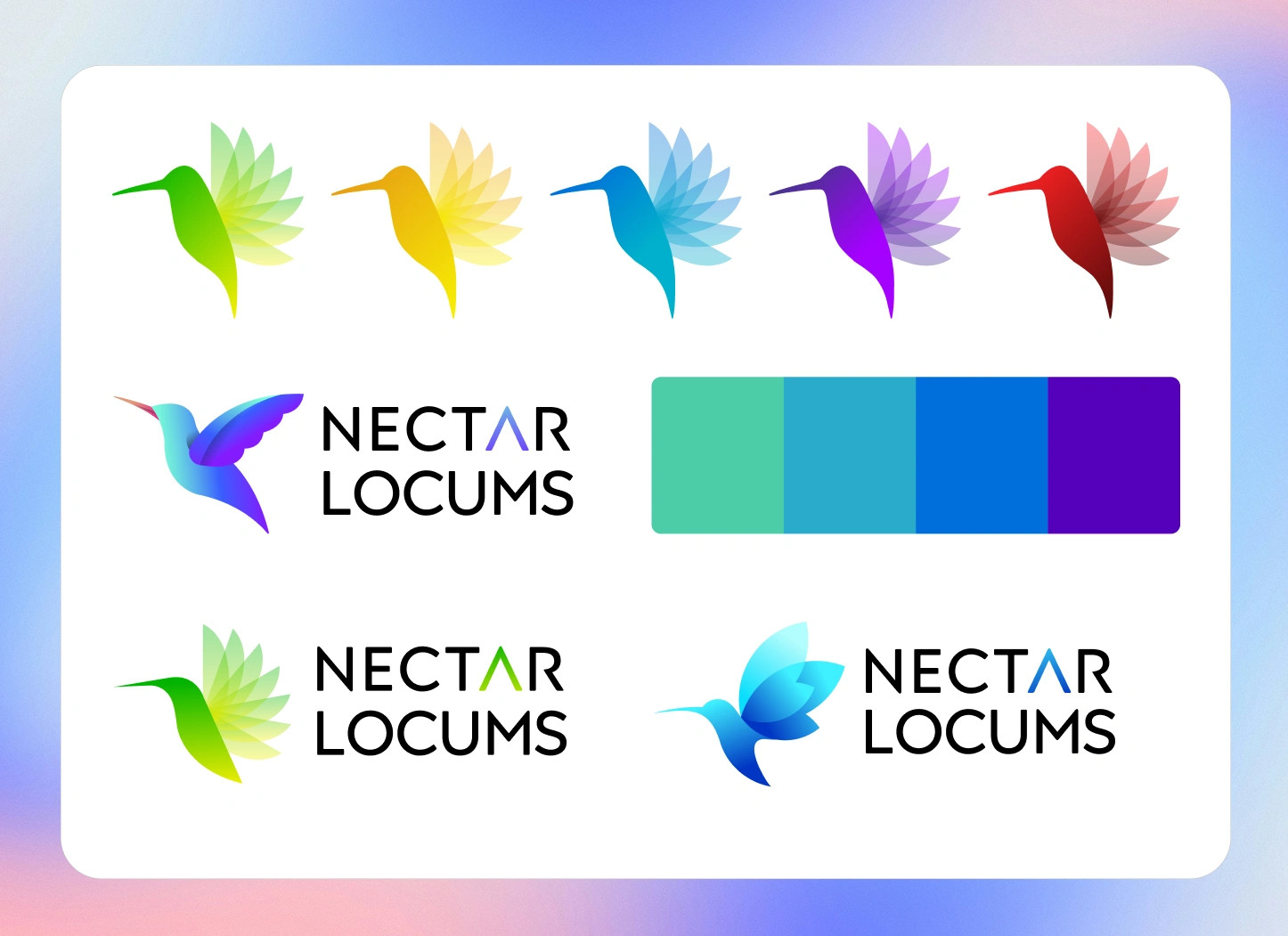
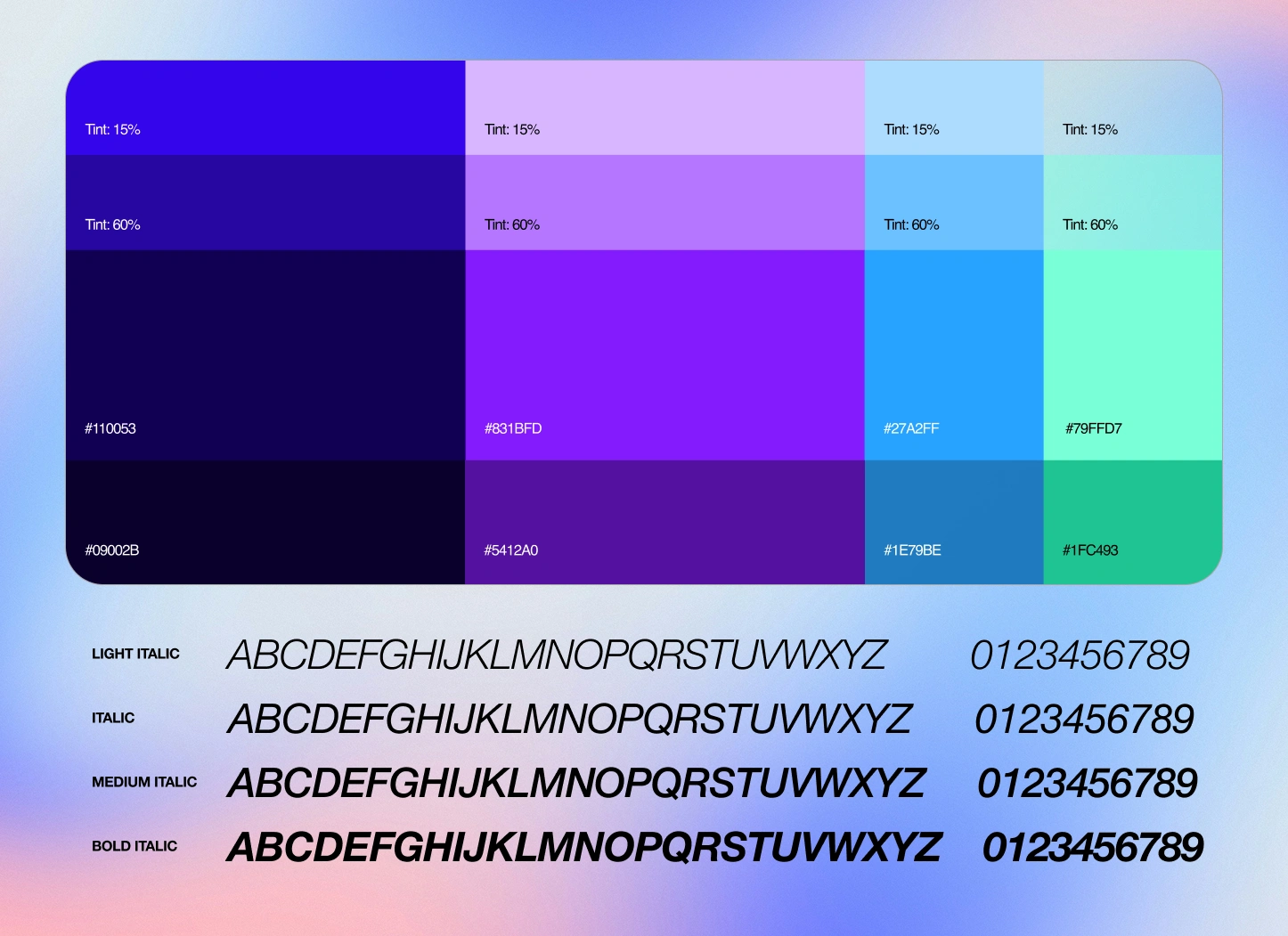
Color and Typography Decisions
Once the logo was finalized, we developed the brand system, the toolkit that defines how everything fits together.
Color Palette:
Deep indigo as the primary tone for reliability and depth.
Lavender for warmth and distinction within a healthcare context.
Light neutrals and white space to create calmness and clarity.
Typography:
A humanist sans-serif typeface for a professional yet friendly tone. It balanced legibility with personality, adaptable for both print and screen.
Grid & Layout:
An 8-point modular grid was used across all brand and marketing materials to ensure rhythm and structural consistency.
The result was a cohesive visual foundation—confident, calm, and scalable.
Wireframing and Structure
After finalizing the brand identity, the next step was to translate its visual language into a functional digital experience. We started with low-fidelity wireframes to define structure, flow, and content hierarchy before adding any visual elements.
The primary goal was to make the website intuitive and conversion-focused, catering to two distinct user groups: healthcare professionals and hiring organizations.
The wireframing phase helped clarify:
Information flow: What users should see first, and how they move through the site.
Page hierarchy: Defining the role of hero sections, service overviews, and CTAs.
Content balance: Giving equal space to trust-building elements (brand tone, testimonials) and functional ones (signup forms, service listings).
By working in grayscale first, we could focus purely on usability. Once the navigation and interaction flow felt logical, we moved into visual refinement using the newly created brand system.
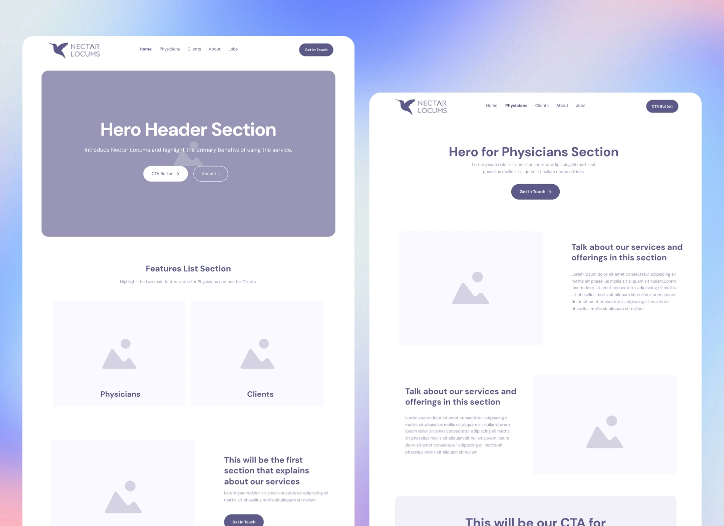
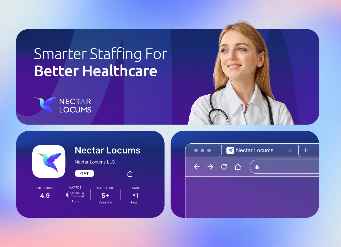
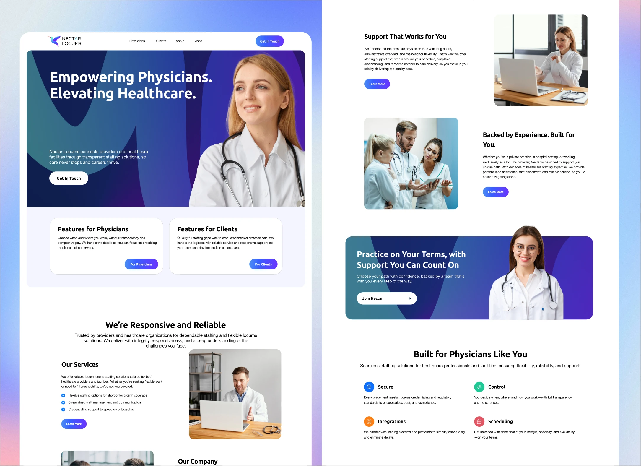
Website Design and Implementation
With the wireframes validated, I designed the full Nectar Locums website using the established brand identity. The design aimed to feel professional, calm, and human, a break from the overly clinical look common in healthcare sites.
Design priorities:
Visual warmth: Indigo and lavender tones were used to soften the clinical edge and reflect empathy.
Clarity: White space and modular grids kept every section digestible and scannable.
Trust-building: Real images of healthcare professionals replaced generic stock visuals, helping the brand feel genuine.
Each page was structured around a clear information rhythm, problem, offering, proof, and call to action, ensuring users always understood where they were and what to do next.
The final build extended across responsive breakpoints, maintaining the same structure and hierarchy on mobile without losing visual character.
Together, the wireframes and the final website turned the brand system into a real, usable interface, a design that feels credible, efficient, and human.
Outcome and Reflection
Designing Nectar Locums from scratch was a study in clarity. Every choice—color, shape, spacing—was deliberate and tied to the brand’s purpose.
The result is a coherent, human brand system that conveys trust without stiffness and empathy without softness.
Nectar Locums now owns an identity that feels professional, scalable, and unmistakably its own.
Like this project
Posted Dec 17, 2025
Built a full brand identity and responsive website for Nectar Locums from scratch to communicate trust, clarity, and human connection in healthcare staffing.
Likes
0
Views
5
Collaborators