Seamless Brand identity - Coméca
Coméca, a house builder based in France, helps individuals bring their home projects to life by focusing on transparency and a smooth process.
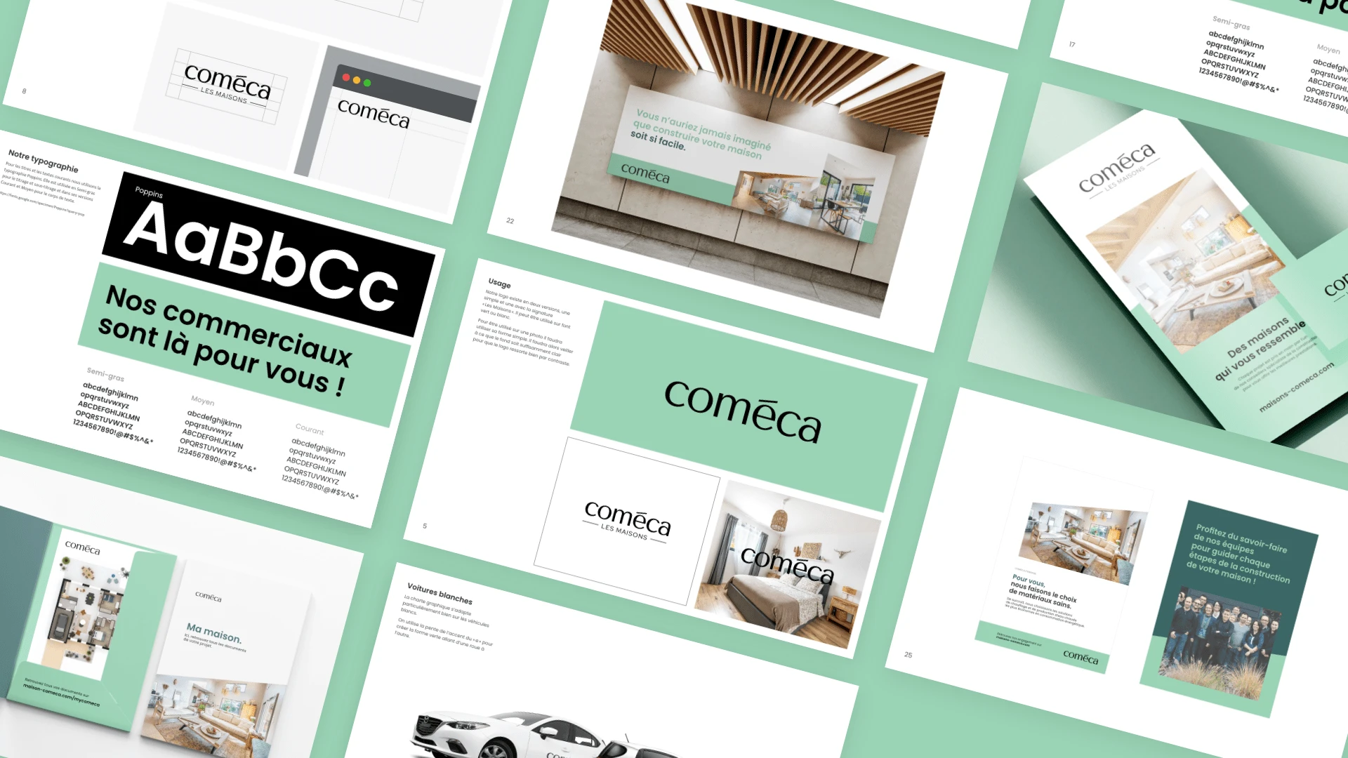
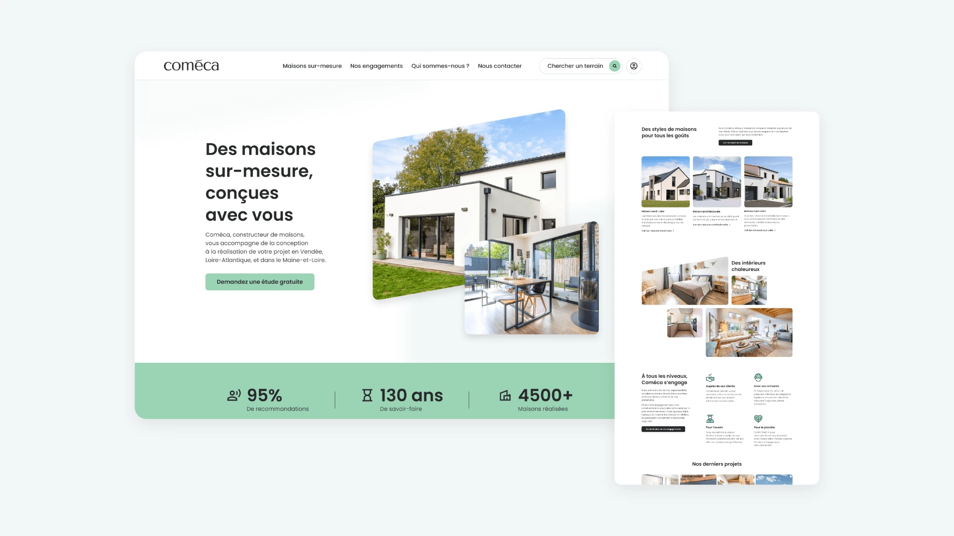
We have designed a visual identity that embodies these values, featuring a carefully selected color palette. The primary mint green color was chosen to symbolize the simplicity, freshness, and approachability that Coméca offers its clients.
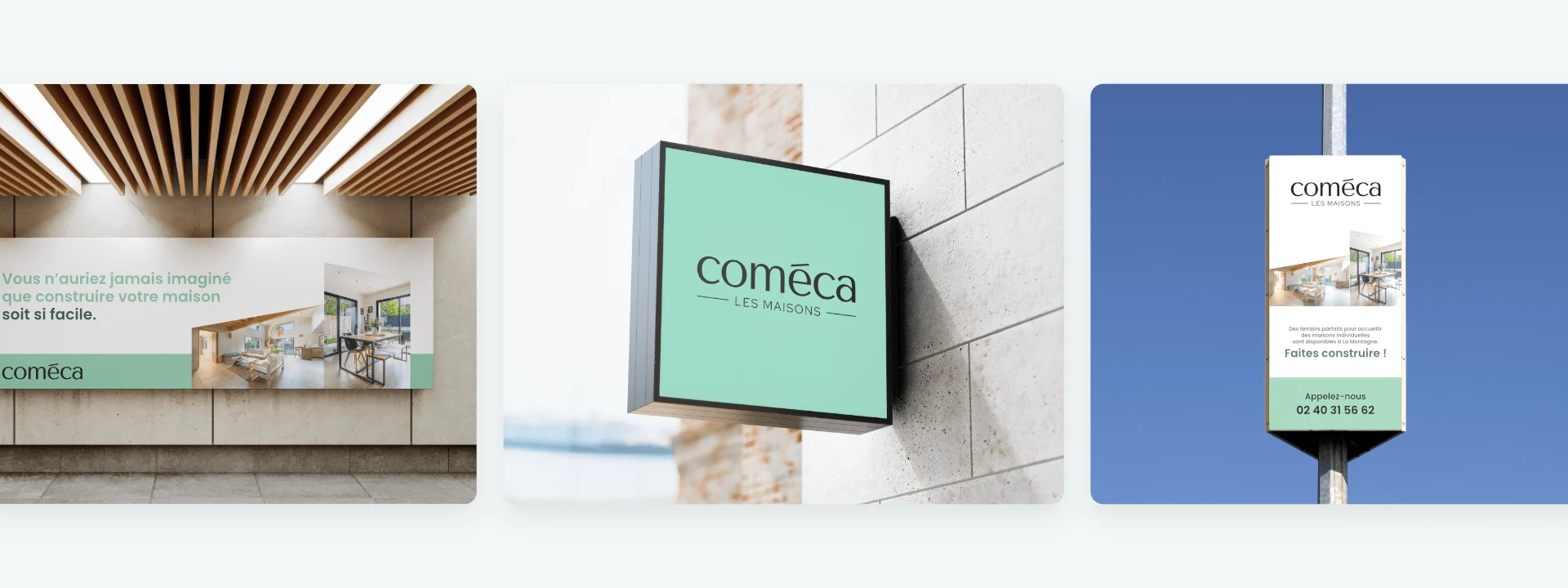
This visual approach is reflected across all communication materials, from the website to printed documents. Each element follows a minimalist aesthetic, aimed at providing a clear and intuitive user experience, aligning with the personalized support Coméca provides.
The web experience is designed to offer a seamless journey, allowing users to easily navigate through each stage of their home-building process. Every feature is created to simplify decision-making, while ensuring a smooth and engaging user experience.
Like this project
Posted Oct 8, 2024
Coméca simplifies home-building with fresh, modern design. Simple branding and intuitive web experience solve complexity, making every step seamless and clear.

