CarbonZE Brand Identity Design
Esra Karakaş
CarbonZE - B2B Climate Tech Brand Identity Design
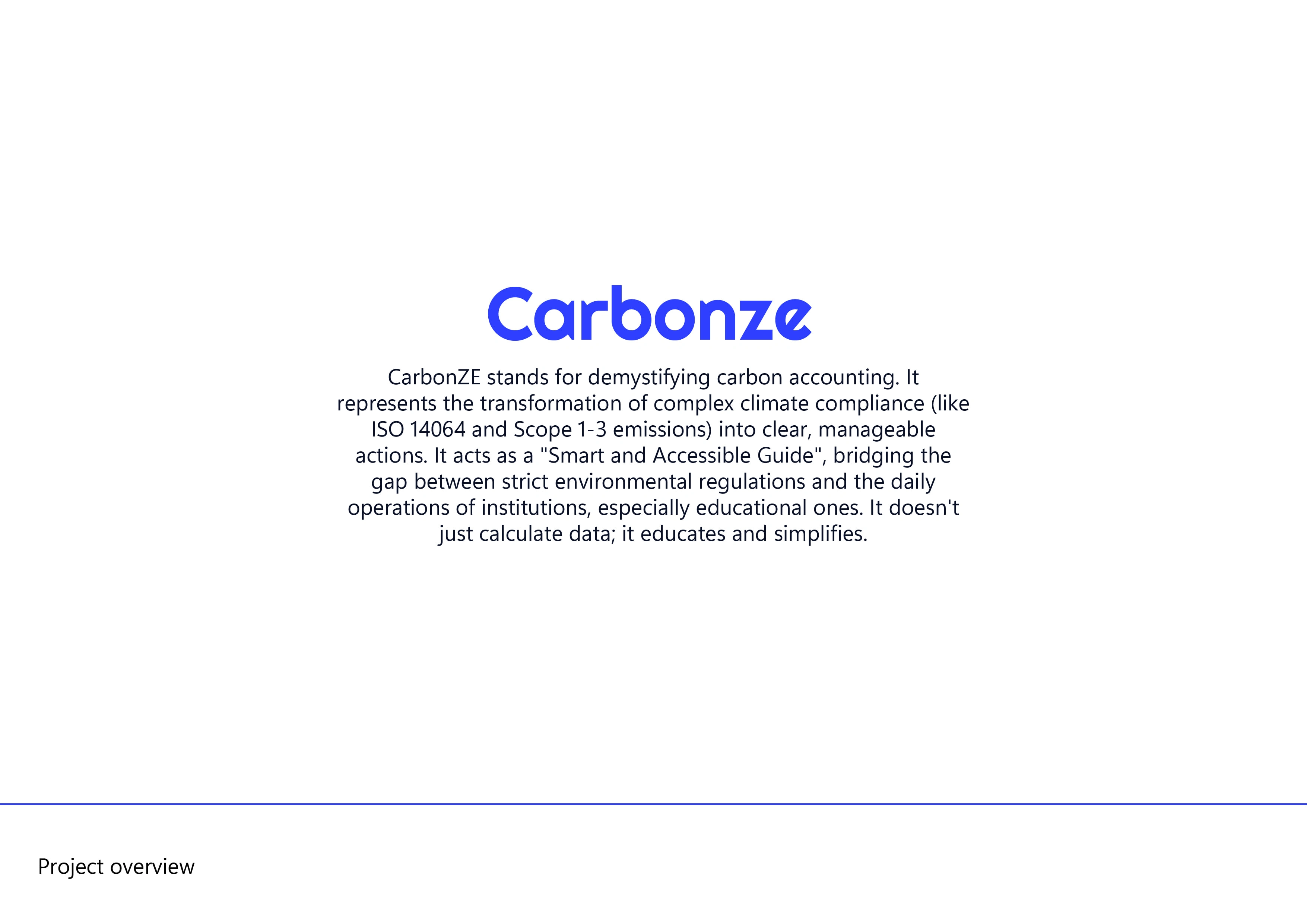
CarbonZE is a digital B2B SaaS platform that translates complex carbon emission data (Scope 1-3, ISO 14064) into clear, manageable actions, specifically tailored for schools and educational institutions. In this project, I explored how to transform the rigid and cold world of "data auditing" into a visual identity that builds immediate trust and acts as a supportive companion for its users.
Throughout my design process, I intentionally stepped away from the overused cliches of the climate tech sector—like classic green leaves or overly aggressive corporate lines—to build a modern, cleverly crafted, and monochrome visual language. It was a fantastic learning journey in practicing how to translate a highly complex engineering problem into a clean, human-centric visual language that anyone can understand.
Starting from Zero
CarbonZE - Project Overview
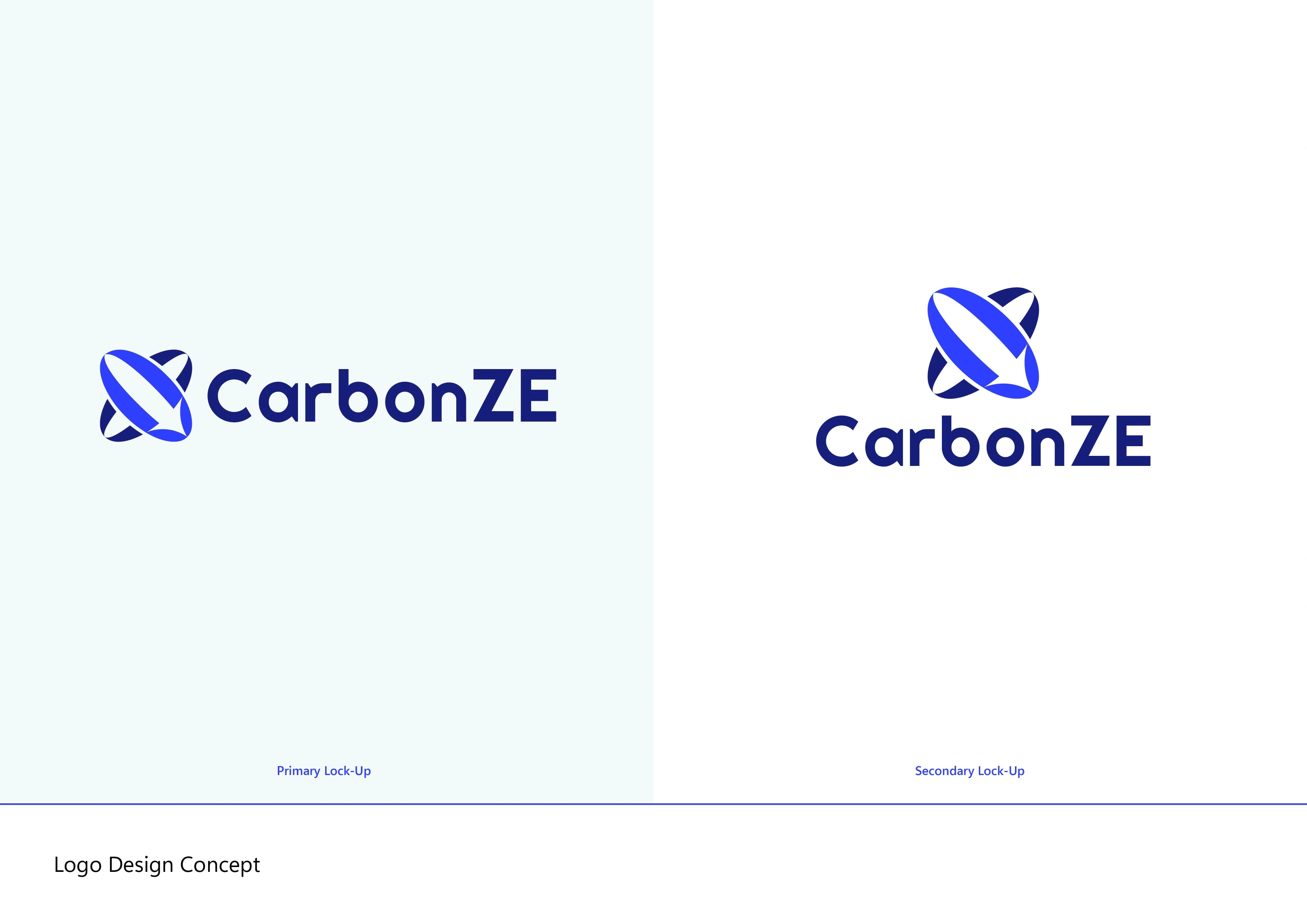
The primary logo form reflecting the "Net Zero" goal at the heart of CarbonZE. My aim was to create a smooth, approachable, and fluid shape without losing the serious B2B authority the brand carries.
Logo Exploration
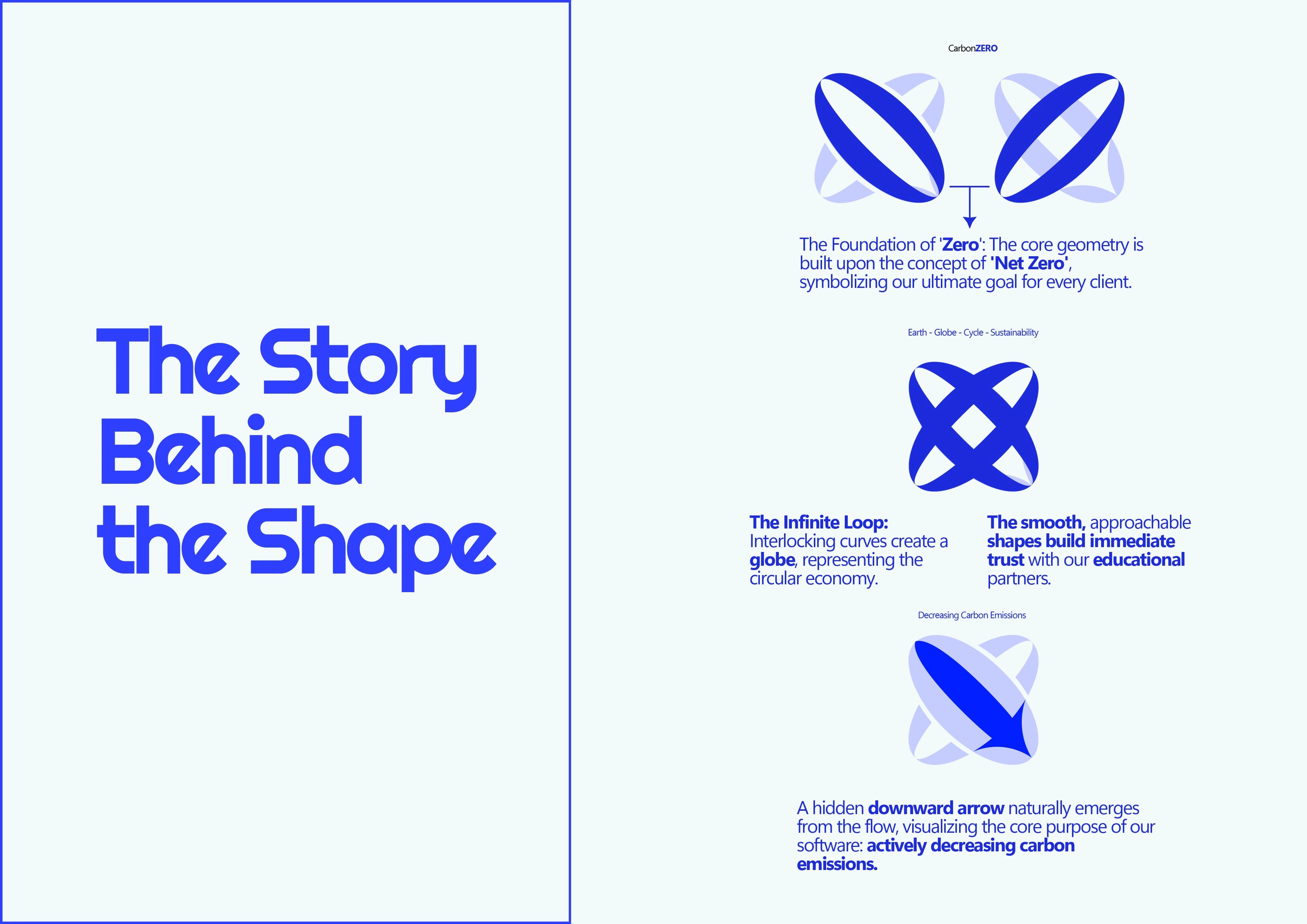
While structuring the logo, I focused on embedding three distinct meanings into a single emblem: the "Zero" goal from the brand's name, a "Globe" structure representing the infinite loop of sustainability, and a hidden "downward arrow" that subconsciously communicates the action of actively decreasing emissions.
Equally important was the emotional impact of the form. Knowing that educational institutions make up the vast majority of the user base, I deliberately softened the logo's edges. By replacing the sharp, aggressive angles typical of corporate B2B software with smooth, continuous curves, the design transforms from a cold auditing tool into a trustworthy, approachable guide for educators.
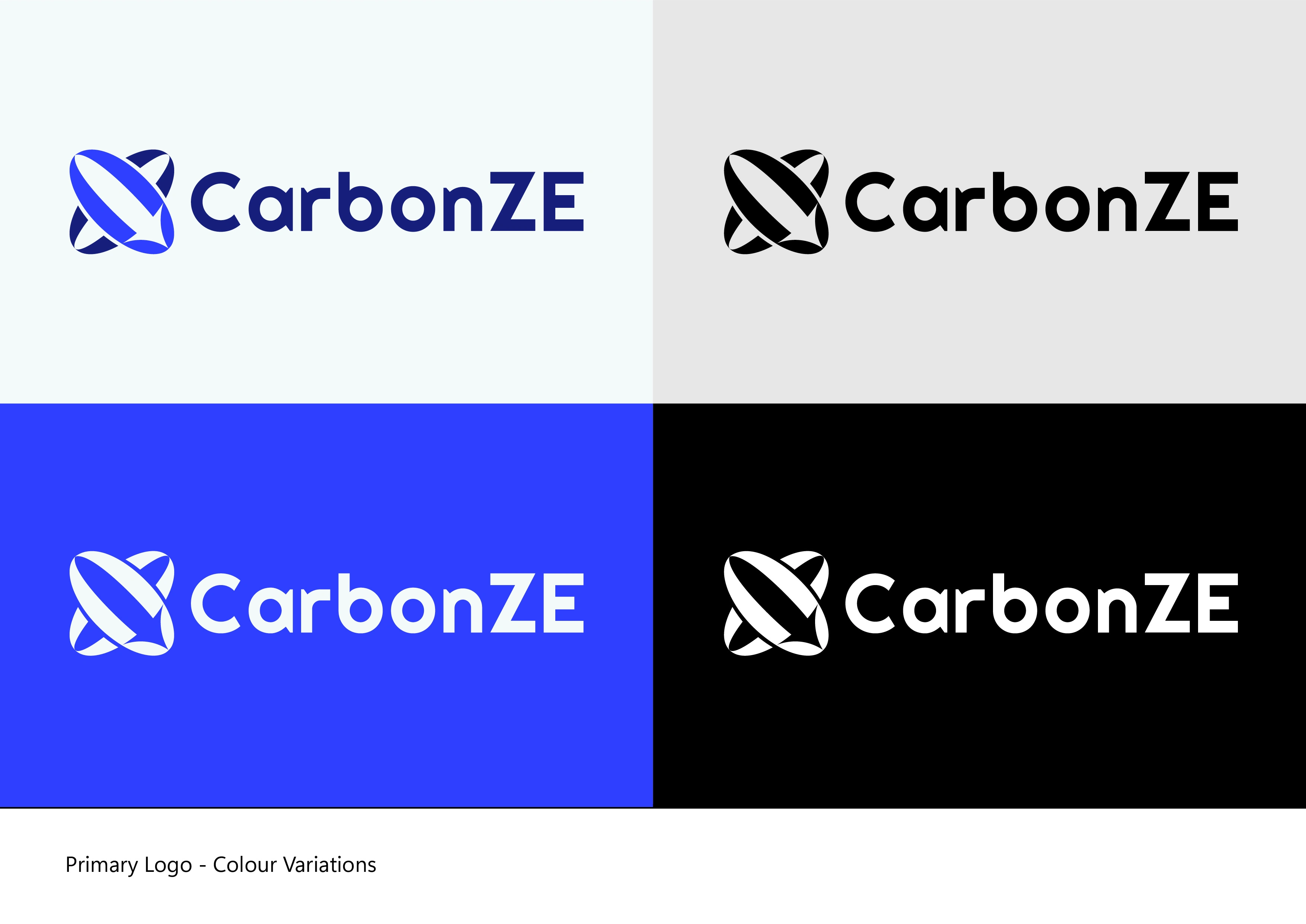
Primary Logo - Color Variations
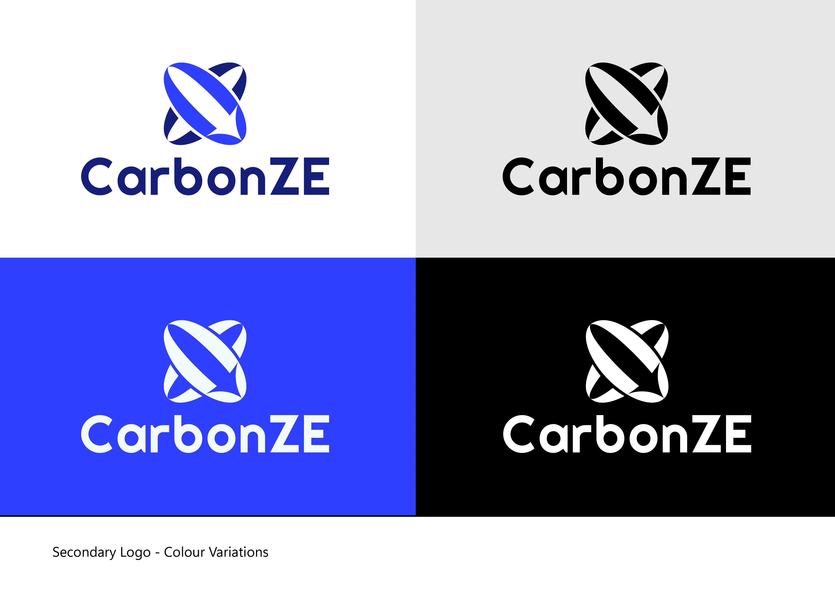
Secondary Logo - Color Variations
To avoid the predictable "green" cliche common in eco-tech brands, I chose to work with a sophisticated monochrome palette. Deep Navy gives users the immediate message of "We are the experts in this data," while the bold, modern typography provides the absolute trust expected by the B2B market.
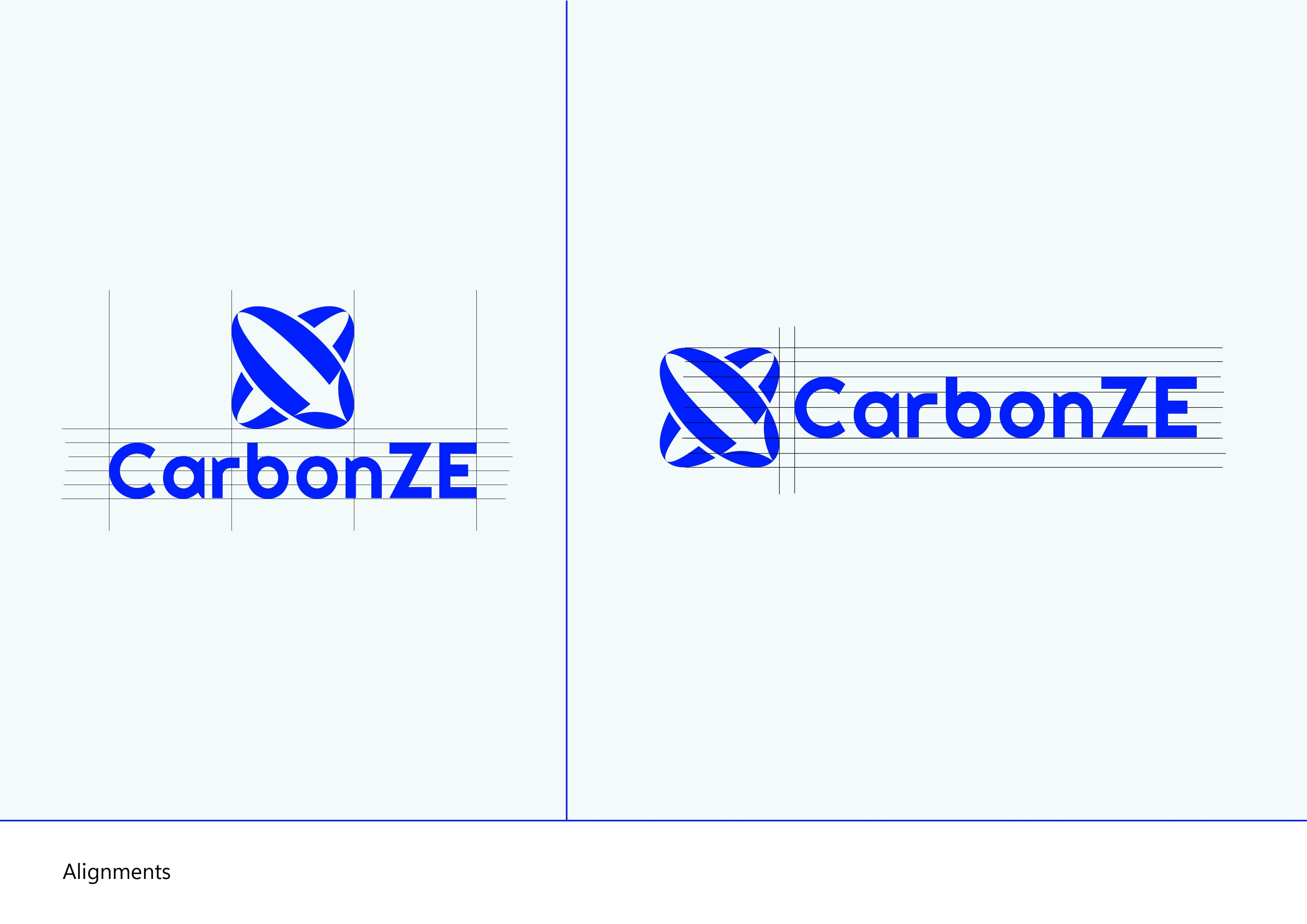
Logo Alignments
Built on a precise grid, the interlocking curves create a balanced, mathematically sound form that scales flawlessly from a massive presentation screen down to a tiny browser favicon.
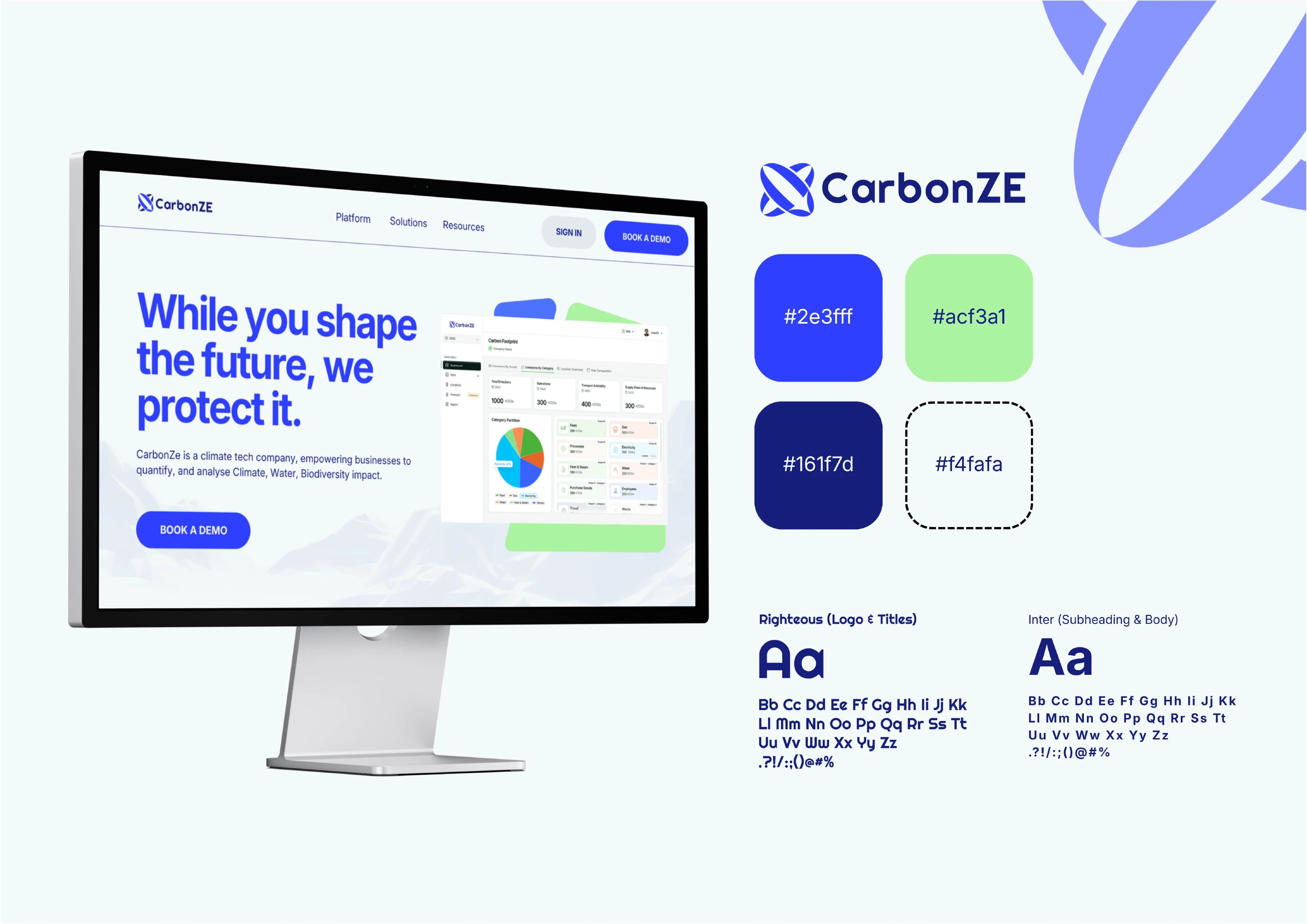
To position CarbonZE as a cutting-edge digital product rather than a traditional environmental NGO, I built a highly intentional visual system.
The Colors: The foundation is a Deep Navy (#161f7d), which provides the gravitas, authority, and data security expected by B2B clients and educational institutions. This is energized by a vibrant Tech Blue (#2e3fff) to emphasize the brand's digital SaaS nature. Instead of falling into the predictable 'leaf green' trap, I introduced a fresh Mint Green accent (#acf3a1). This specific hue subtly nods to the 'Net Zero' mission while remaining highly visible on screens. Finally, a crisp Off-White (#f4fafa) is used as the background to ensure complex data dashboards feel spacious and breathable.
The Typography: Contrast is key in UI design. I selected Righteous for the logo and display titles. Its geometric, slightly futuristic curves give the brand a unique, approachable, and tech-forward personality. To ground this, I paired it with Inter for all subheadings and body copy. As the ultimate workhorse UI typeface, Inter guarantees crystal-clear legibility across complex carbon reporting tables, PDF audits, and mobile interfaces, ensuring a frictionless user experience.
This project was a massive learning curve for me. Balancing the strict, data-driven world of B2B climate tech with the welcoming tone needed for educational institutions challenged me to think beyond mere aesthetics. I am still at the early stages of my design journey, and exploring how a simple shape can carry so much strategic weight—and how a color palette can redefine trust—taught me invaluable lessons. Thank you for taking the time to scroll through my process. I'm always eager to hear feedback, learn from the community, and continue growing.
Like this project
Posted Mar 17, 2026
Developed a modern, approachable brand identity for CarbonZE, focusing on trust and clarity.
Likes
1
Views
5
Timeline
Feb 26, 2026 - Mar 12, 2026