OLIPOP
Basit Adewusi
🍓 UX Case Study: Reimagining the OLIPOP Shopping Experience
Project Overview
OLIPOP is a new kind of soda that combines nostalgic flavors with plant-based ingredients, gut health benefits, and low sugar. Our goal with this design project was to reflect OLIPOP’s unique value proposition through a visually appealing, conversion-focused, and easy-to-navigate eCommerce experience.
The Challenge
OLIPOP is not your average soda. It’s healthy, functional, and rooted in science - yet fun and nostalgic. The challenge was to:
Balance health-forward messaging with a playful brand personality.
Educate customers without overwhelming them.
Encourage subscriptions while still supporting one-time purchases.
Make the user journey intuitive, especially for new visitors.
Build a mobile-first layout that preserves design integrity.
Goals
Communicate Brand Value Clearly
Drive Conversions
Support Product Discovery
Build Trust
🔧 The Process
1. Brand Discovery and Competitive Research
We analyzed competitors in the functional beverage space (e.g., Poppi, Health-Ade, Kin) and drew inspiration from their color palettes, user flows, and educational content strategies.
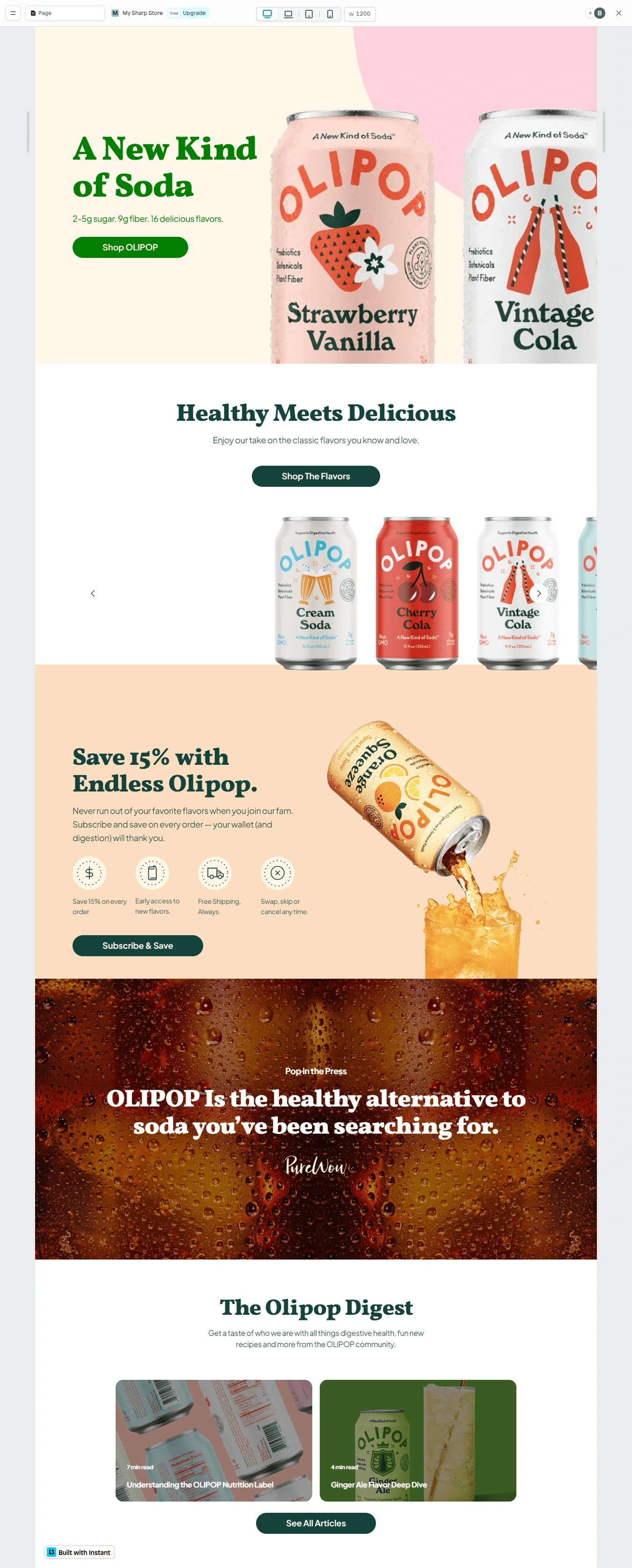
2. Homepage Flow
Hero Section: Features bold product visuals, vibrant colors, and a CTA button that encourages immediate action ("Shop OLIPOP").
Product Education: “Healthy Meets Delicious” introduces core benefits—plant fiber, prebiotics, and botanicals—in one digestible line.
Flavor Exploration Carousel: Interactive, scrollable flavor cards to guide customers visually through OLIPOP’s variety.
Subscription Callout: “Save 15% with Endless OLIPOP” with icons reinforcing the benefits: save money, skip anytime, free shipping.
Press Quote: Positioned above the fold to boost credibility (“OLIPOP is the healthy alternative to soda you’ve been searching for.”)
Digestive Health Blog: The “OLIPOP Digest” section adds SEO value and reinforces authority in the wellness space.
3. Mobile Experience
Prioritized thumb-friendly design and vertical stacking
Clear CTAs are always visible
Optimized image loading for speed
📈 Results
While this was a design-focused project (no direct analytics were tracked), the structure was optimized to:
Encourage flavor exploration and longer session duration
Boost subscription conversion via simplified messaging and design
Reinforce trust through media placements and digestible education
Elevate the overall brand perception as premium, fun, and health-focused
💡 What Worked Well
Balanced messaging: Health science meets nostalgic soda branding
Clear CTA hierarchy: Buttons always guide the user to the next step
Trust elements: Press, icons, testimonials, and blog content
Mobile UX: Fast-loading, visually engaging, and easy to shop
🔍 Tools Used
Builder: Instant site builder on Shopify
Design: Custom sections with on-brand typography and color palette
Apps: Subscription tool, testimonial carousel, blog integration
Testing: Live previews on mobile and desktop breakpoints
Like this project
Posted Apr 6, 2025
Designing the OLIPOP eCommerce Experience