
The name Ritëm comes from the idea of moving at a personal rhythm, without pressure or comparison. In the context of a CBT studio, it represents each client’s individual process—a journey that does not need to be fast or perfect, but steady and aligned with oneself.
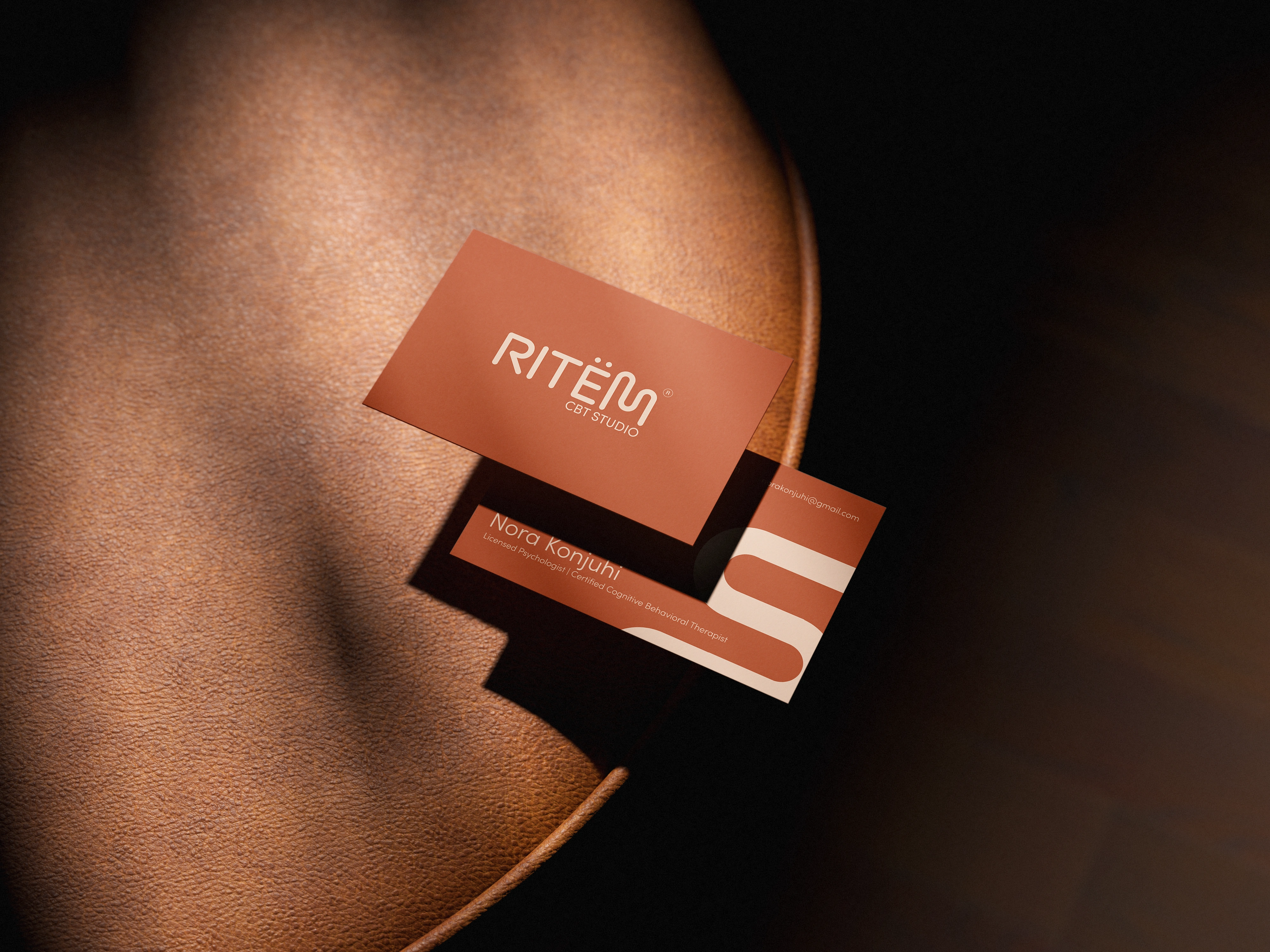
The main element of the logo, the letter “M,” is designed in a slightly asymmetrical and organically balanced way to reflect this concept. Its form suggests a free and natural movement, like a line that follows a unique rhythm, with variations and small pauses.
This visual approach symbolizes the idea that progress is not linear and that each individual has their own pace of development. Through this, the logo communicates a sense of comfort, acceptance, and calm—making the studio a space where clients can feel safe to move forward in their own way and at their own time.
0 likes · 0 views · Jun 9, 2026
The name Ritëm comes from the idea of moving at a personal rhythm, without pressure or comparison. In the context of a CBT studio, it represents each client’...

