
Digital Nomads is an educational institute focused on developing hard and soft skills in students. My role as Brand Designer and Strategist was to build an identity that felt bold and forward-thinking not institutional.
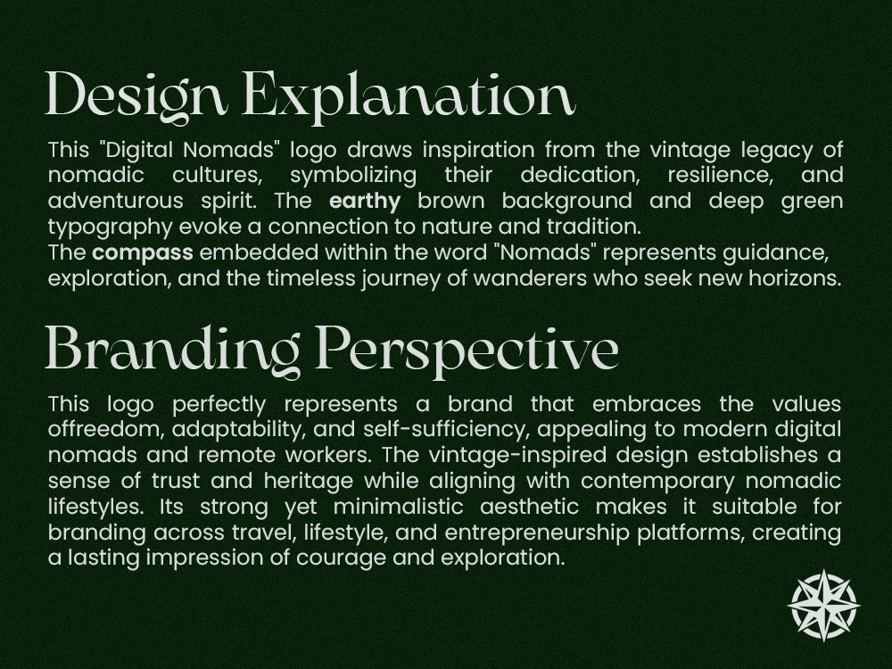
The compass rose became the central symbol, representing navigation and discovery. Embedding it into the wordmark replacing the "O" in NOMADS created a mark that is both conceptually rich and instantly recognizable.
The deep forest green paired with warm desert tan strikes a balance between credibility and warmth. The all-caps geometric wordmark projects confidence, while light and dark app icon variants ensure flexibility across all platforms.
The result is a brand that doesn't look like a school it looks like a movement.


0 likes · 0 views · Jun 8, 2026
Digital Nomads is an educational institute focused on developing hard and soft skills in students. My role as Brand Designer and Strategist was to build an i...

