OmniFlow Dashboard UX Design

Md Abdul Mohimin

OmniFlow Dashboard – Detailed UX Case Study (Screen-by-Screen)
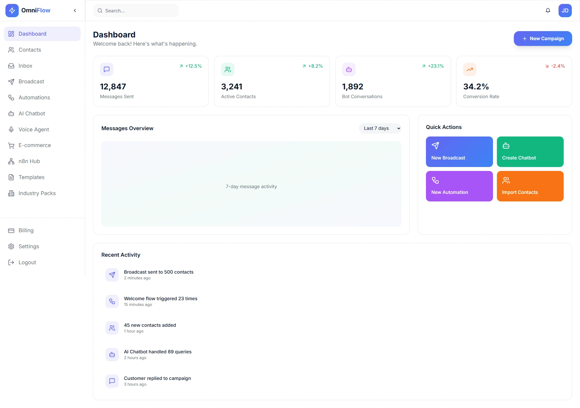
1. Dashboard (Overview Screen)
Goal: Give users an instant snapshot of business performance.
Key Elements & UX Decisions:
KPI cards (Messages Sent, Active Contacts, Bot Conversations, Conversion Rate) use visual hierarchy and color-coded trends to communicate performance at a glance.
"New Campaign" CTA placed top-right to support the primary user action.
Messages Overview chart focuses on trend recognition rather than raw data overload.
Quick Actions panel reduces friction for frequent tasks.
UX Value: Reduces cognitive load and supports daily decision-making within 5 seconds of landing.
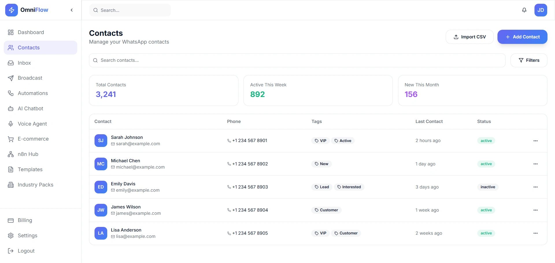
2. Contacts Management
Goal: Help users organize and segment WhatsApp contacts efficiently.
Key Elements & UX Decisions:
Summary cards (Total, Active This Week, New This Month) provide context before interaction.
Table layout optimized for scanning: name + avatar, tags, status, last contact.
Tag-based segmentation (VIP, Lead, Customer) enables targeted campaigns.
Filters and search reduce time to find specific users.
UX Value: Improves list management speed and enables personalized outreach.
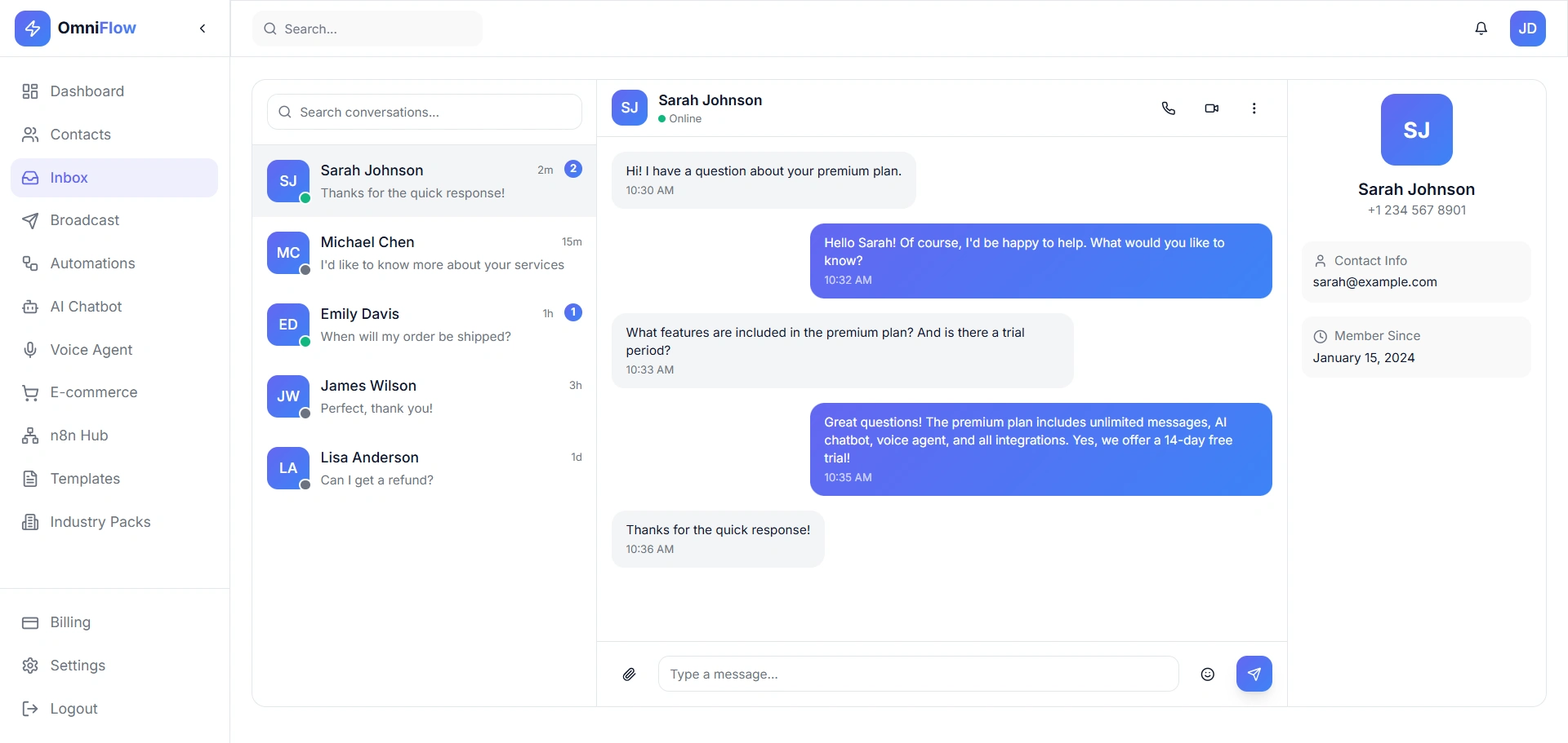
3. Inbox (Conversation View)
Goal: Enable fast, human-like customer support at scale.
Key Elements & UX Decisions:
Three-column layout: conversation list, active chat, customer profile.
Online status indicator builds confidence during live chat.
Message bubbles clearly distinguish user vs agent responses.
Context panel shows contact info without leaving the chat.
UX Value: Reduces response time and agent context-switching.
4. Broadcast Messaging
Goal: Allow users to send bulk WhatsApp campaigns with confidence.
Key Elements & UX Decisions:
Pre-built templates reduce message creation time.
Live preview prevents formatting mistakes.
Audience segmentation cards clarify reach before sending.
Send Now vs Schedule Later supports both urgent and planned campaigns.
UX Value: Minimizes errors and increases campaign success rate.
5. Automations
Goal: Empower non-technical users to automate workflows.
Key Elements & UX Decisions:
Automation stats (Total, Active, Runs Today) validate system value.
Card-based flows with status indicators (active/paused).
Common use-cases (Welcome, Abandoned Cart, Follow-up) shown upfront.
Visual Flow Builder CTA positioned as a learning gateway.
UX Value: Encourages automation adoption without intimidation.
6. AI Chatbot
Goal: Reduce support load using AI-powered responses.
Key Elements & UX Decisions:
Performance metrics (Resolution Rate, Response Time) build trust.
Knowledge base upload supports multiple content formats.
Chat flows separated for clarity and modularity.
Built-in testing area enables instant feedback.
UX Value: Makes AI feel controllable and transparent.
7. Templates Library
Goal: Speed up onboarding and message creation.
Key Elements & UX Decisions:
Category filters help users find relevant templates quickly.
Usage count and ratings provide social proof.
Clear CTA for custom templates reduces frustration.
UX Value: Lowers learning curve for new users.
8. Billing & Plans
Goal: Make pricing transparent and upgrades frictionless.
Key Elements & UX Decisions:
Current plan highlighted to avoid confusion.
Feature comparison supports informed decisions.
Usage progress bar reduces anxiety around limits.
Billing history builds trust and accountability.
UX Value: Improves conversion and reduces support queries.
9. Settings – API Keys
Goal: Support developers and integrations securely.
Key Elements & UX Decisions:
Separation of Production vs Development keys.
Masked keys improve security awareness.
Simple "Generate Key" CTA reduces complexity.
UX Value: Developer-friendly without overwhelming non-technical users.
10. Settings – Profile & Account
Goal: Centralize account control and safety.
Key Elements & UX Decisions:
Clean form layout for personal and WhatsApp API info.
Clear Save Changes CTA.
Danger Zone visually separated to prevent accidental deletion.
UX Value: Builds trust and reduces critical errors.
Overall UX Takeaways
Consistent layout and spacing across modules.
Clear visual hierarchy and minimal color usage.
Designed for SaaS founders, marketers, and support teams.
Balances power features with simplicity.
Result: OmniFlow presents itself as a scalable, trustworthy, and user-friendly WhatsApp automation platform.
Like this project
Posted Dec 31, 2025
Developed a user-friendly dashboard for OmniFlow to enhance performance and user experience.
Likes
0
Views
1