Street Blends Rebrand
Mariann Ilyes
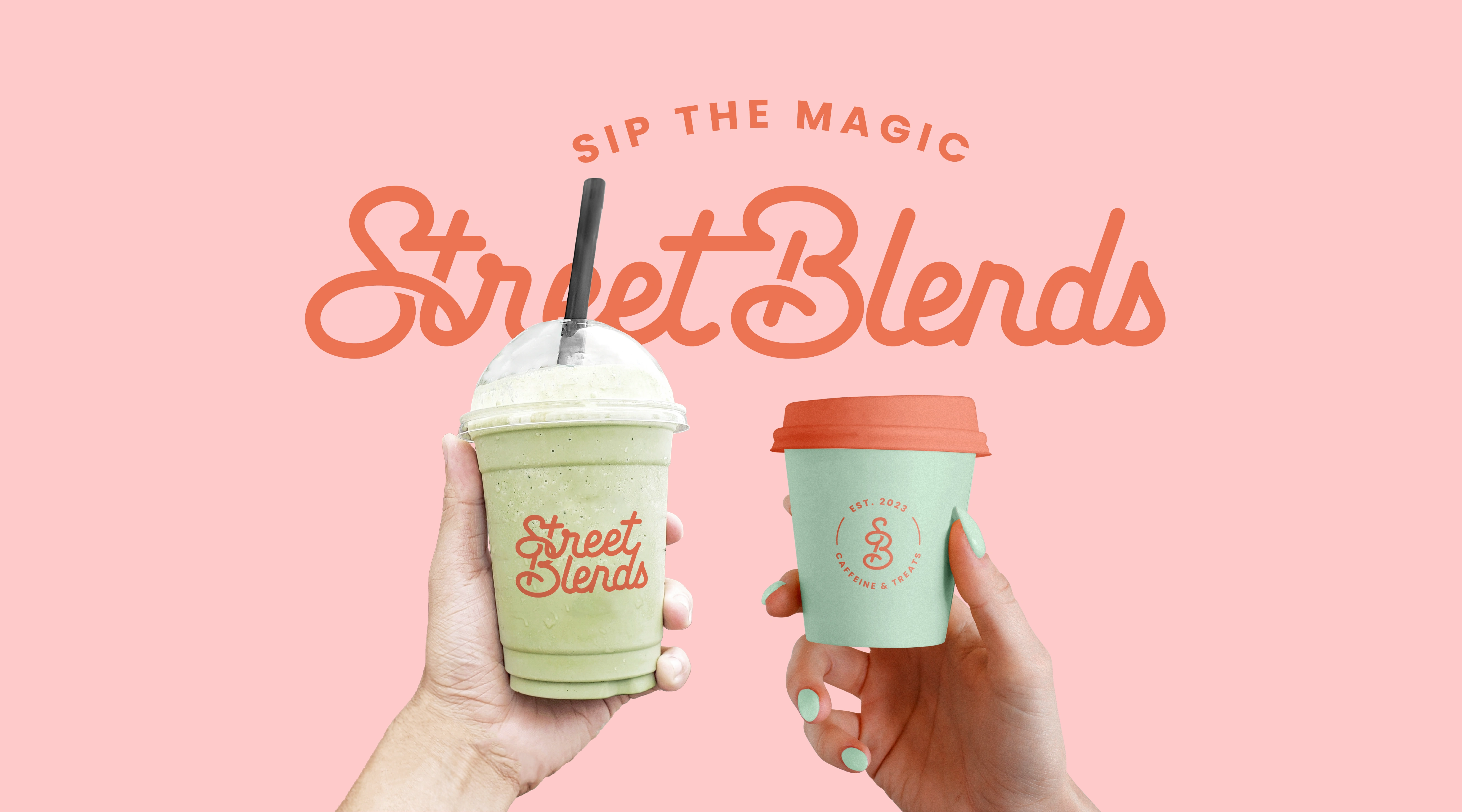
Street Blends is a fast-growing coffee shop based in Antigua, known for its fun, flavorful drinks and bold street-side personality. Since launching in September 2023, the brand has built a loyal following with its window-service model and vibrant energy. Their slogan, “Sip The Magic,” says it all — they make coffee feel exciting, approachable, and just a little magical.
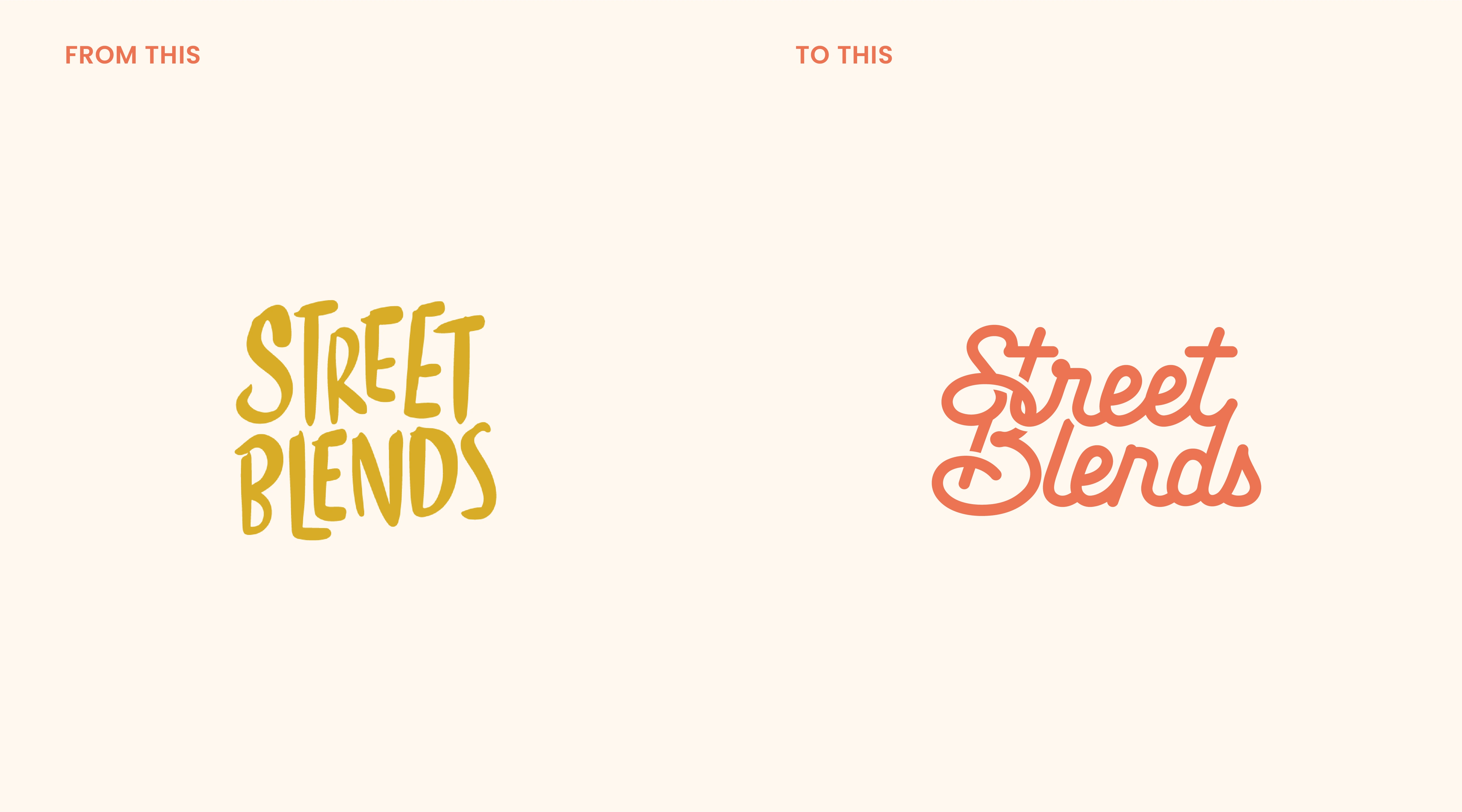
In just seven months, they realized their original logo couldn’t keep up. As they planned for expansion, including a new bakery kitchen and mobile food trailer, they knew it was time for a more cohesive and strategic brand identity.
They came to me looking for a full refresh:
✔️ A modernized logo that kept the soft, funky charm of the original
✔️ A distinct brand mark for easy recognition
✔️ A color palette that felt fresh, warm, and energetic
✔️ Typography, packaging, and social templates to unify their growing brand
The goal was clear: create a fun, high-quality identity that speaks to all ages and feels just as natural on the street as it does in future markets.
I started working on the branding by putting together two moodboards — each one showcasing a different vibe through logos, color palettes, typography, and overall style. This helped the Street Blends team visualize the potential directions the brand could take. Once they picked the mood that resonated most, I used that as the foundation to design their new identity.
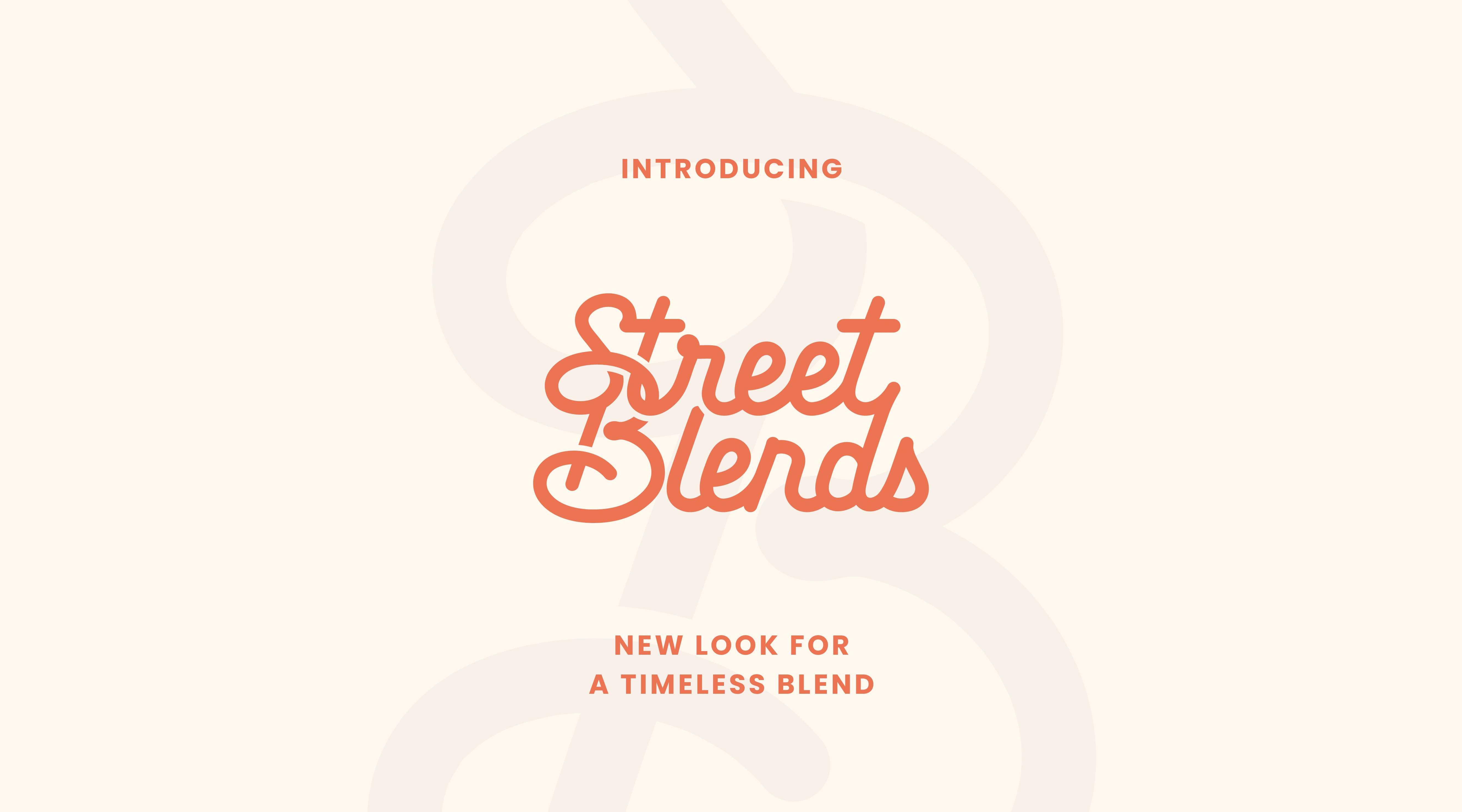
The result is a custom logotype that feels fun and friendly, yet polished enough to grow with the brand. One of my favorite touches is the way I blended the “S” and “B” — a subtle but clever nod to the word “Blends” and a unique way to tie their initials together into a recognizable icon.
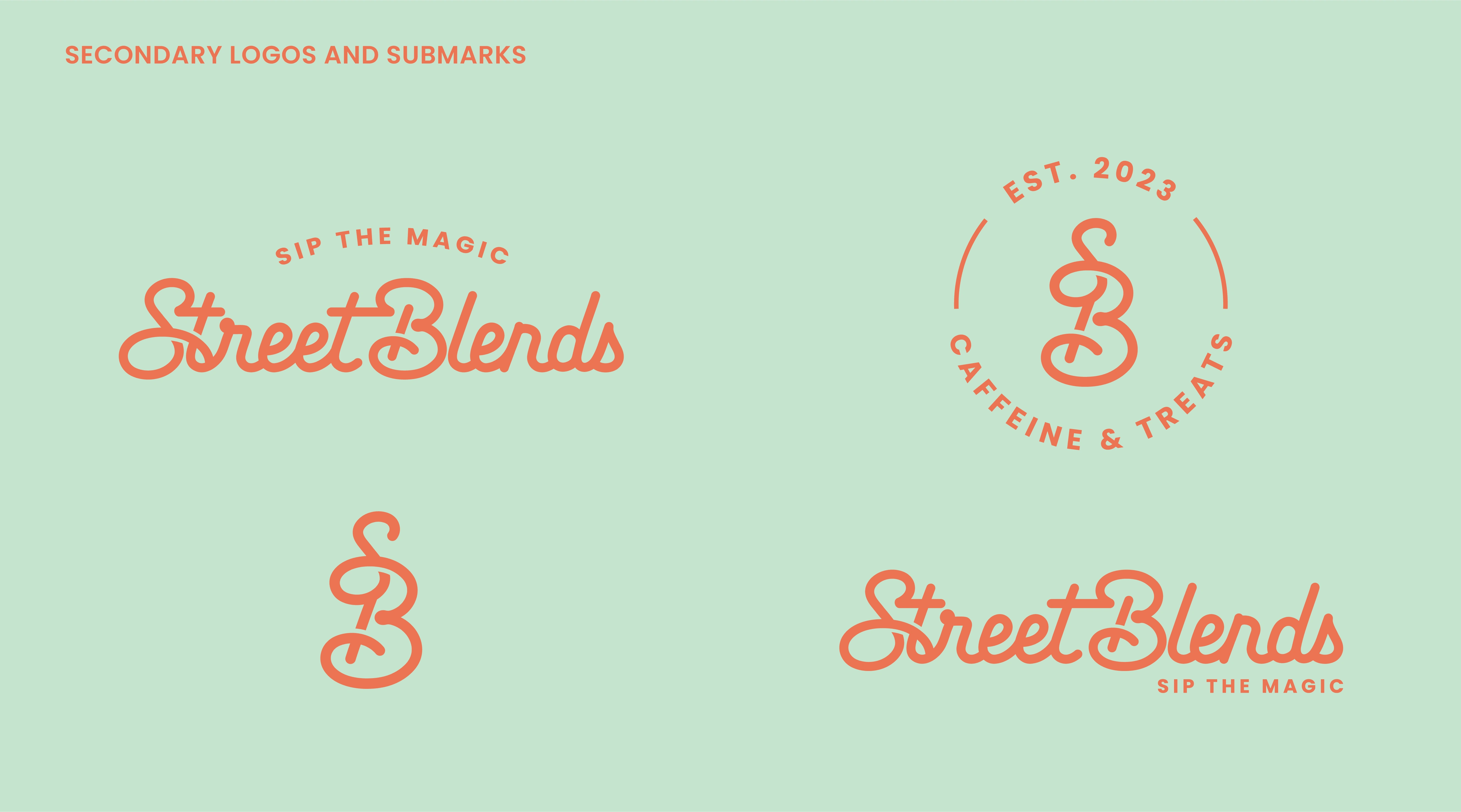
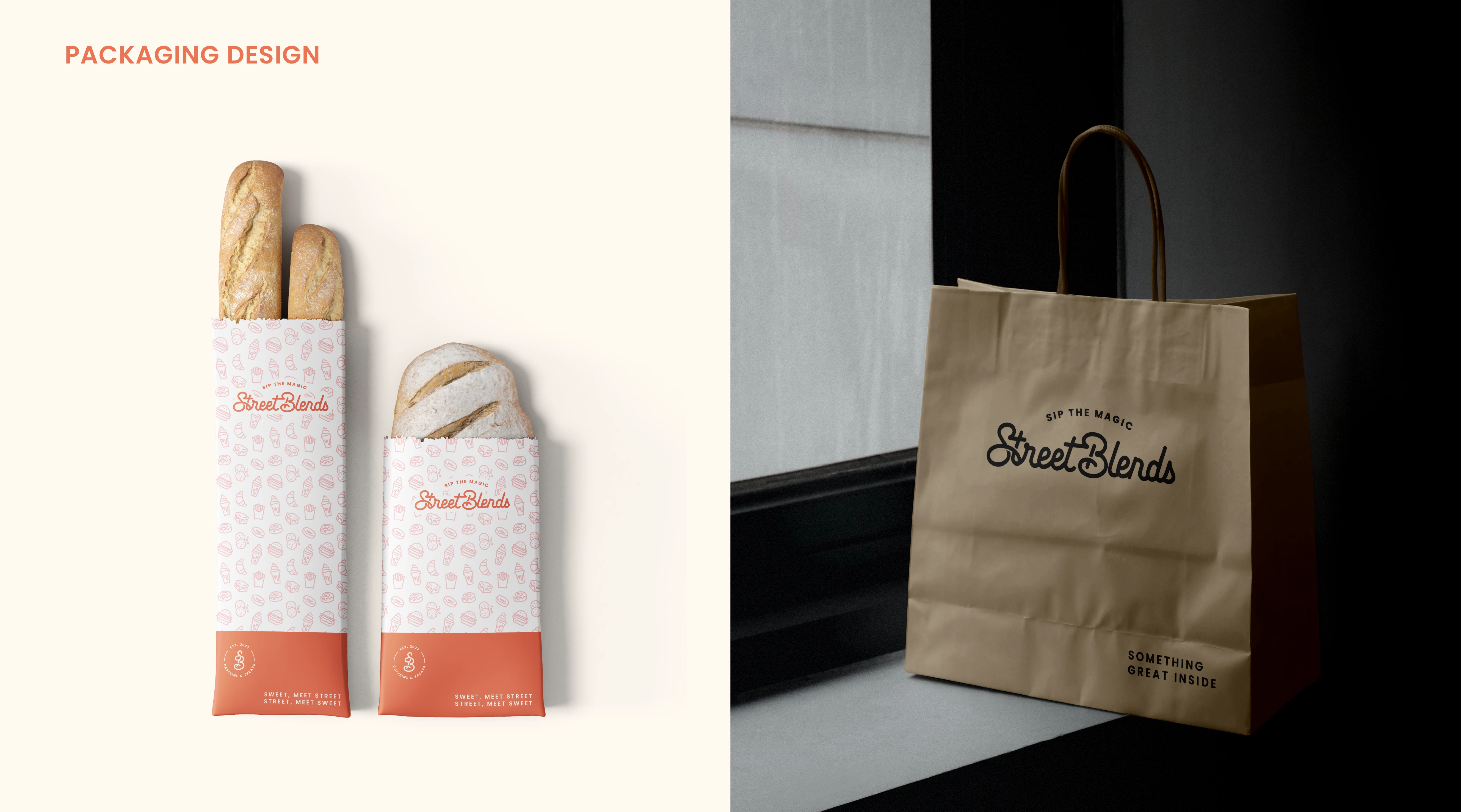
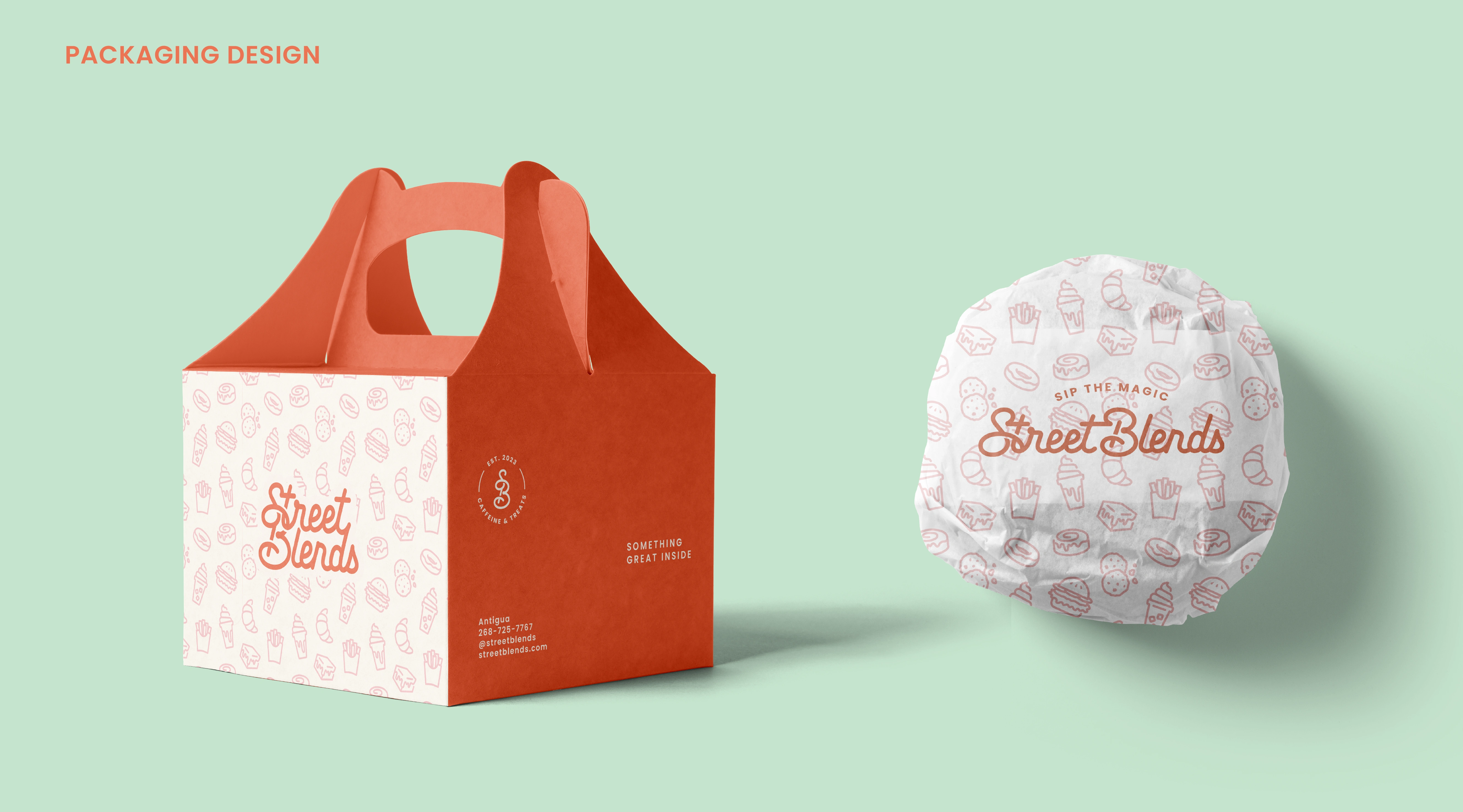
To make sure the branding works across all kinds of touchpoints, I created a full logo suite, including: A primary logo, a circular badge version (great for stickers, cups, and packaging) , “SB” monogram as a submark, horizontal and stacked layouts for different formats
The final system gives them everything they need for a consistent, flexible brand presence - whether it’s on a coffee cup, food trailer, or Instagram grid.
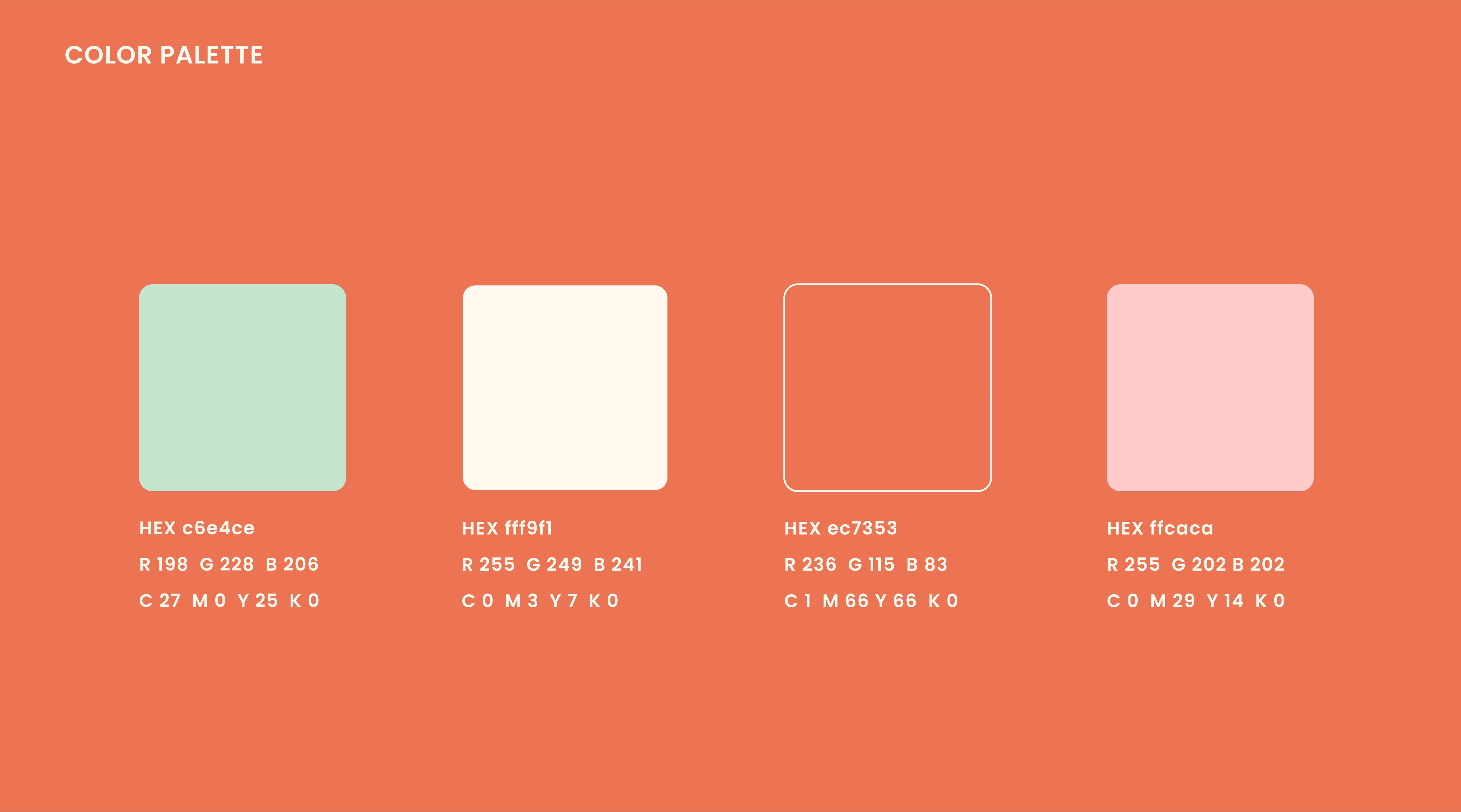
The color palette captures warmth, playfulness, and energy, creating an inviting yet fresh vibe. Built around the client's love for pastels, the palette feels modern and elevated. Key elements include a creamy neutral base, a zesty coral as the hero color, and soft mint and blush for contrast. These colors pair beautifully with coffee and bakery items, giving the brand a vibrant, welcoming feel across digital, print, and packaging.
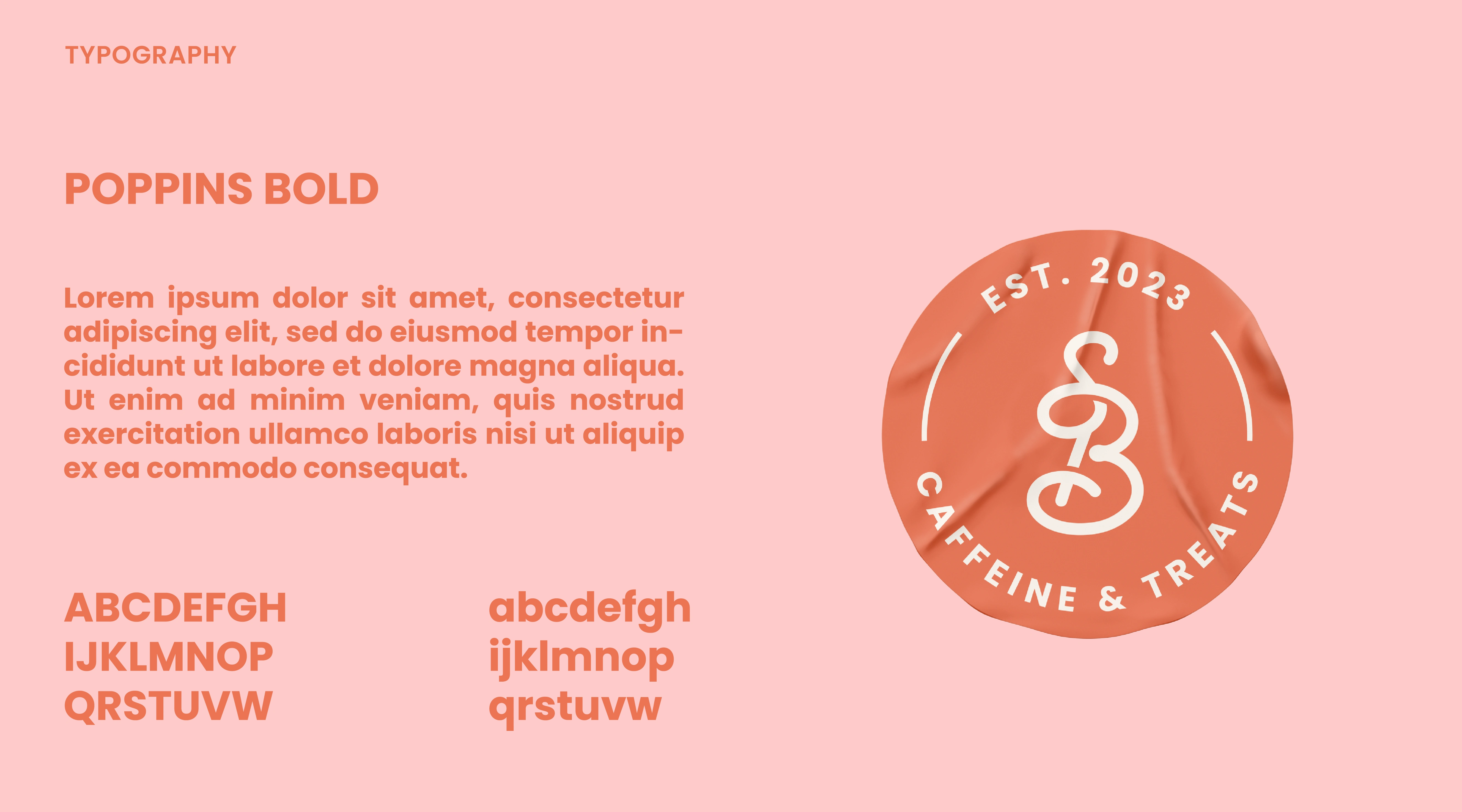
For the typography, I chose Poppins, a clean and modern font that complements the custom logotype. The logotype has a slight retro and playful touch, so I selected Poppins to maintain a balanced, contemporary feel. It’s sleek, versatile, and works beautifully across all applications.

The brand pattern reflects the items sold in the coffee shop, featuring line-drawing illustrations of coffee and bakery items like cookies, croissants, and cinnamon swirls. These illustrations align with the modern, playful vibe of the logo, creating a cohesive design.
Like this project
Posted Apr 8, 2025
Rebranding Street Blends, a growing coffee shop in Antigua.
Likes
0
Views
14
Timeline
May 15, 2024 - Nov 14, 2024