Redesign | CooksEquipment | MachineRepairElectrician

AnoxsH _




Like this project
Posted Oct 20, 2026
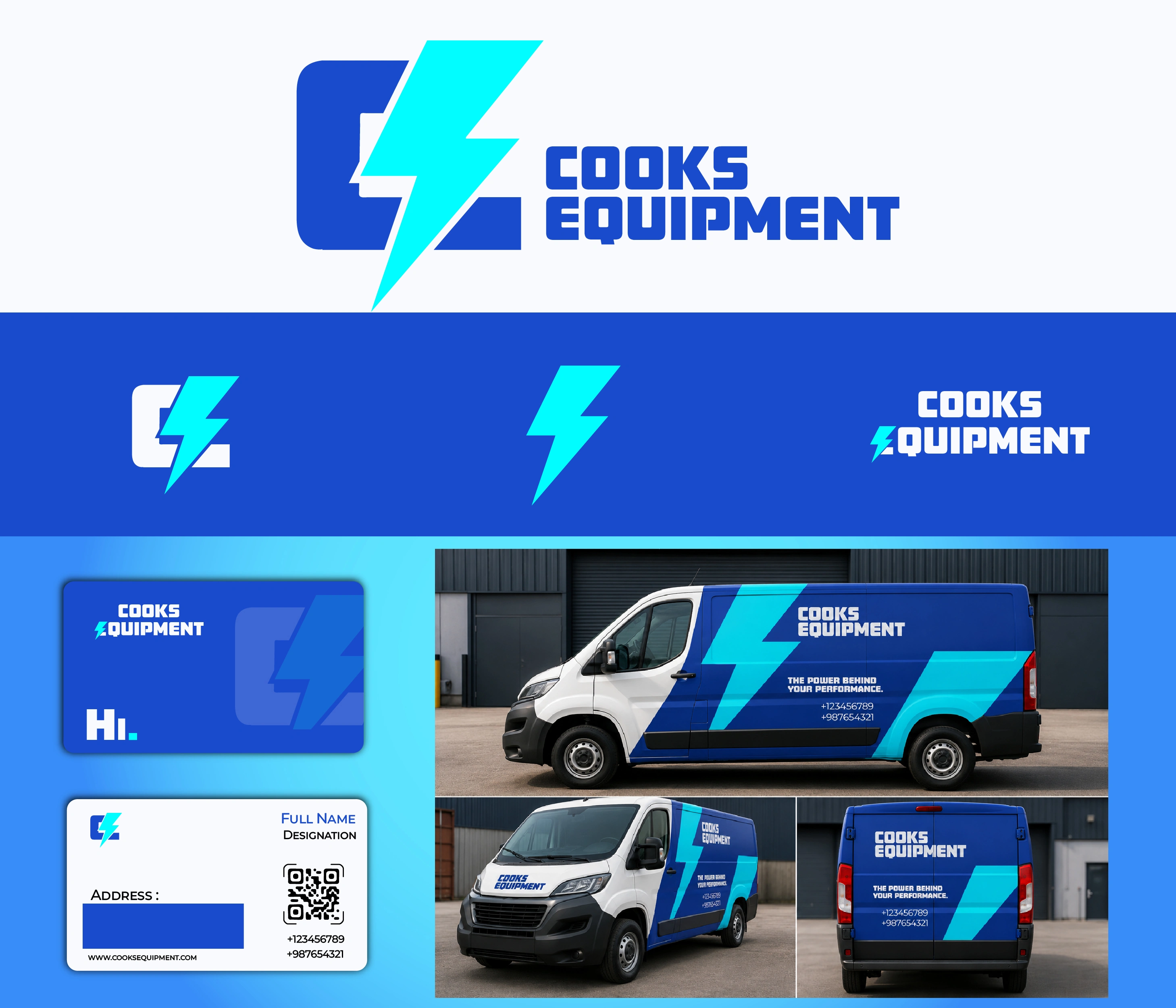
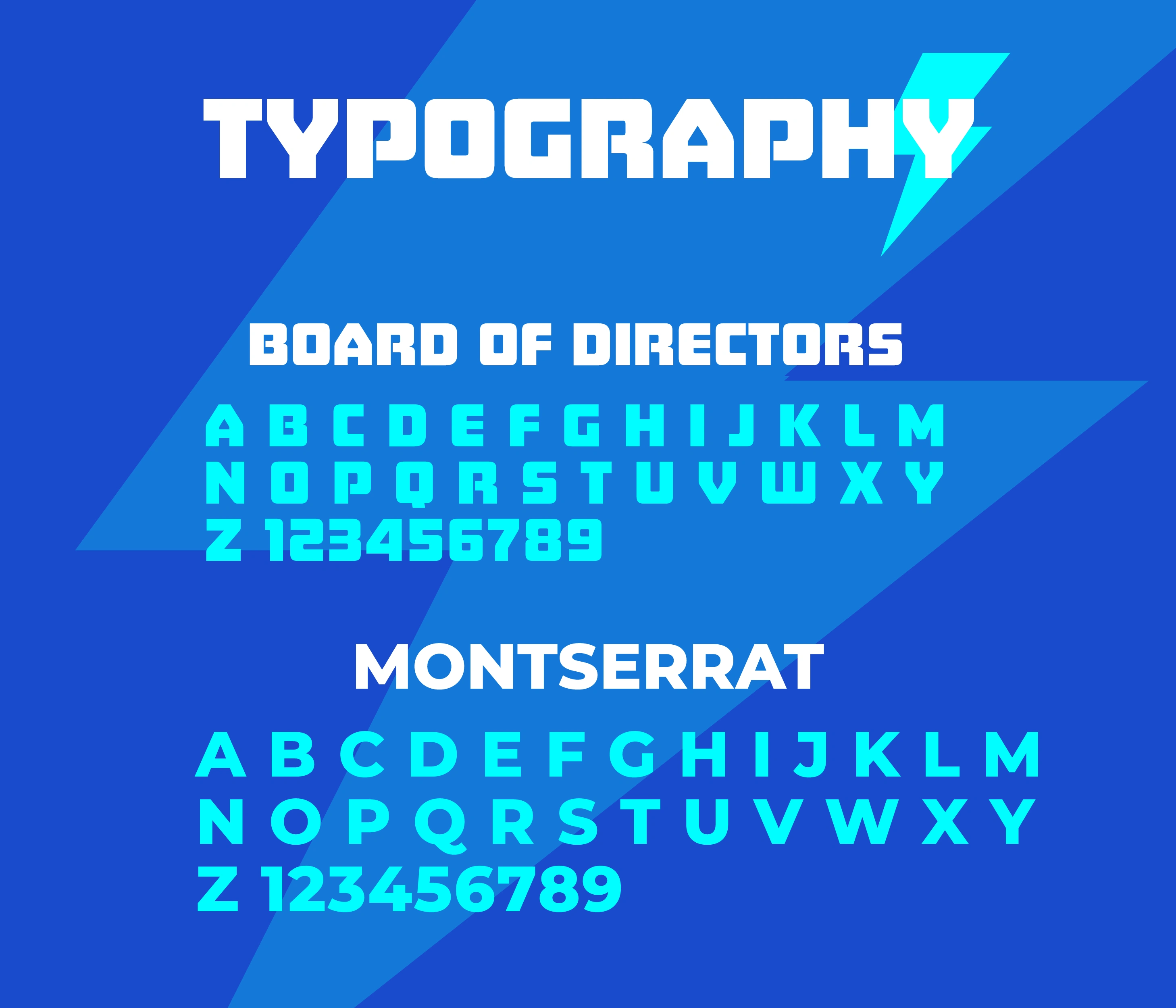
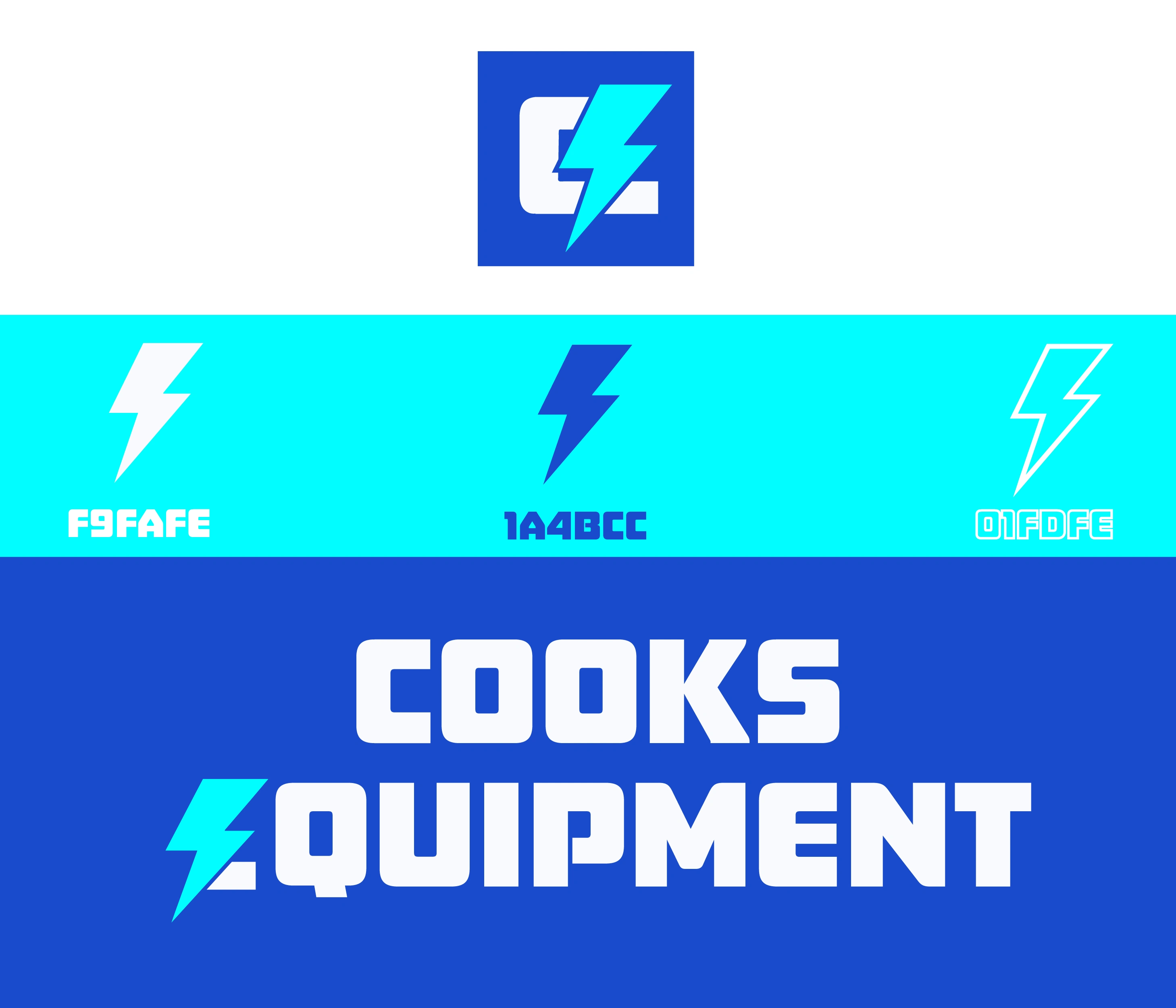
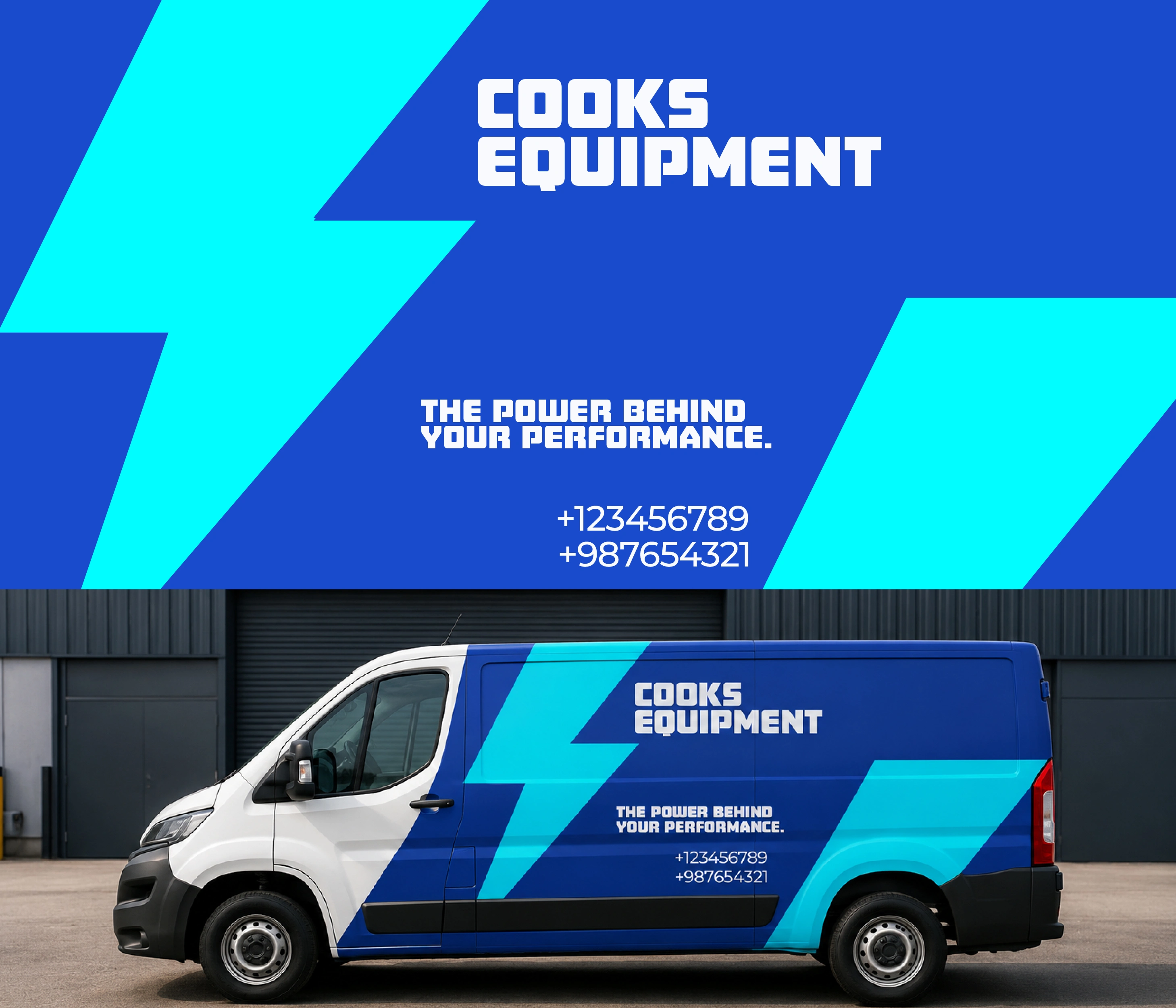
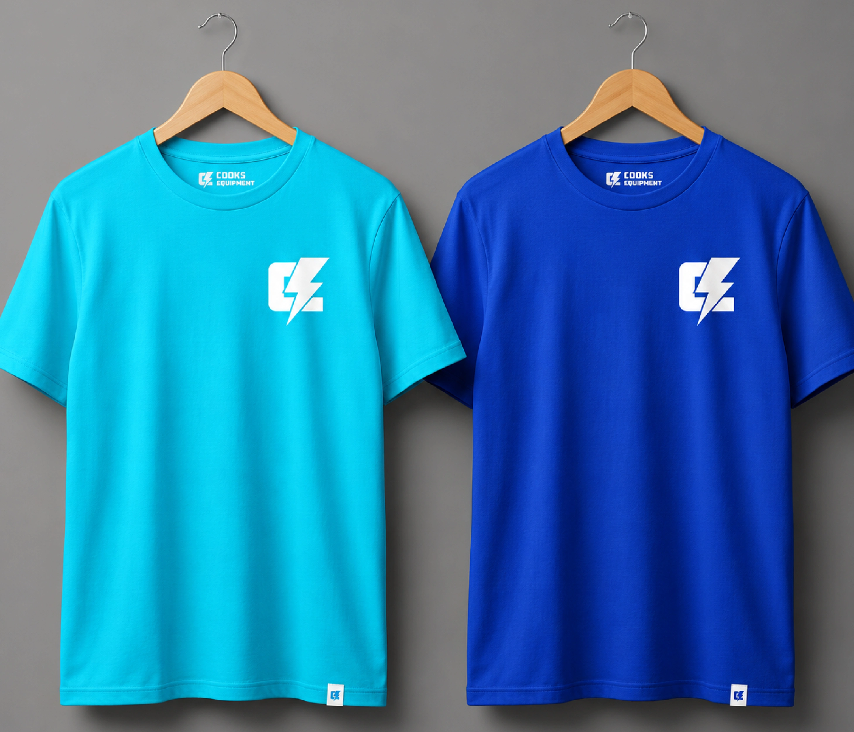
⚡ Cooks Equipment - Brand Identity Redesign The client wanted to modernize their existing logo while keeping its original concept - the C connected to the E through a lightning bolt. I simplified the curvy font to give it a stronger presence and create a unique monogram of it to give it a more distinctive personality, while keeping the core idea recognizable. The electric blue palette was chosen to reflect what the business represents - electricity, machinery, power, and technical expertise. And that’s how the existing logo evolved into a more modern and cohesive brand identity.