.amo — Fintech Card Promo Concept

Bohdan Dod
1 collaborator


.amo — Fintech Card Promo Concept
Overview
.amo is a motion design concept for a digital banking card. The goal was simple — create a short, atmospheric promo that makes paying feel effortless and premium, without relying on heavy UI or long explanations.
Concept
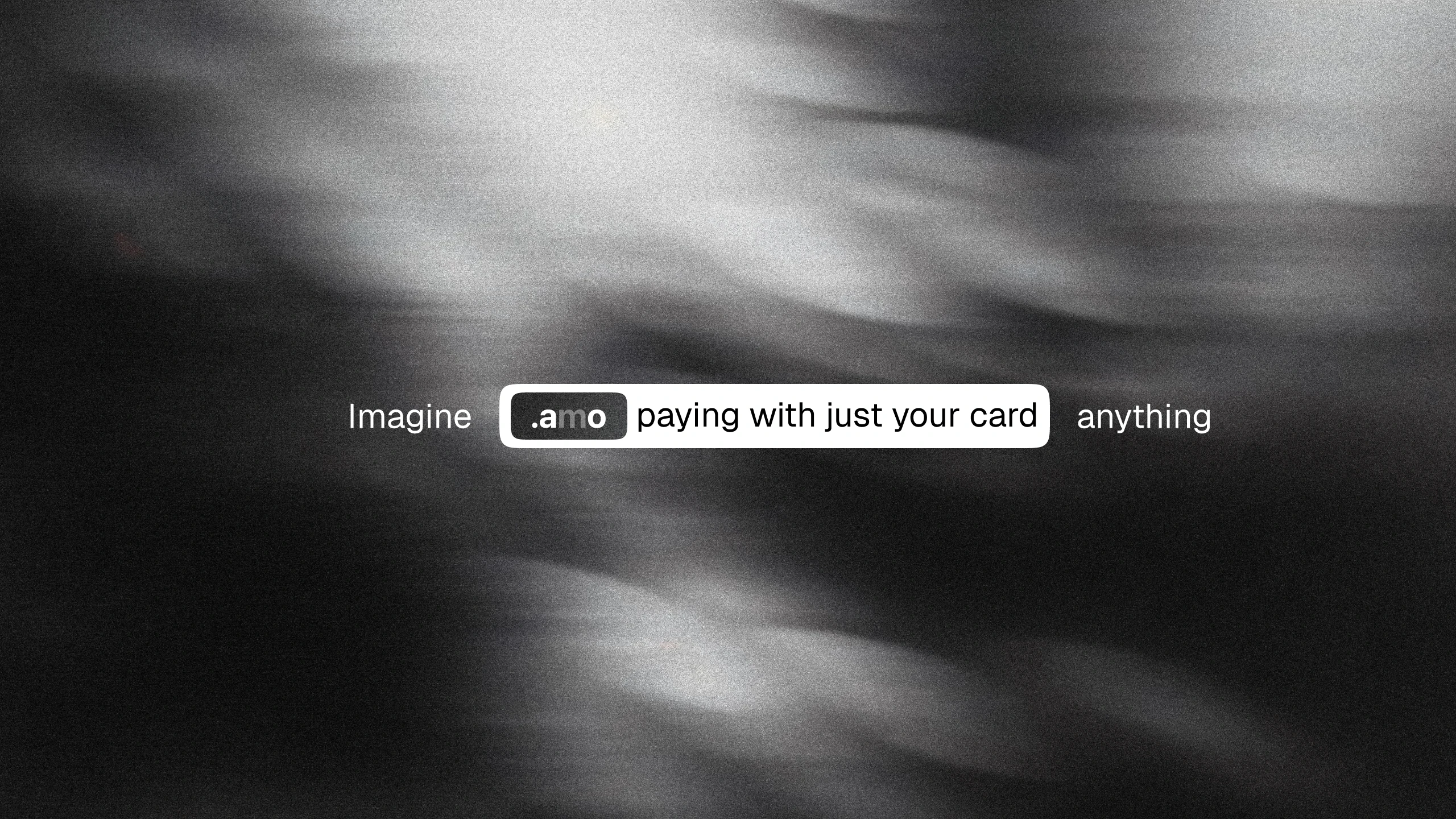
The idea came from a simple thought: what if paying felt as easy as typing a prompt? The video builds around that metaphor — an input field, a swipe, and it's done. No forms, no friction, just intention turning into action.
Visual Direction
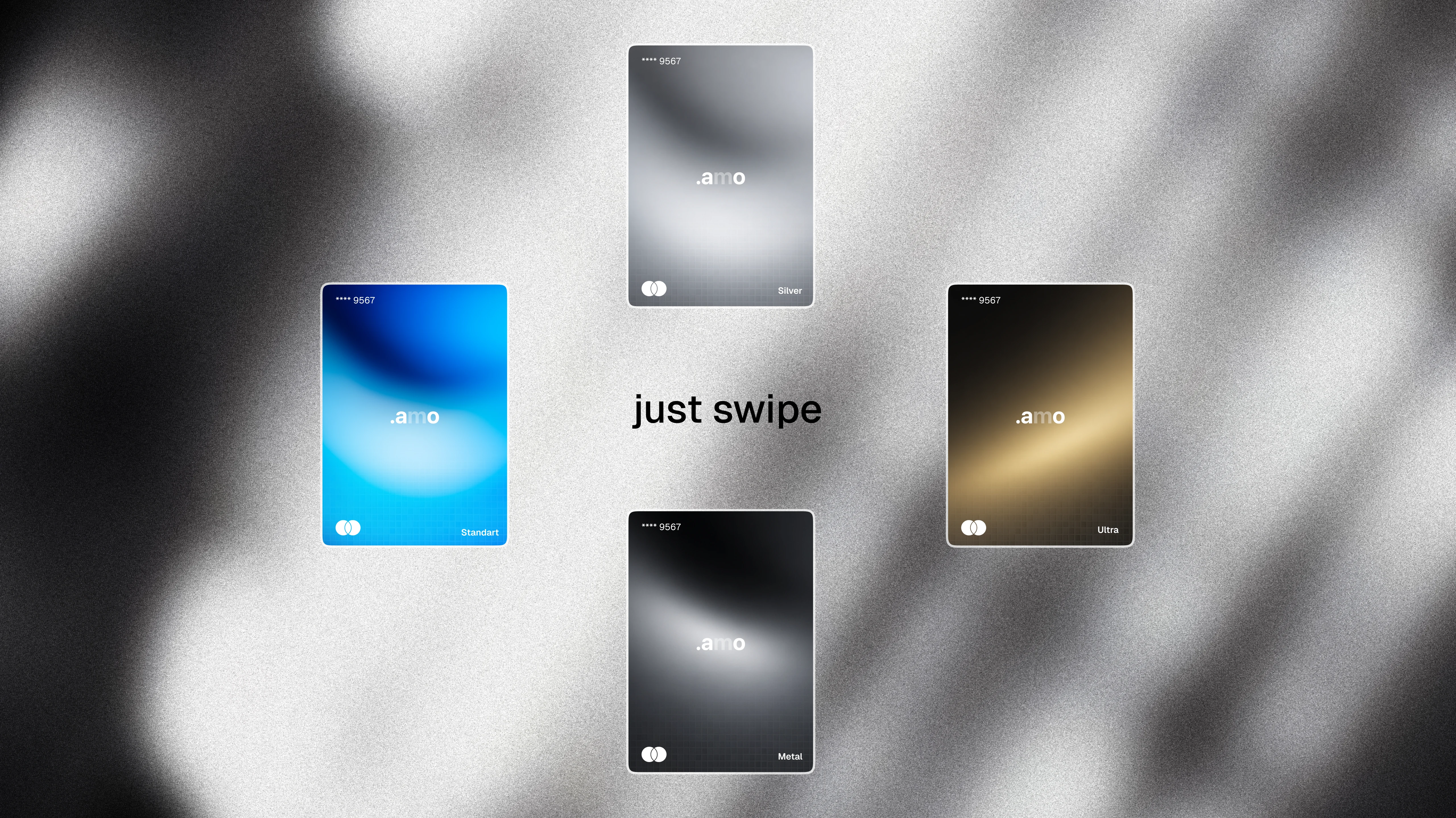
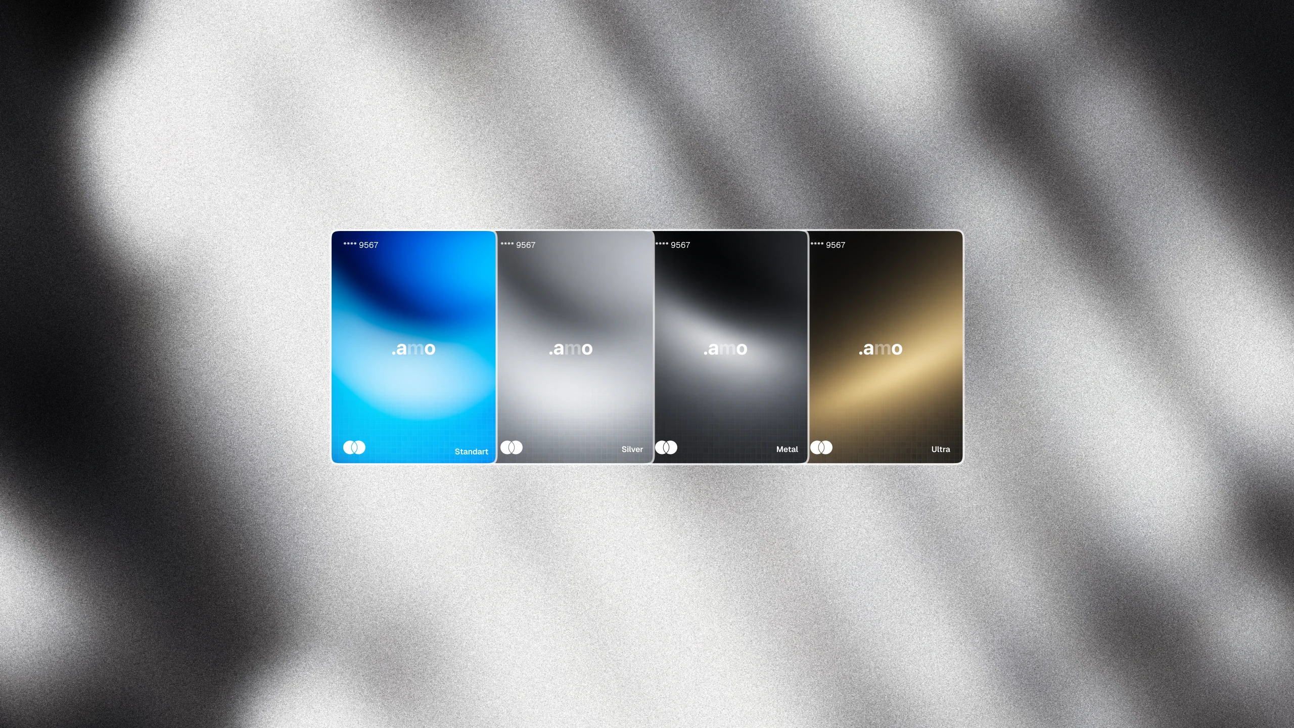
The entire video runs on a dark, grainy, cloud-like texture — moody, tactile, almost cinematic. Cards appear as floating glass-like objects with soft gradients: blue, silver, black, and gold. Each color represents a different tier of the card, without needing extra explanation.
Card Design
Four card variants were designed to cover different customer segments — from an entry-level Silver card to a premium Gold tier. Each card uses gradient-driven color to feel tactile and premium on screen, mimicking how light reflects off real metal and glass cards.
Product Mockups
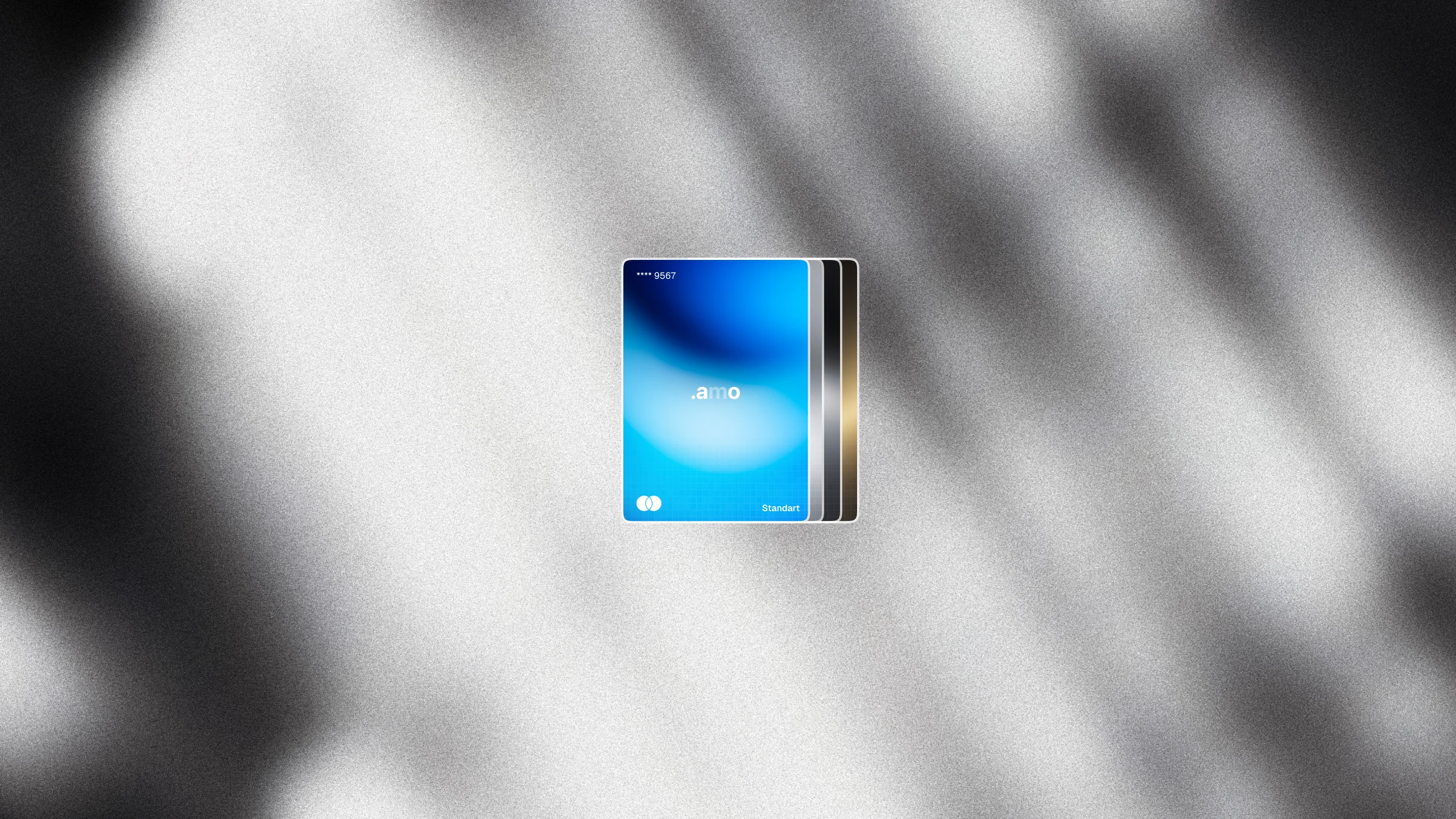
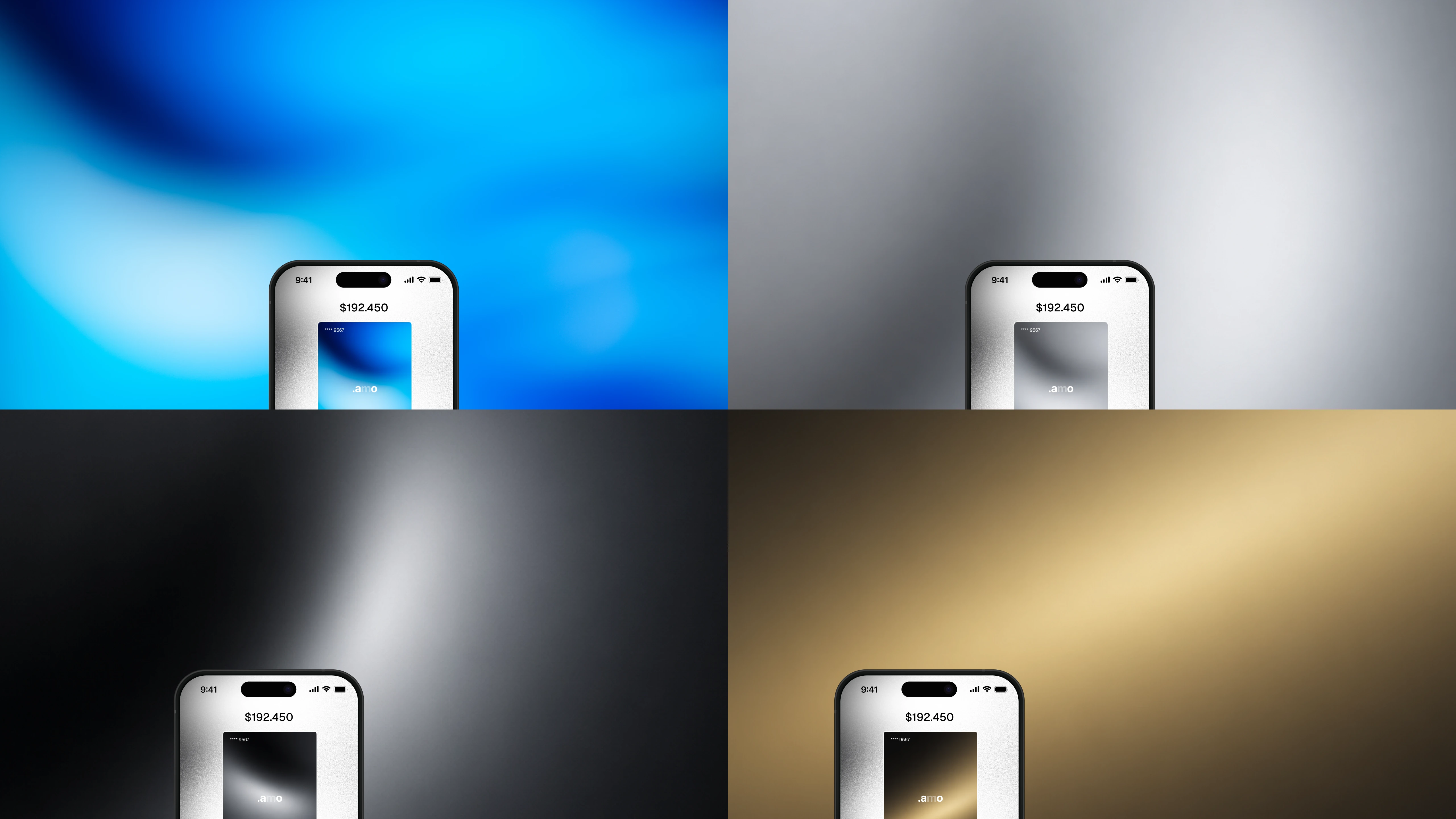
Each card was placed into a phone mockup with a matching gradient background — extending the card's color identity into the full app experience. This shows how the card design translates directly into the product UI.Product Mockups
Outcome
A 14-second promo that communicates the product's value through mood, motion, and minimal typography — no lengthy explanations, no clutter. Just a feeling: paying should be effortless, and the card should feel like it belongs to you.
Tools Used
After Effects · Figma
Like this project
Posted Jul 21, 2026
Created a 14-second fintech card promo — motion design, atmospheric visuals, and UI concept for a digital banking product. Built in After Effects and Figma.
Likes
2
Views
26
Collaborators