UX Project: Mood Monitor
What is Mood Monitor?
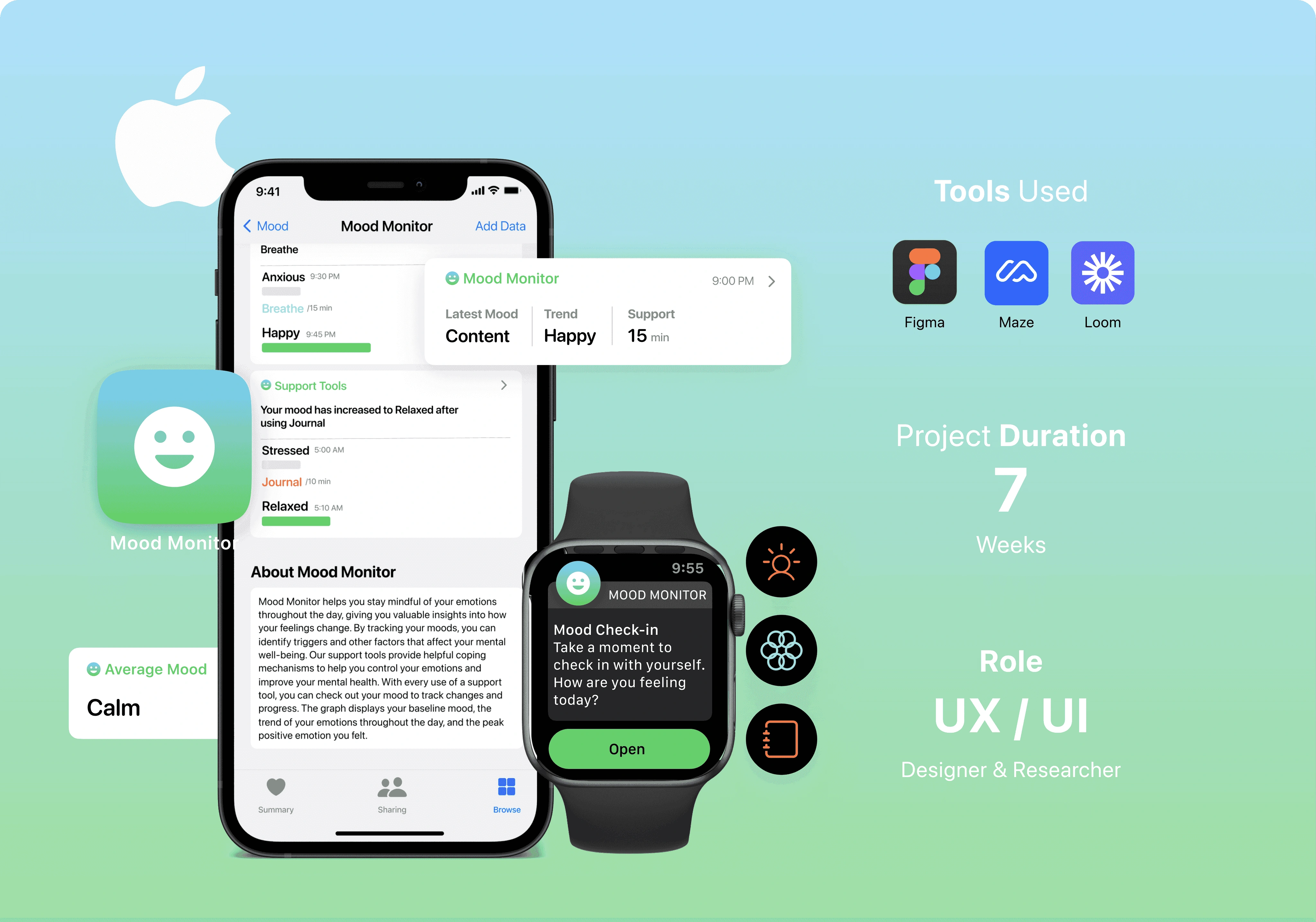
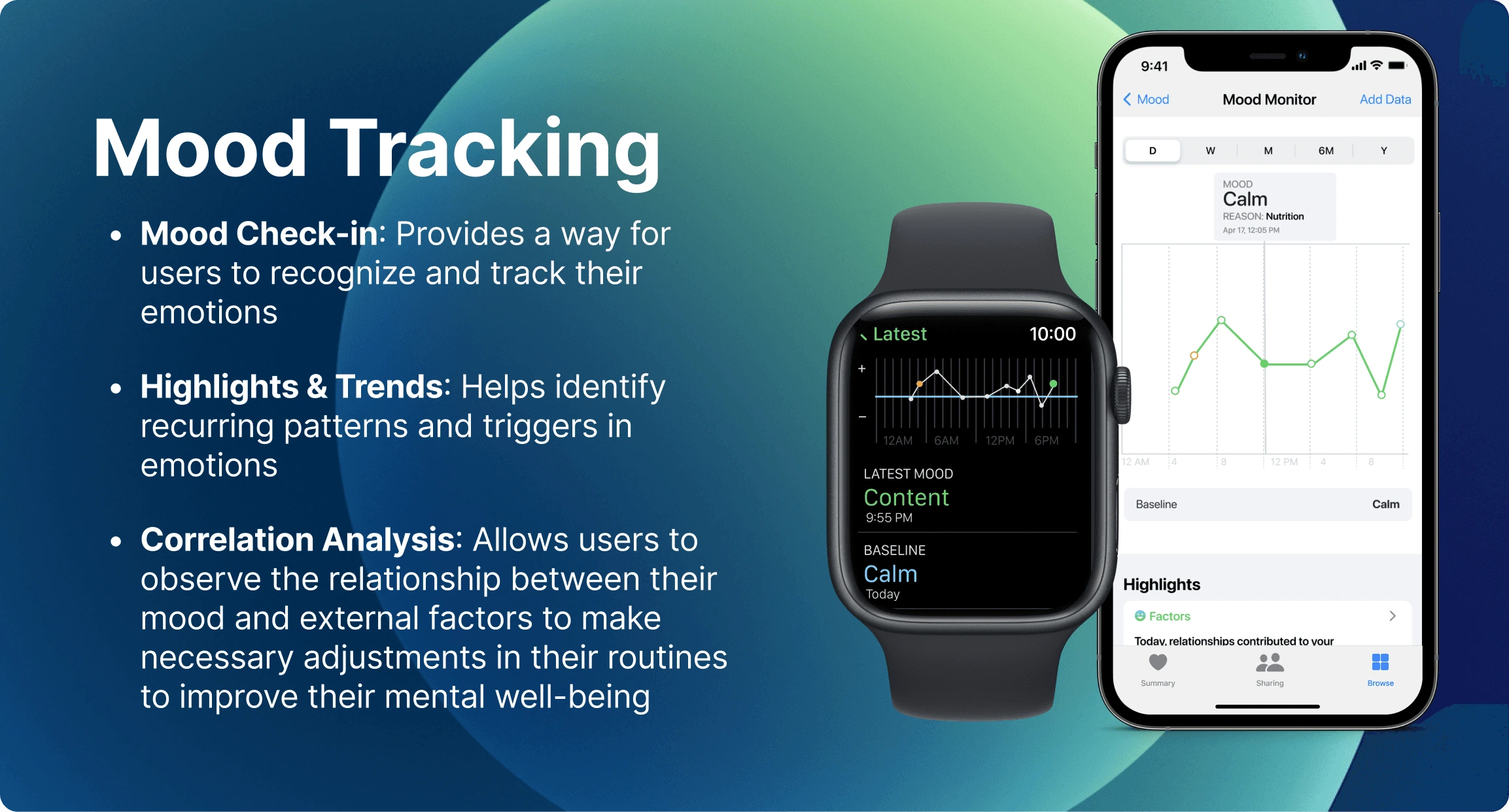
A feature designed to help users monitor their emotional well-being. By tracking mood changes throughout the day, users can identify triggers and factors that affect their mental well-being.
BACKGROUND
Rethinking mental health support beyond apps
When analyzing various mental health apps, a recurring pattern appeared: users needed to navigate to a separate app for mental health support. This realization prompted me to wonder why leading major tech platforms hadn't already built-in mental health features. It sparked my curiosity about the integration of mental health functionalities directly into everyday devices.
THE PROBLEM
Addressing mental health needs
While Apple has been a leader in physical health data and insights, there is a significant gap in its offerings when it comes to mental health. Considering that 1 in 5 adults live with mental illness, the question arises whether technology can help bridge this gap.

THE SOLUTION
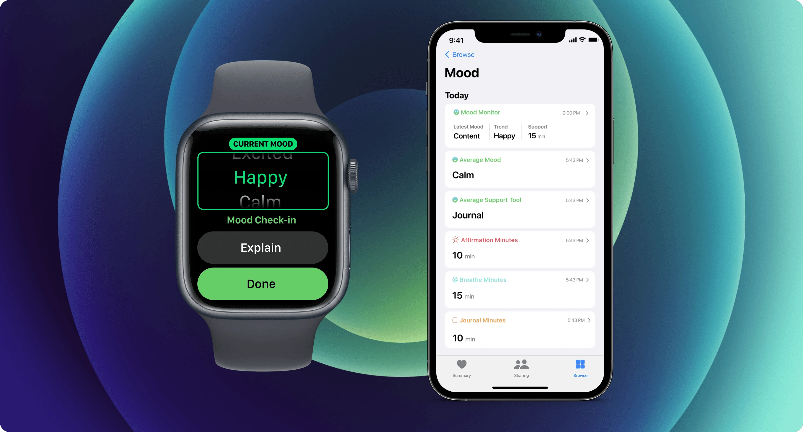
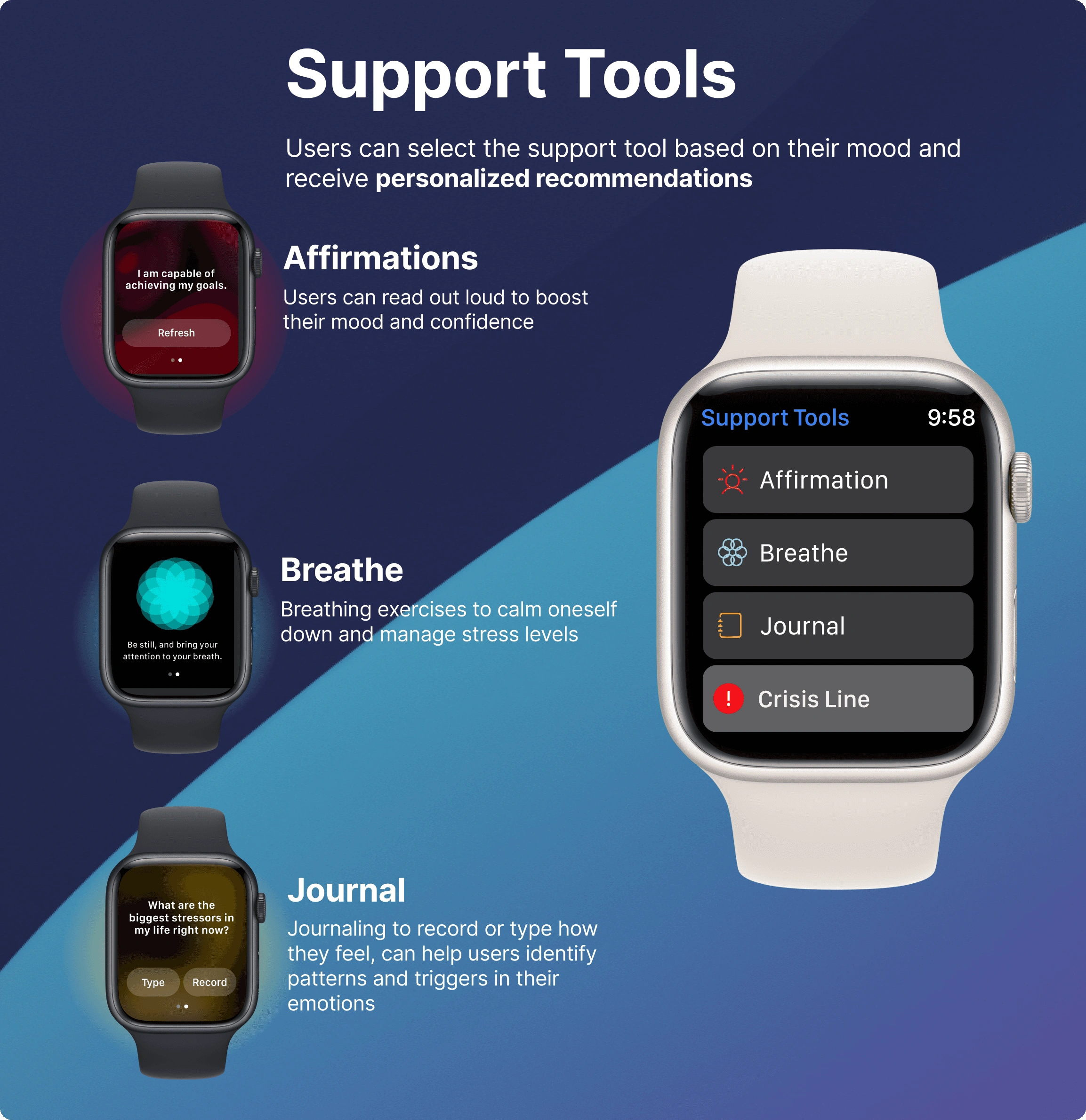
Adding mental health to Apple
*The feature was created in February 2023, before Apple announced mental health features in June 2023.
RESEARCH
Lack of mental health apps in smartwatches
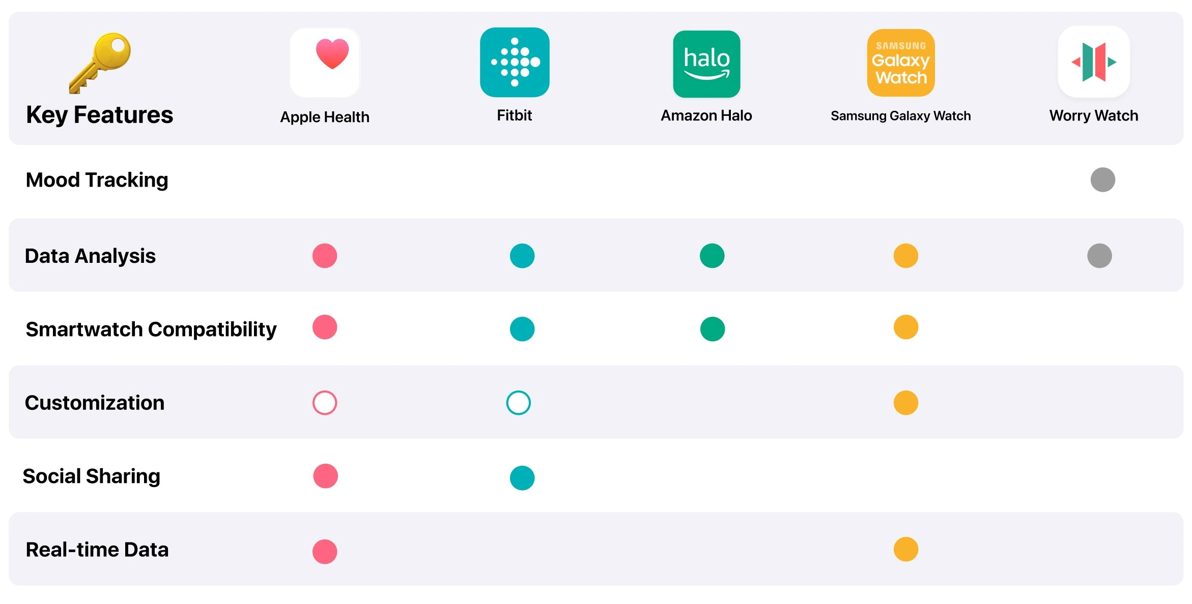
In my research, I conducted a competitive analysis and found that the Amazon Halo was the closest smartwatch with mental health integration, but user feedback highlighted concerns about its intrusive nature. It was clear there was a lack of mental health apps on smartwatches. I identified an opportunity for Apple to gain a competitive advantage by addressing this important aspect of user well-being.
SURVEY
Insight from Smartwatch users
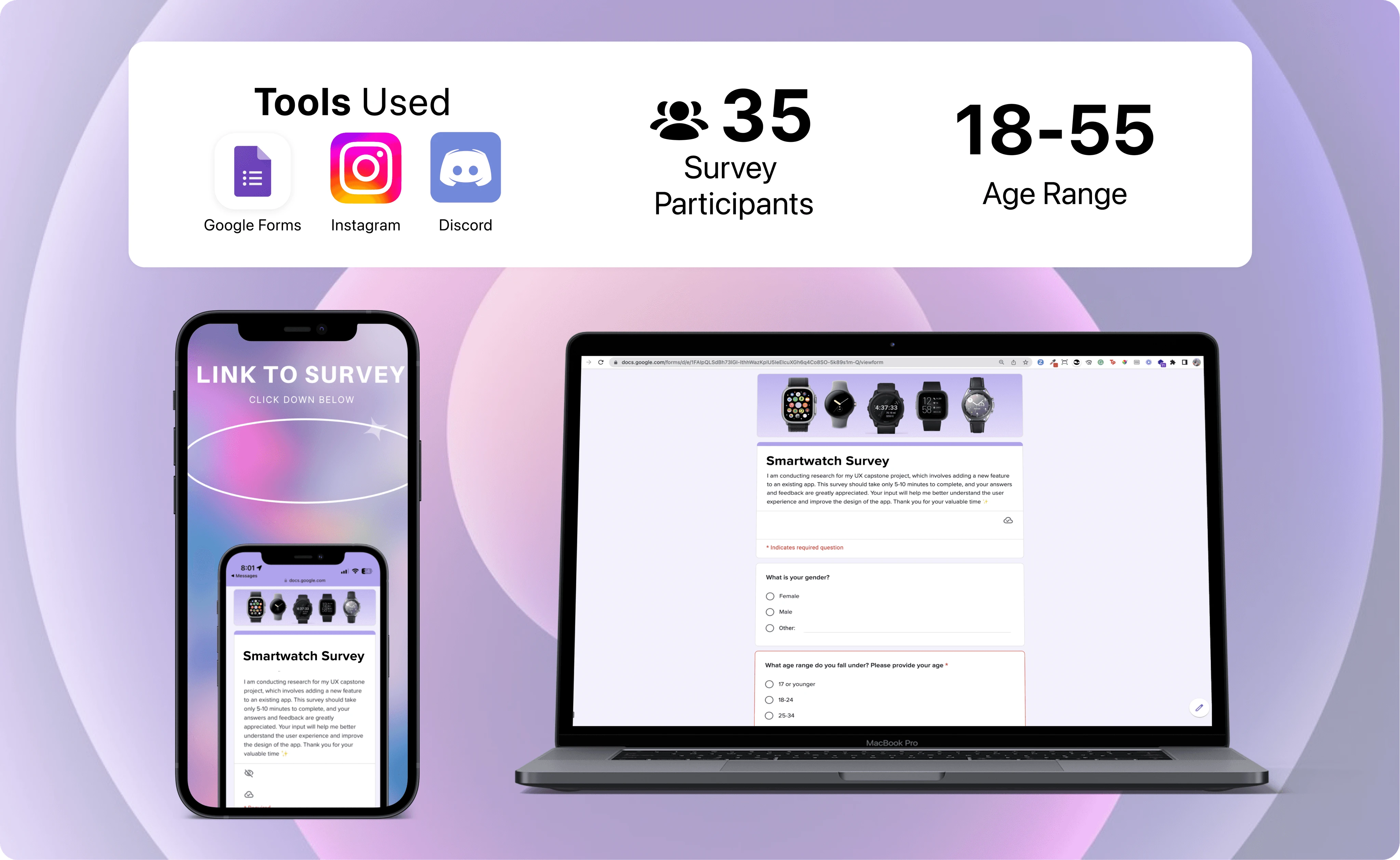
To gain deeper insights, I conducted a targeted Google survey among smartwatch users. The survey results indicated that 100% of respondents showed interest in using a mental health feature. However, some users expressed concerns about potential intrusiveness when designing for mental health. These findings led me to question how we can best integrate a feature that helps users connect with their mental health without being intrusive.
USER INTERVIEW
Explore user's perspective on mental health
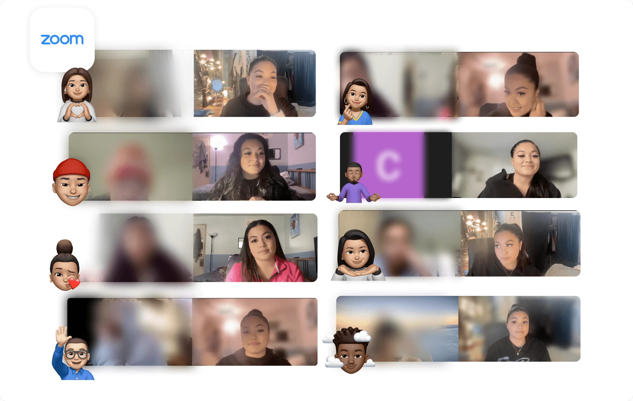
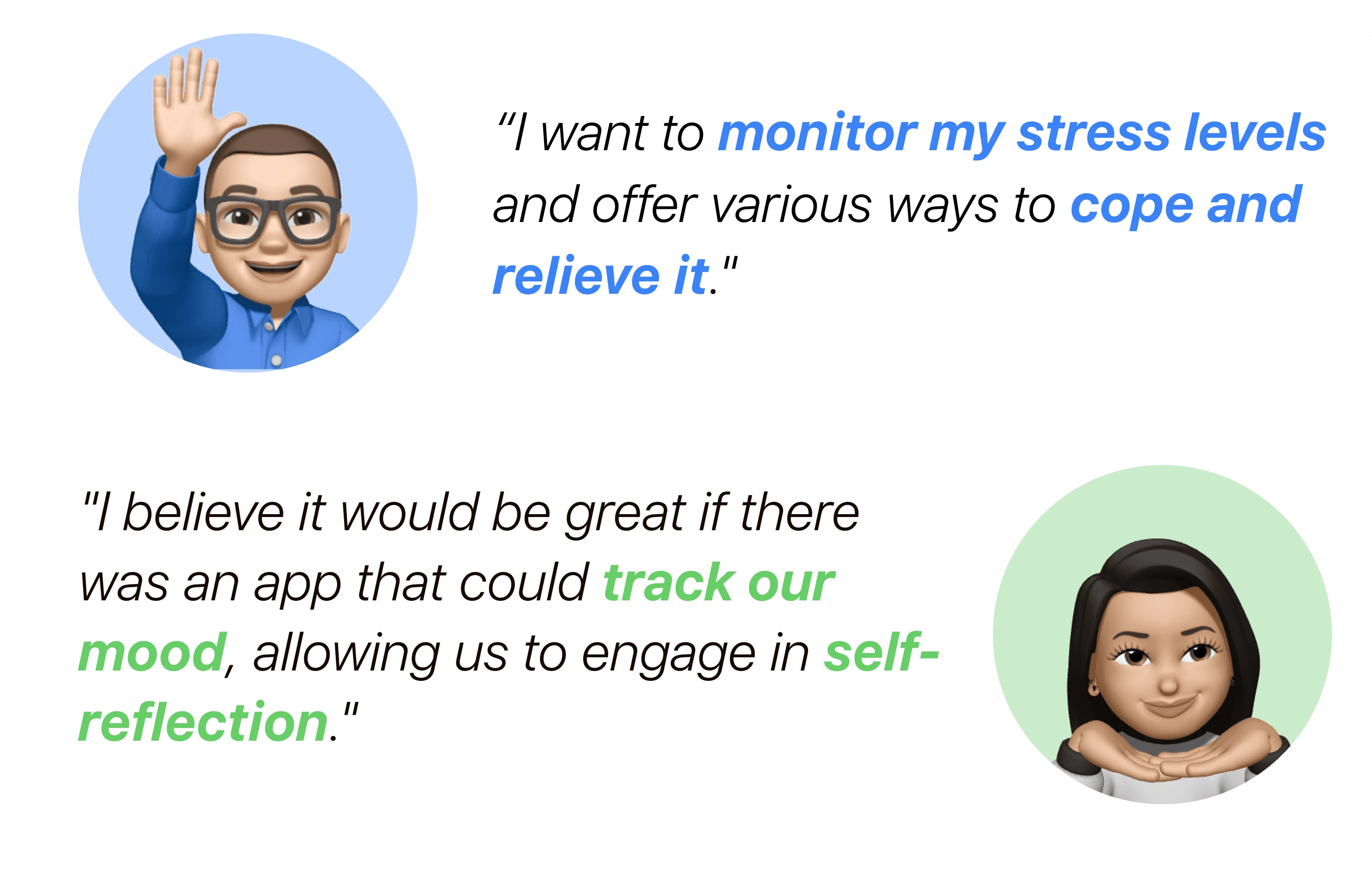
I conducted Zoom interviews to gain insights into people's perspectives on mental health and its relationship with technology. These interviews highlighted the significance of self-awareness and emotional understanding for maintaining good mental health. Users expressed particular interest in mood tracking and coping mechanisms, emphasizing the importance of mental health apps in supporting their well-being.
POV & HMW
Unlocking User Insights
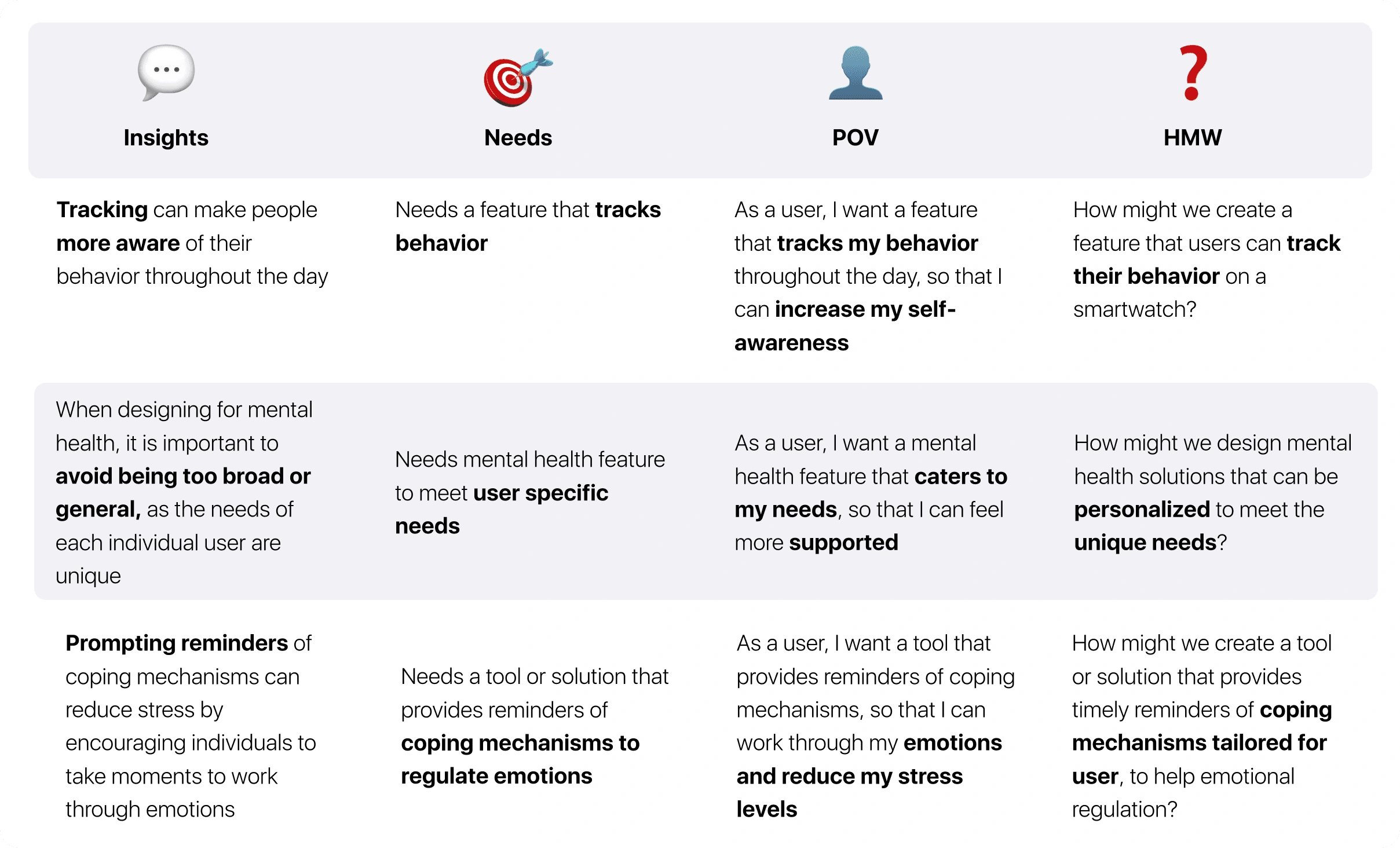
After affinity mapping, insights highlighted the significance of behavior tracking and the need for personalized mental health solutions. These insights were utilized to create a chart breaking down user needs, points of view, and key problem areas. As a result, key questions emerged: How might we develop a feature for tracking behavior on a smartwatch? and How might we design personalized mental health solutions to address unique user needs?
DESIGN TILE
Align with Apple's aesthetic
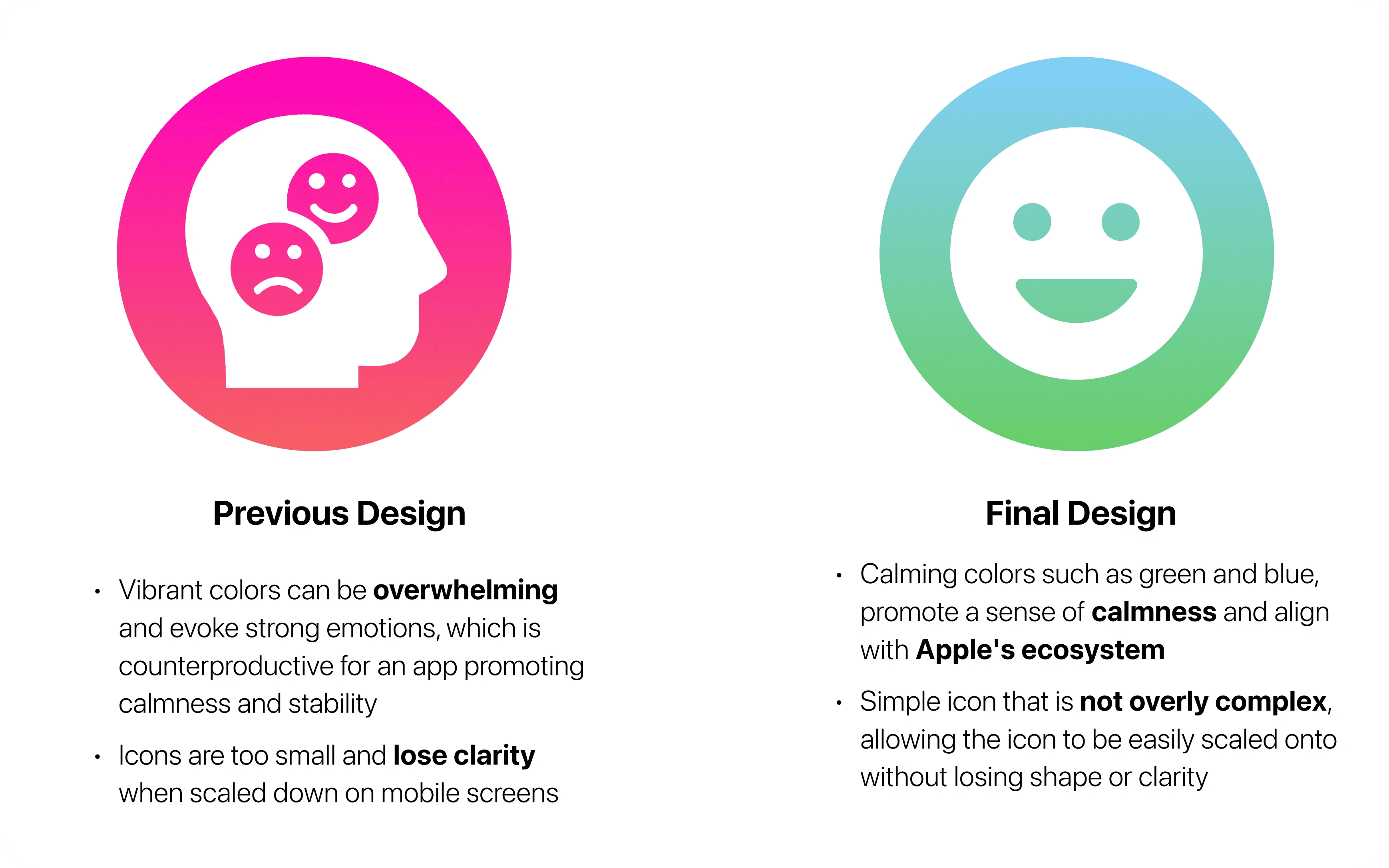
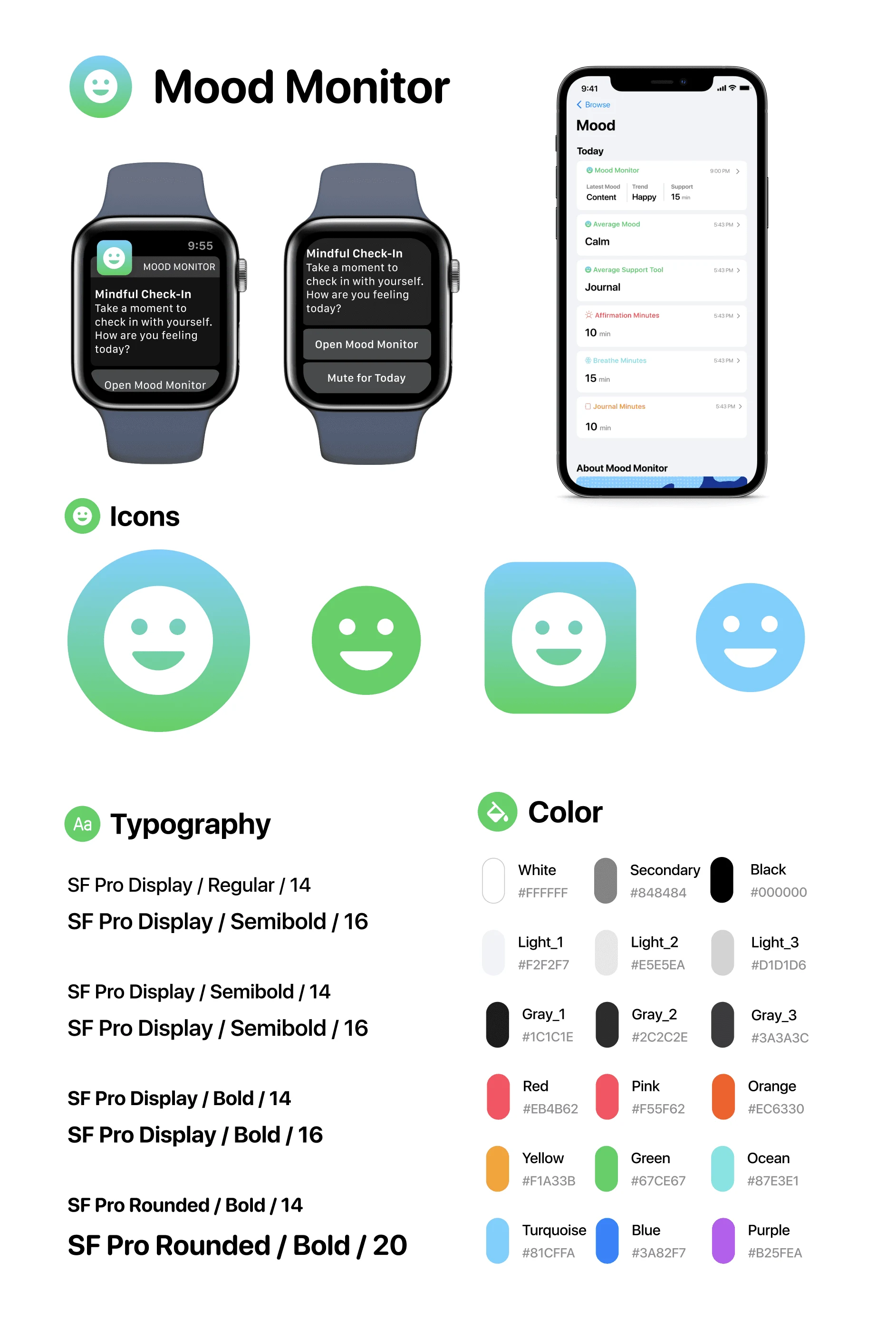
To start designing the app, I followed Apple's design system closely, maintaining consistency in fonts, colors, and overall aesthetics. The app logo aligned with Apple's app branding, while the initial color palette aimed for warmth and vibrancy to engage users. However, after exploring color theory, I recognized the significance of incorporating calming colors such as blue and green. This choice aimed to create a soothing experience for users while they engaged in mood tracking.
SKETCHES
Effortless & intuitive design
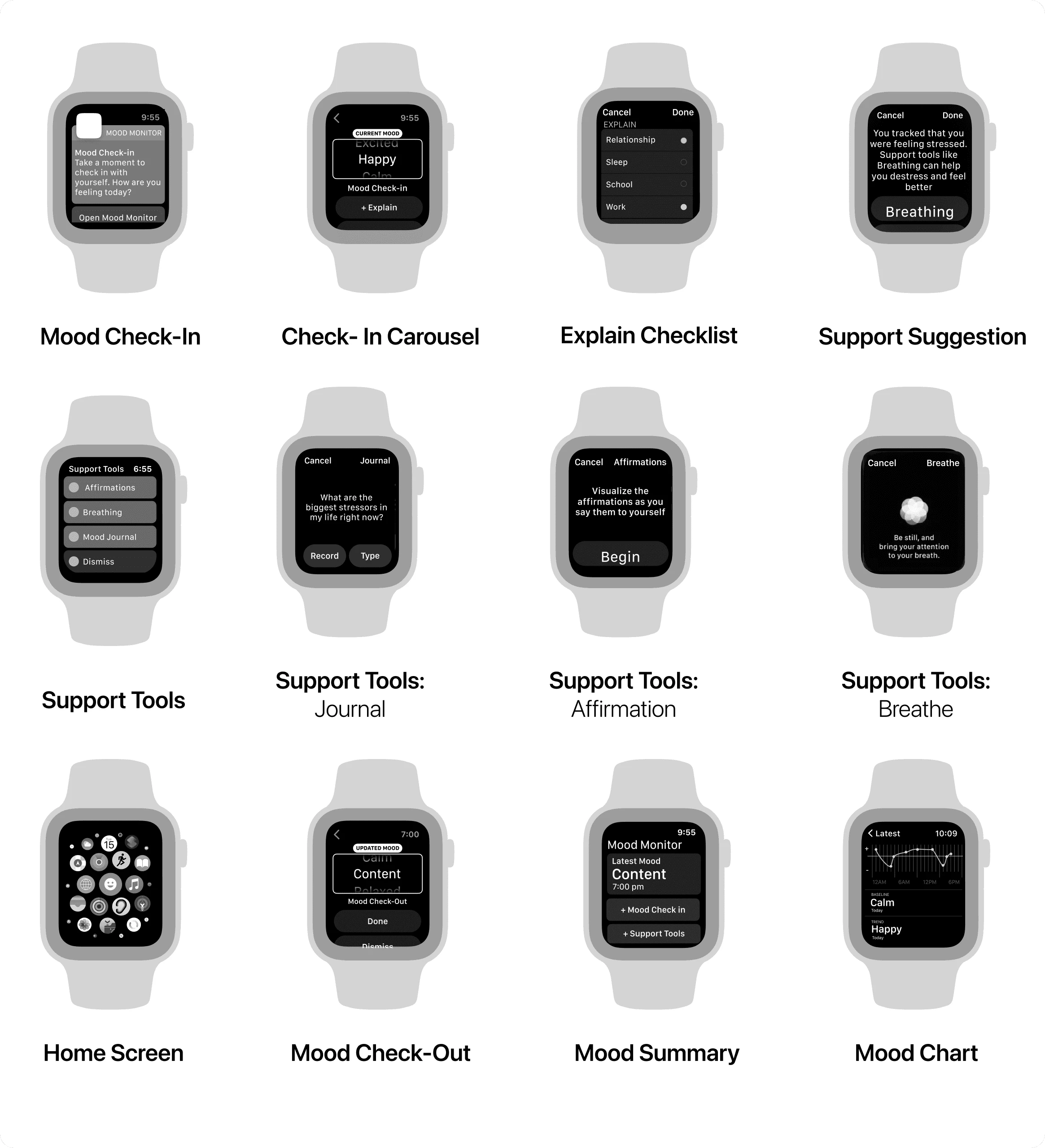
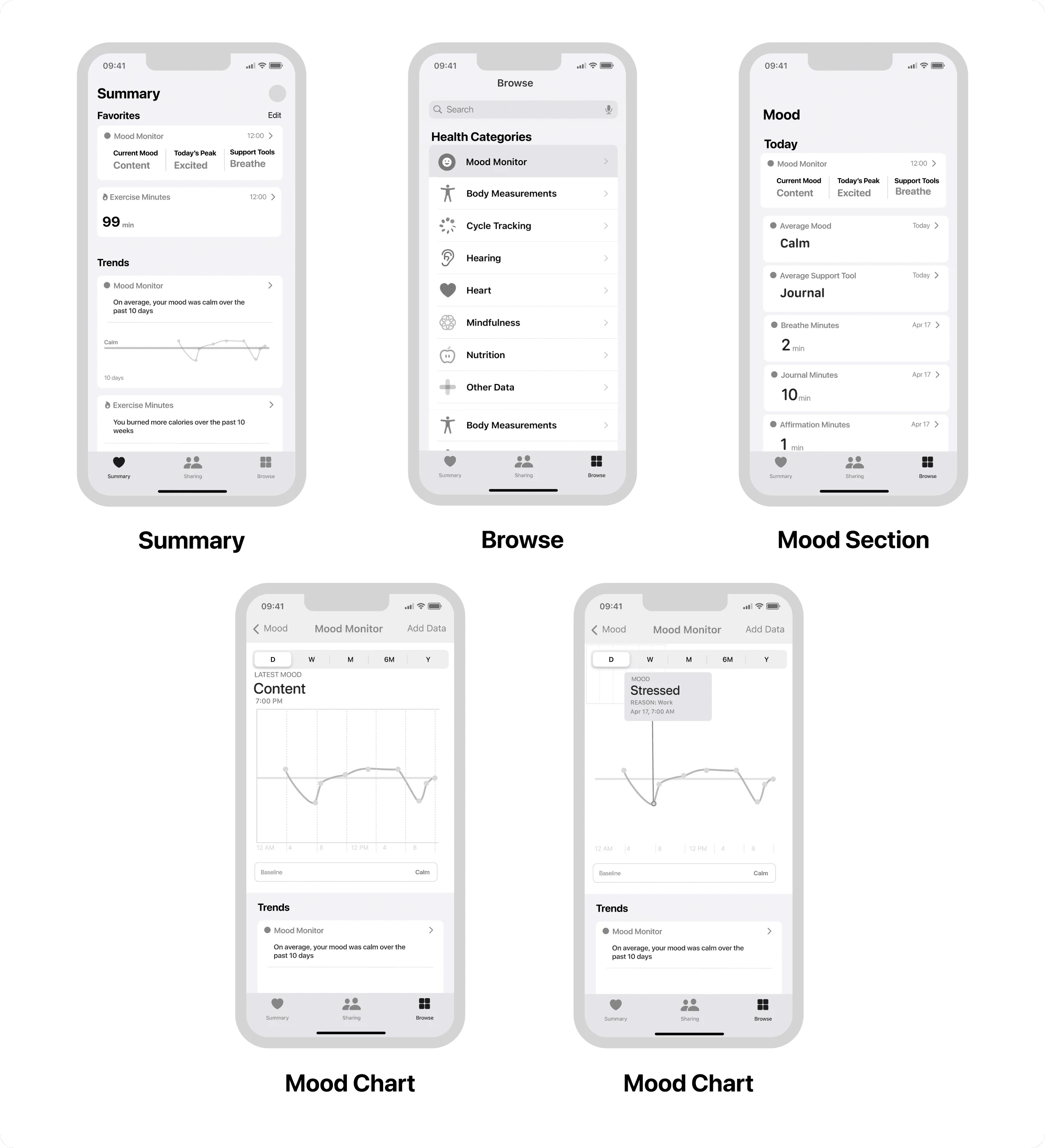
To create a cohesive and recognizable interface, the design process began with low- to mid-fidelity sketches that followed Apple's design guidelines. With a focus on consistency in typography, color schemes, and visual aesthetics, aligning with Apple's design language. The goal was to develop an experience that seamlessly integrated with the Apple ecosystem while considering the unique challenges of smartwatch screens.
TESTING+ ITERATIONS
Enhancing the feature
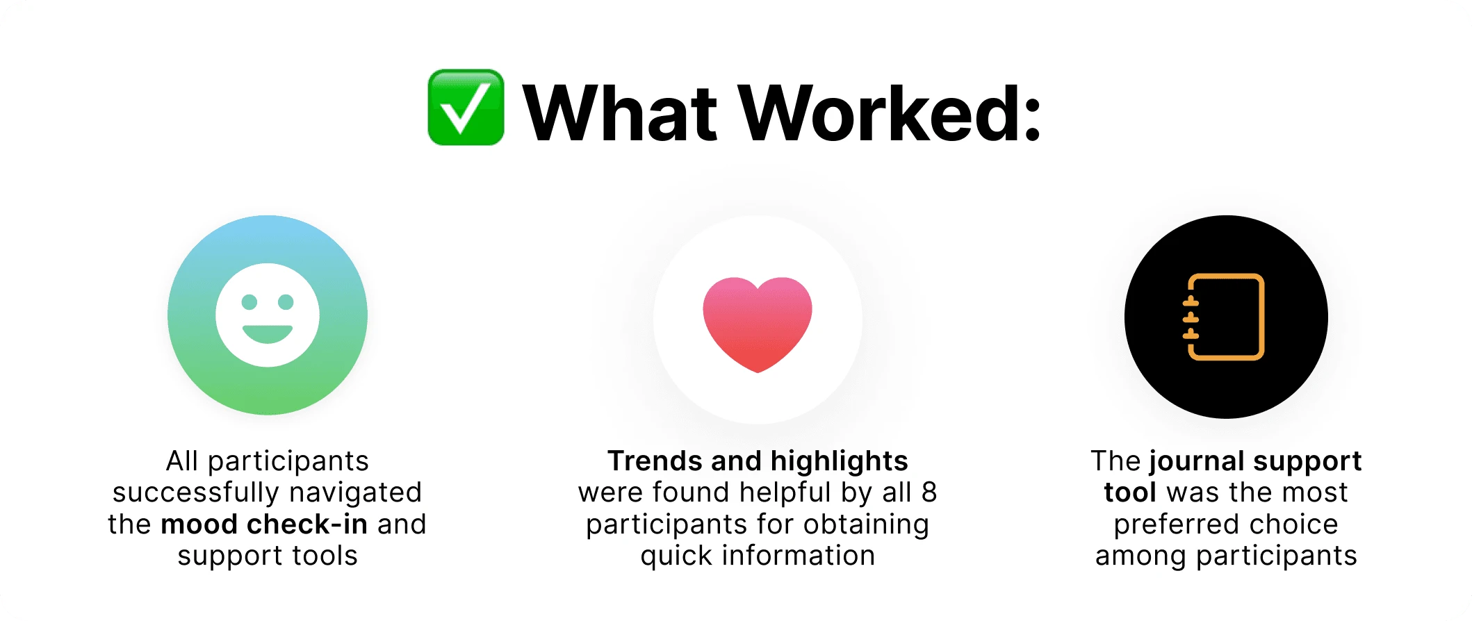
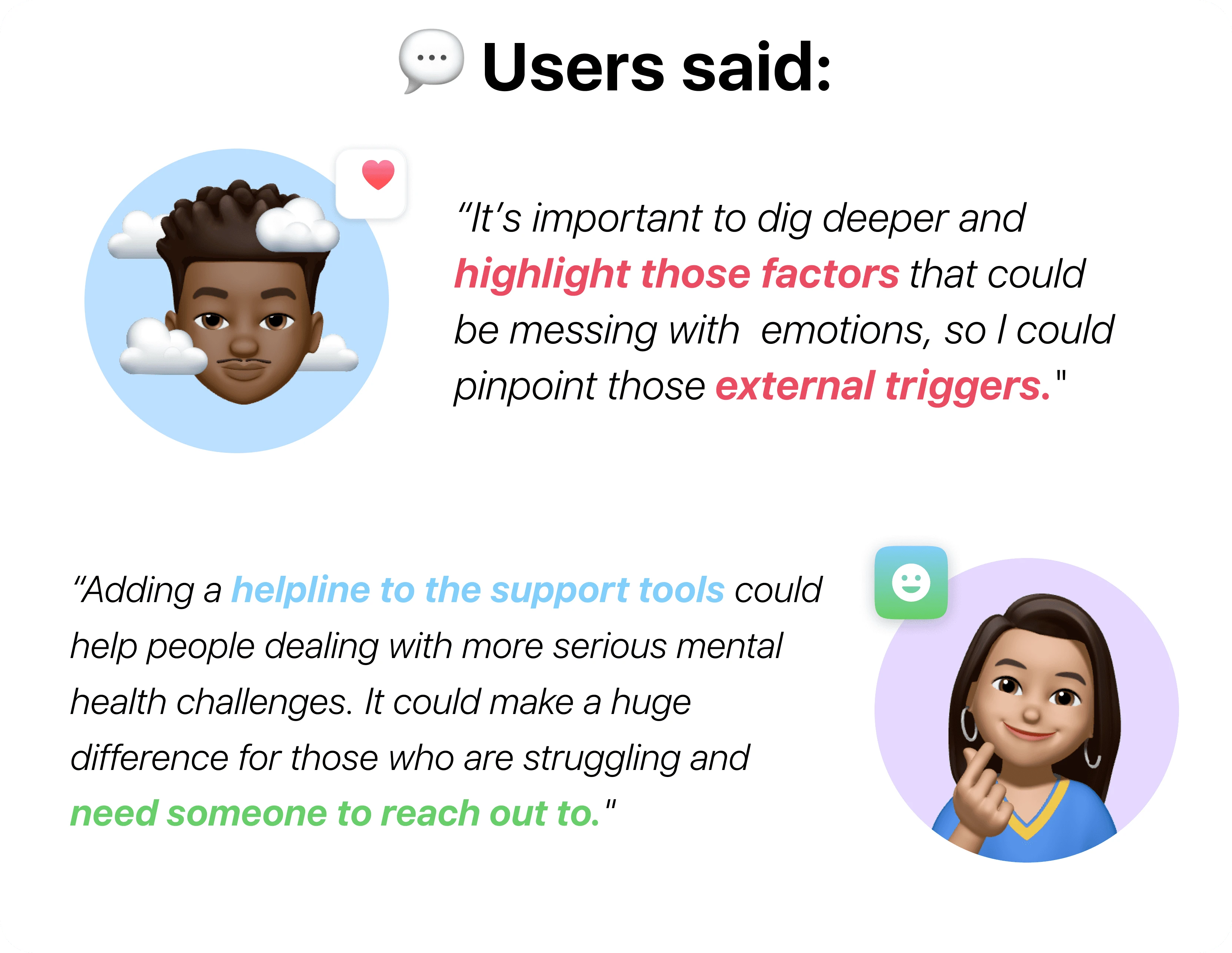
During extensive user testing involving 8 participants conducted via Zoom, it became clear that users effortlessly navigated through the prototype, thanks to their familiarity with Apple's UI. Valuable feedback from the testing resulted in key revisions to improve the overall design.
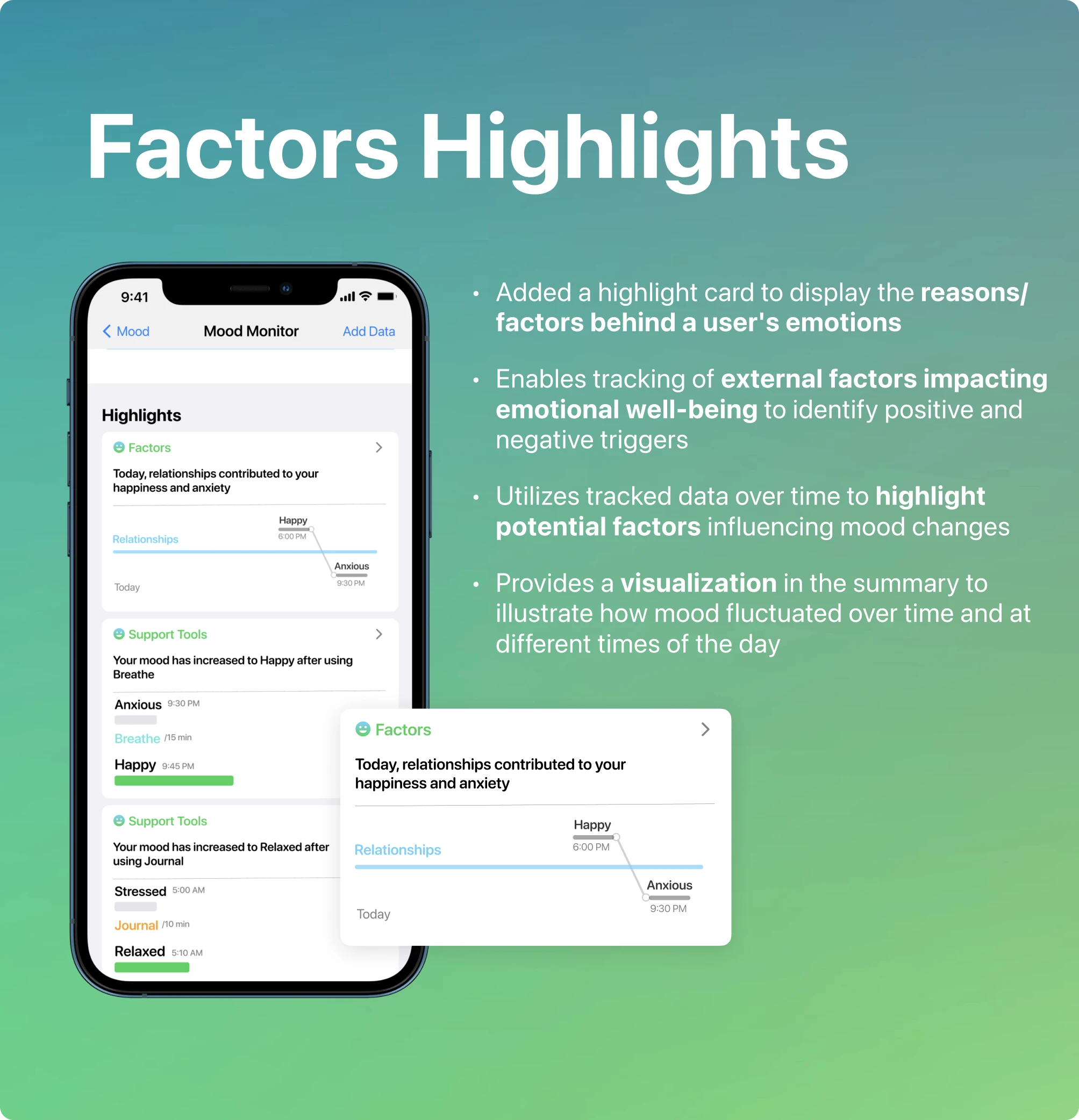
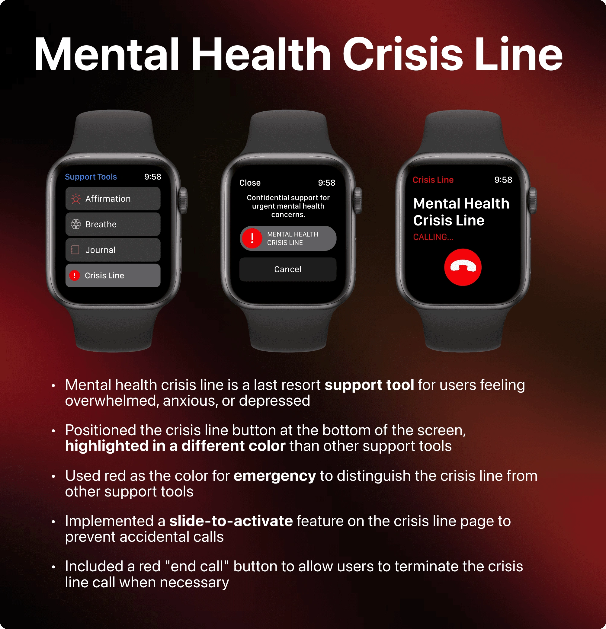
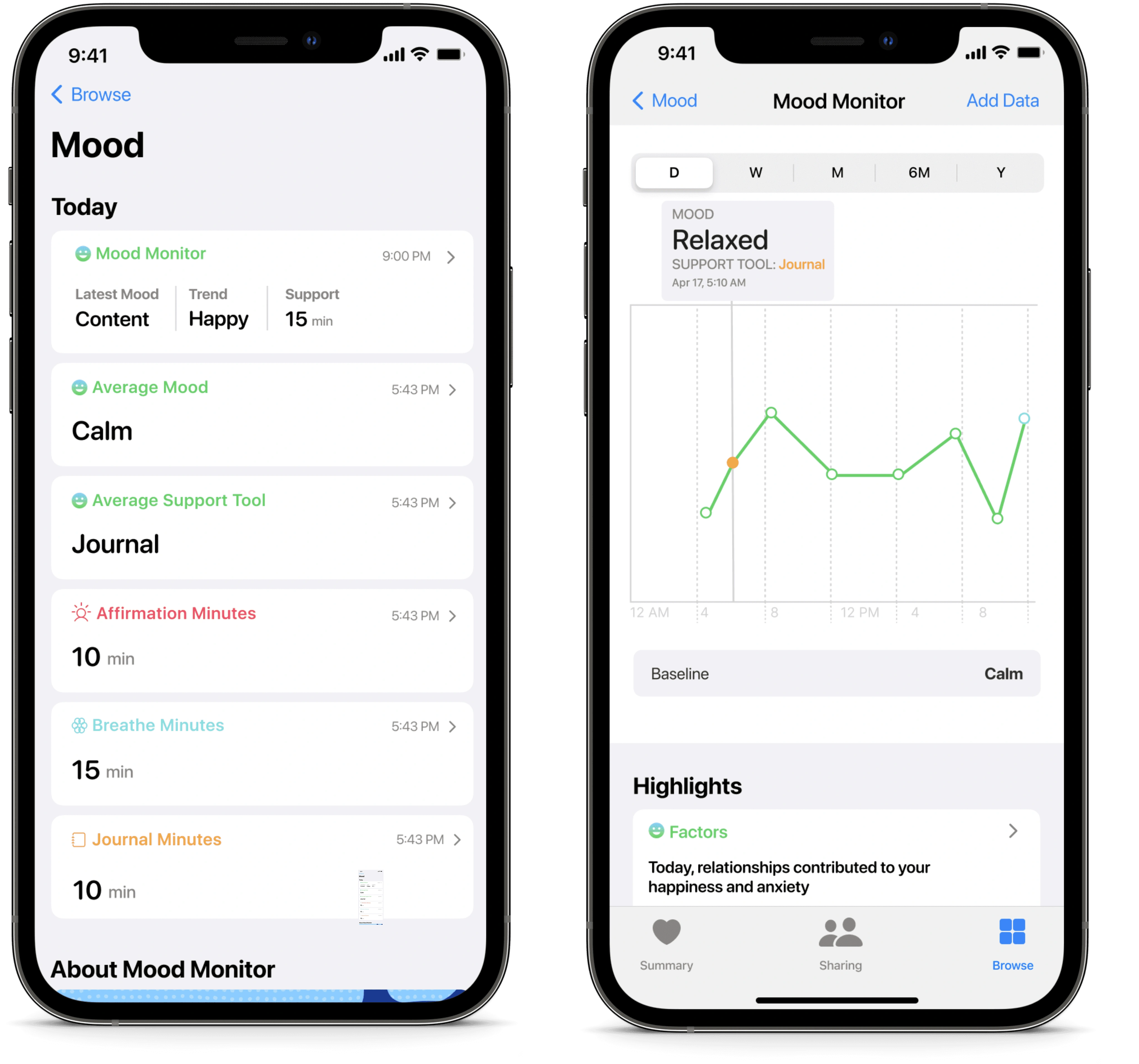
Final Screens
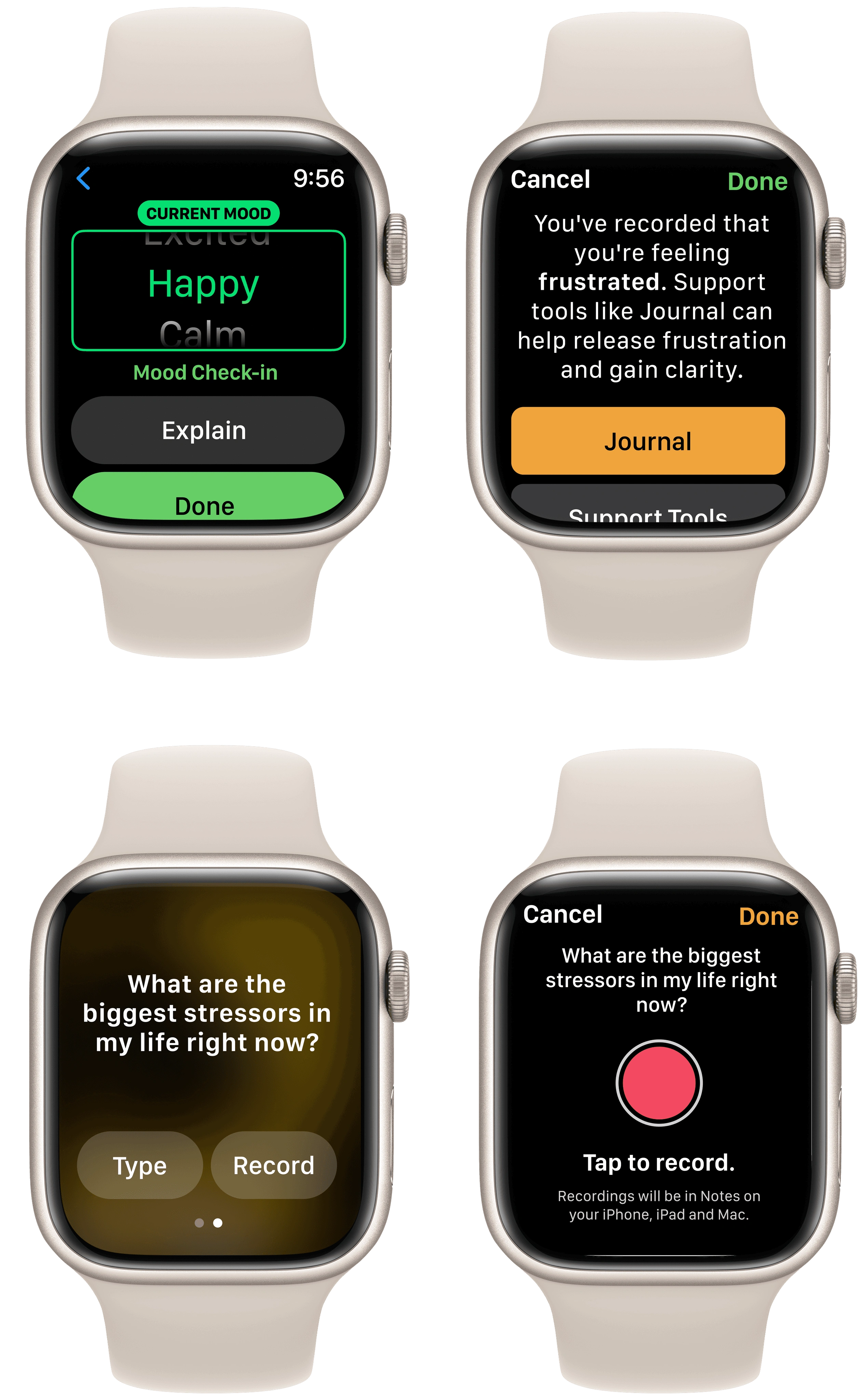
PROTOTYPE
Introducing Mood Monitor
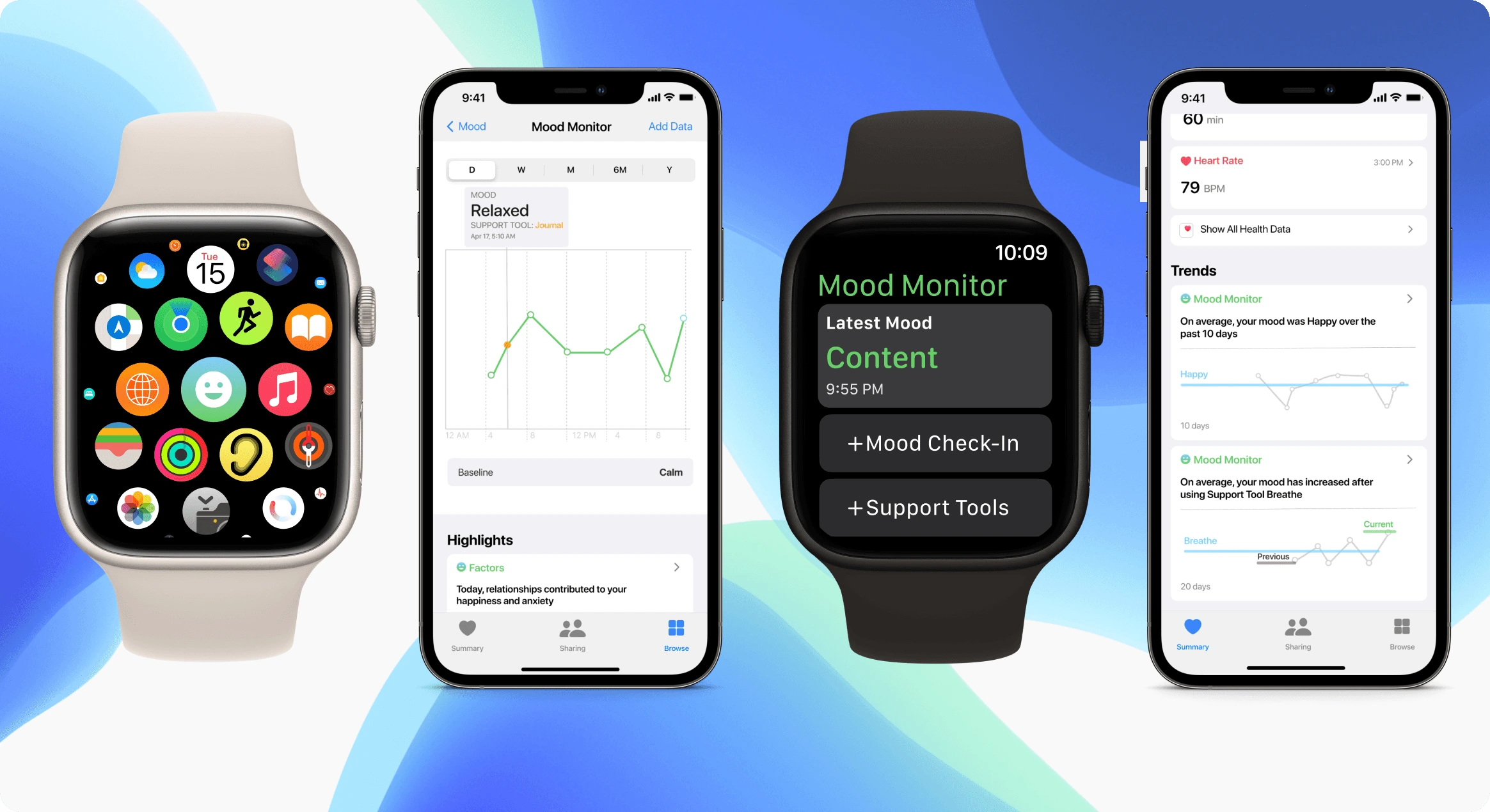
The final prototype was created using Figma. You can access the prototype for the Smartwatch and the Apple Health app by clicking on the links.
CONCLUSION
Lessons Learned and Key Takeaways ✨
Addressing sensitive topics and creating a comfortable environment for participants to share their experiences with mental health was a unique challenge, requiring a different approach compared to previous projects.
The project highlighted the importance of understanding customers' needs, with Apple releasing a similar feature shortly after. While it was disappointing, it validated the alignment between the project and user needs.
Designing for new screens, such as smartwatches, presented its own set of challenges. Despite the smaller size, the design process mirrored that of larger screens, requiring careful consideration of touch points and buttons. This experience proved valuable for future endeavors.
Like this project
Posted Mar 7, 2024
Created an Apple smartwatch feature that integrates seamlessly with the Apple Health app
Likes
0
Views
19

