

01: Intro
Currency gets its value from people, not just banks.
Vurt began as QPay, a mobile-first exchange app for people moving money across currencies. The first version proved the need, but it made a high-stakes transaction feel harder than it needed to be.
The redesign turned that early product into a P2P marketplace: customers could compare offers and choose who to trade with, while Vurt handled the coordination and risk underneath.
02: Metrics
The clearest signal came from onboarding.
Onboarding completion rose from 26% to 67.6% after the redesign—a 160% increase.
That was the clearest evidence that reducing the first-use burden was doing its job. The Beta’s early traction gave us a second signal: people were willing to return when the exchange felt useful and dependable.
03: My role
I owned the product direction from strategy to handoff.
As Head of Design and Product, I led the product strategy, UX, UI, and design system across the customer and exchanger experiences.
The team was one product manager, three developers, and three designers. I handled the core product direction and worked closely with stakeholders throughout. The other designers extended the system across mobile viewports and features such as KYC, bank-account listing, and exchanger ads.
04: Opportunity
Making rates easier to compare and exchanges safer to complete.
New startups were offering similar solutions, while traditional exchangers were still relying on WhatsApp, Telegram, and in-person conversations. The opportunity was bigger than a visual refresh: Vurt could give both sides a better way to do business.
For customers, that meant clearer choices and a faster path to payment. For exchangers, it meant bringing existing customers online without asking them to abandon the relationships they had already built.
05: The problem
The core problem was not just finding a good rate. It was trusting the exchange.
A customer needed confidence at the exact moment money left their account: what would they receive, who would receive their deposit, how long would it take, and what protection existed if the transaction failed?
The exchanger had their own problems. Manual transfers created opening hours, delays, and exposure to risk. The product had to make the exchange feel immediate for the customer while keeping the underlying transaction controlled.
06: Context
We used a small beta to test the marketplace model.
The Beta was the first time we put multiple exchangers in the same product. Three internal exchangers supplied rates at different times of day, but all appeared under the QPay name.
Over two weeks, 400+ people used the platform and 109 came back for another exchange. With almost no marketing, the experiment proved that customers were willing to compare offers, and that the marketplace model could support repeat behaviour.
07: Process
I treated the redesign as a product-system problem.
I started with the moments where confidence could break: account creation, choosing an offer, making payment, waiting for resolution, and managing an exchange as a provider.
We combined competitor analysis, Beta behaviour, stakeholder input, and our own experience as customers and exchangers. I then translated those findings into the design system, interaction patterns, and implementation decisions, working with the PM and developers throughout.
08.1: Solution - Marketplace
Putting the decision in one clear place.
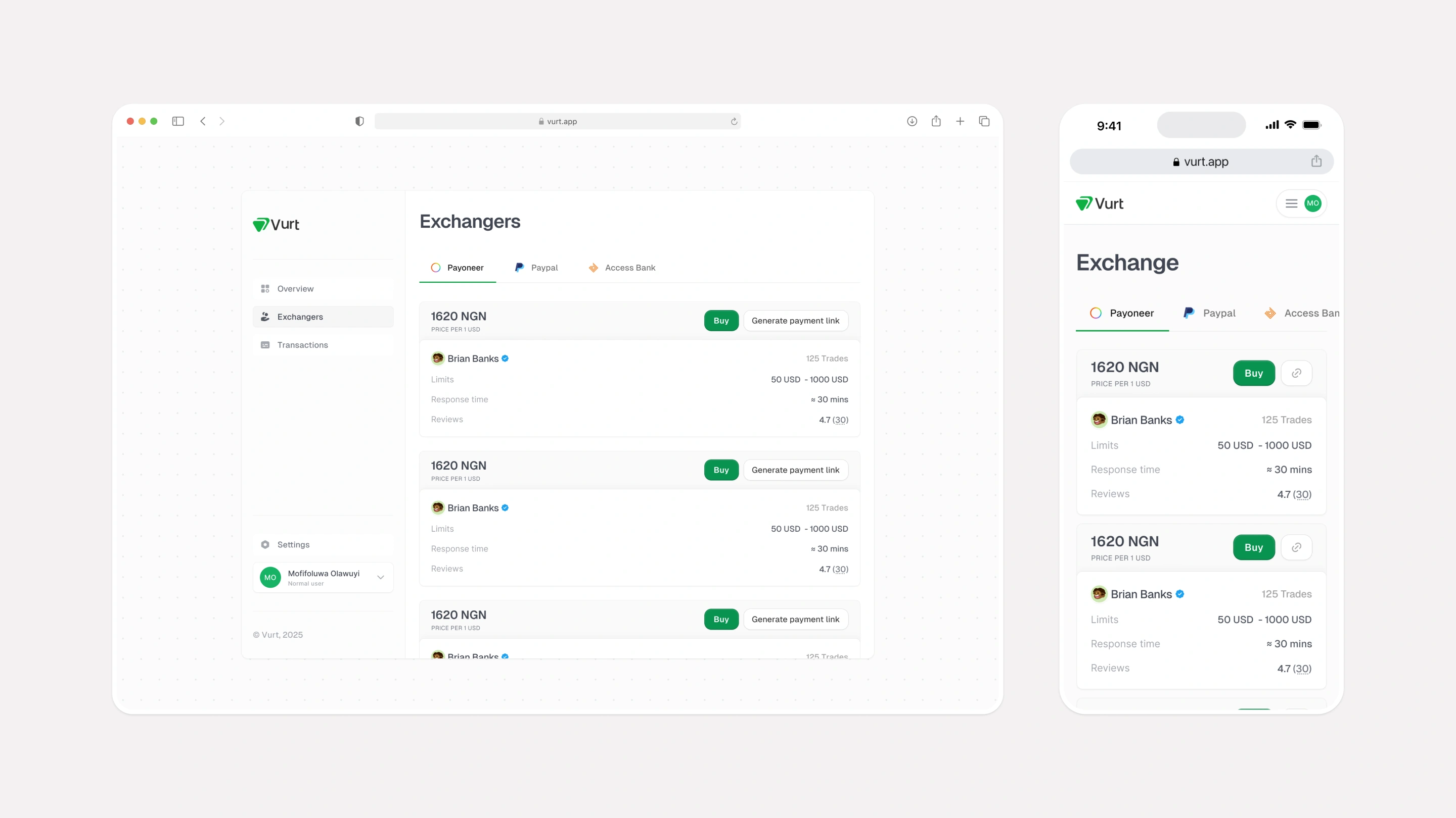
The exchanger card became the centre of the marketplace. It answers the questions a customer has before committing: what rate am I getting, who am I dealing with, and how will the exchange work?
Rate, limits, response time, trade count, reviews, and verification status sit in one hierarchy. Buy and Generate payment link stay close to the offer, so the action follows the decision instead of starting another search.
Payoneer, PayPal, and foreign/domiciliary accounts are separated into tabs. Desktop supports quick comparison across offers; mobile keeps the same information legible in a single scroll.
08.2: Solution - Onboarding
Letting people understand the exchange before asking for commitment.
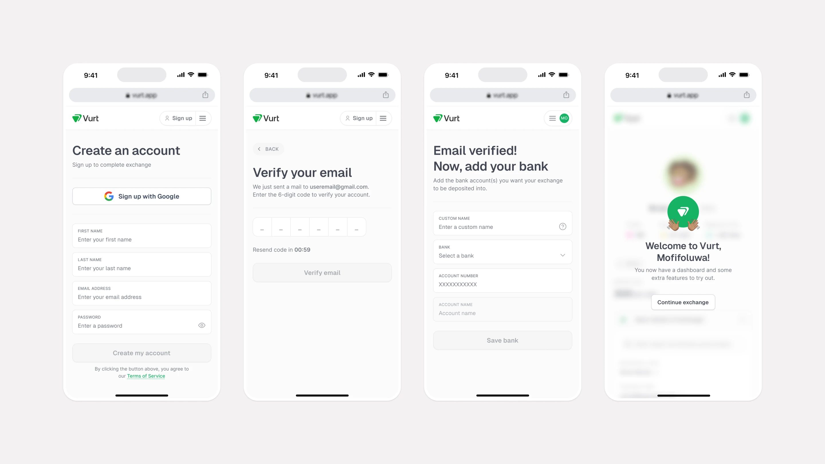
The original flow asked for an account before users had seen enough value. In the new flow, a customer can choose an exchanger, enter an amount, and see the expected return before signing up.
The registration flow is only triggered when payment details are needed. Exchange links take the same idea further: an exchanger can send an existing customer directly to their offer, turning a WhatsApp or Telegram conversation into a structured transaction.
08.3: Solution - Trust
Designing the system state, not just the happy path.
The key concern: what stops an exchanger from taking the money and disappearing?
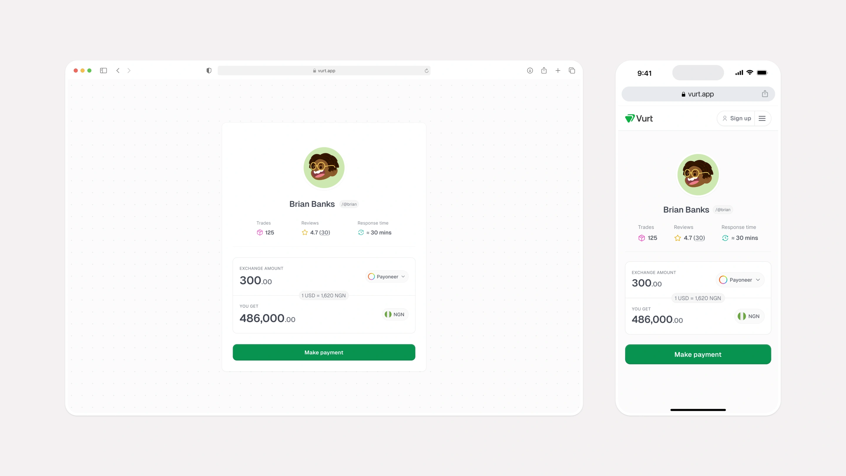
We implemented an internal escrow system. Customer funds move into an account provided through a partner bank, and the equivalent amount is held until the exchange is confirmed. If resolution fails, the exchanger cannot withdraw the funds from Vurt.
The interface makes that protection legible through verified profiles, trade history, response times, reviews, and a progress card that shows where the exchange is. The system does the heavy lifting; the UI gives the customer enough evidence to keep moving.
08.4: Solution - Platform
Moving to web before adding more surface area.
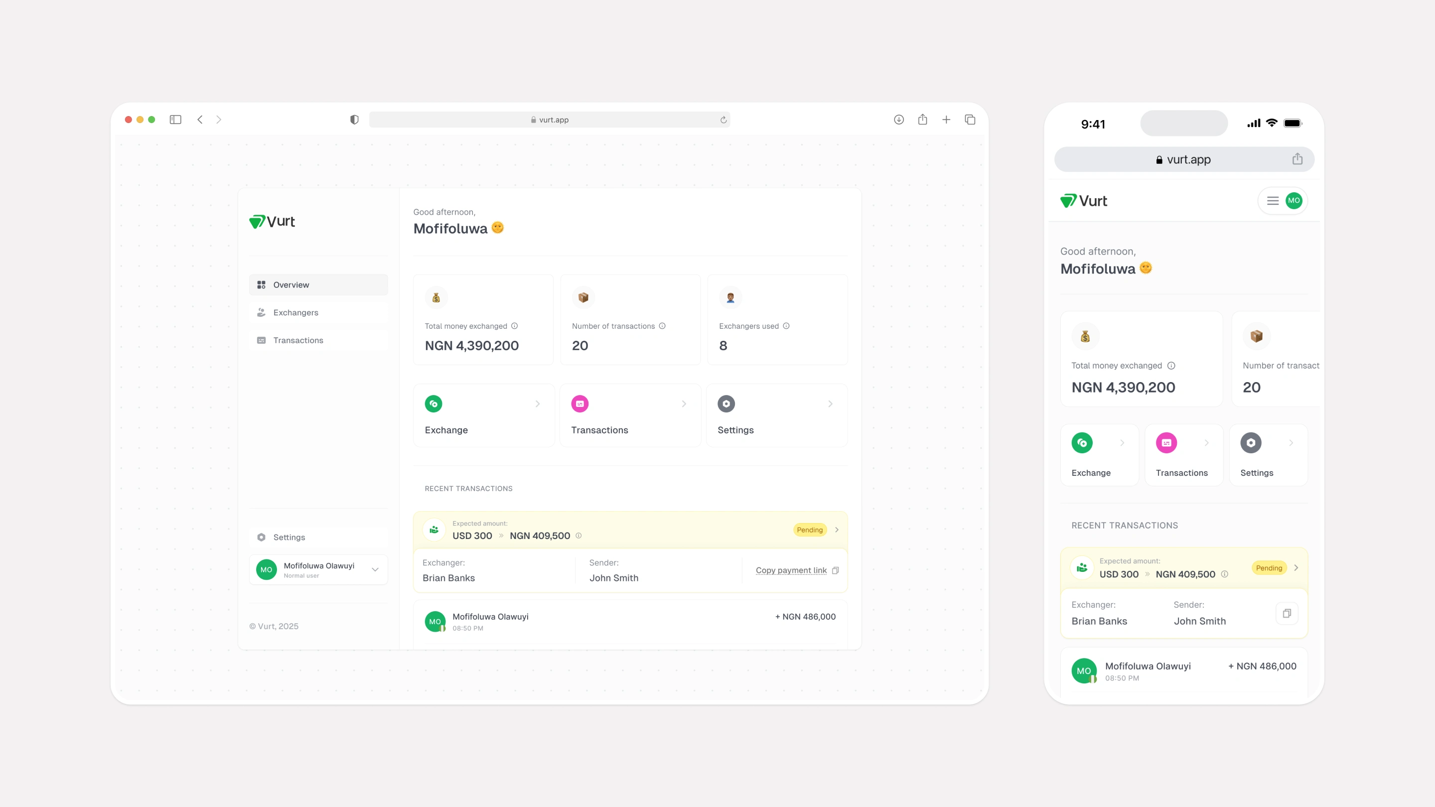
We decided to transition to a web platform based on feedback from the beta test and the newly onboarded exchangers. The first interaction needed to be easy to share and easy to access. Asking someone to download an app before their first exchange was unnecessary friction.
The dashboard gives customers a home for their money exchanged, transactions, settings, and recent activity. It also gives exchangers room to manage KYC, bank accounts, offers, and payment links. A customer can pay an invoice link without installing the app just to complete one payment.
08.5: Solution - Invoicing links
Giving freelancers a simple way to get paid.
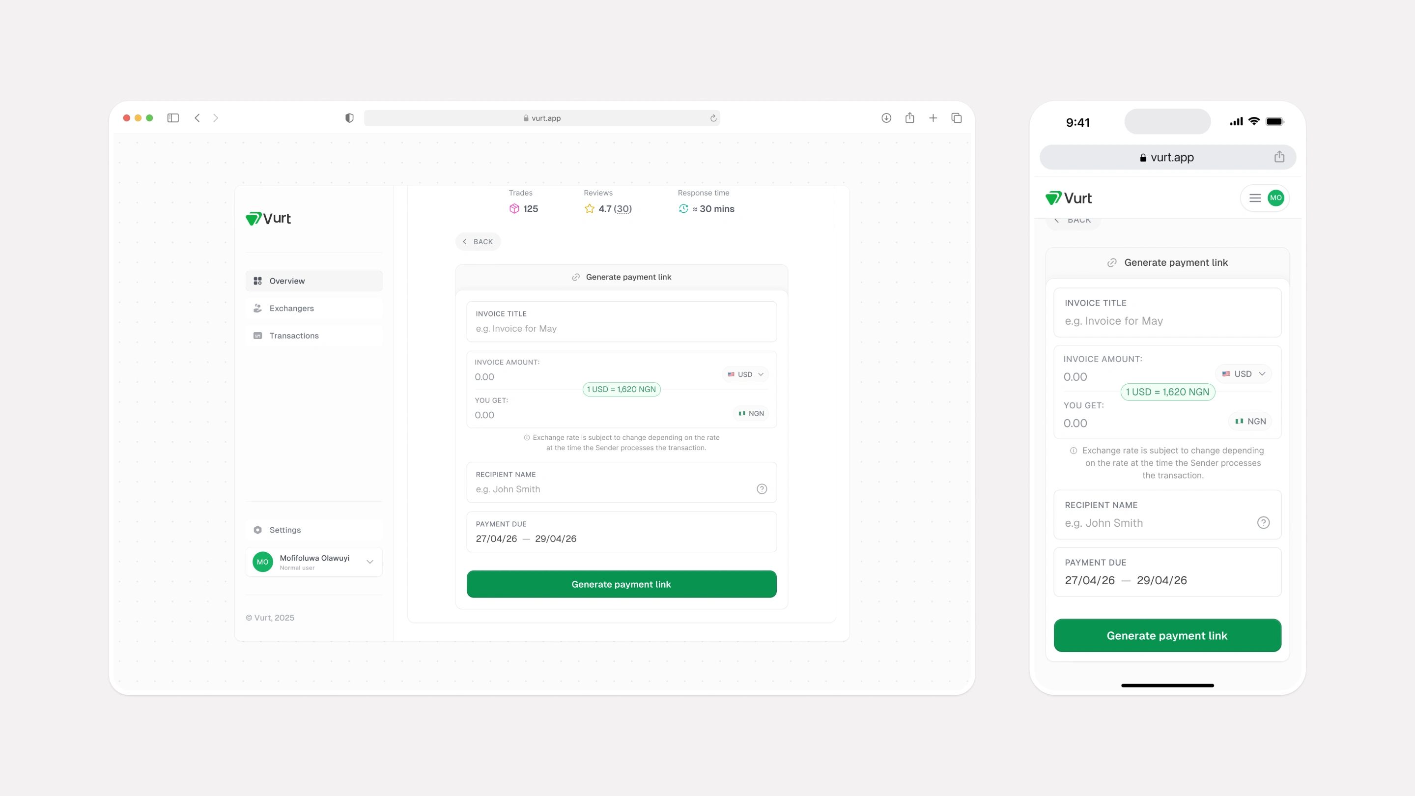
Several test customers asked for a way to collect payments from their own clients. They did not want to explain exchange details every time or ask someone to download an app for a single payment.
Invoice links let a freelancer create a payment request with the information a proper invoice needs: the amount, currency, exchange rate, payment details, and due date. Vurt generates a shareable link that the client can open, review, and pay from the web.
The payment first goes directly into the exchanger’s account. Vurt then reconciles the payment through the exchange flow, converts the value, and settles the exchanged amount into the freelancer’s receiving account. This keeps the client’s payment simple while the platform handles the currency conversion and settlement underneath.
09: Impact
The redesign improved the first step.
Onboarding completion rose from 26% to 67.6%, a 160% increase.
The Beta also gave us meaningful early traction: 400+ users and 109 repeat users in two weeks with almost no marketing. The current product is preparing for launch with a stronger foundation for comparison, trust, and reliable resolution.
10: Feedback from users
The strongest feedback was behavioural.
The most useful feedback was not a comment. It was what people did next. Users returned because they could find a rate that worked for them without giving up the familiarity of their exchanger.
That behaviour reinforced the product direction: customers wanted control over the price, but they also needed the experience to feel safe, visible, and predictable from payment to resolution. The invoice-link request showed the same pattern: customers were telling us where the platform could remove work beyond the core exchange.
11: Lessons learnt
Systems not just screens
Vurt taught me to design the operational model and the interface as one experience—and to keep listening for the adjacent problems that make the core product more useful.
Trust is a product behaviour, not a visual layer.
In a two-sided marketplace, every customer decision affects another user.
Progressive disclosure can remove friction without hiding important information.
Operational constraints should shape the experience from the start.
Repeat behaviour is stronger evidence than positive feedback alone.
A web-first product can validate demand before adding the cost of a mobile app.
The best adjacent features often come directly from what customers are already trying to do.
Lessons learnt



0 likes · 0 views · Oct 30, 2026
I led Vurt’s redesign from a rough mobile exchange app into a responsive P2P marketplace—raising onboarding completion from 26% to 67.6%.
