Give Me Yesterday
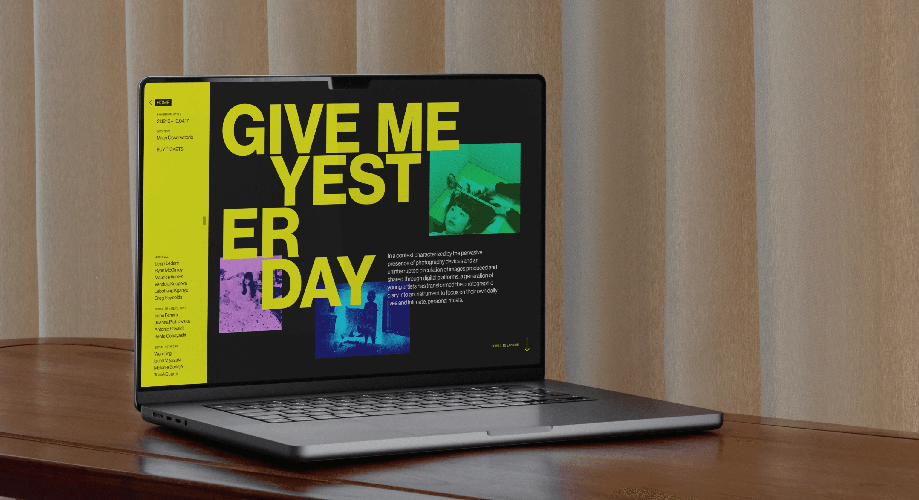
A pre-exhibition microsite, showcasing artworks from 14 artists for Fondazione Prada’s “Give Me Yesterday” exhibition.
CONTRIBUTION
Art Direction, UI Designer , Researcher, Decision Maker
CREDITS
Jasper Precilla, Sam Newaz, Karishma Sen, Claret Egwim-Nwagbara
Project Overview
Fondazione Prada, based in Milan, Italy, is a contemporary art and culture center. It strives to cultivate ideas and the way it can transform into cultural products such as literature, cinema, music, philosophy, art and science. As the visual design lead for a team of five, I spearheaded a significant five-week multimedia final project. Primarily developed in Figma and prototyped using After Effects and ProtoPie, the project entailed the creation of a microsite for a pre-exhibition within Fondazione Prada’s exhibition space. This involved crafting new branding, three physical assets, and incorporating unique style elements inspired by researched designer influences.
Disclaimer: This particular client was a mock client and was done for a university level design course.
Designer Precedent: Dan Friedman
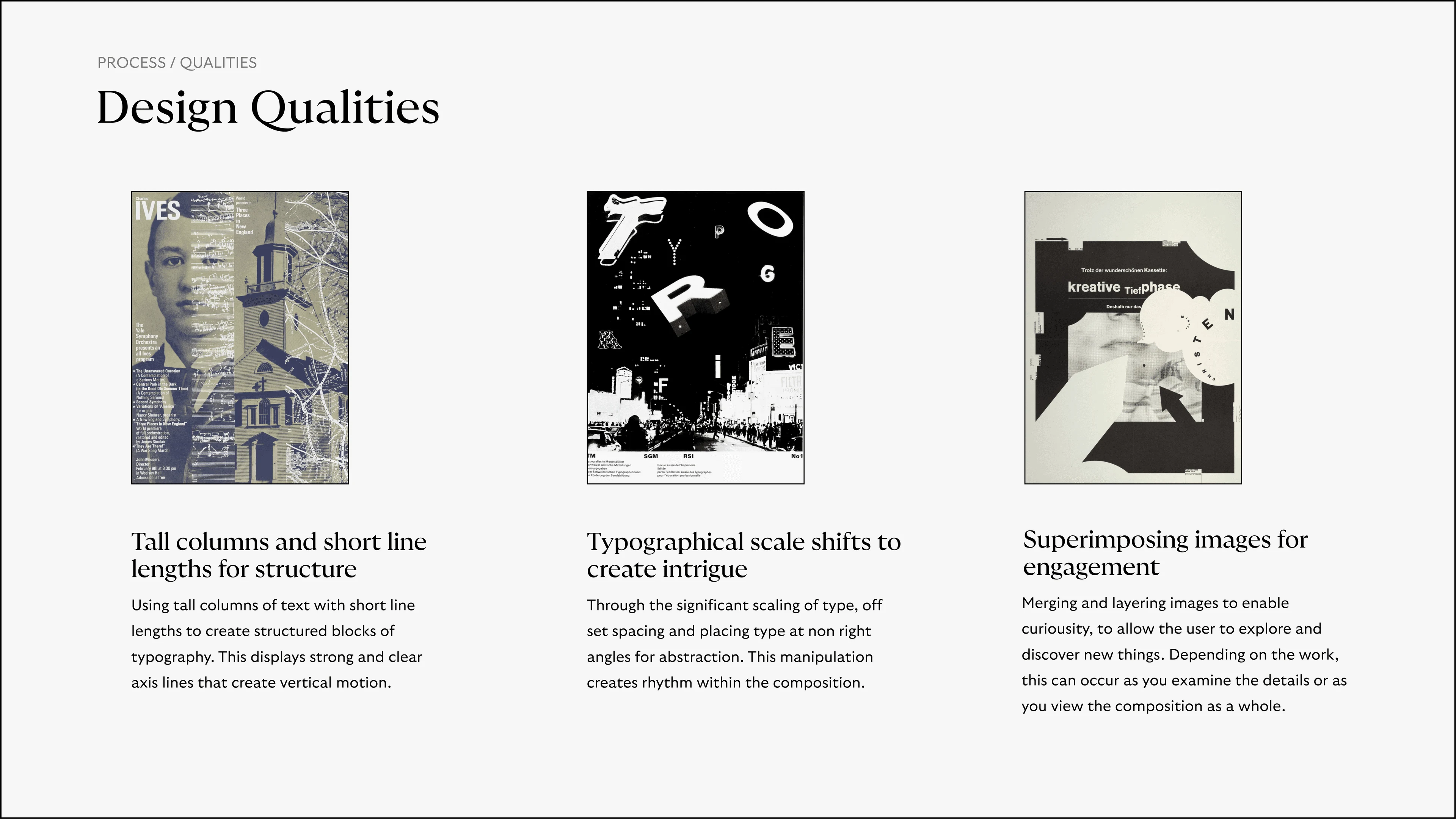
The first week of the project involved a deep dive into the works of American graphic designer, Dan Friedman, understanding why he designed the way he did, what principle could be seen within his work, and what made him significant. Analyzing and collecting as much of his work as possible, as well as reading about the impact he had on the design world as a Radical Modernist.
Physical Assets: First Iteration
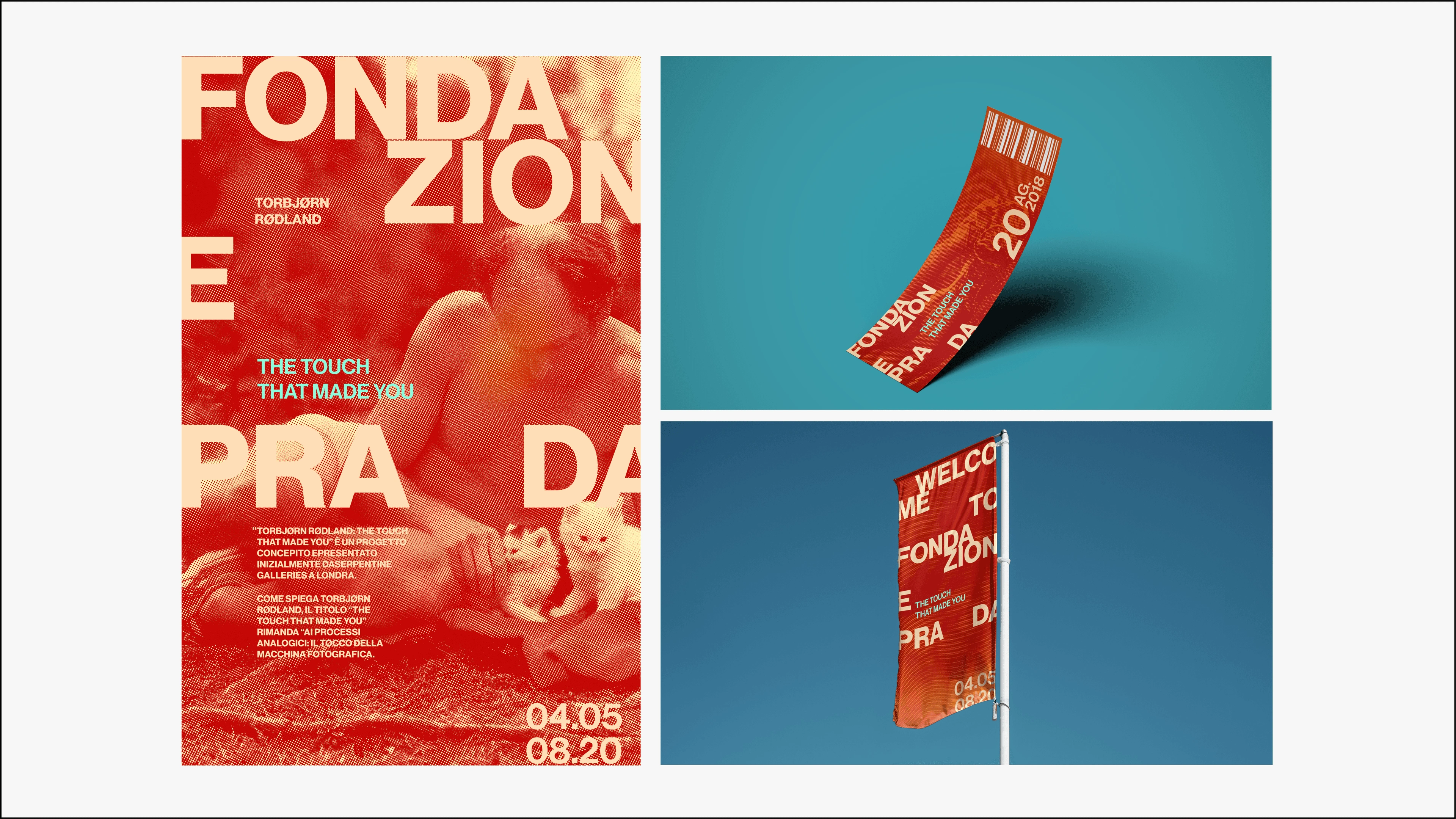
During the second week the main objective was to conduct research on a newly assigned mock client and design three variations of a poster, a lamp post banner, and a ticket for one of Fondazione Prada’s exhibitions of our choice. My primary focus was on designing the poster, which significantly influenced the style of the other assets. Balancing the necessary research and design work within the span of a week was a substantial challenge. After a few days of effort and iteration, we successfully created a poster that worked. However, the other assets were not as successful in achieving the desired impact.
Physical Assets: Second Iteration
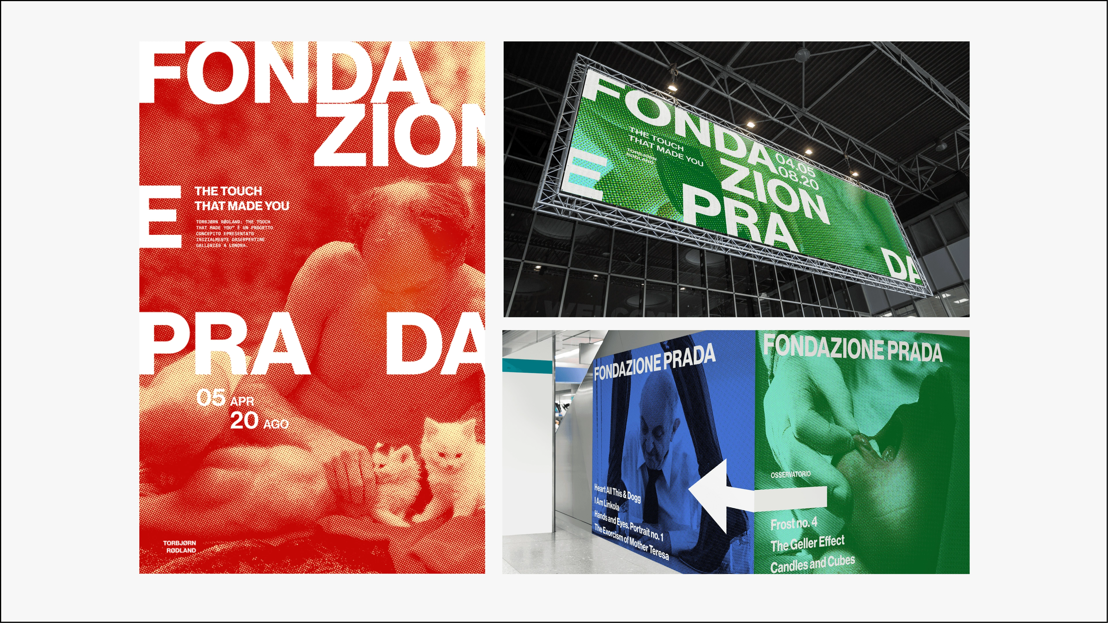
Following the feedback received from the second week, our focus this week centered on converging and iterating to elevate our design. I conceptualized an extended banner and directional asset that aligns more closely with the artistic direction established by the poster. Our stylistic approach drew considerable influence from Radical Swiss Modernism, embracing elements such as asymmetry, restrained color palettes, and purposefully contrasting imagery. The implementation of Friedman's Typographical Scale adjustments, Tall Columns, and Superimposed images played a crucial role in achieving cohesion in the project.
Microsite: First Iteration
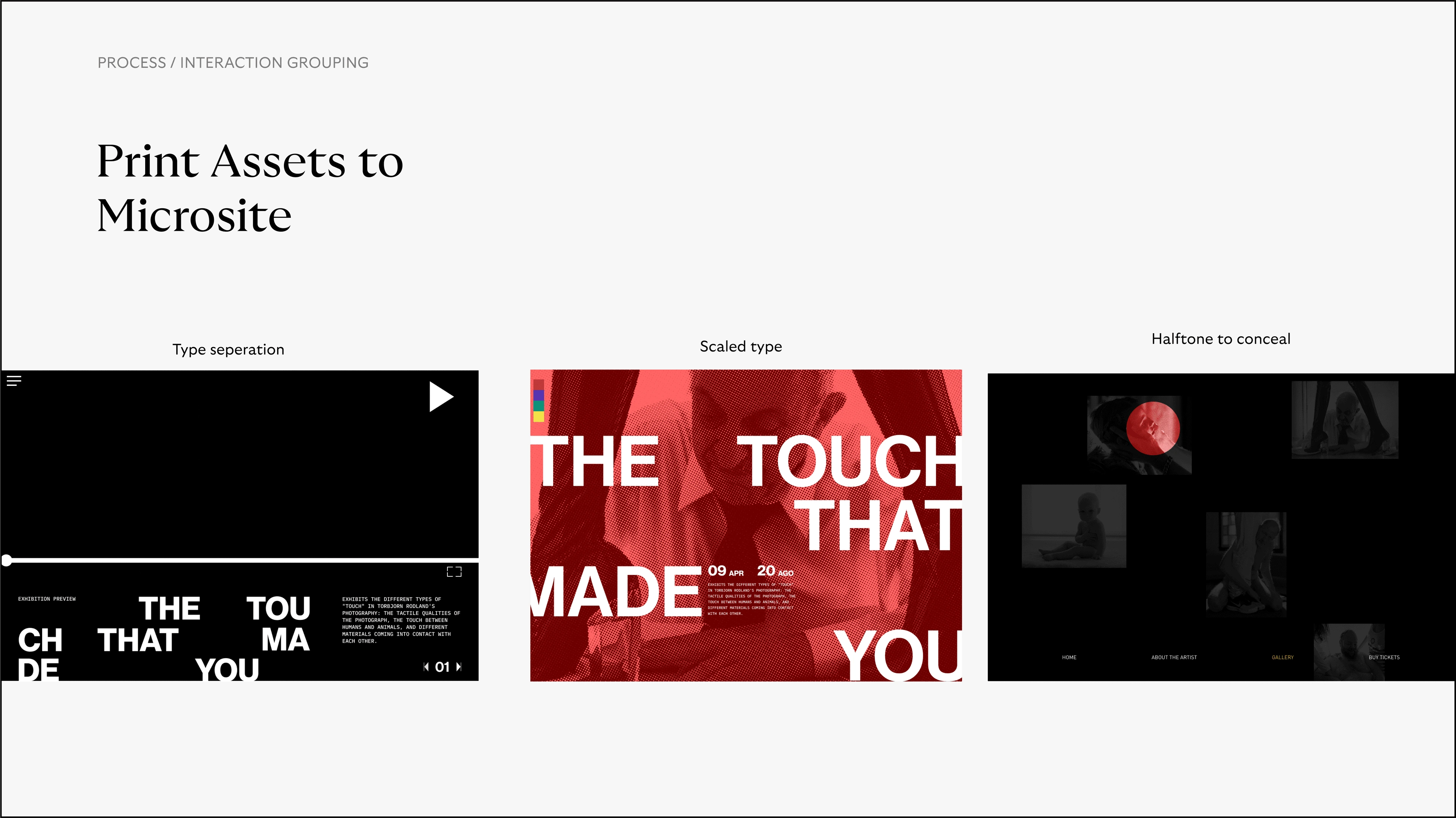
When creating the initial version of our microsite, the team conducted a reassessment of our posters and assets to pinpoint the essential qualities defining our art direction. However, during the development of our microsite, it became apparent that we were experimenting with interaction design independently of our visual design. This diverge made it challenging to establish a sense of unity and articulate clear rationales for our design decisions. To tackle this issue, we sought additional precedents and contemplated how our interactions could harmonize with the qualities defining our art direction.
Microsite: Landing
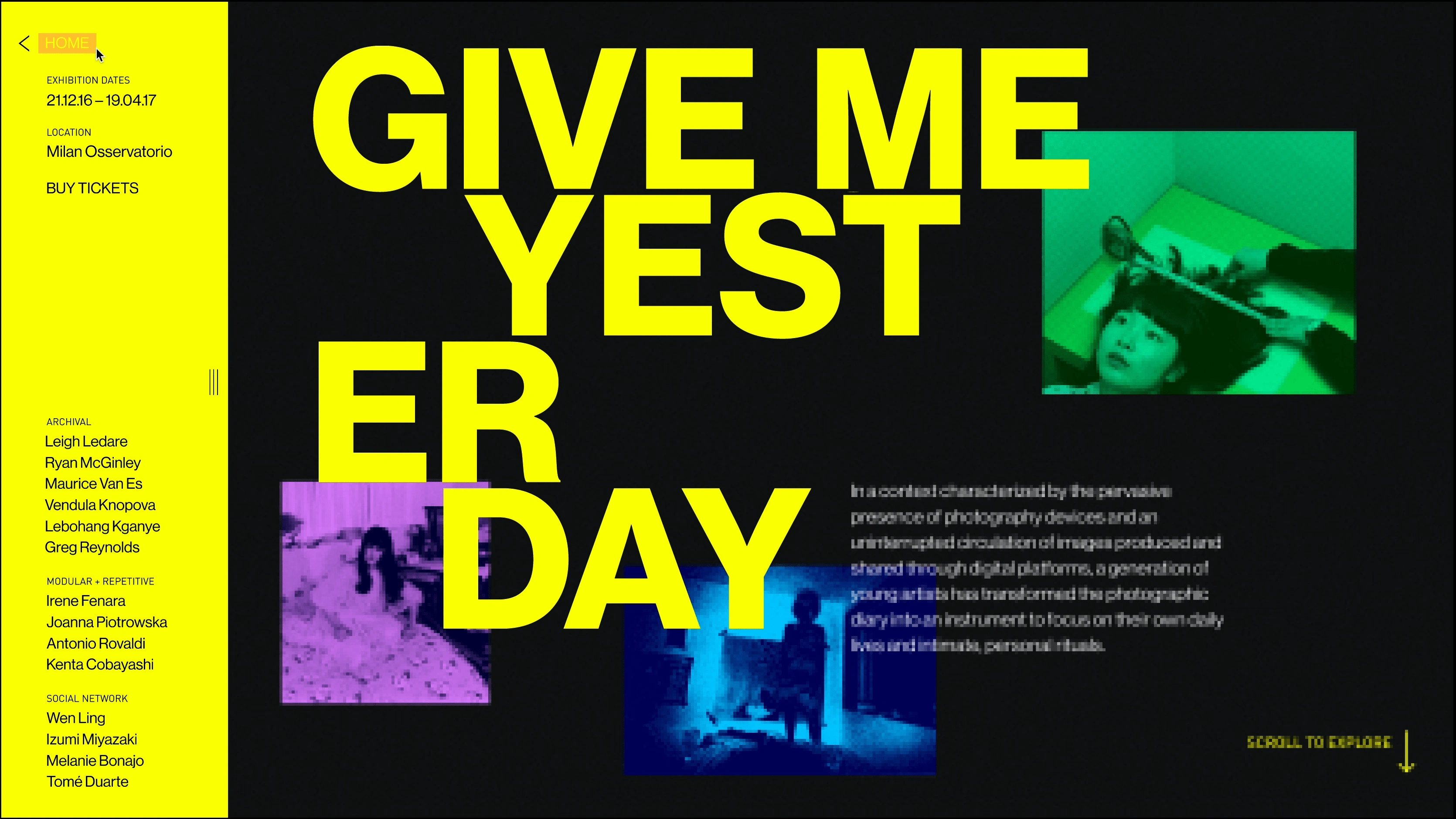
Greeting the visitor with floating images from the exhibition, each artist section and the associated content are previewed through a colour representation. The transition from artist to artist can be seamlessly achieved using a vertical scroll or by clicking through the navigation. Hovering over the “About the Artist” section reveals a description of the work, providing users with the option to read more before entering the gallery. This design ensures the image remains the primary focus while still catering to users who prefer to access additional information.
Microsite: Call to Action
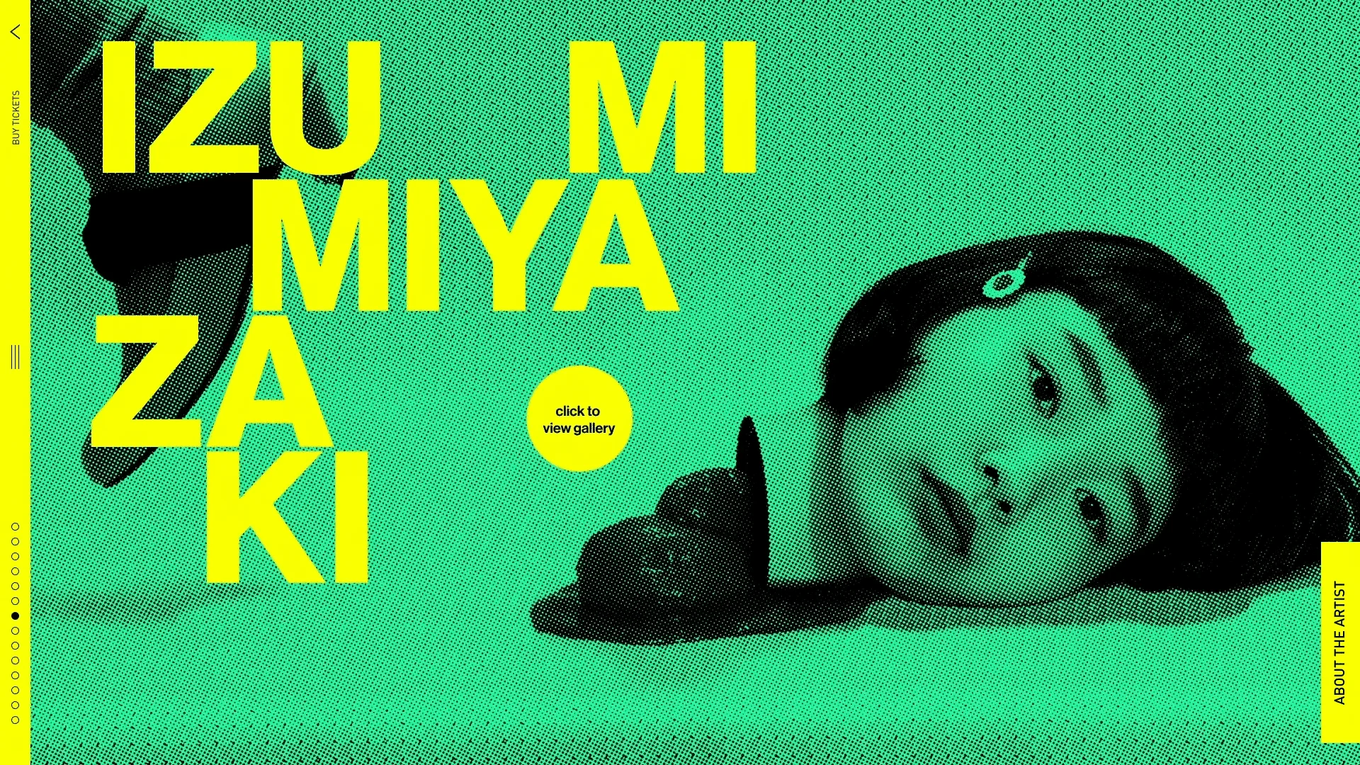
Each artist has a preview displayed at a large scale. The circle cursor appears as the user is moving across the artist landing page screen, when clicked upon it transitions the visitor to the artist gallery. The intention was to maintain a consistent circle cursor throughout the entire site, but, unfortunately, we were only able to implement it for this prototype due to the limited amount of time.
Microsite: Hover to View an Image in Full
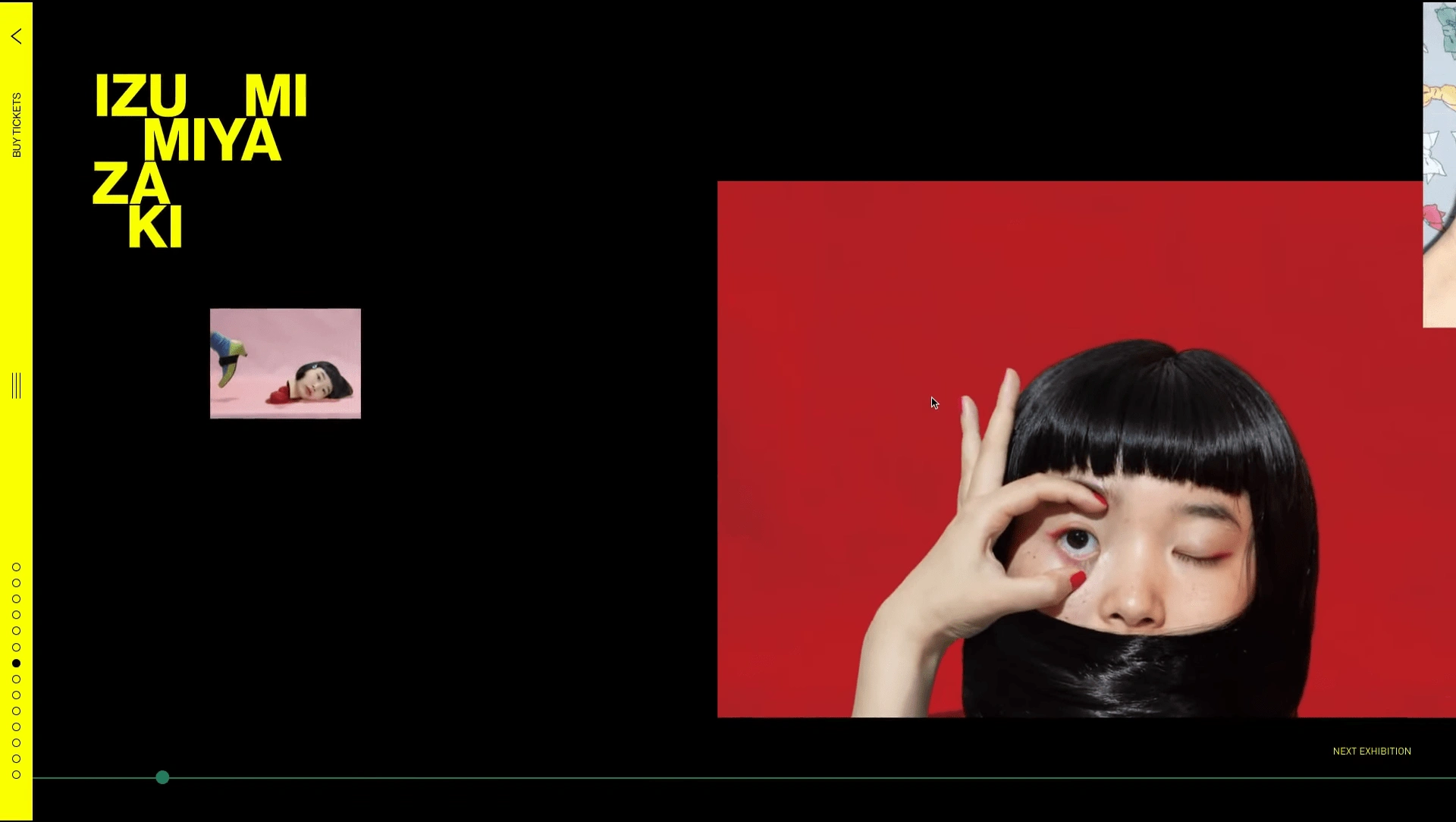
By hovering over an image, the visitor is able to expand its size to view the image as a whole. To better implement the concept of large scale shifts and figure and ground, the background will shrink while the content is pushed to the side as the image expands.
Lessons Learned
Crafting this visual identity was a journey of exploration that not only honed my skills in visual and digital design but also expanded my overall perspective on design. It made me recognize that design isn't confined to the present; it draws inspiration from the past and shapes the future. The prospect of inspiring others through our creations adds an intriguing dimension to this experience.
Like this project
Posted Jan 28, 2023
A pre-exhibition microsite that provides a curated preview of artworks by 14 international artists, featured in Fondazione Prada’s 'Give Me Yesterday' exhibitio
