UX/UI Project - Redesigning Logit's Website
Bruno Romero Prado
UX/UI project: Redesigning Logit's website
Redesign of Logit's website, a 35-year-old logistics and transportation consulting company; the project included the modernization of the company's visual identity.
Problem
Logit, a 35-year-old logistics and transportation consulting company, has a website that presents significant challenges that compromise its functionality and the user experience, including outdated design, confusing navigation, lack of responsiveness for mobile devices and poor usability. In addition, the unattractive communication of the services, as well as performance problems, make it difficult to deliver an efficient experience.
Solution
Complete redesign of the website, which included updating the visual identity to convey a more contemporary, professional image in line with the company's values, and above all a complete restructuring of the user experience. The new design prioritizes usability, with intuitive navigation, responsive layouts for all devices, and clear organization of information, ensuring that the company's services and projects are presented in an attractive and understandable way.
The project will also include improvements in technical performance and accessibility, creating a functional, inclusive and strategic website to strengthen Logit Engenheiros' digital presence.
Bruno Prado: Lead UX Designer and Graphic Designer in a team of 3 professionals.
Natália Pincelli: UX Designer and Graphic Designer in a team of 3 professionals.
Scope
Ongoing project starting in April 2024.
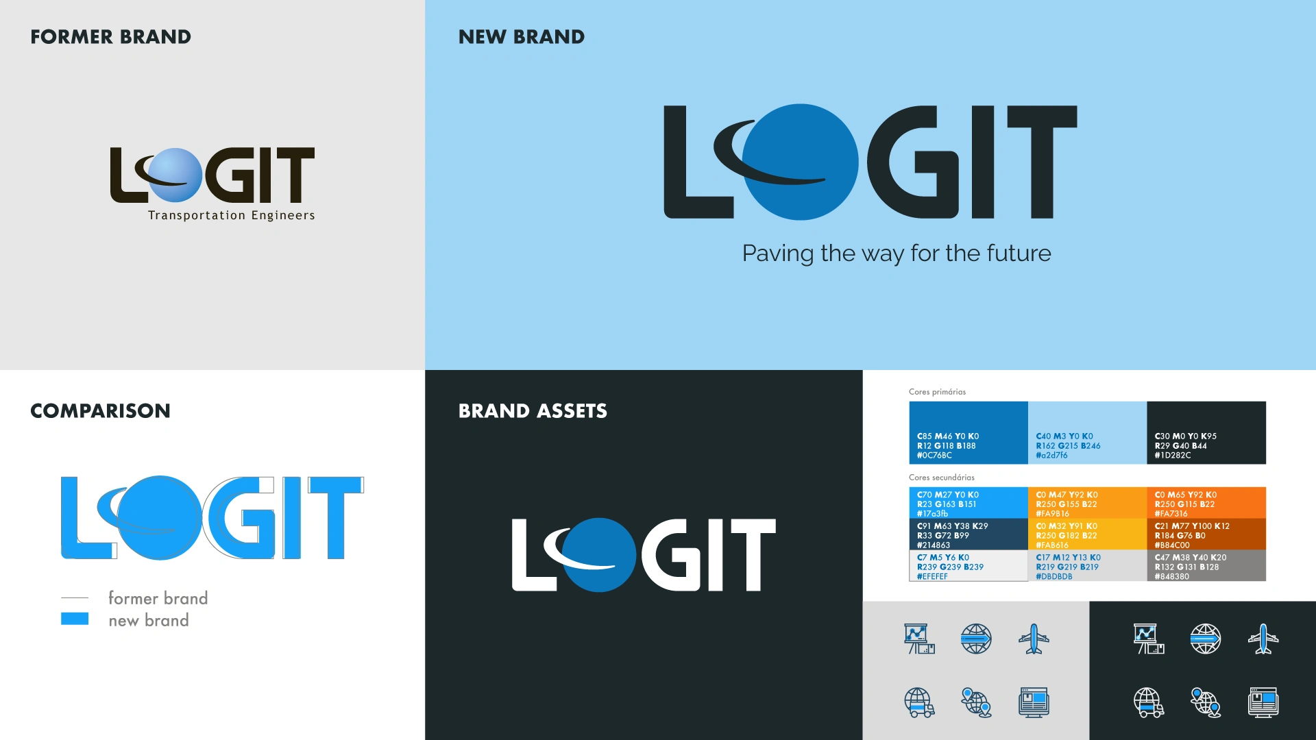
Modernization of the company's logo and visual identity
Logit's current visual identity uses graphic elements and typography that do not reflect a contemporary aesthetic, nor does it convey innovation or technological sophistication, which are essential values for engineering companies. The color palette and visual styles seem generic and lack a clear connection with both the brand identity and the message of trust and professionalism that the company wishes to convey.
With this context in mind and based on studies of shapes and colors, the logo was modernized so that it would bring a more innovative and fresh look to the company, and the visual identity was rebuilt, thus gaining an air of technology and professionalism, without leaving behind the history already lived by Logit.
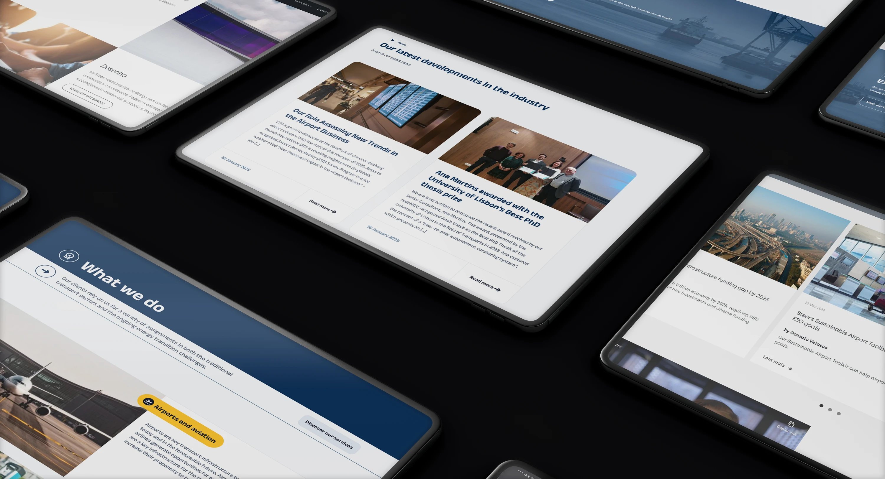
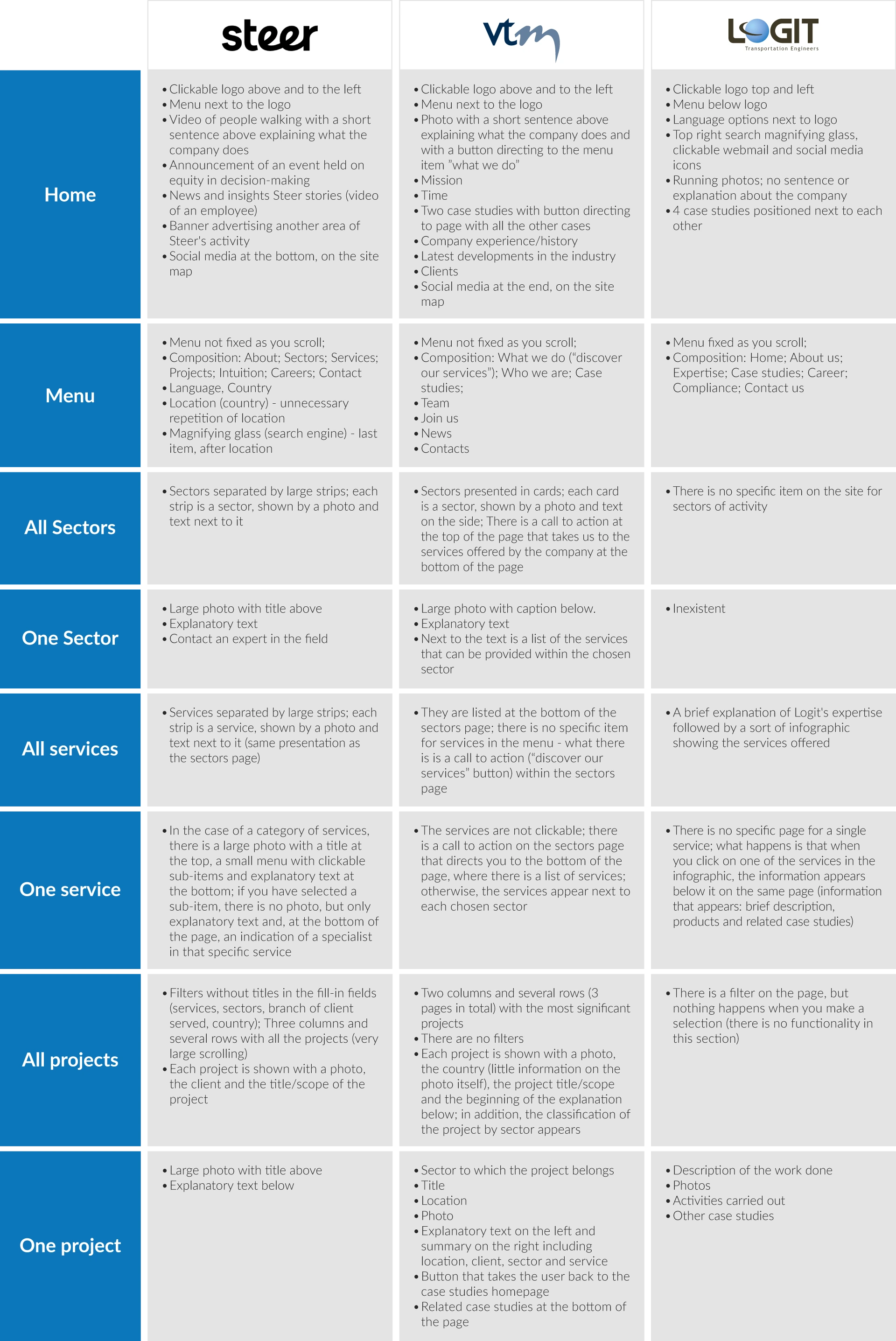
Benchmarking
To begin studying Logit's website, I conducted thorough research on various engineering websites to explore how they function across different platforms and to identify key features from a usability perspective. I visited a number of sites, and below, in a comparative table with Logit itself, are the ones I thought were most in line with my vision for the project:
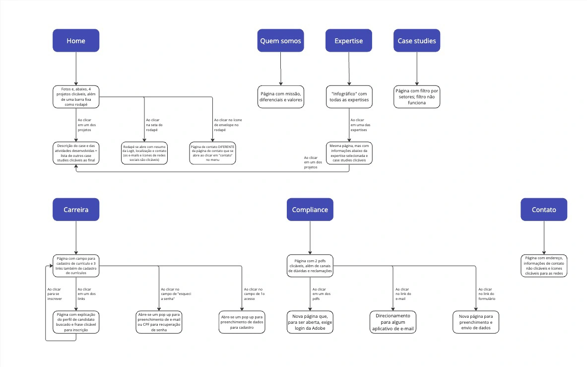
Logit's former flowchart
Insights after Benchmarking
Logit's current website has a number of critical points that negatively impact the user experience and brand communication. The main problems identified are:
Unintuitive navigation:
The structure of the site is confusing, making it difficult to locate important information such as services, projects and contact details.
Lack of responsiveness:
The site is not properly adapted for mobile devices, compromising the experience of users who access it via smartphones or tablets.
Inefficient presentation of services:
Information about services and projects is not presented in a clear, visually appealing or strategic way, jeopardizing the communication of the company's values.
Insufficient technical performance:
Problems with slow loading and lack of optimization impact usability and can drive visitors away.
Outdated design:
The visual interface is outdated and does not reflect a modern or technological image, essential characteristics for an engineering company.
Feasible proposals
More organized and intuitive menu:
Logit's website could benefit from a simpler and better structured main menu, with clear categories such as “Services”, “About Us”, “Projets” and “Contact”, so that users can quickly find what they are looking for.
The implementation of submenus to organize additional information could further improve navigation.
Improving navigation and usability:
Adopting a more fluid and intuitive navigation, with quick links and well-delimited sections, as observed on the sites analyzed during benchmarking research, can reduce the complexity of finding important content.
Ensuring that the site is fully responsive and adaptable to mobile devices is fundamental to guaranteeing a good experience on different platforms.
Modern and clean design:
The visual identity of Logit's website can be modernized by adopting a cleaner and more contemporary design, similar to Steer's, with a more up-to-date color palette and legible typography, to convey a more professional and technological image.
Visible call-to-action buttons (CTAs):
Insert call-to-action buttons prominently, in contrasting colors and appropriate sizes, to facilitate user interaction with the site.
The location of the buttons should be strategic, such as in the service and sector sections, ensuring easy access to the main actions.
Clear and attractive information:
The presentation of services and projects should be more organized and visually appealing, using layouts that highlight Logit's differentials more clearly and strategically, as seen with VTM Global and Steer.
Performance and speed:
Optimizing page load times and improving technical performance must be a priority, ensuring faster, uninterrupted browsing and avoiding the loss of visitors.
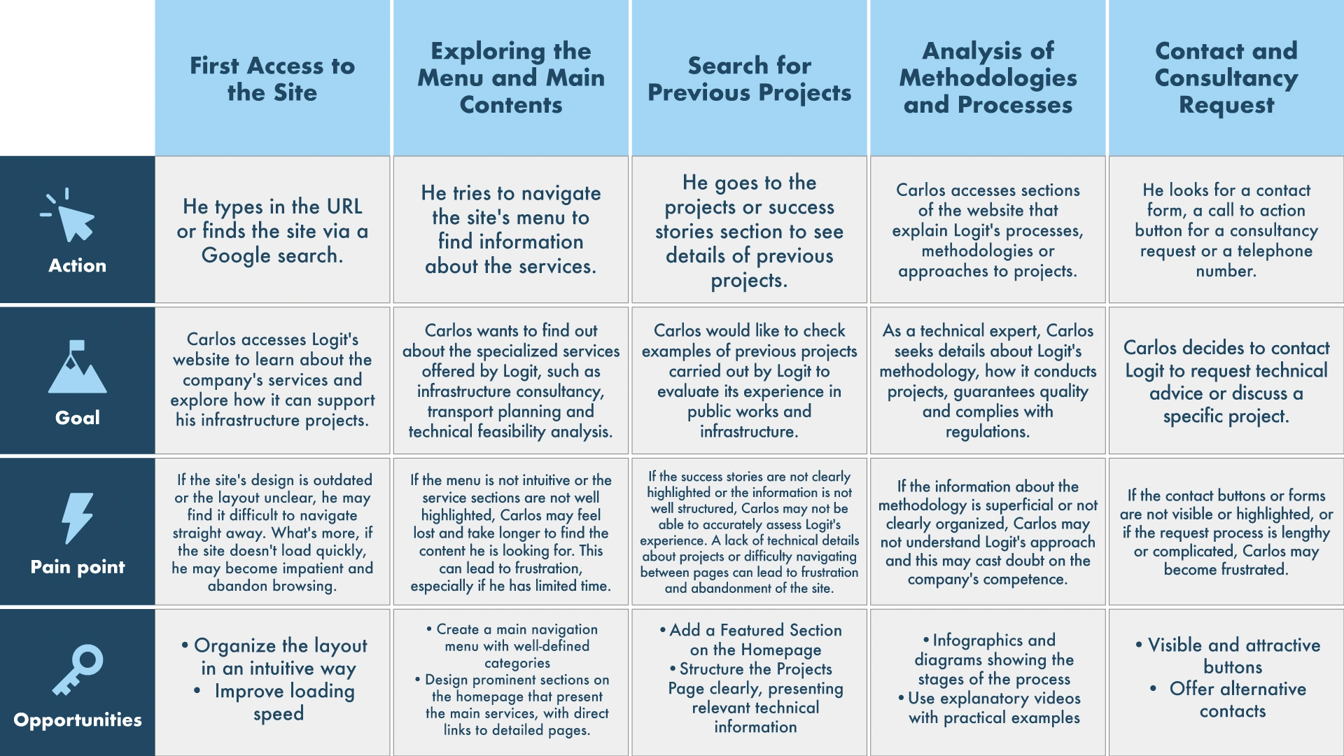
PERSONA AND USER JOURNEY
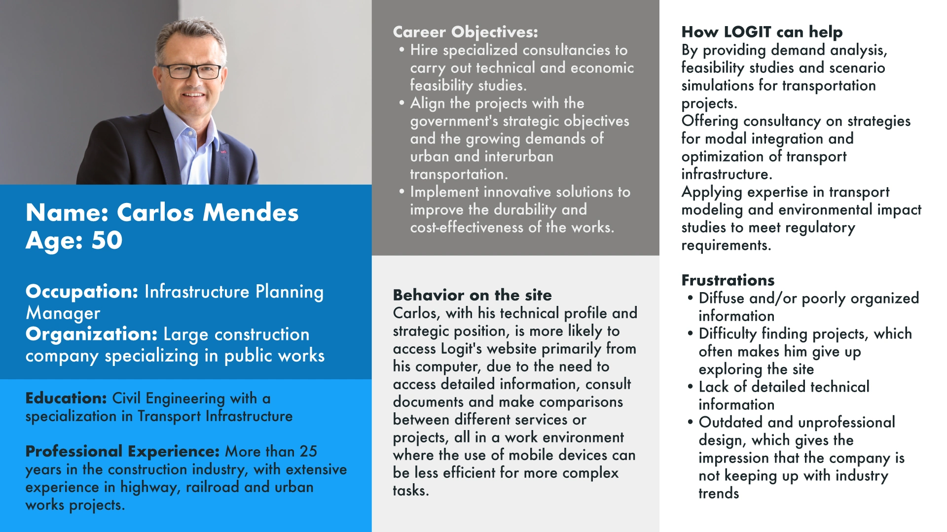
I conducted a series of interviews with Logit's executives to gain a deeper understanding of the site's target audience, their behaviors, and expectations. Following these discussions and meetings with the CEO, I developed a detailed persona to reflect the main profile of the site's audience. Additionally, I mapped the user journey, leveraging insights from the interviews and meetings, to identify key interactions, behaviors, and pain points throughout their experience.
Persona
User journey
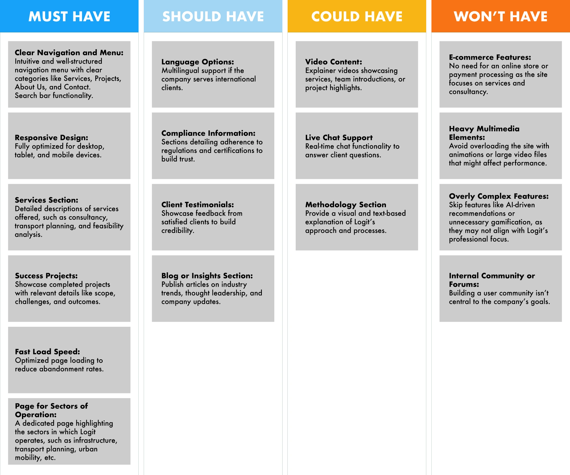
MoSCoW technique
Using the MoSCoW technique, a prioritization framework that helps define the essential (Must), recommended (Should), optional (Could), and excluded (Won't) features, I established the scale of priorities in building the new website:
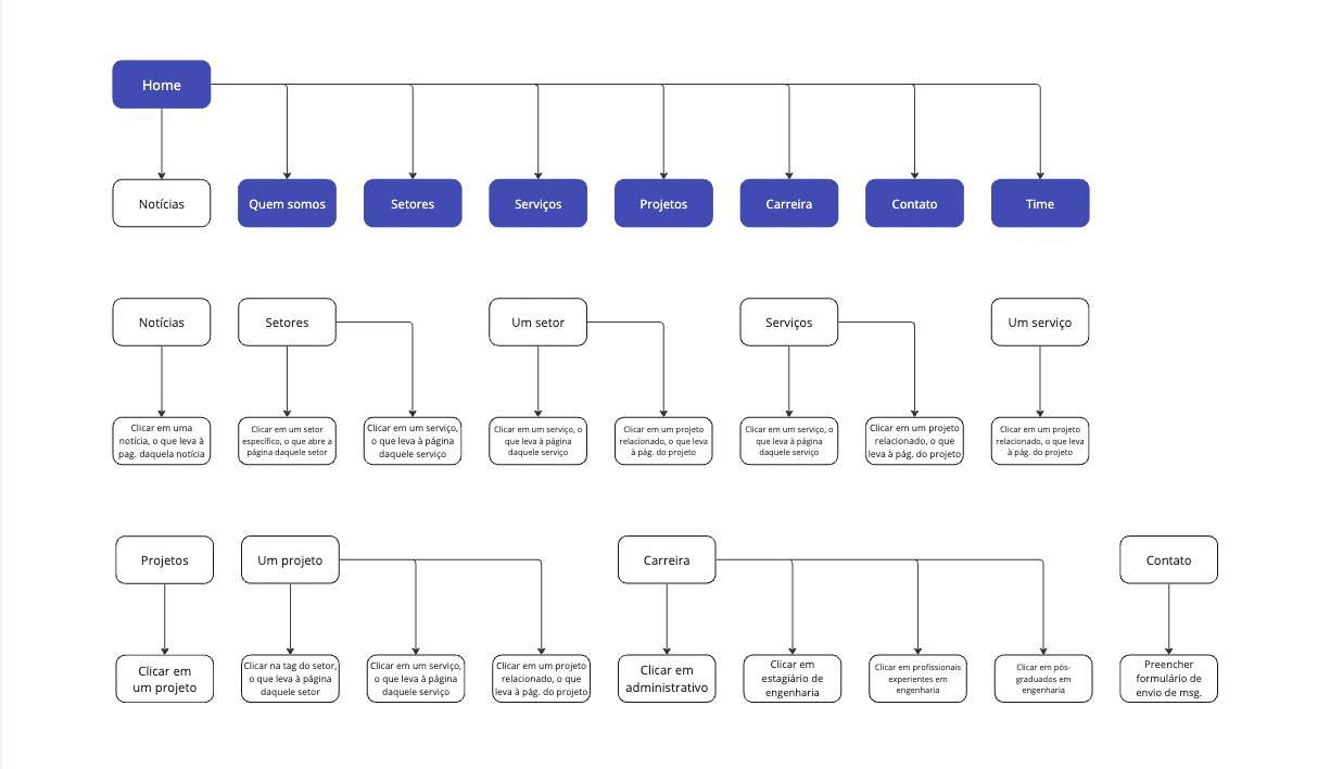
New flowchart
DESIGNING THE NEW SCREENS: WIREFRAMES, HIGH FIDELITY PROTOTYPE
After understanding the main needs for the new site, which was the result of a thorough process of analysis and immersion in existing problems, we began developing the new Logit screens. An intuitive and organized menu, as well as improved navigation and site performance were the guiding principles of the process.
Wireframes
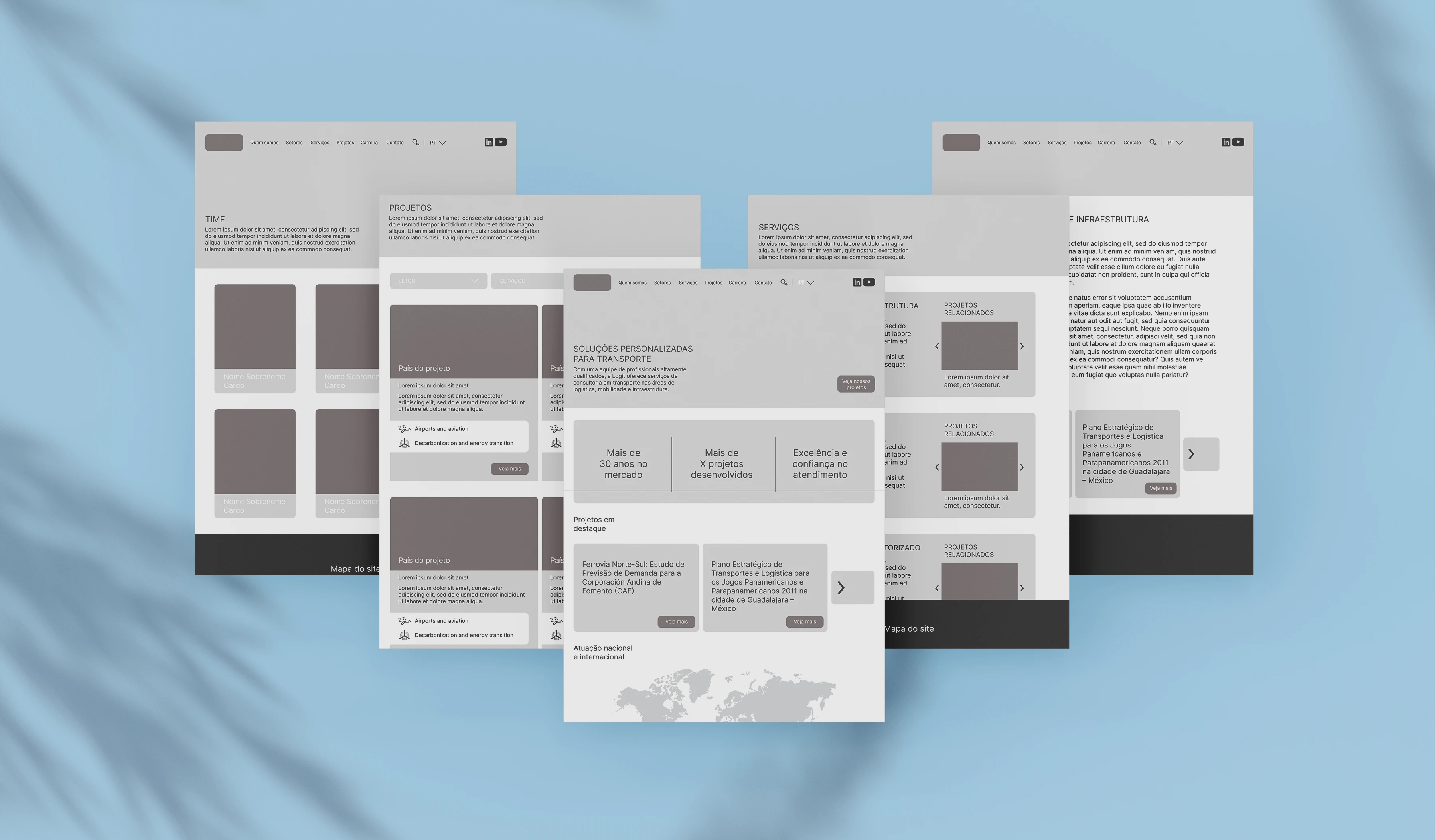
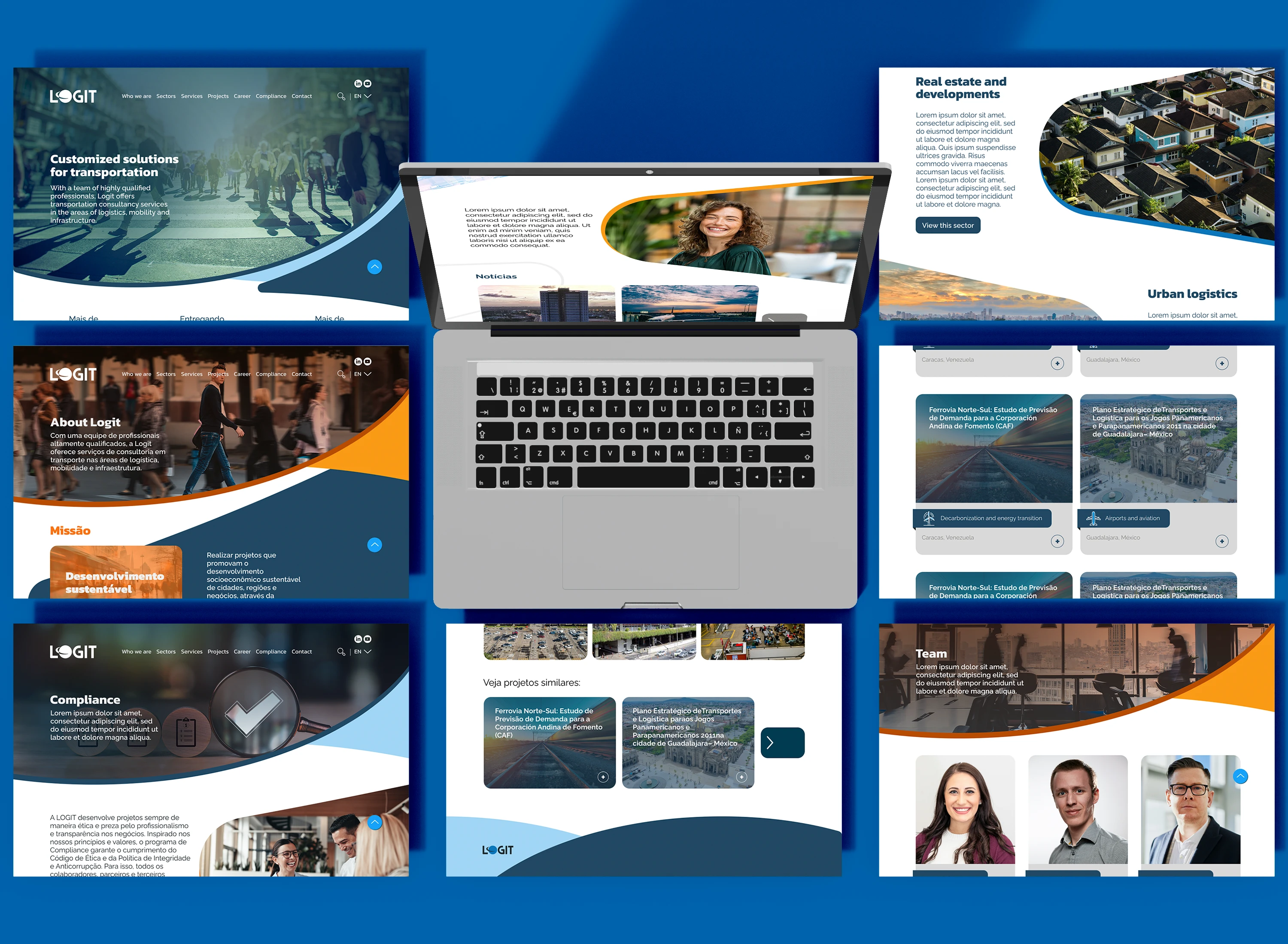
High-fidelity Prototype
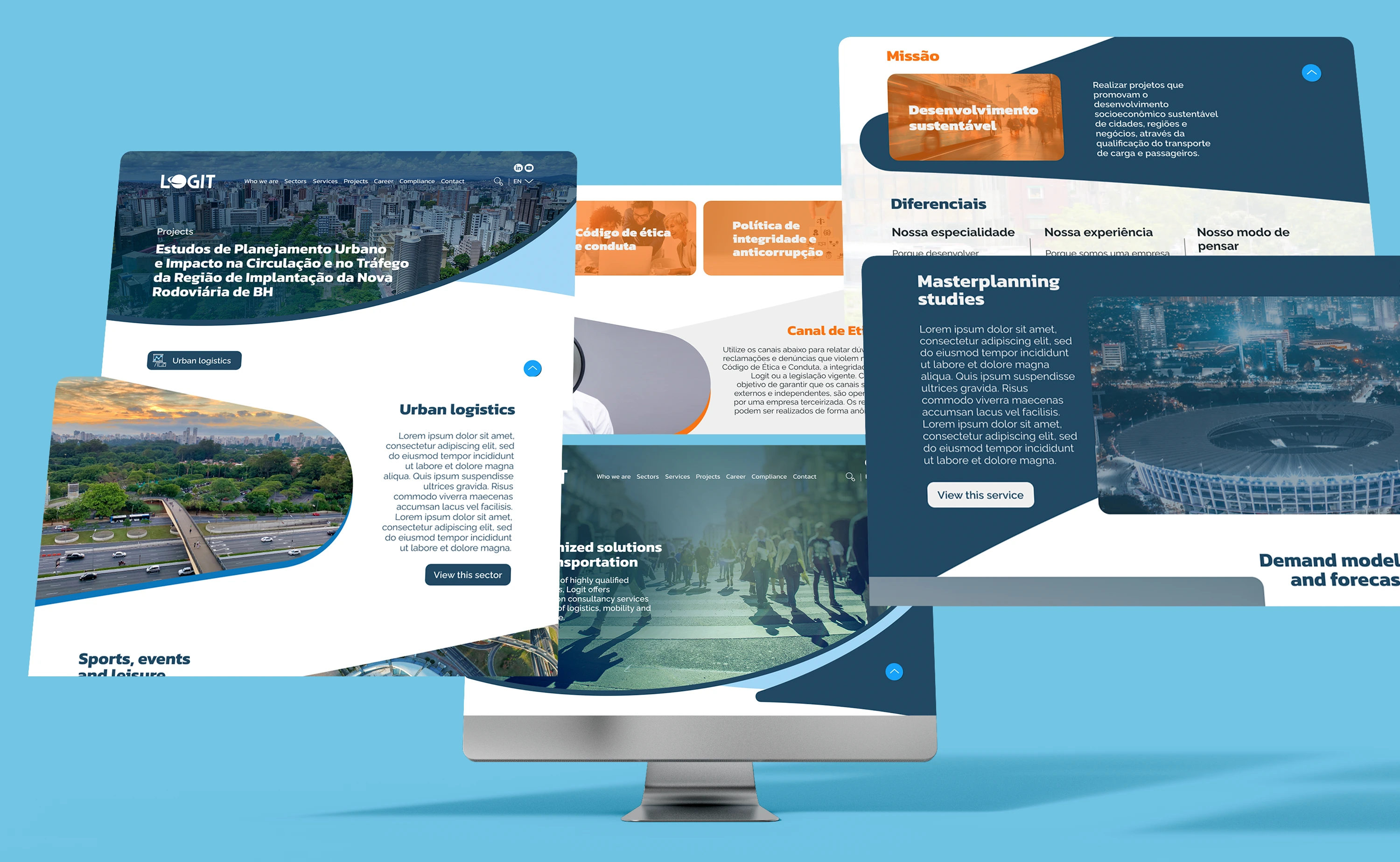
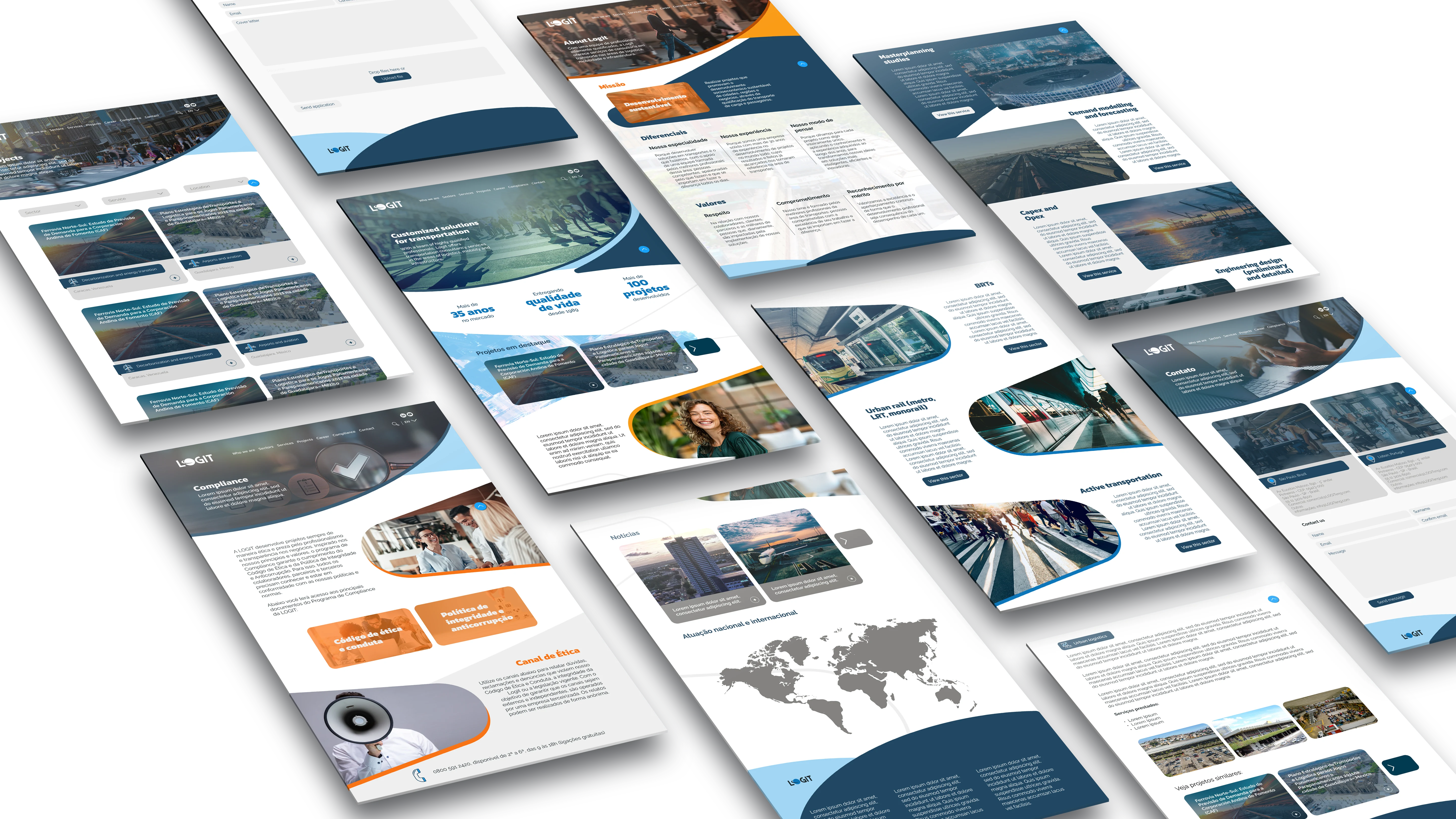
Clickable prototype
Current stage
The project is currently at the stage of usability tests and post-test adjustments. We will then move on to implementation.
Like this project
Posted Apr 16, 2025
Redesign of the Logit website, a 35-year-old logistics and transportation consulting company, and modernization of the company's visual identity
Likes
0
Views
1
Timeline
Dec 16, 2023 - Apr 16, 2024
Clients
LOGIT