Inventory Analysis Dashboard
Brief
An internship project which sought to reduce the time required for individual stores to analyze inventory data regardless of their available staff talent and time.
Role: UX Designer and Researcher
Team (3): UX Designer and Researcher (2), Developer
Product Overview
The inventory analysis dashboard was created to help supermarkets better understand their current stock levels and reduce the likelihood of an item running out. Each store currently has a different process depending on their available staff, time and capability in extracting and processing the raw data.
The dashboard was created to allow all stores equal opportunity in simplifying the raw data quickly and allows users to pick and choose which data sets they would like to see.
Target Audience
Individual store buyers who place orders for their stores
Design Process and User Research
I started with conducting user interviews with head office stakeholders and multiple store buyers to understand how the end to end process worked from discovering an empty shelf to placing an order. After completing the user research I helped design the first wireframes that met the MVP criteria. Finally, through repeated design, testing and feedback the final iteration of the dashboard was presented that created value by allowing all users to equally analyze data in a reduced timeframe.
Pain Points
Complexity in analysing data: No centralised method, each store must create their own process to break down the raw data which is subjective to their available time and staff talent
Time-consuming process: Refining and analysing the data is a very time consuming process which removes staff from completing other daily tasks
Overwhelming data: Raw data is produced in a very large volume that quickly overwhelms the user. Data only provided in numerical text leading to further difficulty in analysing.
User Flows
Current user flow: The current user flow consisted of the store buyer opening the inventory app and applying individual filters to sort through the raw data. Once this was done the buyer would export the data in the form an excel sheet and apply any custom macros they had created to help analyze the data they had extracted.
This process was both time consuming and difficult for the user, creating and applying the custom macros would also be subjective to the store’s available time and talent as smaller store would be unable to utilize the data to its full potential.


New user flow: The new user flow would remove the steps where the user would export into an excel sheet and apply any custom macros. This would be possible as the new inventory dashboard would replace the need for custom macros by filtering the raw data and presenting the sorted data in a simple analytical manner.
The user would then be able to choose the key data sets they would like to see thereby removing the barrier of limited time and staff talent.


Low-fidelity wireframes
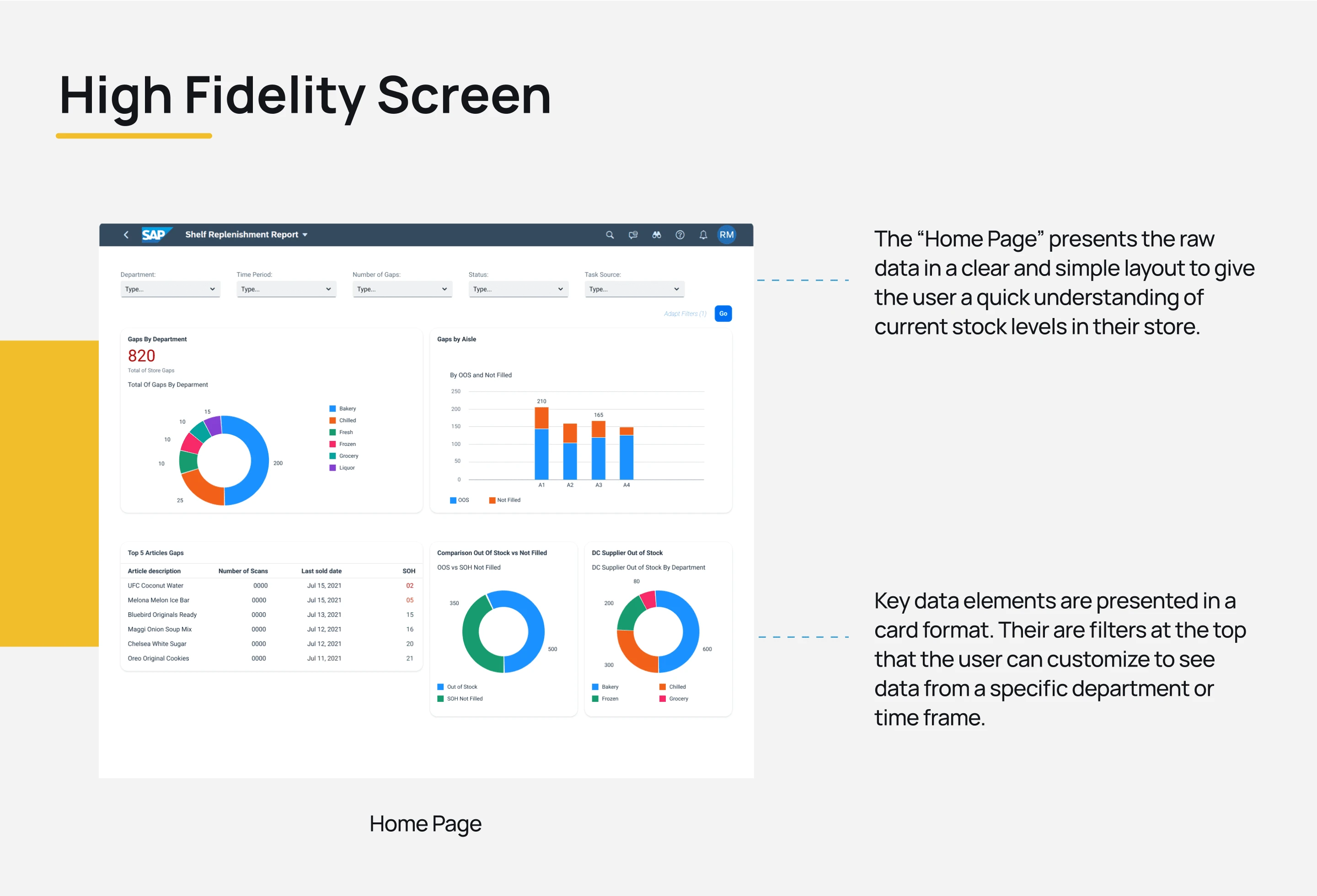
High-fidelity home page screen
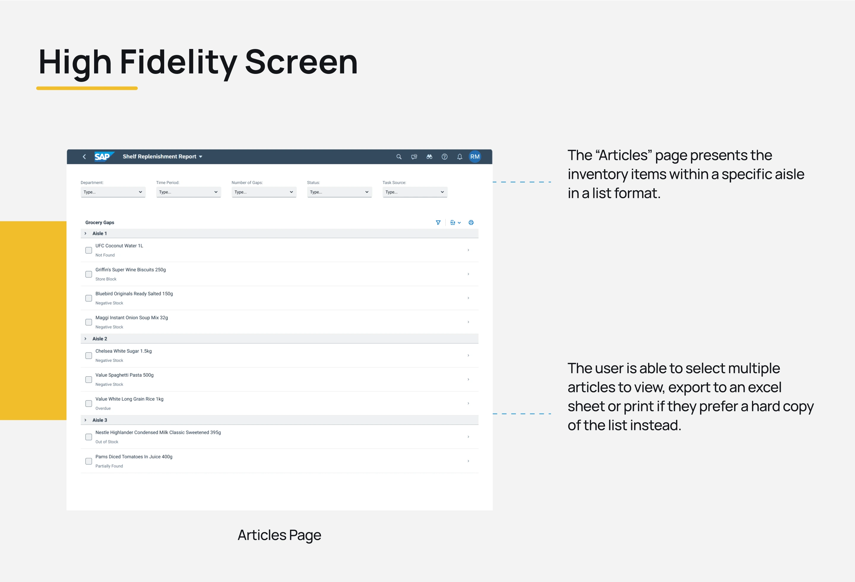
High-fidelity articles page
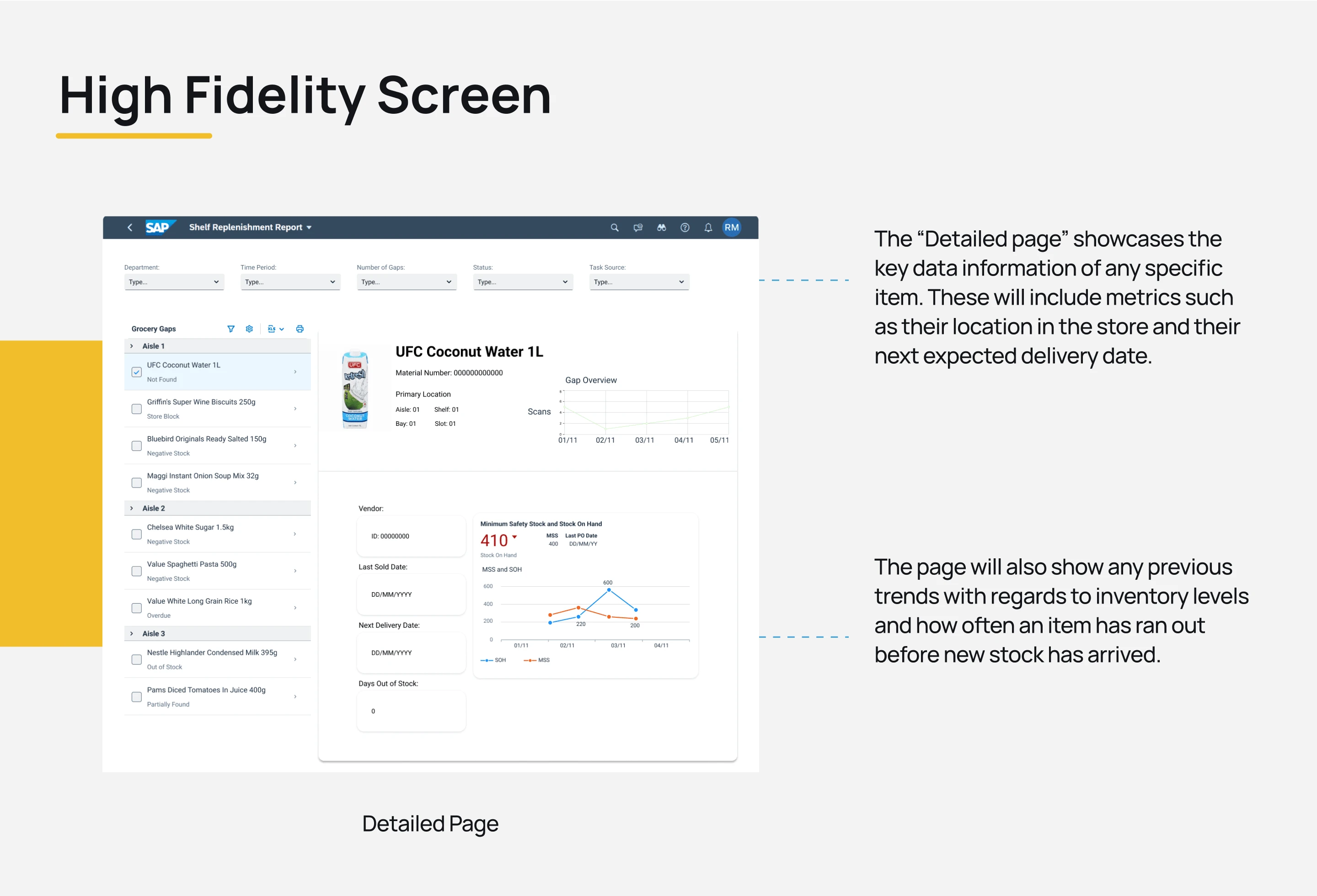
High-fidelity detailed page
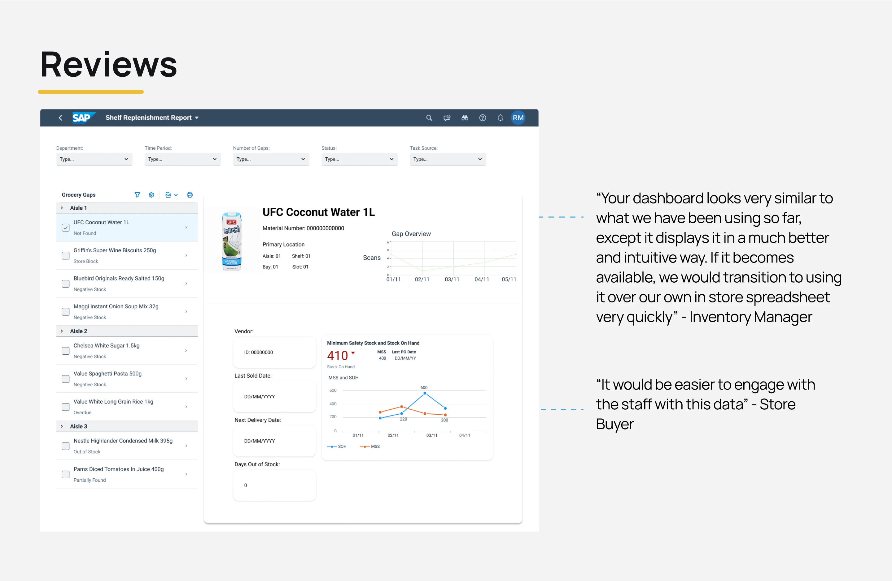
User reviews
Like this project
Posted Feb 23, 2024
An internship project which sought to reduce the time required for stores to analyze inventory data regardless of their available staff talent and time.
Likes
0
Views
15
Clients
Foodstuffs North Island

