Shin Signature - Brand Identity Design
Abdul Ahmad
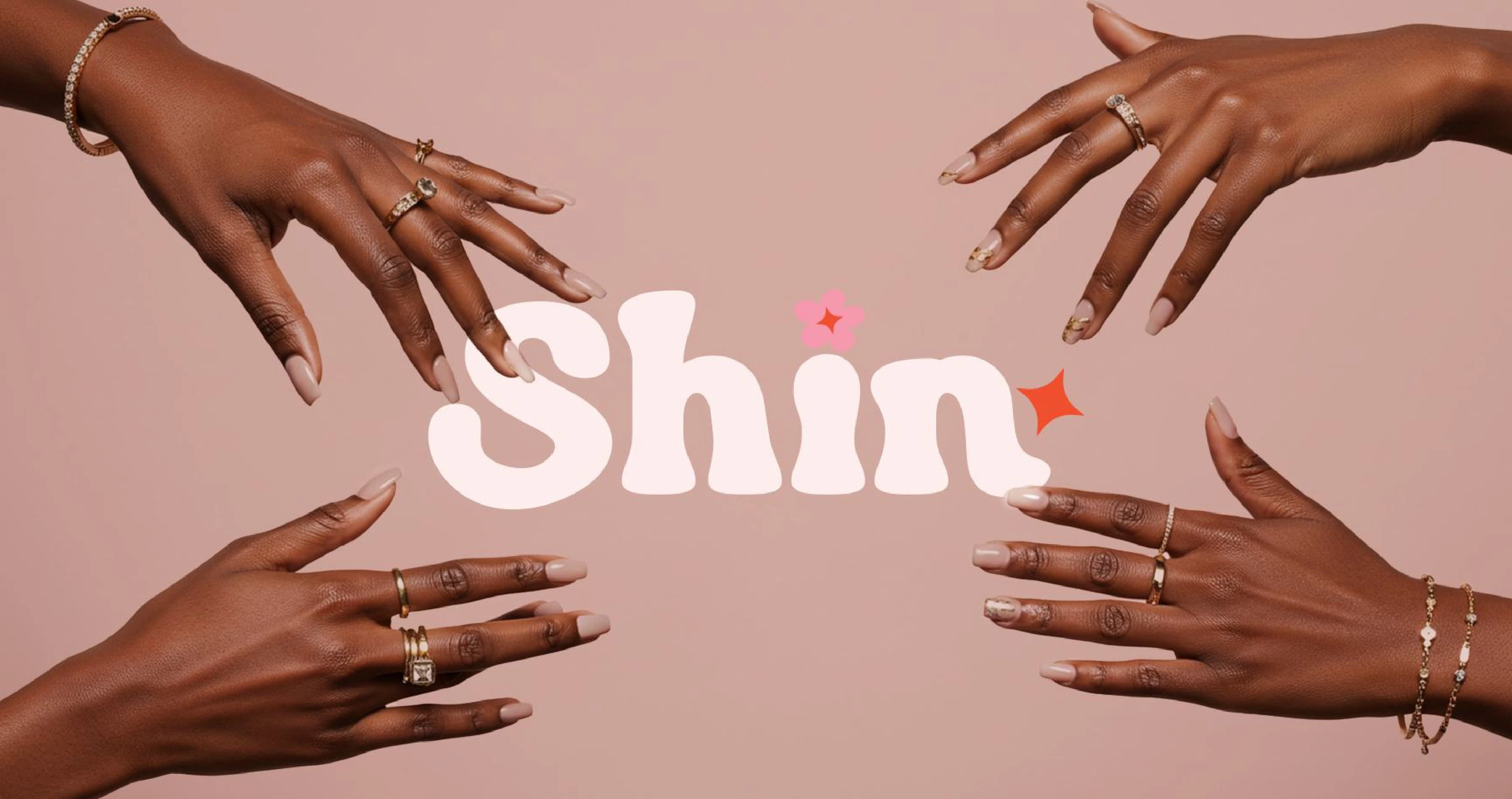
Shin Signature is a beauty and self-care brand that celebrates individuality, self-expression, and confidence. The goal of the brand identity was to create a playful yet premium visual language that resonates with a youthful audience while staying true to Shin’s mission of empowering people to shine in their own skin.
Brand website : Shin Signature.
Design Approach
The identity was built around bold typography, floral elements, and retro-inspired shapes to create a sense of fun and inclusivity.
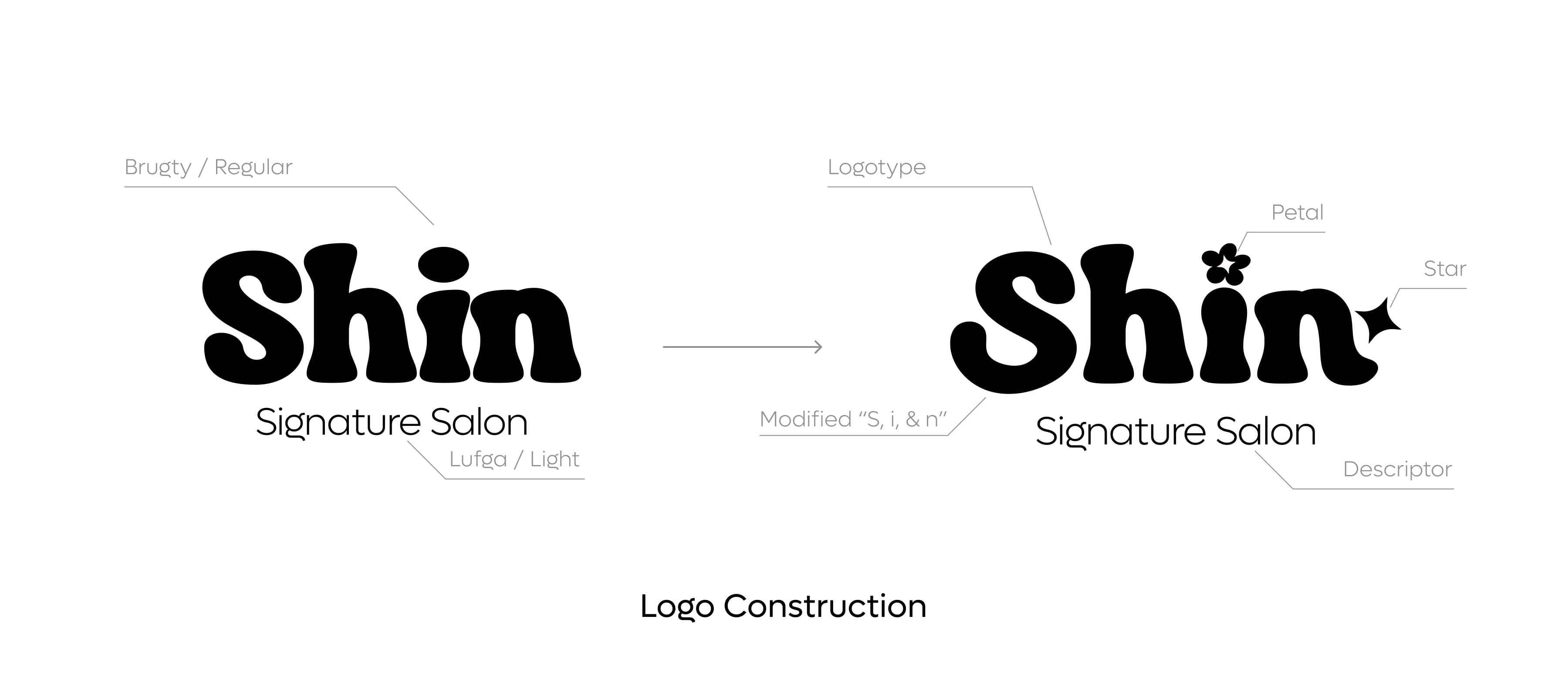
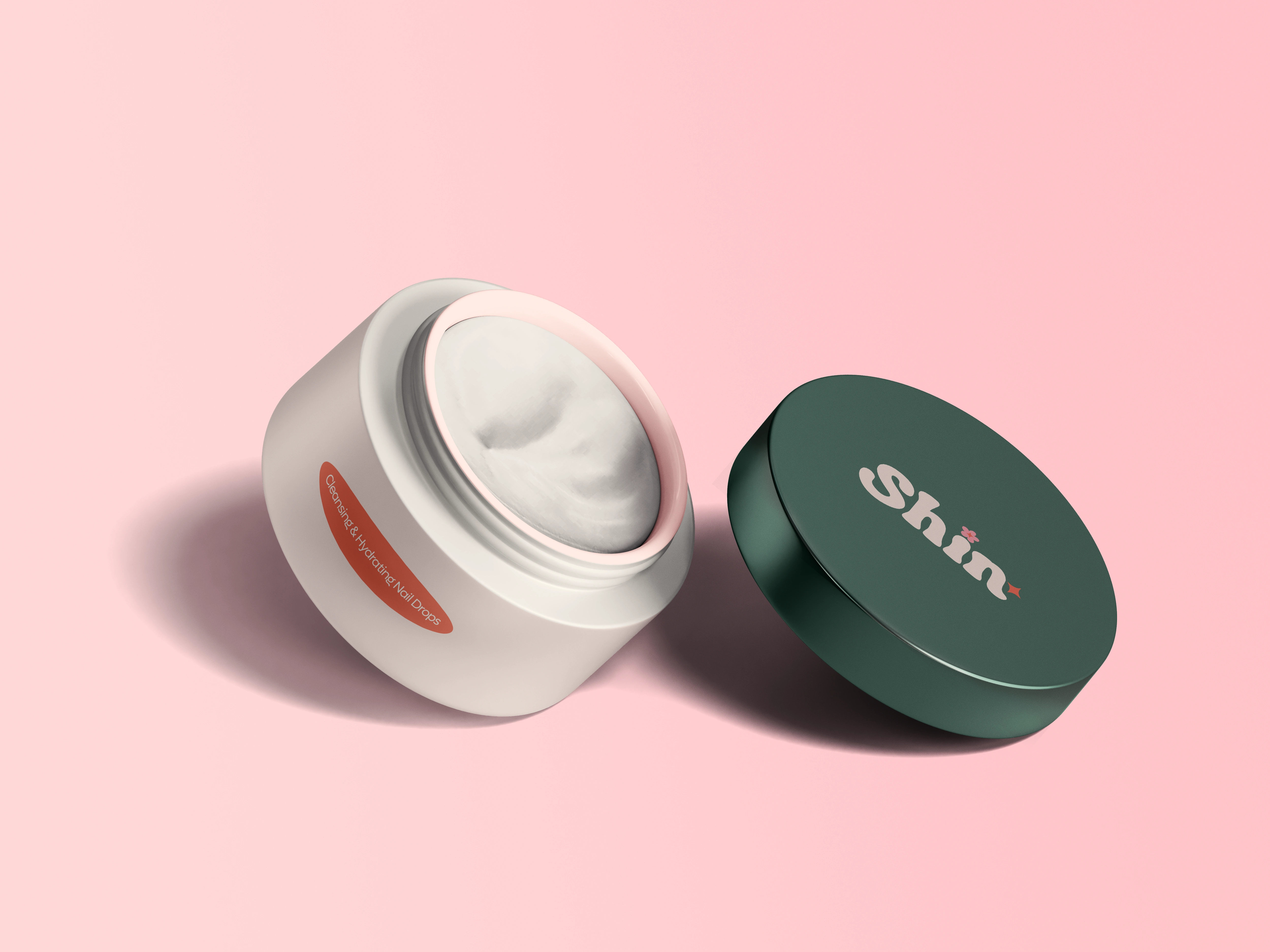
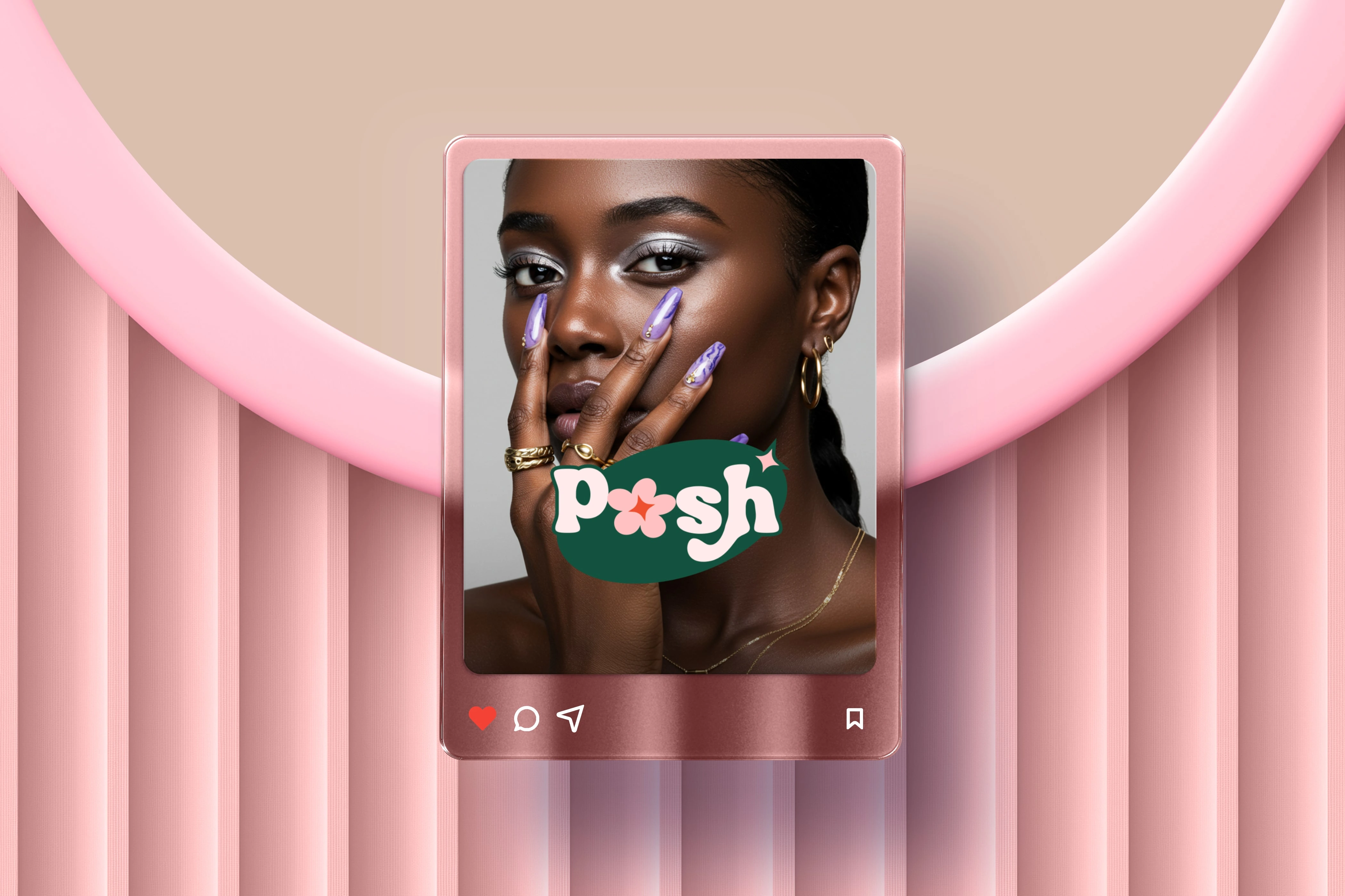
Logo System: A customised logotype featuring soft curves, with petal and star accents to symbolise beauty and radiance.
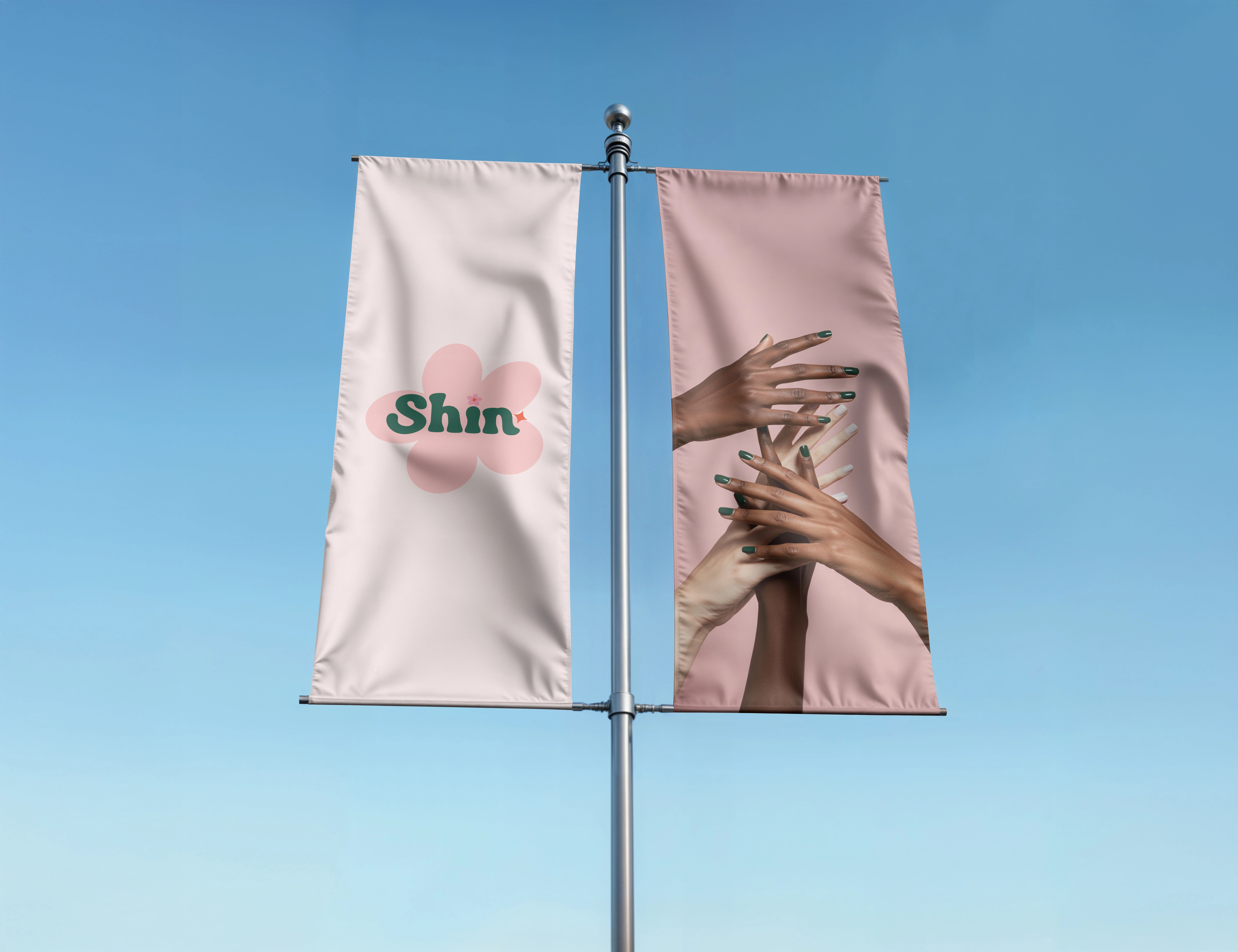
Color Palette: A fresh mix of pastel pinks and earthy greens, designed to feel modern, approachable, and memorable.
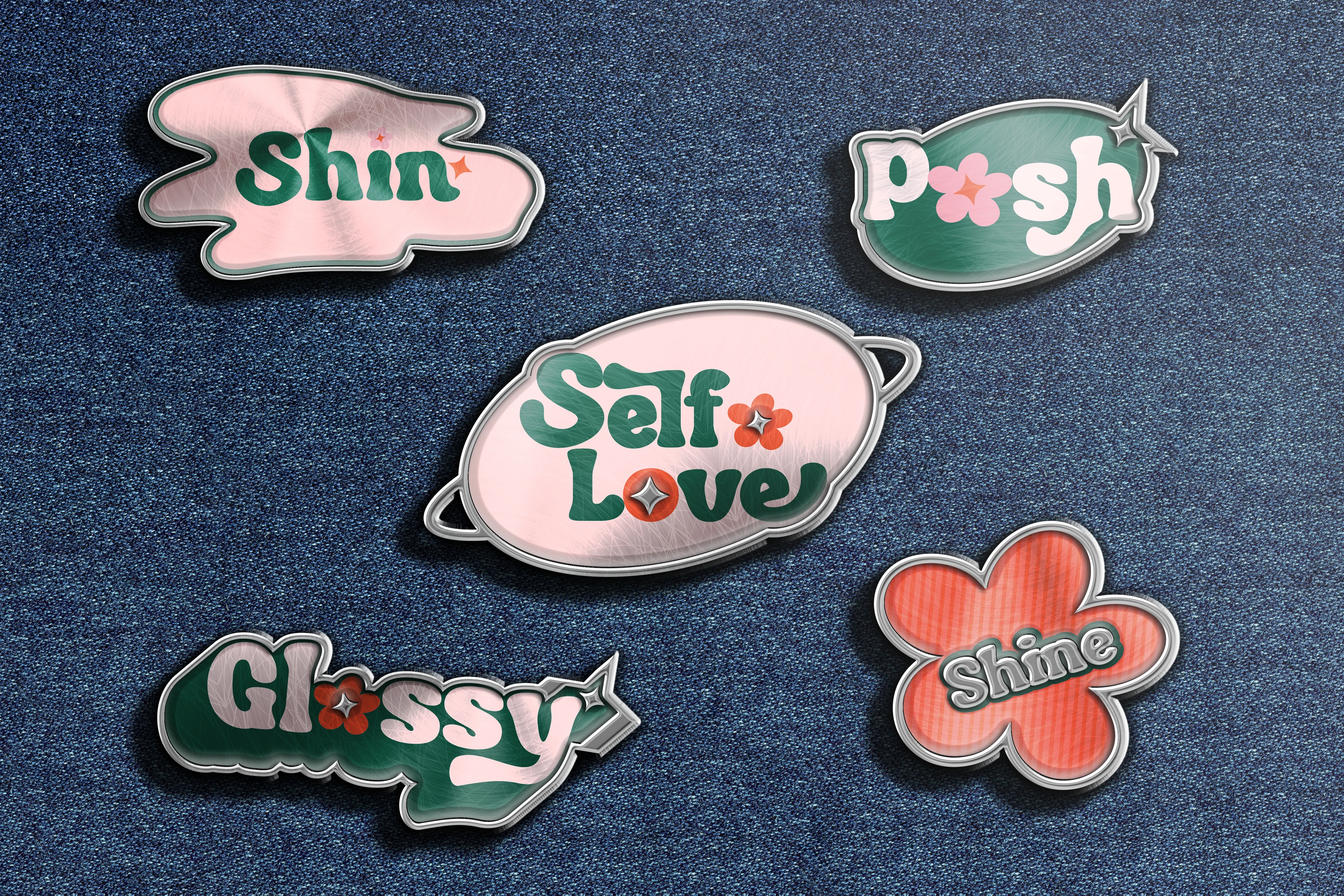
Visual Language: Flower icons, enamel-pin inspired graphics, and playful stickers emphasize Shin’s youthful and creative spirit.
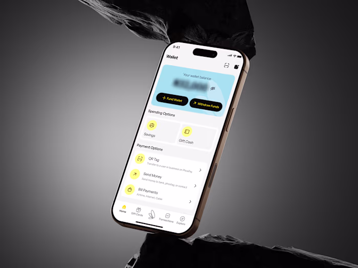
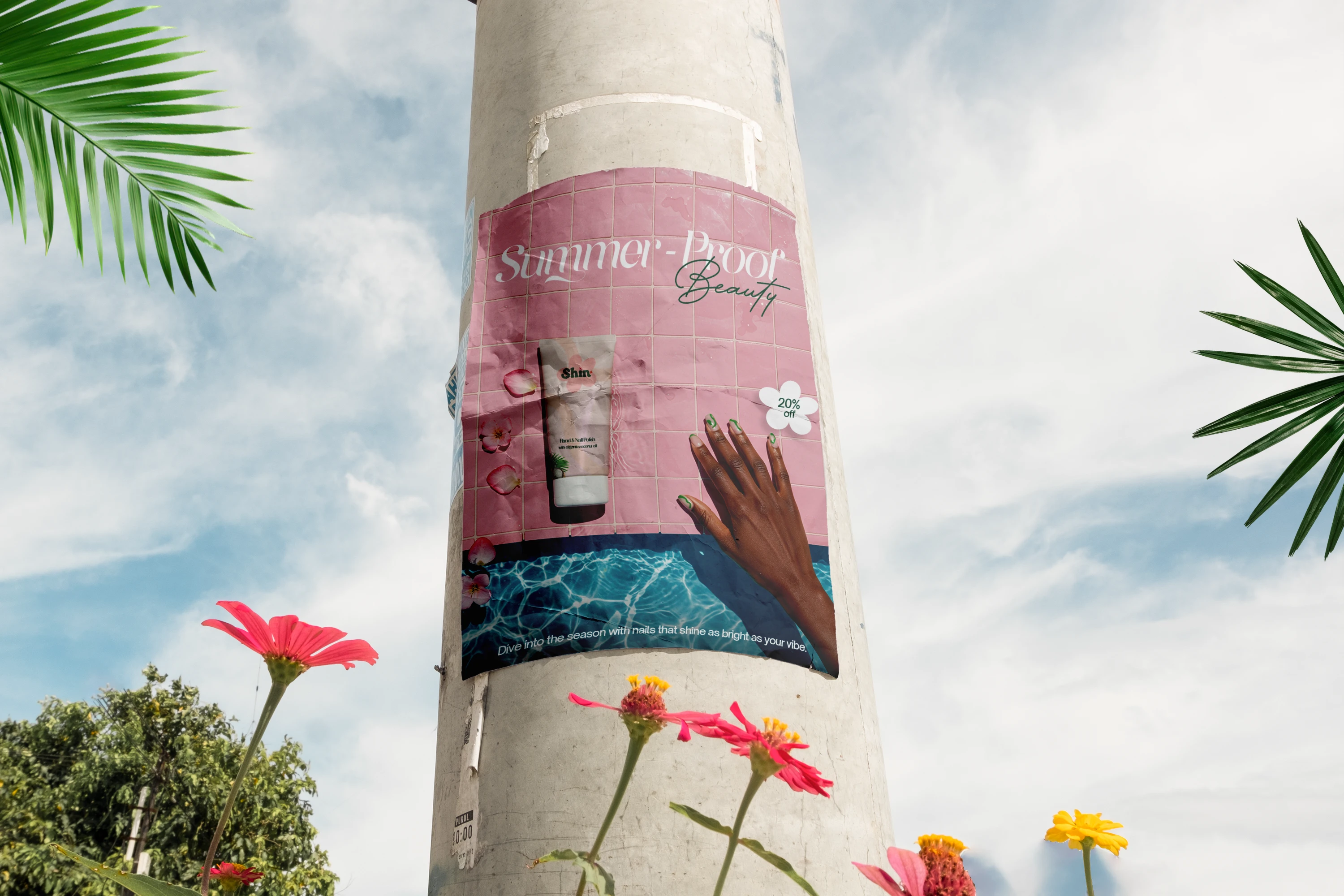
Brand Applications
The identity extends seamlessly across multiple touchpoints, including:
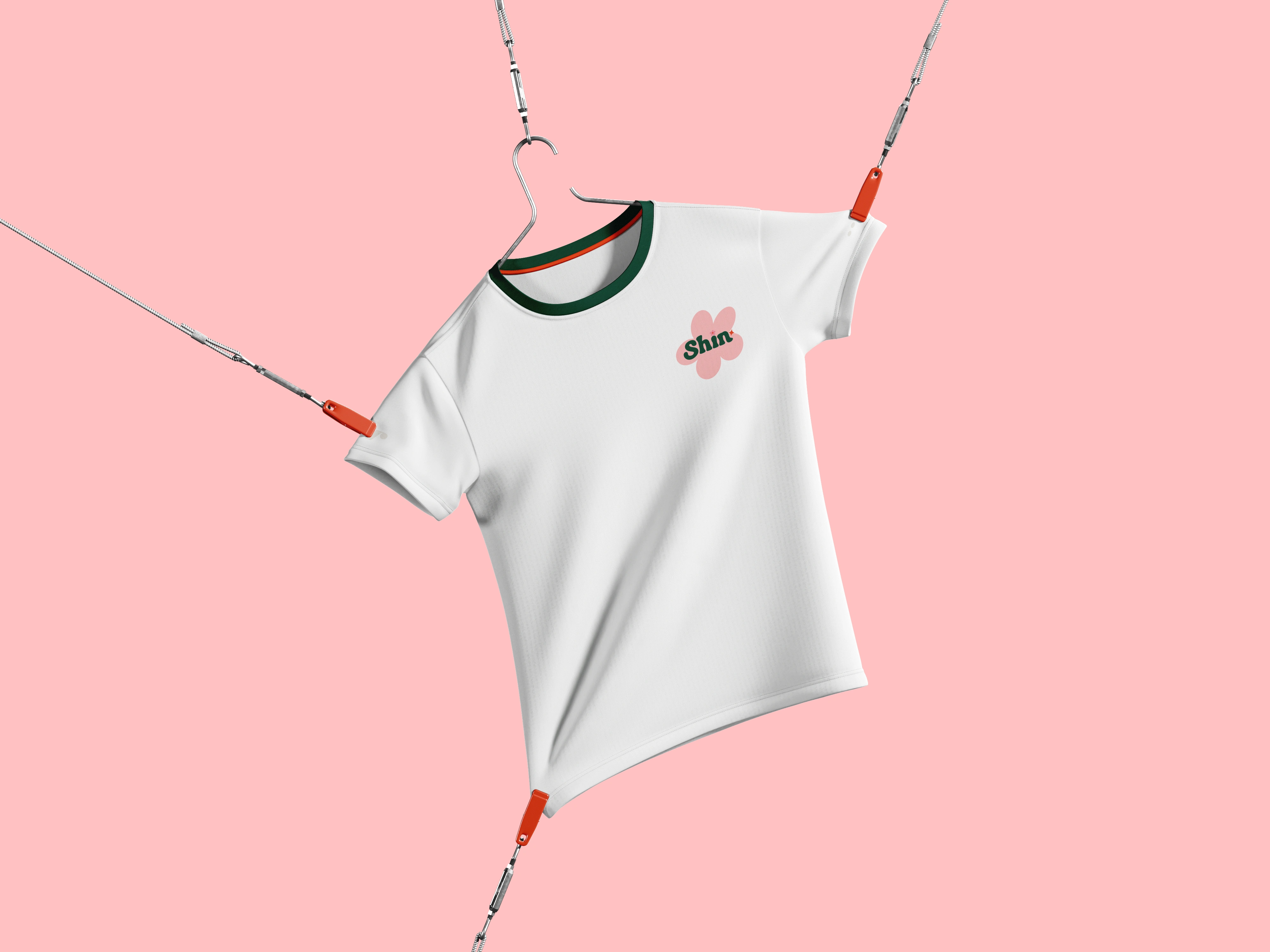
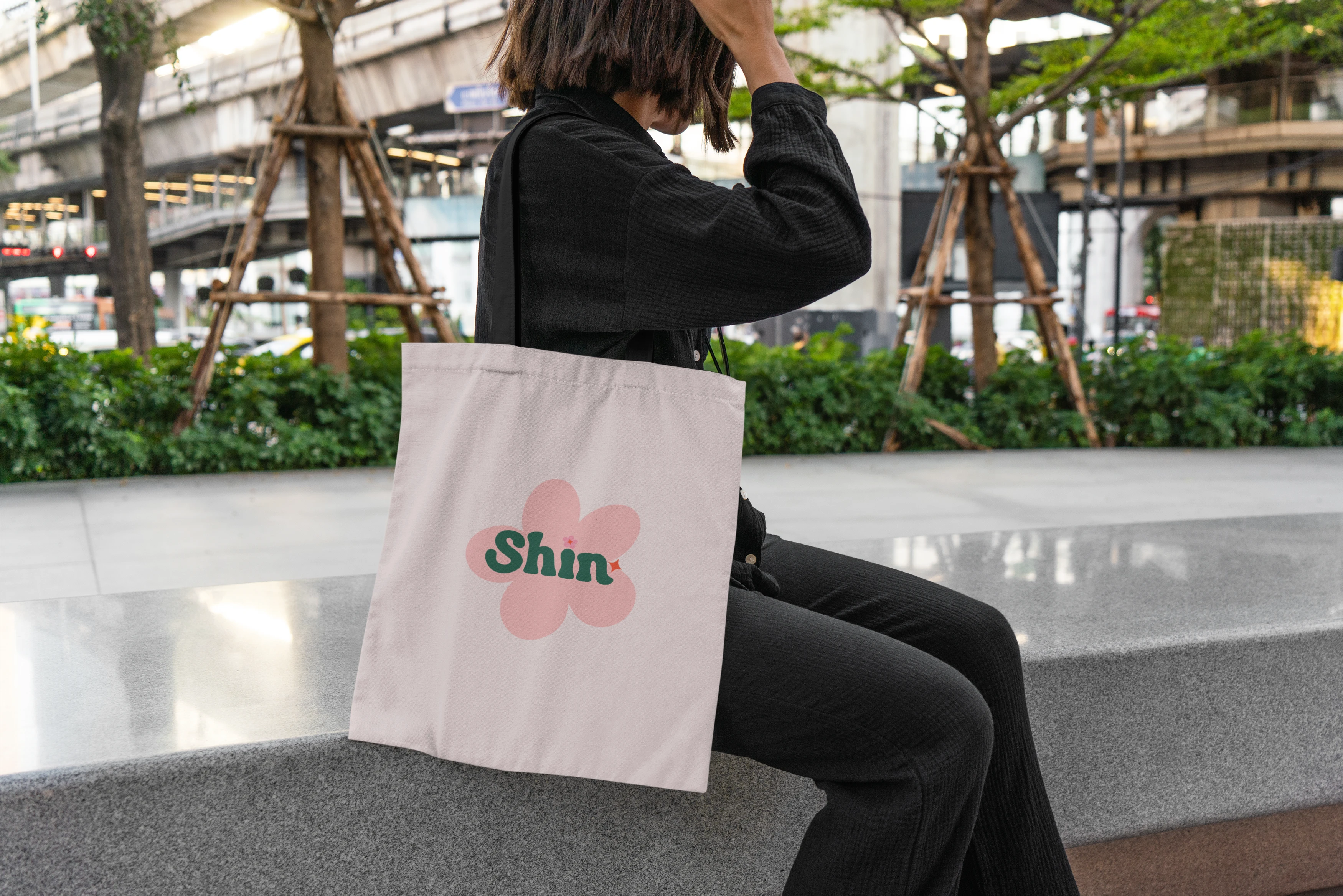
Product Packaging, Merchandise, Posters & Outdoor Ads, Digital & Social Assets
Outcome

The new identity positions Shin Signature as a modern beauty and lifestyle brand that is not just about cosmetics, but about self-love, inclusivity, and expression. The visual system gives Shin flexibility to scale, while keeping its personality intact across every brand touchpoint.
Thank you
Like this project
Posted Sep 20, 2025
Designed a bold and playful brand identity for Shin Signature, blending premium beauty with self-expression and modern lifestyle appeal.
Likes
0
Views
24
Timeline
Jul 24, 2025 - Aug 30, 2025