EchoFM – Dark-Themed Radio App UI

Sargis Vardanyan


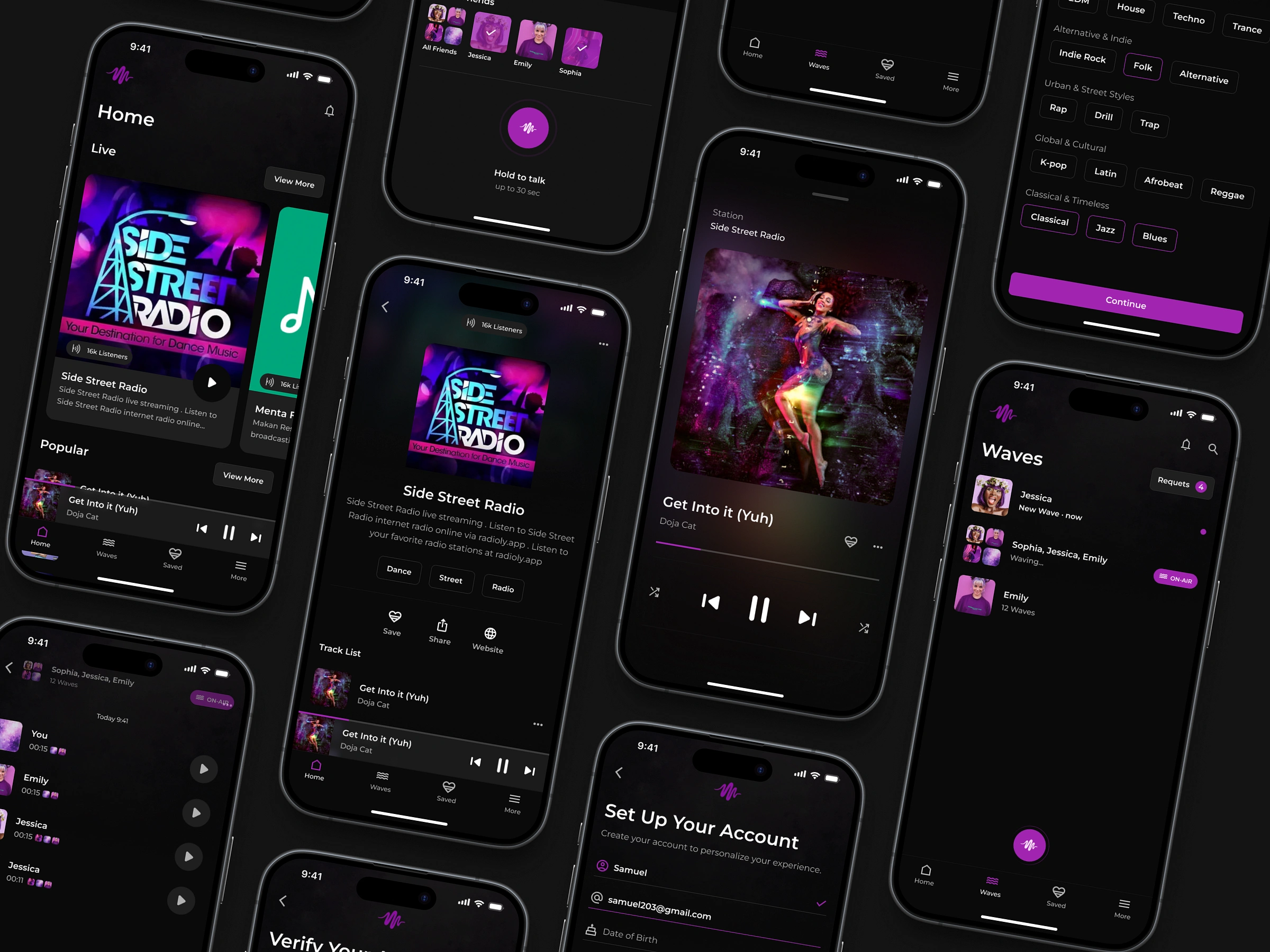
EchoFM – Dark-Themed Radio App UI
Enter youI designed this app interface because most music apps today feel too heavy — too many features, too much clutter. This concept is for people who just want to tune in and listen without distractions.
What makes it different:
It’s built around simplicity. A clean dark theme that feels good at night. Big, easy-to-read station cards. Just play, pause, and switch — no deep menus or confusing flows.
Design decisions that matter:
The dark UI reduces eye strain and gives focus to content. I used high-contrast buttons and legible typography so users can explore quickly. Navigation is bottom-based, so it’s easy to use one-handed.
The layout adapts well to different content types — music, talk radio, podcasts — without changing the experience.r text here...
While not live yet, this concept rethinks what a radio app could be focused, minimal, and easy to use.
Let's Build Something Great Together
Have a project idea, collaboration request, or just want to connect? Let's talk.
Like this project
Posted Sep 20, 2025
Designed a dark-themed, simplified radio app UI for easy, distraction-free listening.
Likes
0
Views
0
Timeline
Feb 2, 2024 - Apr 2, 2024