Modern Framer Website Design
Asad Synt
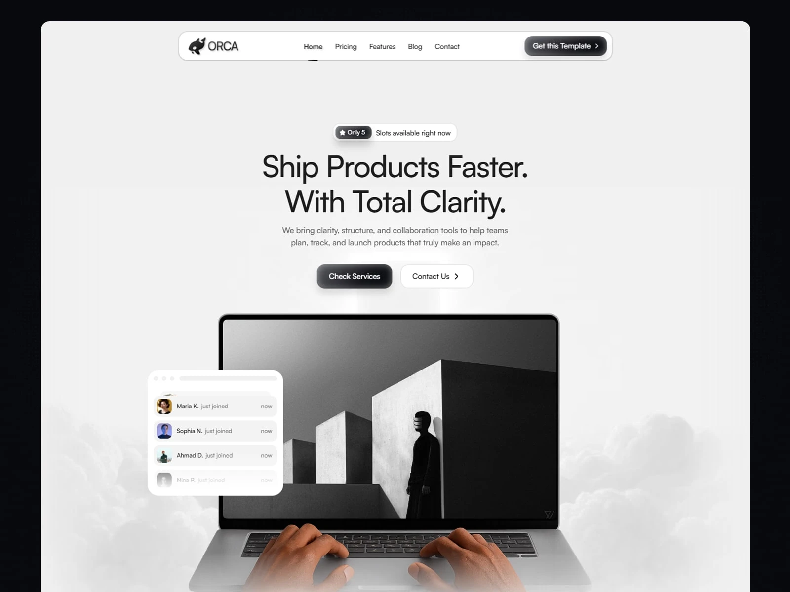
My Role: Full website design and development done by me (Everything)
Time: 15 Days
Preview: orcaco.framer.website
About the Project
This project was about designing a clean and professional website that could give businesses a strong online presence. The focus was on creating something modern and minimal, where every section felt purposeful and easy to navigate. My aim was to design a site that not only looks visually appealing but also communicates clearly what the brand offers and builds instant trust with visitors.
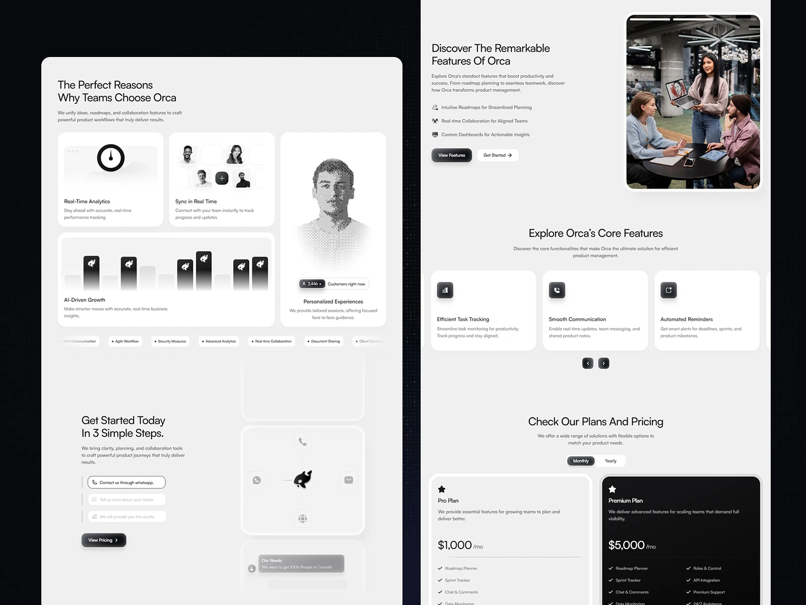
Design Process
I started by researching similar business websites to understand common patterns and what could be improved. From there, I created wireframes that mapped out the essential pages — a homepage, features, pricing, blog, and contact page. Once the structure was solid, I moved into visual design, keeping the style bold but simple with clear typography, balanced spacing, and strong call-to-actions. I then built the design in Framer, where I refined the details and tested responsiveness across desktop, tablet, and mobile to ensure a smooth user experience.
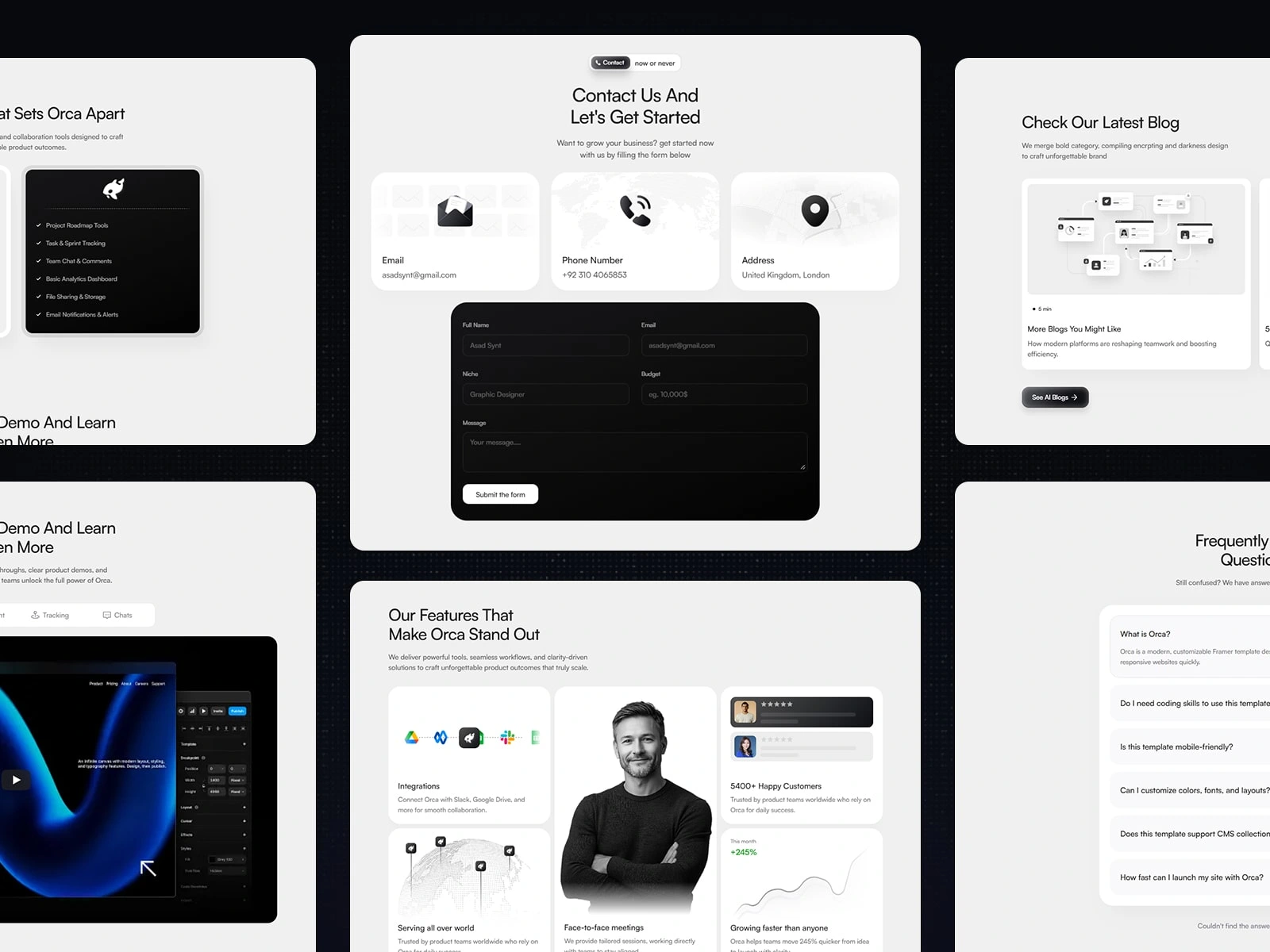
How It Helps Companies
The final website helps companies build credibility by presenting their services in a clear and professional way. The pricing and feature pages make it easy for potential clients to understand offerings at a glance, while the blog and FAQ sections encourage engagement and trust. Since the design is fully responsive, businesses can be confident their site will look and work great on any device. Overall, the project delivers a strong foundation for companies to attract customers, communicate effectively, and grow online.
Want to work with me?
Contact me using any of following method
(Available now)
Whatsapp: https://wa.me/923104065853
Email: asadsynt@gmail.com
Like this project
Posted Sep 16, 2025
I designed this website to give businesses a clean and professional online presence. It solves problems like cluttered layouts and poor mobile experience.
Likes
0
Views
13
Timeline
Sep 1, 2025 - Sep 16, 2025