Real Estate - Branding + Web Design + Mobile Design
Joseph Pacheco
Brand Intro
A realtor look & feel within the real estate demographic

Intro to Brand Guidelines
Tone of Voice
Tone of voice, effective for reaching individuality in a saturated space
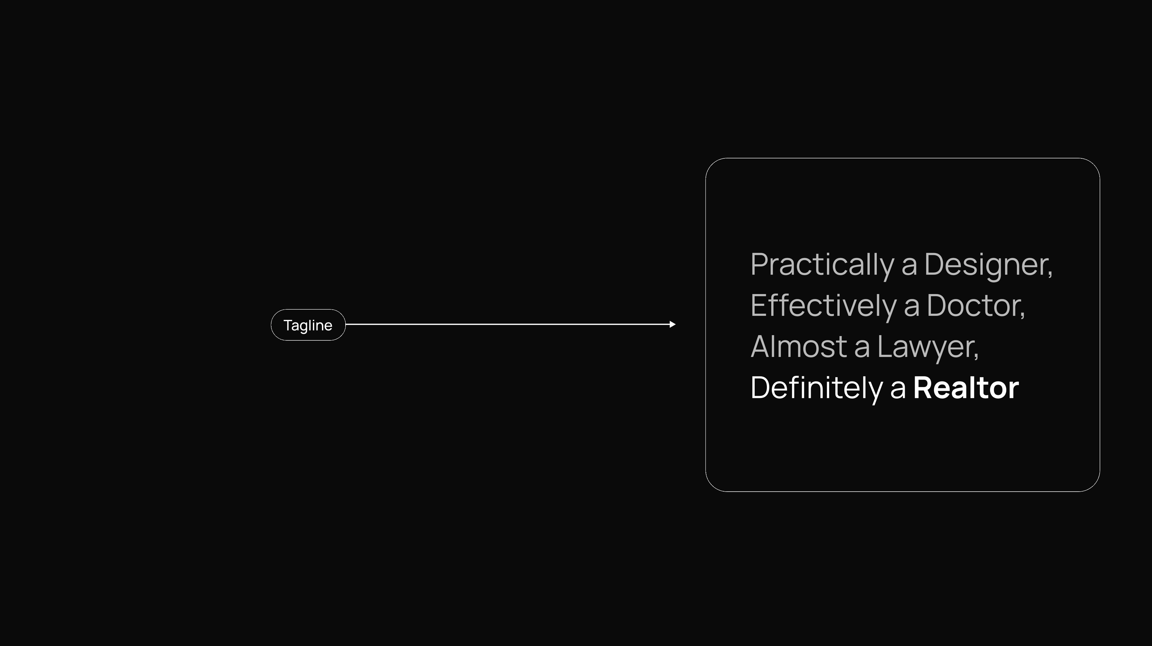
JK Tagline
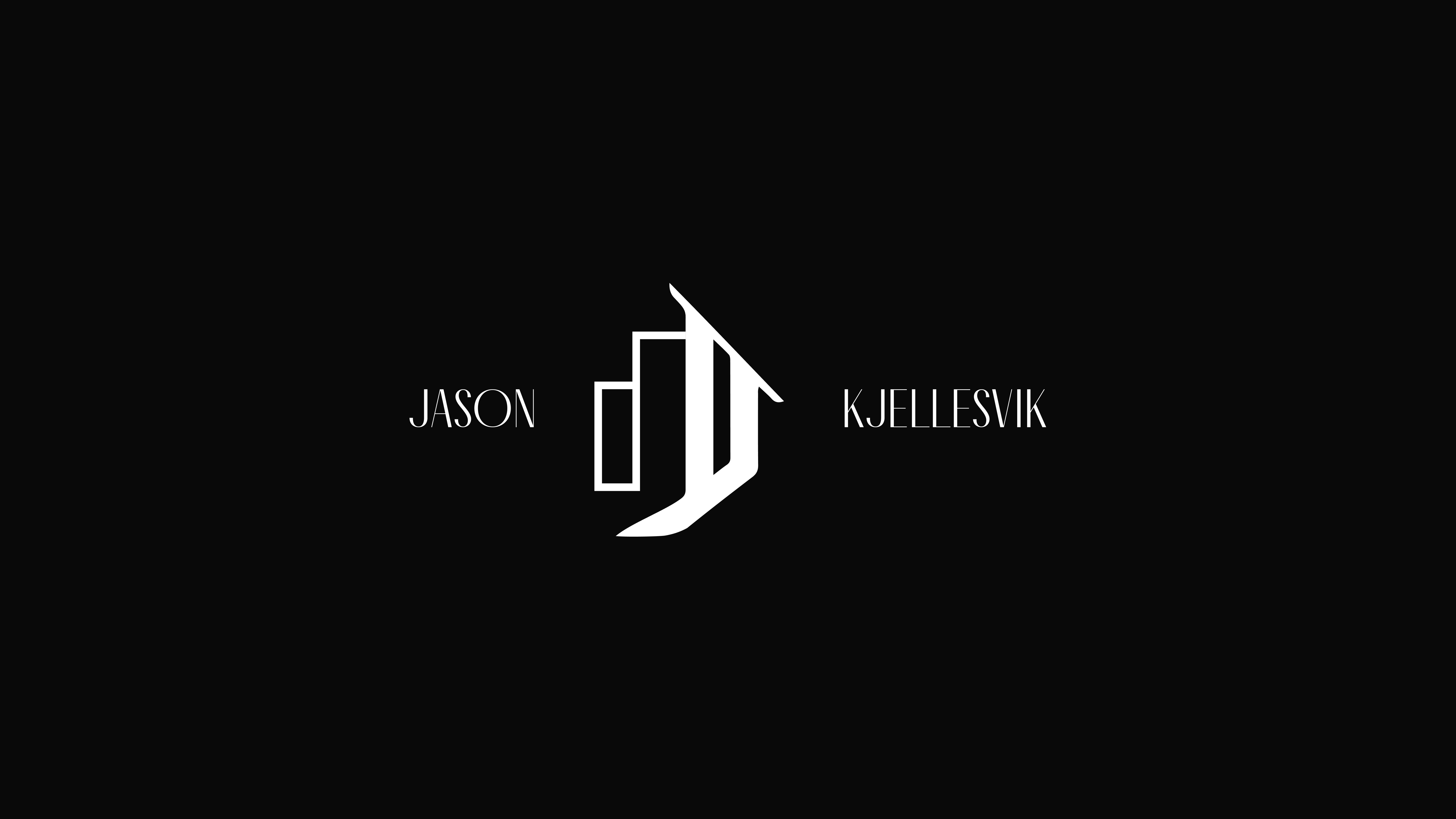
Logo Design
Logo of JK realtor that combines both typographical and unique treatment that embolds both suburb and city living
Dark Logo Version
Logo Break down (Dark/Light Version) - Interpretations of the logo to combine both visual and typographical reinforcement
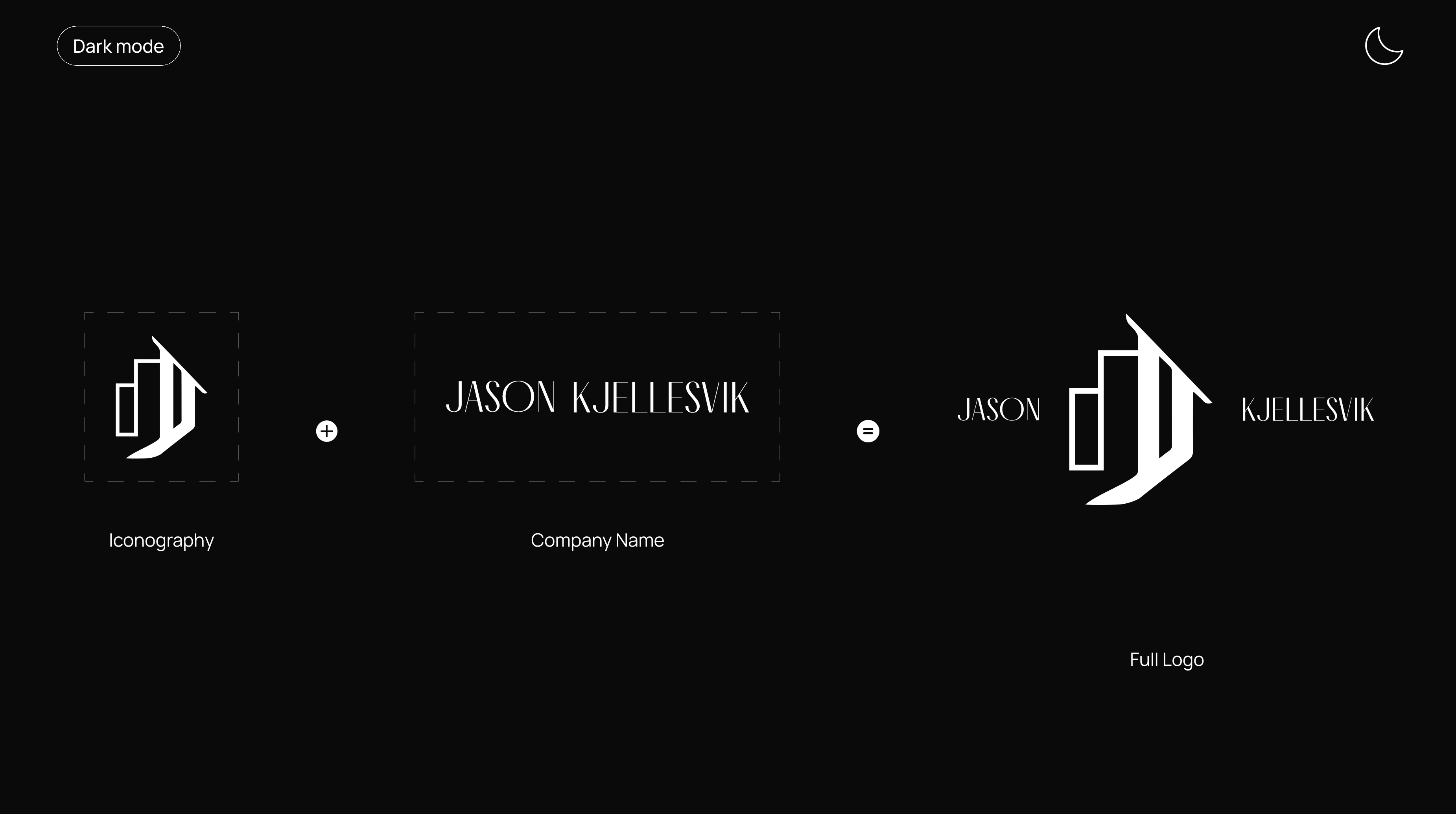
Logo Break down (Dark Version)
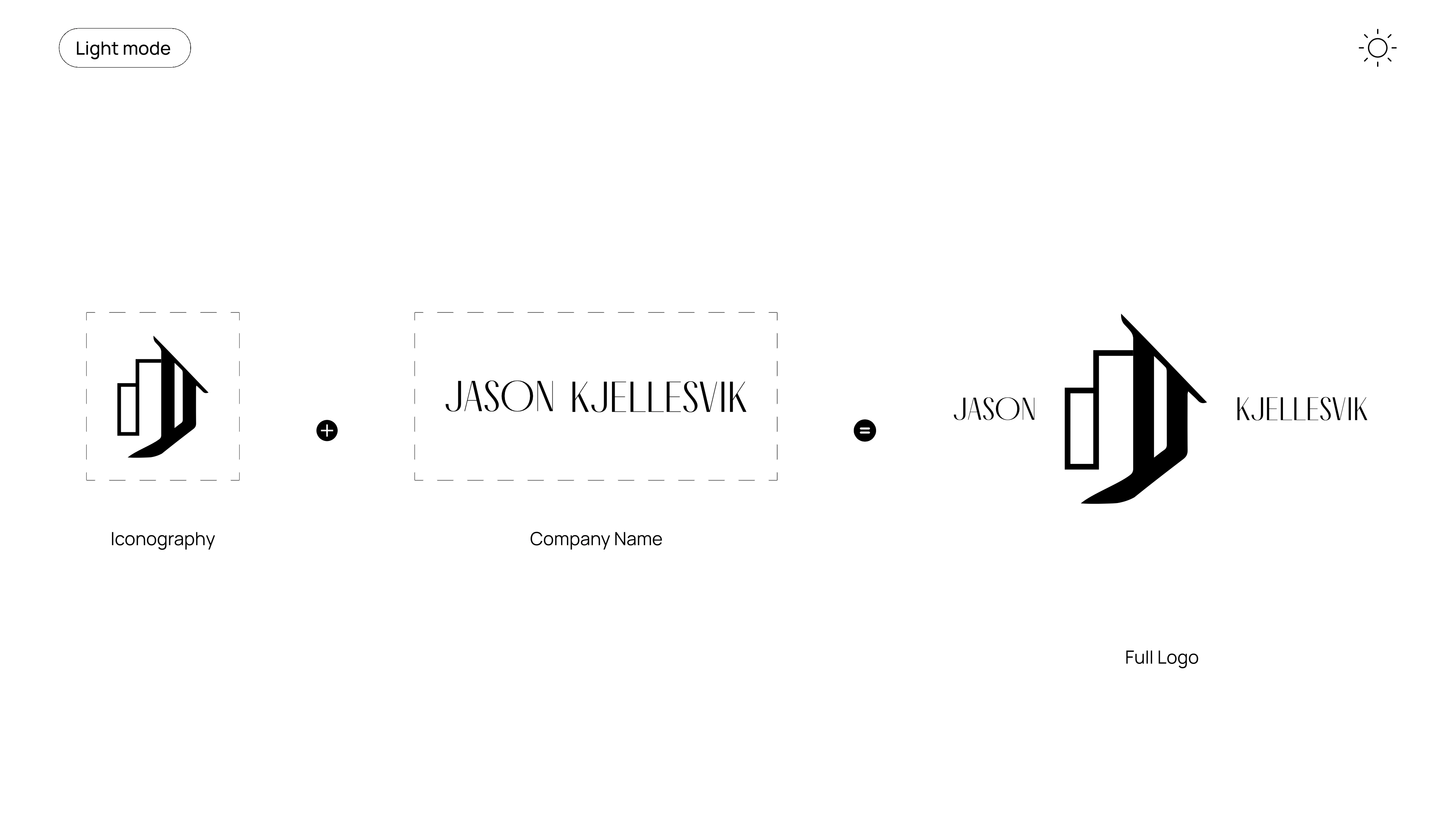
Logo Break down (Light Version)
Imagery
PNW prominent realtor with visuals that compliment the market environment of the Pacific North West
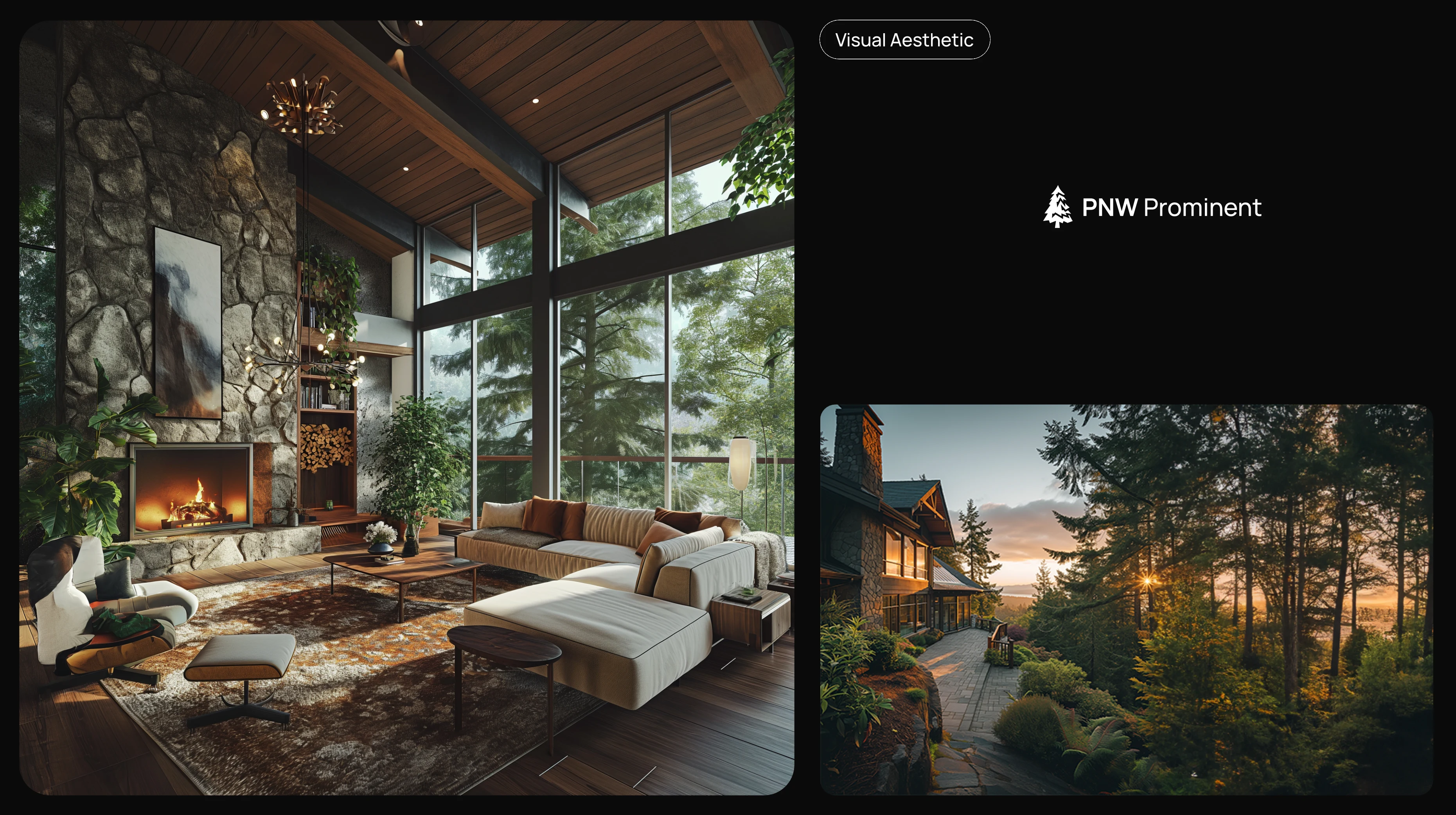
JK Visual Aesthetic
Typography & Colors
Typographical approach and colors to reinforce the brand and create consistency in future marketing assets
Type & Color Guideline
Business Cards
Interpreted by the created brand, focusing on simple information and logo to drive engagement
Business Cards
Web Design
Web Design/Landing Page - The landing page for the real estate listings the client has as the prominent following a Informational Hierarchy created to drive the most important area as the priority.
Web Design/Landing Page - The landing page for the real estate listings the client has as the prominent following a Informational Hierarchy created to drive the most important area as the priority.
Web Design/Landing Page - The listing page that lists our the realtors homes in an elegant clear manner to drive more engagement and easily able to ingest information
Web Design/Listing Page
Mobile Design
Scalable design that can be easily scaled from mobile to desktop, with limited space the Informational Hierarchy is moved around to take advantage of the limited real-estate space from mobile

Mobile Design
Like this project
Posted Sep 9, 2024
A branding and web/mobile design project to create a online real estate platform from the realtor to market and and promote themselves