

The name already carried the argument.
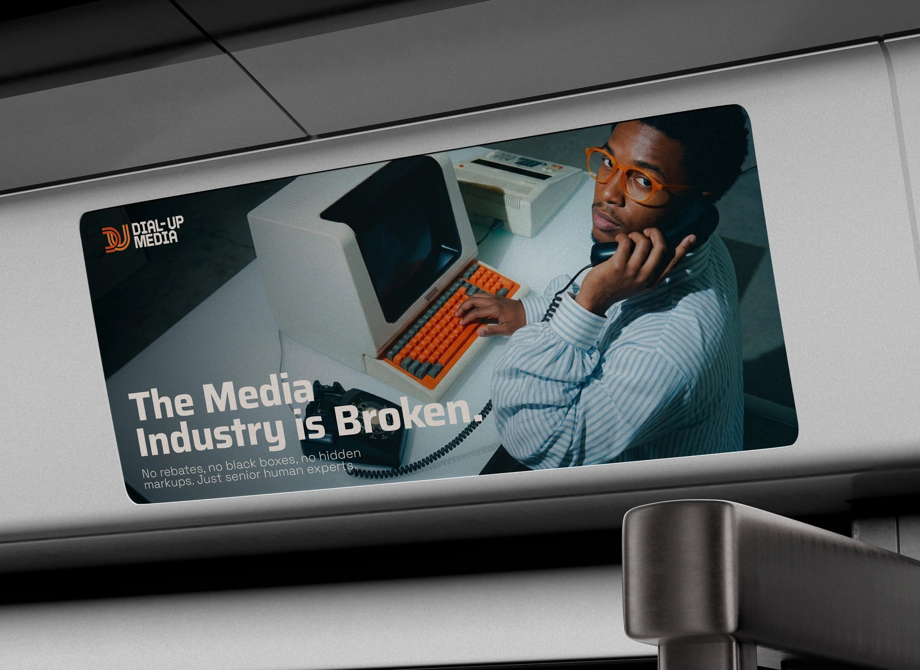
Dial-Up Media was founded on a premise much of its category has dropped: an agency owes its first duty to the client's money. By the agency's account, rebates go undisclosed, technology fees are marked up, and black-box tools steer spend wherever pays the platform best. Its audience is brand marketing executives at eCommerce and D2C companies, and most arrive after another agency has let them down. A visual audit of the field found a familiar, cold look. Navy and blue dominate, nearly every brand sets its name in the same kind of sans serif, and most logos are plain wordmarks. The brand had to look like the opposite of what burned them. Dial-Up is a provocation as much as a throwback, a deliberate return to the years before every decision passed through an algorithm.
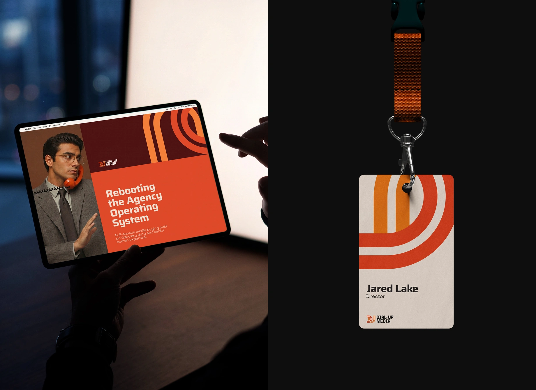
Logo design and applications
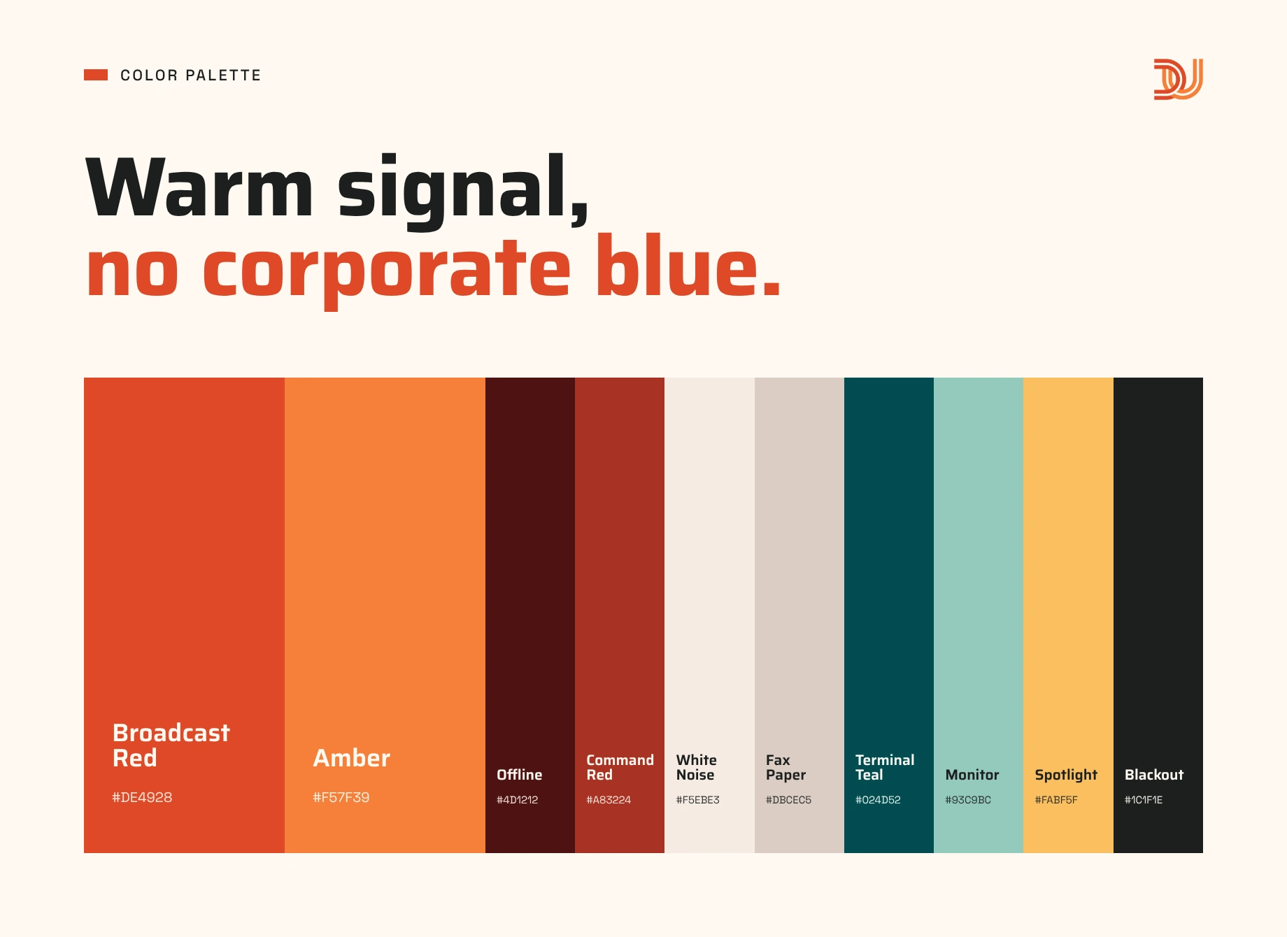
Color palette
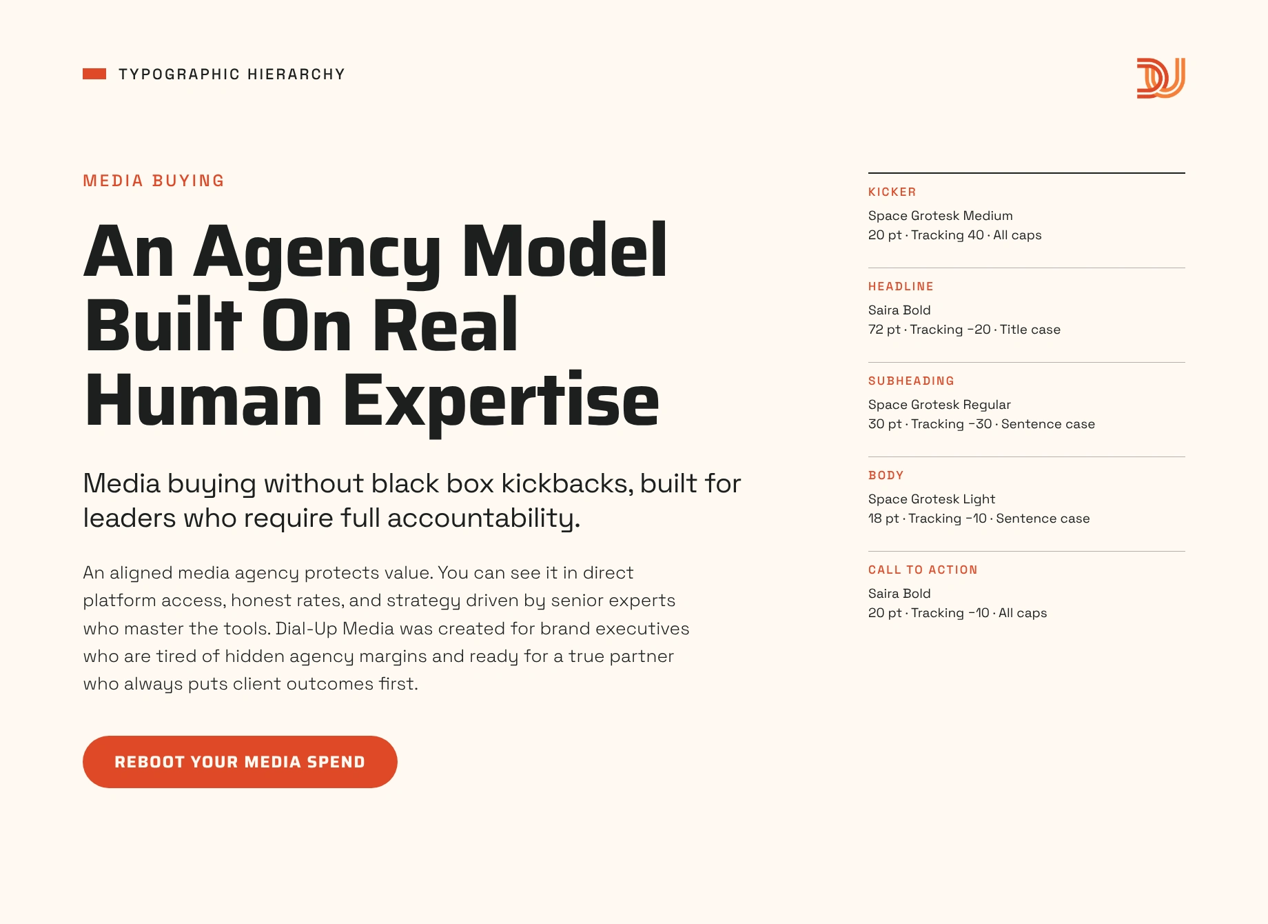
Type system
Motion
The same system then moved to the web.
The agency had grown past a single channel focus and its public presence was still catching up, so the site was rebuilt on a custom platform the team edits itself, including copy, client logos and a Journal of articles and podcast episodes. The page structure carries the identity's argument.
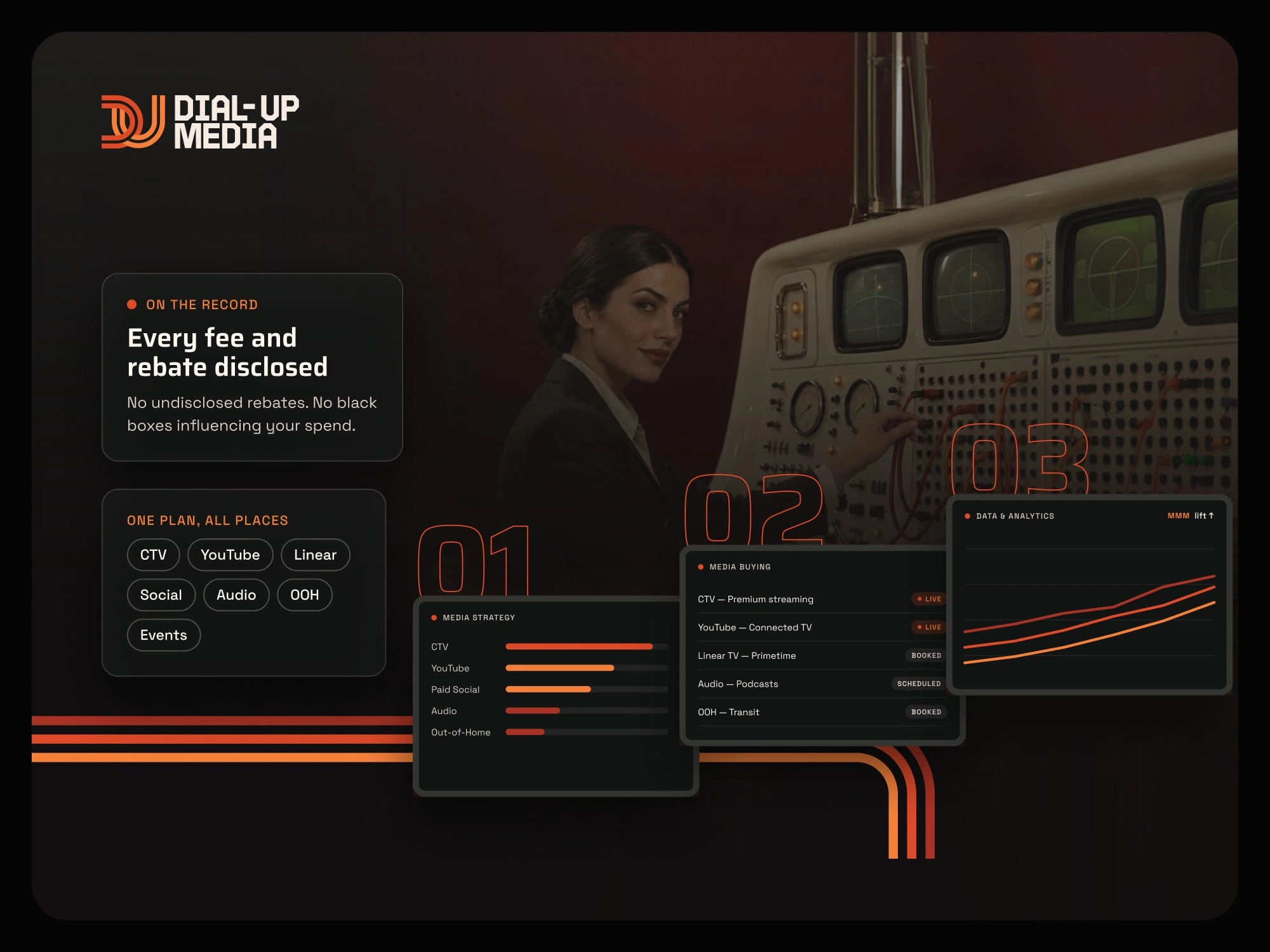
Web design
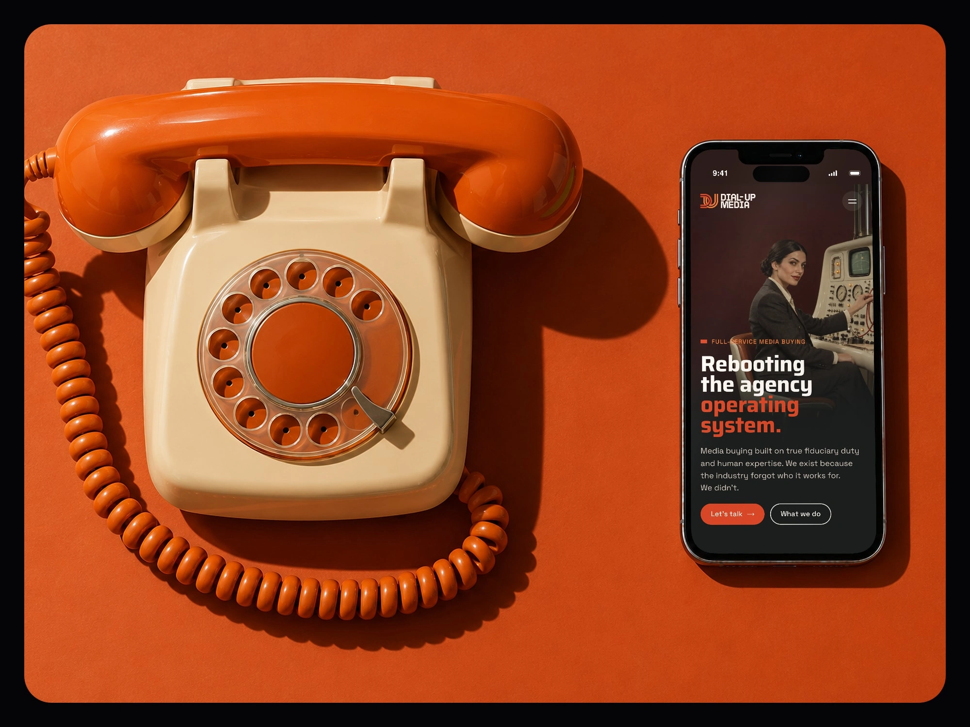
Mobile design
0 likes · 3 views · Oct 29, 2026
An identity and website rebranding for a California-based media buying agency built around a promise of nothing hidden between budget and outcome.


