RentWise Logo Design

Oluwafemi Gabriel

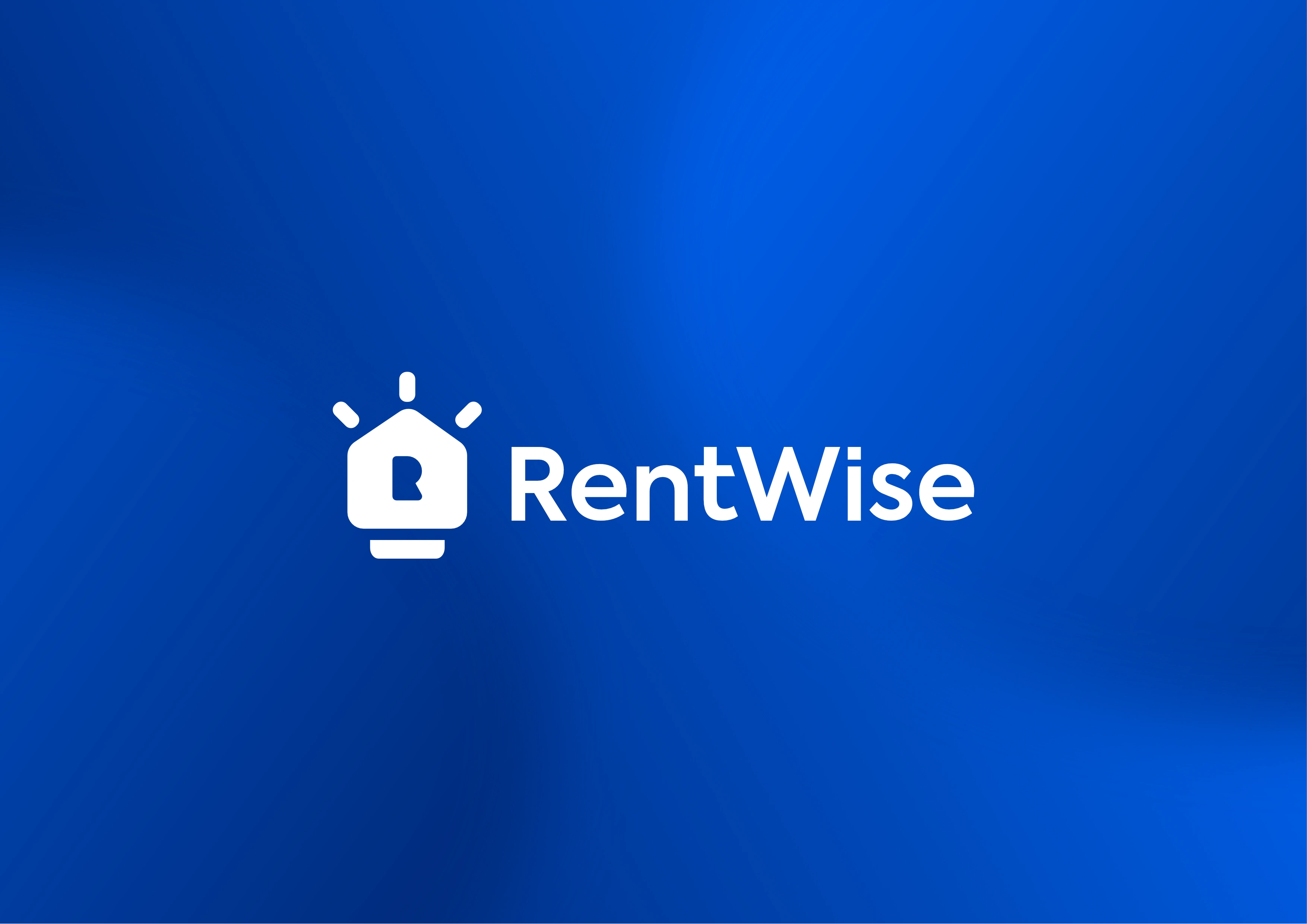
RentWise
RentWise is an online savings platform that allows users to save money towards getting an apartment, paying for property or mortgage.
The challenge was to create a new Logo for the Brand, which they consulted me for. After evaluating what they have and all the information gathered, this is the logo that was created.
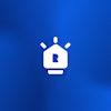
The concept in this logo is unique and very simple.
First thing that is noticeable is the house which is the main element in the logo because it conveys one of the important things that RentWise is about. Secondly is the keyhole, which also forms the first initial letter of the brand name, R. Finally everything was compounded to for a lightbulb with three shapes that forms a W, which is the second initial letter in the brand name, representing the light rays and showing that the lightbulb is active to convey the word, wise.
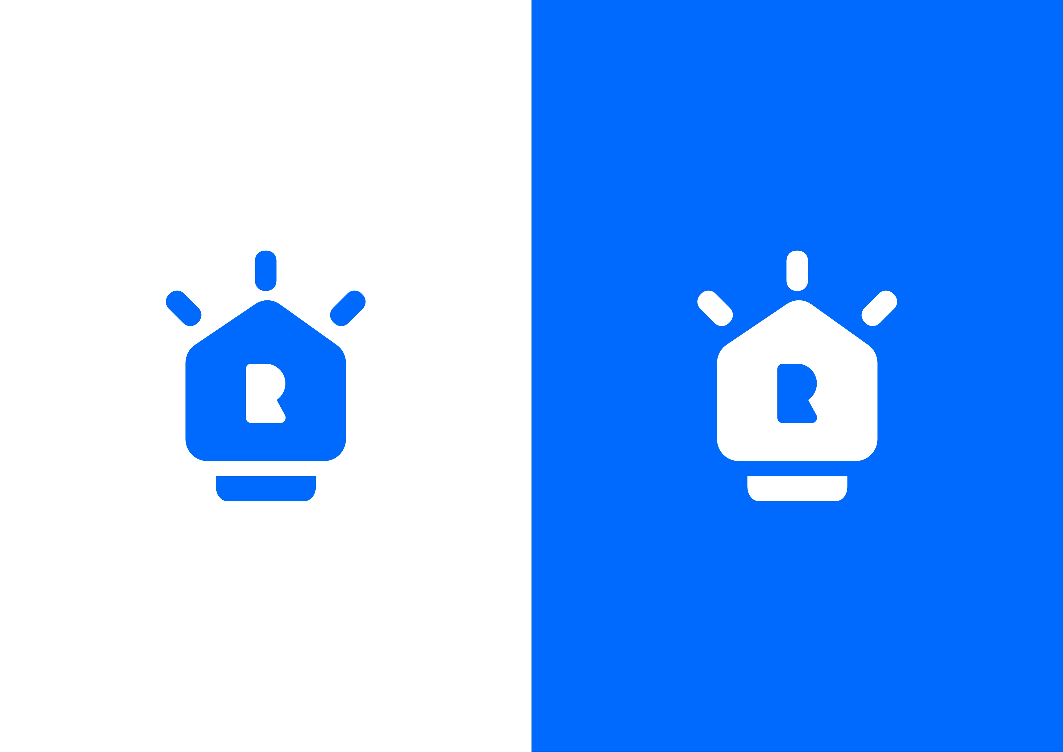
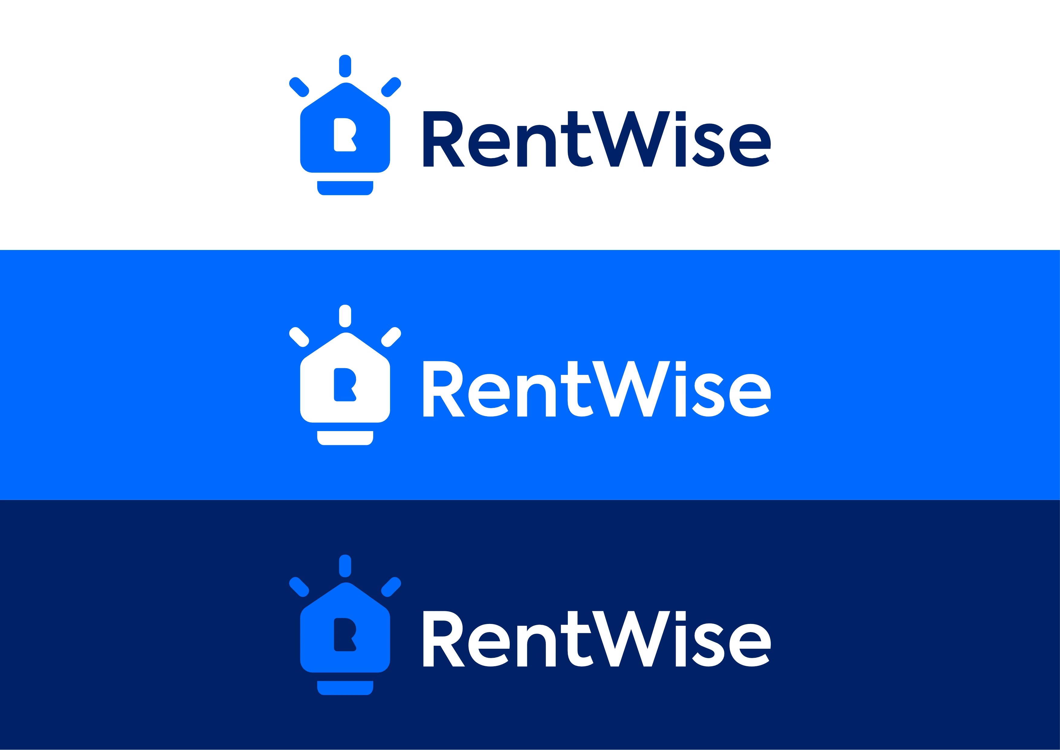
Considering one features of a functional logo which is adaptiveness, the RentWise logomark was created to adapt to different color usage including black and white which is a very essential characteristic of any functional logo.
Thank you for coming through!
You can reach out to me when you have a project to work on, I am looking forward to working with you.
Like this project
Posted Mar 6, 2021