Experience in Healthcare Management: A UX Transformation
Overview
This case study explores my role in improving the overall user experience of the VSaúde Gestão, a comprehensive healthcare management system developed by VSaúde, a healthtech company specializing in applications for medical professionals.
The project aimed to address user complaints about system complexity, unintuitiveness, and difficulties in understanding business rules within the platform. The goal was to enhance user adoption and engagement while reducing user effort.
Role and Duration
As the lead UX designer, I collaborated closely with a talented designer and received unwavering support from our dedicated Product Owner (PO). Additionally, I benefited from the valuable support of our Customer Support (CS) team and the Sales team.
The project spanned four intensive months, marked by thorough research, user-centric design, and meticulous implementation.
Problem Statement
Users encountered difficulties in utilizing VSaúde Gestão's features, particularly in configuring settings and comprehending implemented business rules. This led to low engagement and high user churn rates, primarily due to usability issues and excessive user effort.
Goals
Our multifaceted objectives encompassed:
Identifying and comprehending users' foremost challenges within the system.
Enhancing the overall usability and user experience of VSaúde Gestão, sans any major structural overhaul.
Elevating user engagement while mitigating user effort.
Design Process
Research and Planning
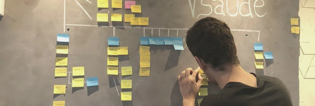
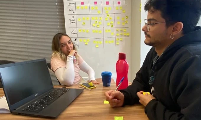
In our design process, we followed a systematic approach to address the challenges faced by VSaúde Gestão. We began with extensive research and planning, carefully defining our research objectives and identifying problem areas within the system. To gain valuable insights, we conducted user interviews and comprehensive surveys. This allowed us to create and validate user personas, develop empathy maps, map out intricate user journeys and thoroughly dissect the existing system flows. Additionally, we devised key performance indicators (KPIs) to measure the success of our project.
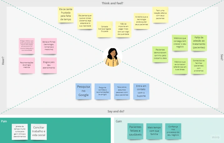
These personas were not mere hypothetical constructs but were grounded in real user data and insights gathered through our extensive research efforts. Additionally, we employed empathy maps to delve deeper into the emotional and psychological aspects of our users. These visual aids facilitated the organization and visualization of user thoughts, feelings, and pain points. By fostering empathy with our users, we gained valuable insights that informed our design choices, ensuring that our solutions resonated with users on an emotional level and addressed their motivations.
Furthermore, we developed user journey maps to provide a comprehensive overview of the entire user experience within the VSaúde Gestão system. This involved meticulously documenting each user touchpoint and interaction, spanning from the initial onboarding process to the completion of specific tasks. By mapping out the user journey, we were able to pinpoint areas of friction, identify bottlenecks, and uncover opportunities for improvement.
Analysis and Insights
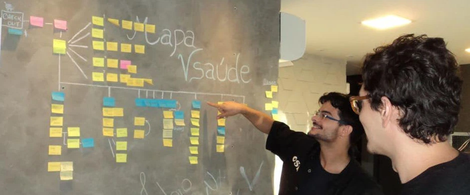
The next phase involved analyzing user feedback to uncover major pain points and sources of frustration. We dedicated ourselves to the painstaking task of prioritizing these issues and tactically identifying potential solutions. Our focus was on revamping system flows and intricacies to ensure that users could enjoy a seamless and intuitive experience.
Design Iterations
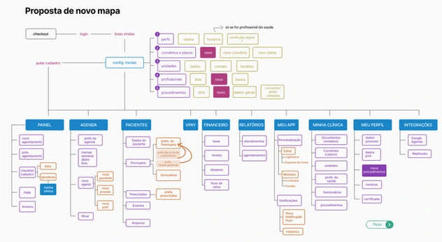
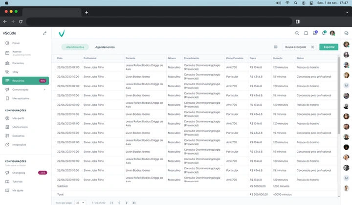
Moving forward, we adeptly crafted prototypes, cleverly building upon the existing UI as our foundation. We introduced innovative strategies aimed at guiding novice users through the setup processes, significantly reducing confusion. Furthermore, we undertook a comprehensive overhaul of system pathways to ensure a harmonious interaction with the complex business rules. Our ultimate aim was to align the UI with user expectations, striving to deliver a seamless and gratifying experience.
Results
The culmination of our relentless research and refined design interventions bore fruit:
A streamlined onboarding process alleviated confusion for new users.
System flows were artfully reconfigured, guiding users intuitively.
A refreshed UI resonated more profoundly with users' expectations.
Key KPIs painted a vivid portrait of progress: task completion times were expedited, abandonment rates for specific tasks plummeted, and both the Net Promoter Score (NPS) and Customer Effort Score (CES) displayed marked improvements.
Impact
Our design solutions instigated a profound transformation, positively reshaping the user experience. Engaged users became the new norm, and the once formidable churn rate began to diminish. Noteworthy achievements included expeditious task completion, reduced task abandonment, and resoundingly improved NPS and CES scores.
This comprehensive case study illuminates the extraordinary journey of user-centered design in surmounting intricate usability challenges within a healthcare management system. It serves as a testament to our unwavering commitment to enhancing user experiences and promoting user adoption within the healthcare ecosystem.
Like this project
Posted Sep 20, 2023
This case study explores my role in improving the overall user experience of the VSaúde Gestão, a comprehensive healthcare management system developed by VSaúde

