Uwazi UI Redesign and Refactor
Juan Cornejo
Redesign and refactor to improve clarity, consistency, and usability across Uwazi’s workflows.
A multi-phase UI refactor focused on clarity, consistency, and scalability: mapping the legacy interface, rationalizing patterns, prototyping improvements, testing with power users, and shipping a cohesive design system.
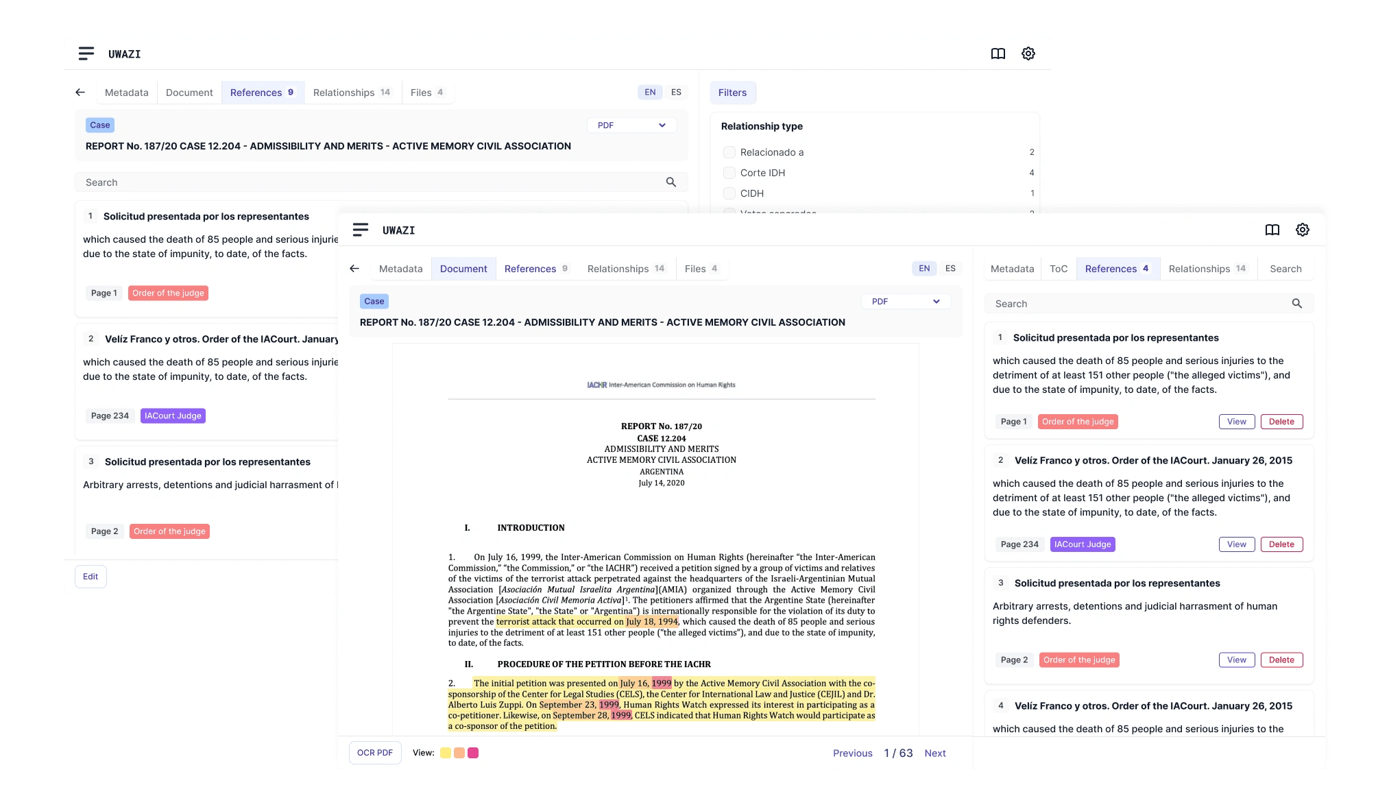
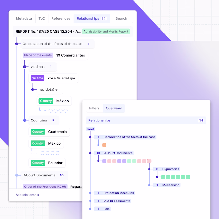
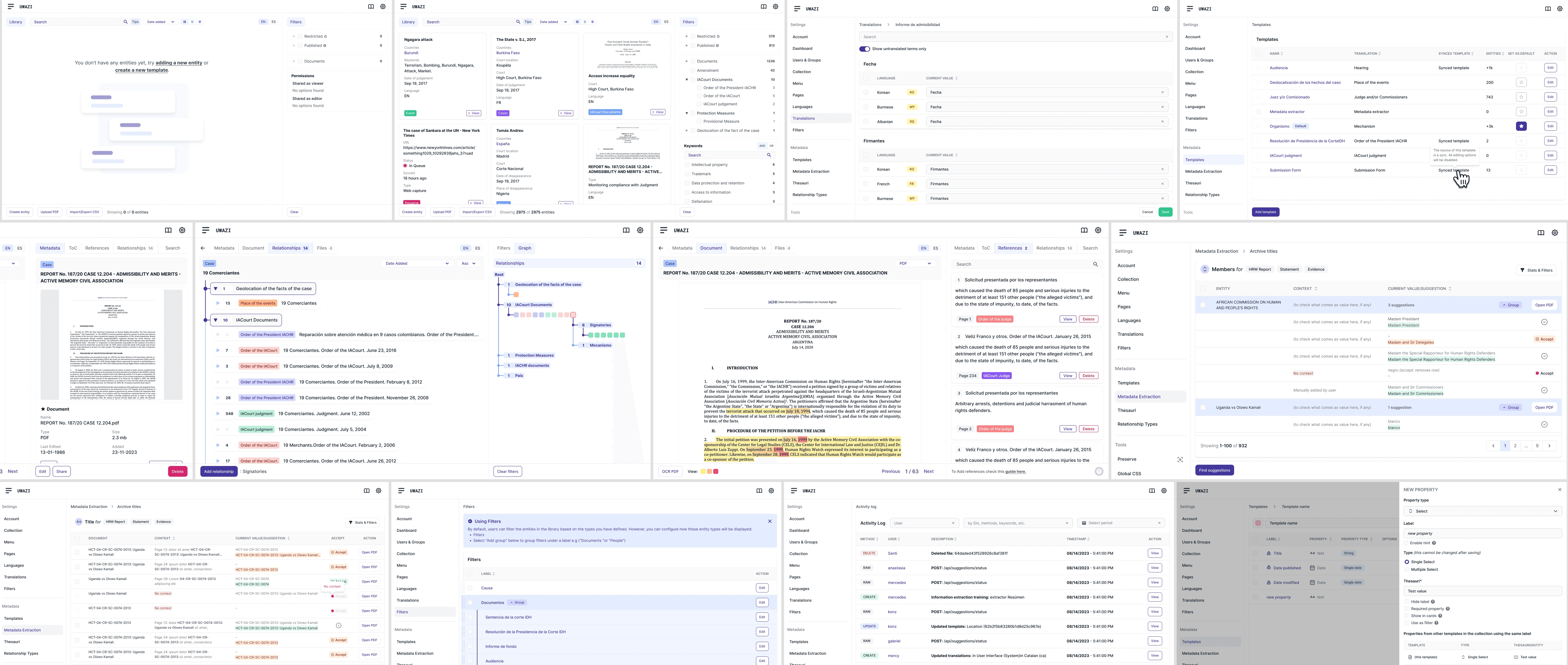
Text referencing and multi-layer linking
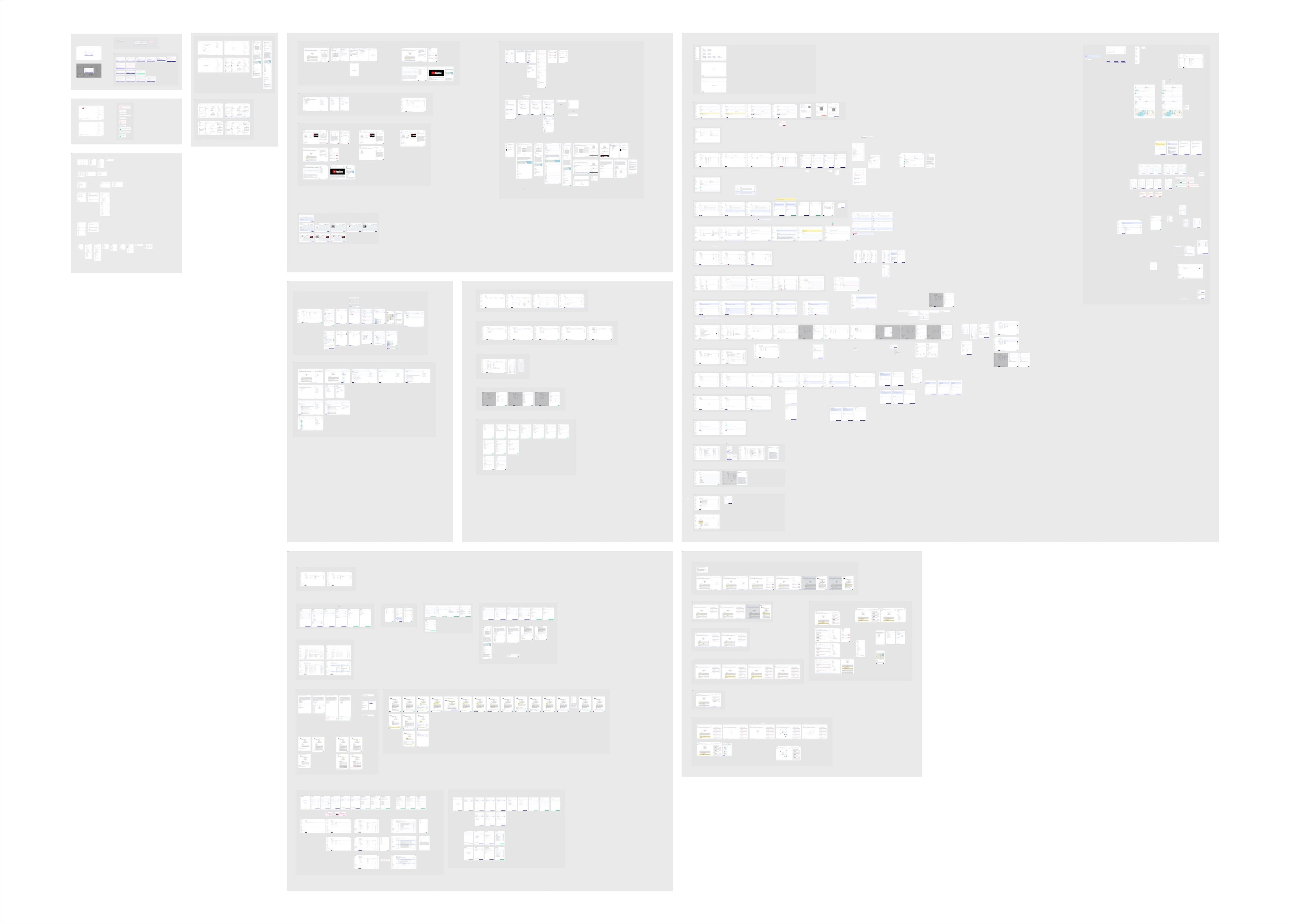
Birds eye view of the final figma file
Uwazi had grown into a powerful but inconsistent tool. As features multiplied, the interface drifted, making dense workflows harder to navigate. My challenge was to bring clarity and consistency without disrupting expert users.
I mapped legacy flows, audited hundreds of screens, and catalogued patterns that had drifted apart. Collaborating with engineers and the CTO, I sketched new hypotheses and validated them through quick prototypes and feedback from power users.
We tested new approaches to navigation, spacing, and visual hierarchy. Before/after comparisons revealed where clarity improved and where power users resisted change. Iterations refined both usability and trust in the new system.
Delivered a design system with tokens, consistent input states, and reusable templates. Empty states guided users instead of blocking them. PDF flows became clearer and more predictable. The system became easier to scale for engineers and more coherent for end users.
I learned how important it is to codify patterns early, and how powerful user feedback loops can be. This work laid the foundation for Relationship v2 and Text References — concepts I prototyped as next steps for Uwazi.
Like this project
Posted Nov 6, 2025
Redesigned Uwazi's UI for clarity and scalability, delivering a cohesive design system and improved user-flows.
Likes
0
Views
4
Timeline
Jun 1, 2022 - Oct 24, 2023
Clients
HURIDOCS