Wings Studio Logo Design

Milos Maksimovic


Wings Studio Logo Design
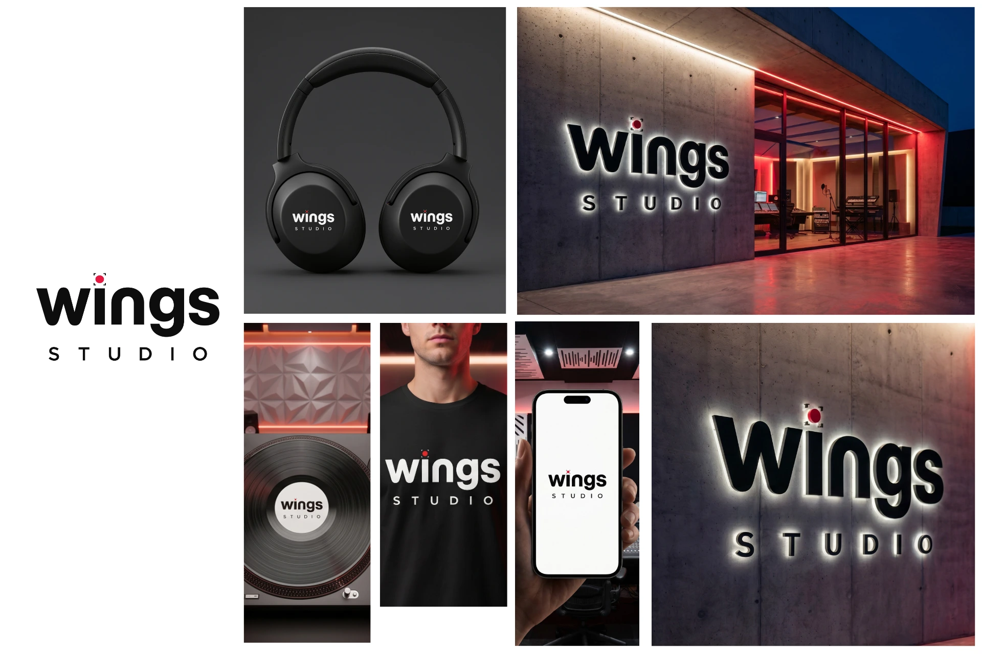
Created a custom logo for Wings Studio that avoids literal wing imagery, using a refined typographic approach and a recording-inspired detail to reflect the studio's connection to music production.
Overview
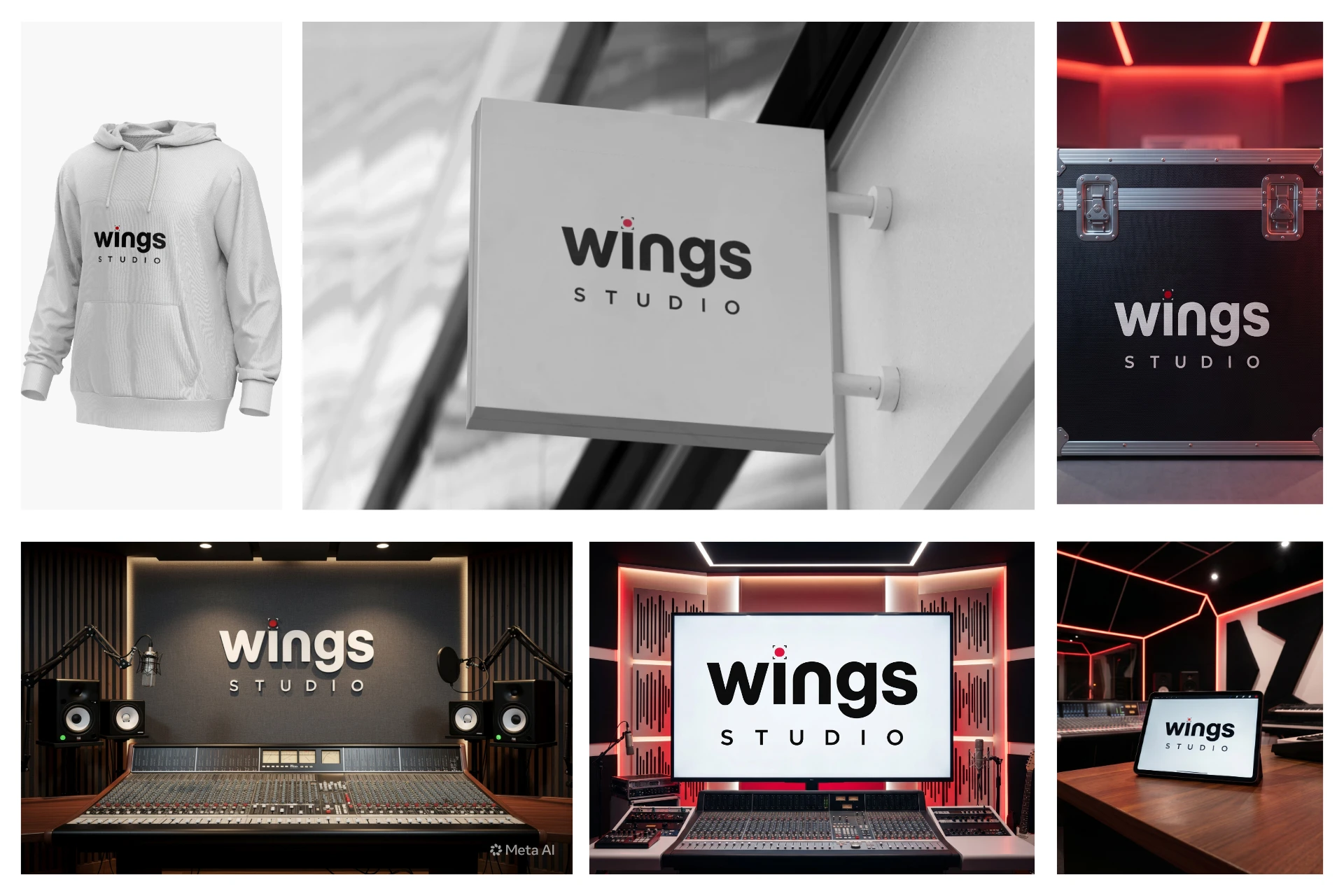
Wings Studio approached me to create a distinctive logo that reflects the brand's creative direction while remaining clean, memorable, and versatile across digital and print applications.
The Challenge
Create a recognizable visual identity
Balance originality with simplicity
Ensure scalability across different sizes
Design a logo suitable for both digital and physical branding
Design Decisions
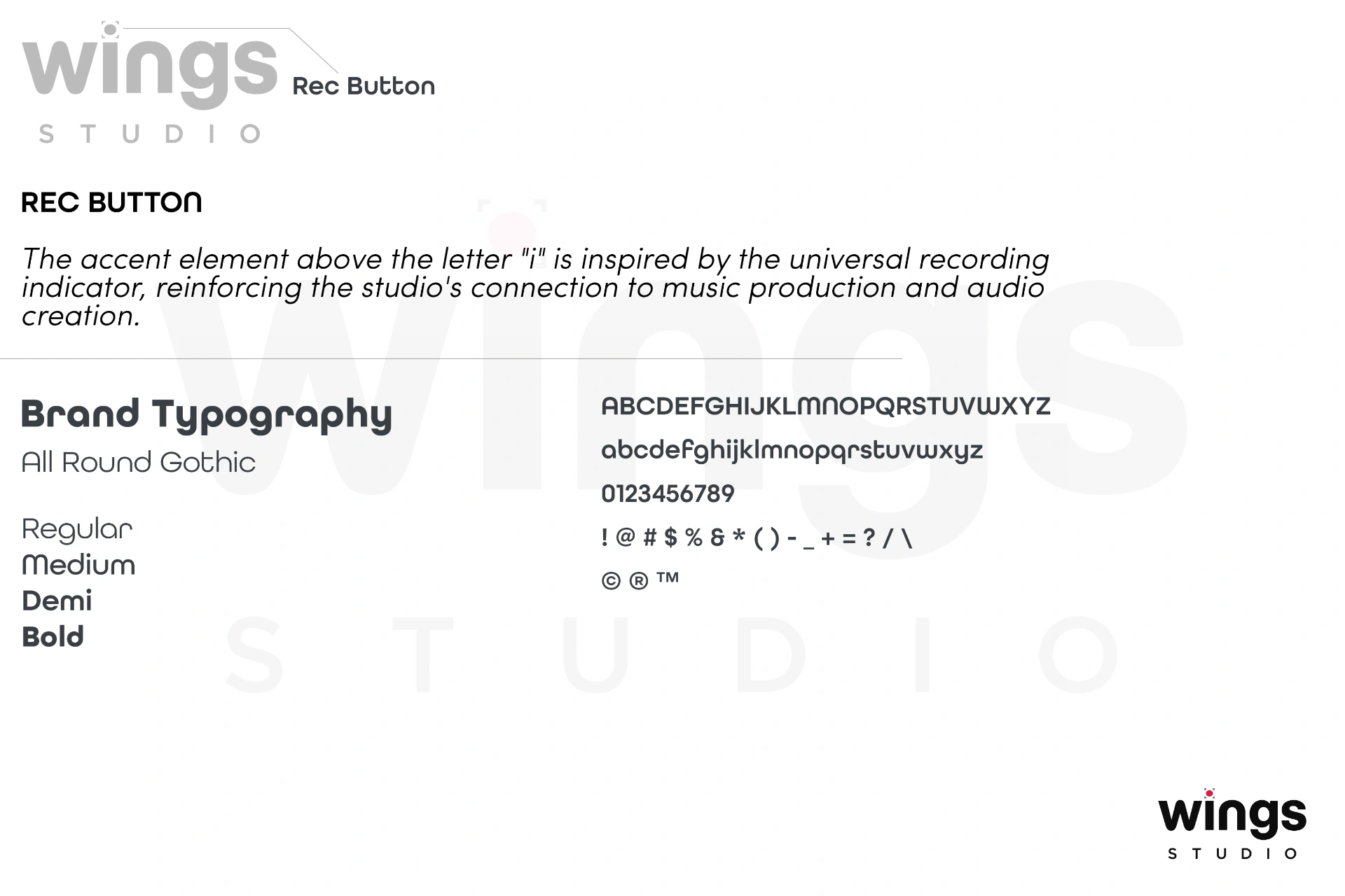
Although the brand name is Wings Studio, the client specifically requested to avoid using wings or any literal wing symbolism. Instead, the identity relies on typography with a subtle conceptual detail.
The accent above the letter "i" was transformed into a recording indicator, referencing the universally recognized REC light used in music production and recording environments. This creates a meaningful connection to the studio's industry without relying on obvious visual clichés.
Final Logo
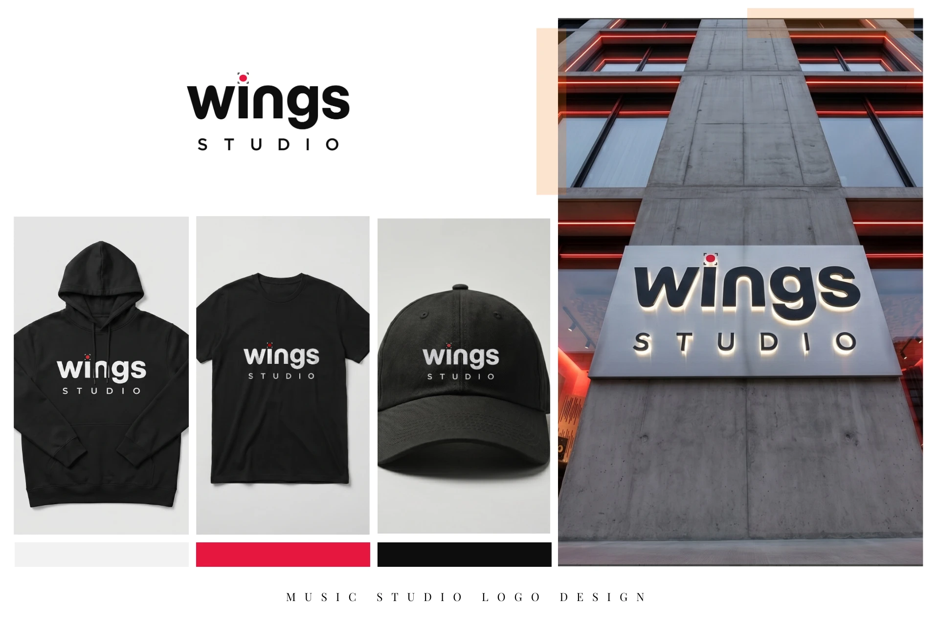
Brand Applications
Deliverables
Primary Logo
Color Variations
Black & White Versions
Vector Files (AI, SVG, PDF, EPS)
PNG Assets
Services
Logo Design
Brand Identity
Visual Identity
Brand Strategy
Like this project
Posted Jul 7, 2026
Created a modern logo for Wings Studio, replacing literal wing symbolism with a subtle recording-inspired typographic detail.