DeSense Branding
Waleed Ahmed
Overview 🔎
DeSense branding was the most challenging project, cause the thing I was looking for was very simple as simple that it never be noticed so that the only thing that the client remember is service. Firstly it was a minimal logo and then back to the word logo without any fancy calligraphy and then it was about color, after the number of trials on colors the only color left was white, and white was the right!
Problem & Solution 🤝
There were two main problems first was brand name and second was the logo (logo type).
Goals/Requirements: Requirements that helped get this project to the finish line.
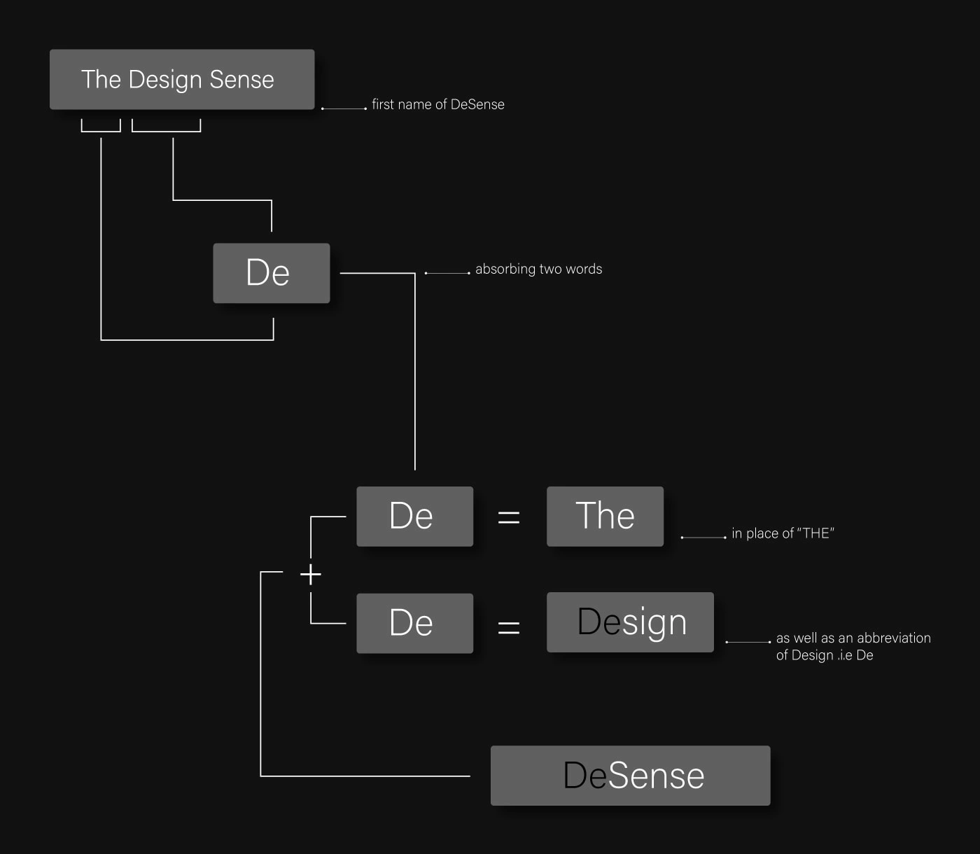
• Minimalize the the brand name that was "The Design Sense"
• Logo with most simple look
• A Slogan
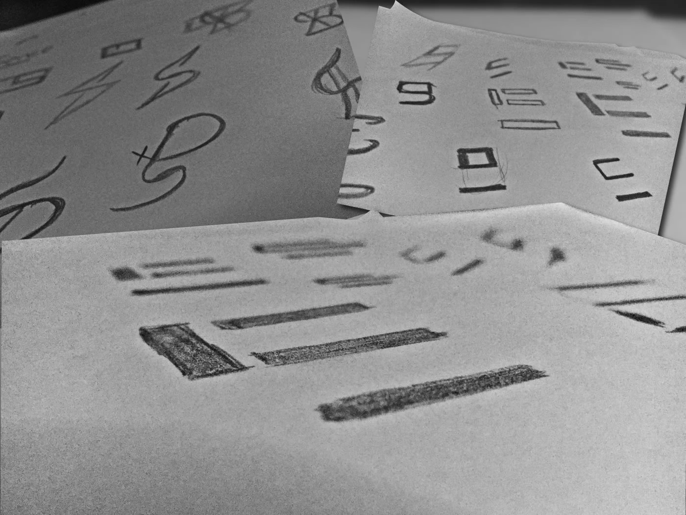
Process 🛣
The process was started from paper work where I design dozens of minimal drawings that convey our service about design, quick service and time saving and that's all but again at the end it was becoming very specific very limited and to get rid off that the only thing was word. So then it was switched to finding fonts...and here we comes with "Acumen Variavle Concept".
Results 🎁
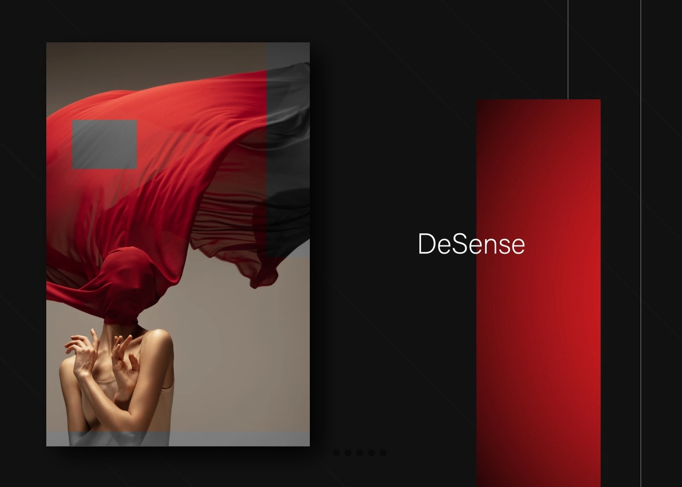
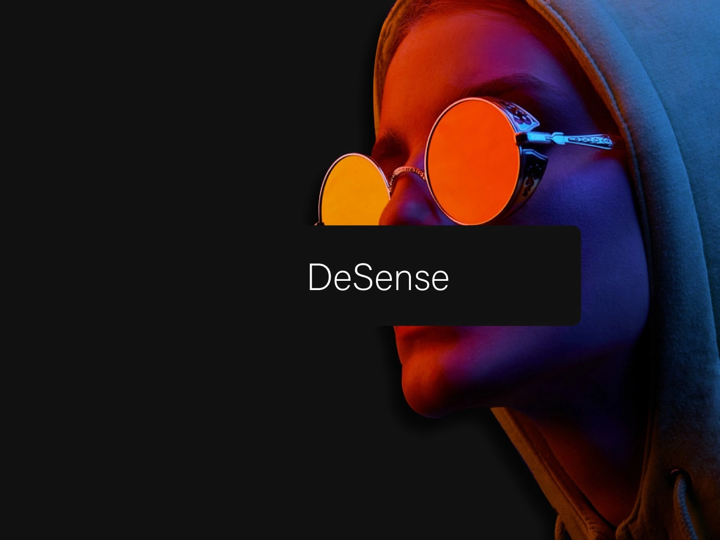
So that font was the final thing that comes in white color, it was white that represent simplicity, cleanliness and focus and many more characteristics.
SLOGAN: DESIGN, MAKE SENSE
and a quotation was another part
We Design for Living and By Design We Live 🗣
Like this project
Posted Jan 16, 2023
Designing logo for DeSense, minimal to word logo, colors to again white it was an amazing journey. All the story is here!