
What should a software brand feel like before anyone reads a single word? I wanted the identity to carry speed, confidence and calm at the same time.
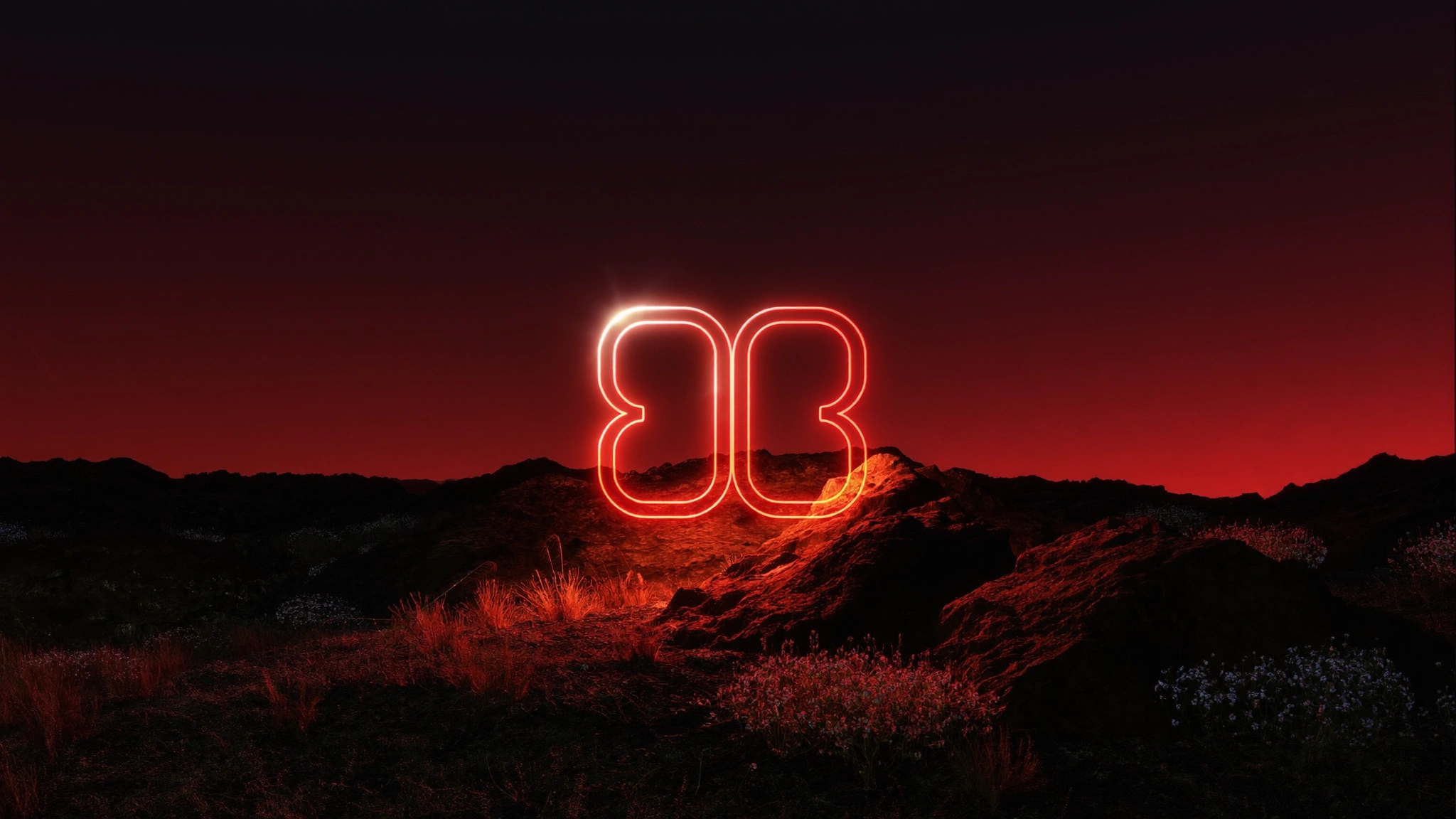
I began by designing the mark as one continuous line, so it could work as a logo, as a source of light and as a motion element across the whole brand. From there I built the hero world around it using AI and CGI, keeping to one strong light source, a restrained red palette and plenty of dark space so the headline and product message stay in control.
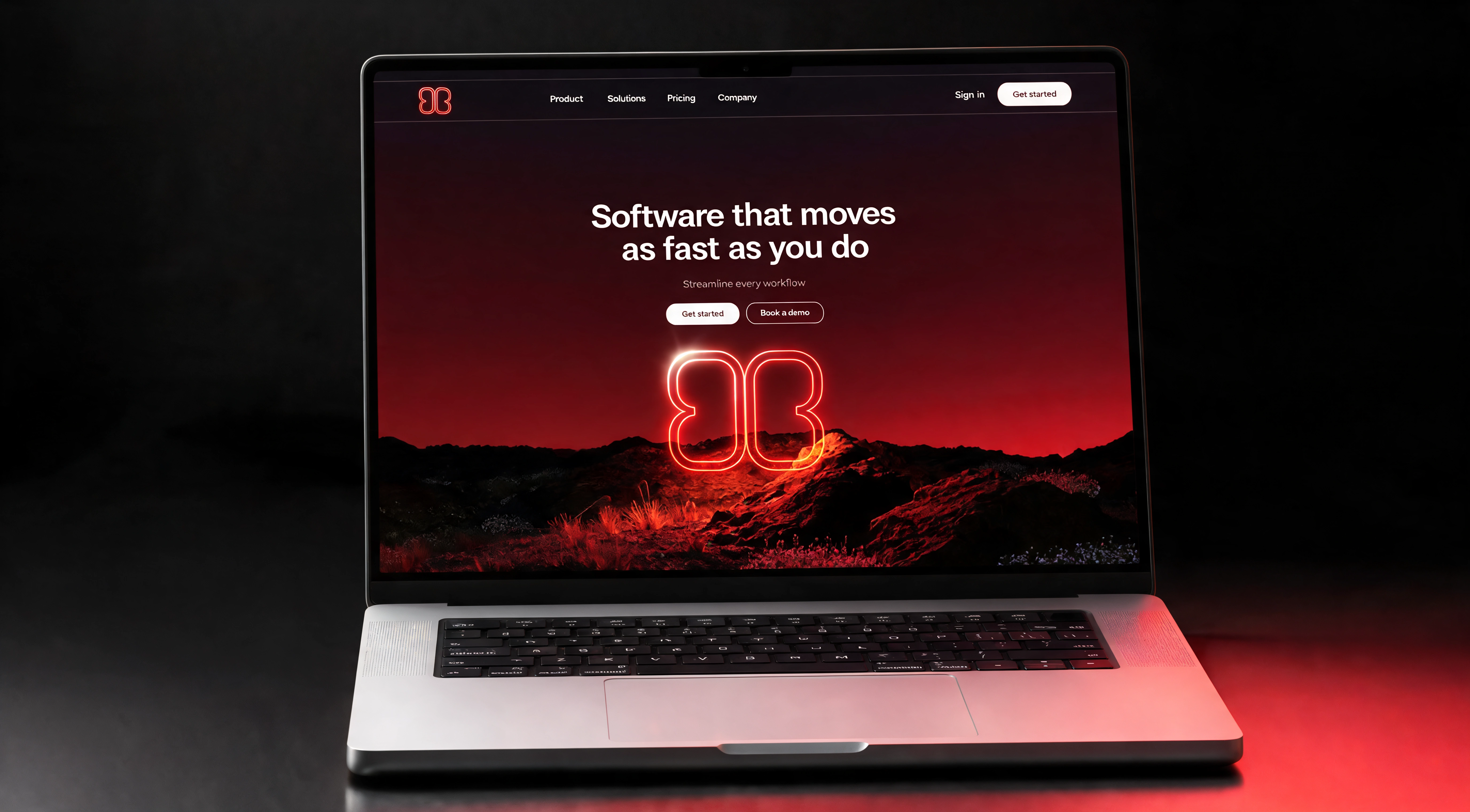
The last step was placing everything inside a real website layout and a laptop mockup. That way the logo, the hero and the interface are judged together as one system, the same way a client’s customers will see it.
0 likes · 0 views · Nov 15, 2026
A complete brand identity for a modern SaaS platform, built as one connected system instead of separate pieces. I designed a logo mark made to carry light and m


