Local Liquids - Brand Design
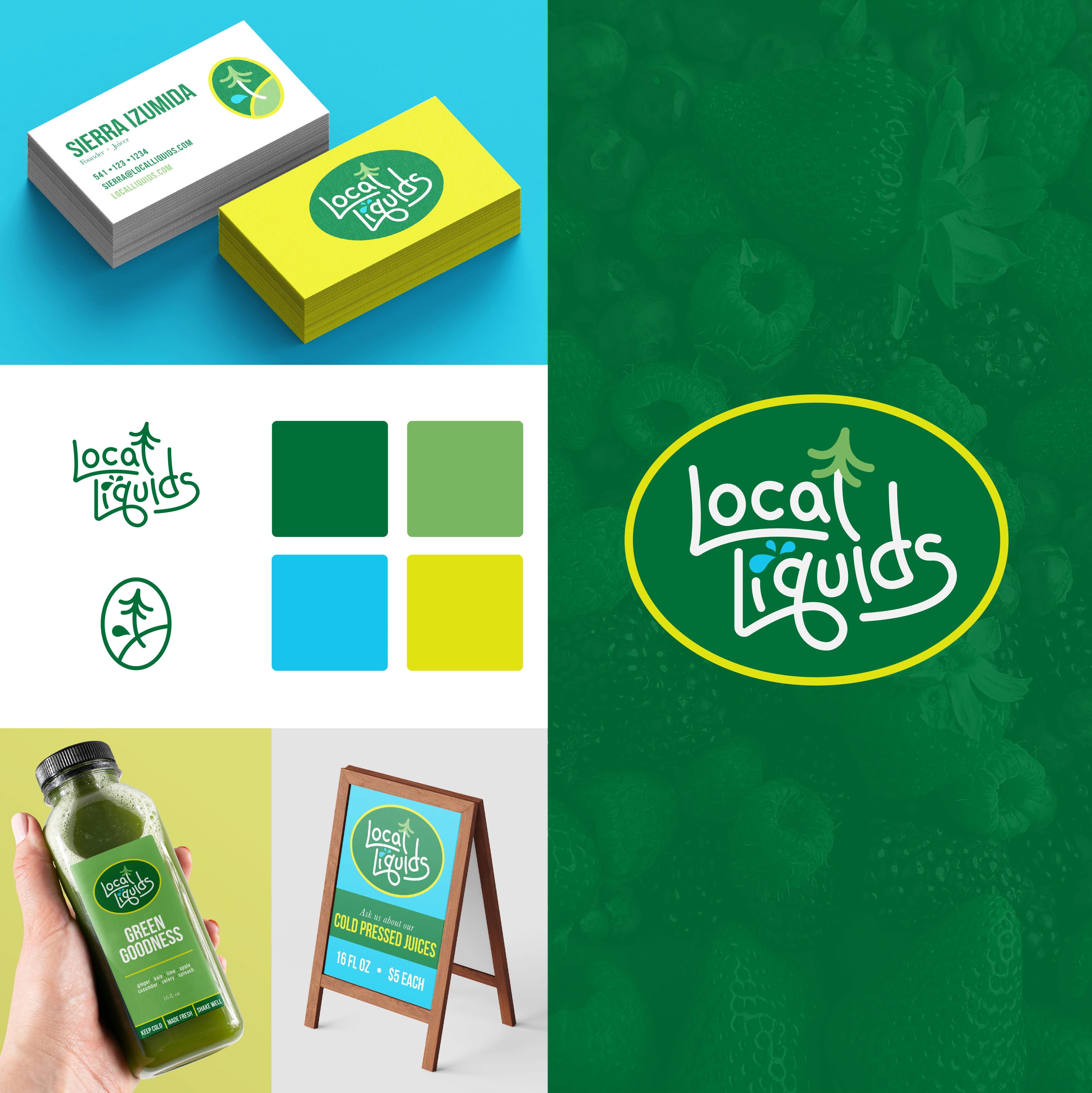
Business Information
Business Name: Local Liquids
Industry/Niche: Cold Pressed Juices, Nut Milks, and Teas (at Markets)
Brand Personality
Brand Description: Local source of health and abundance
Emotions to Evoke: Pacific Northwest Vitality
Target Audience
Ideal Customer: Repeat customers purchasing at markets or subscribing to weekly deliveries
Demographics: All ages, all genders
Interests: Personal health, vitality, enjoying life through refreshments
Competitor Analysis
Competitors: All bottled juices and milks
Competitor Logo Feedback: Competitors' logos do not appeal to locals and are too generic. Local Liquids' logo should feel homey.
Design Preferences
Color Scheme: Simple earth tones with one bright accent color (yellow, orange, or red)
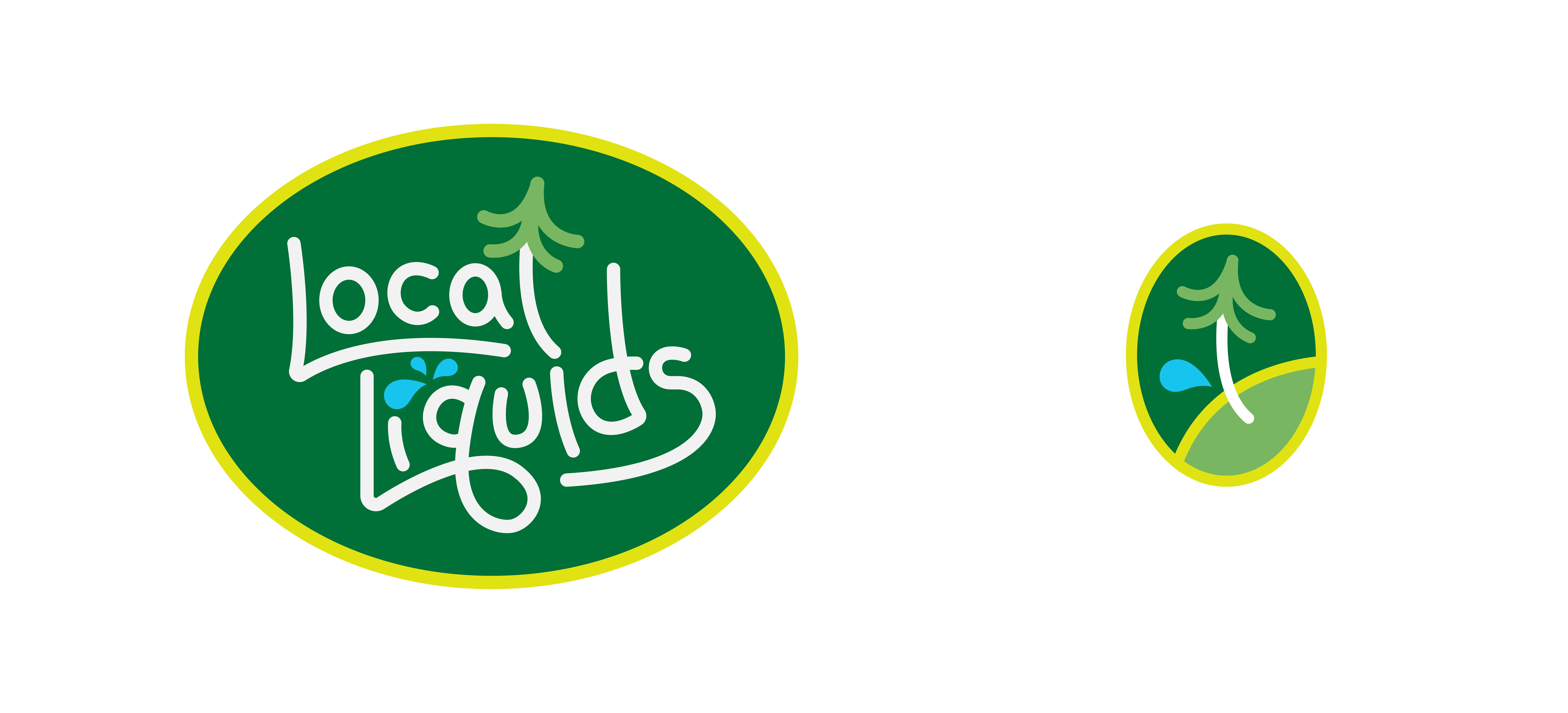
Font Style: Modern with elements integrated into the image, making the letters come to life
Symbols/Icons to Include: Tree and water
Logo Usage
Primary Usage: Website, business cards, banners, social media
Size/Layout Preferences: Circular
Preferred Logo Style:
Drawn to circular logos for their wholesome flow
Enjoys incorporating natural landscapes and plants into the logo, integrating these elements with the lettering
Prefers simple colors with one prominent accent color
Summary
Local Liquids was seeking a logo that embodies the vitality and abundance of the Pacific Northwest. The goal was to use simple earth tones with a bright accent color and integrate natural elements like trees and water into a modern, circular layout. The logo should evoke a sense of home and health, appealing to a broad audience interested in personal vitality and natural refreshments.
Like this project
Posted Jun 10, 2024
Local Liquids was seeking a logo that embodies the vitality and abundance of the Pacific Northwest.

