Arch Network Brand Creation
Craitve Jack
The Brief:
Create a distinctive brand for Arch Network.
Concept:
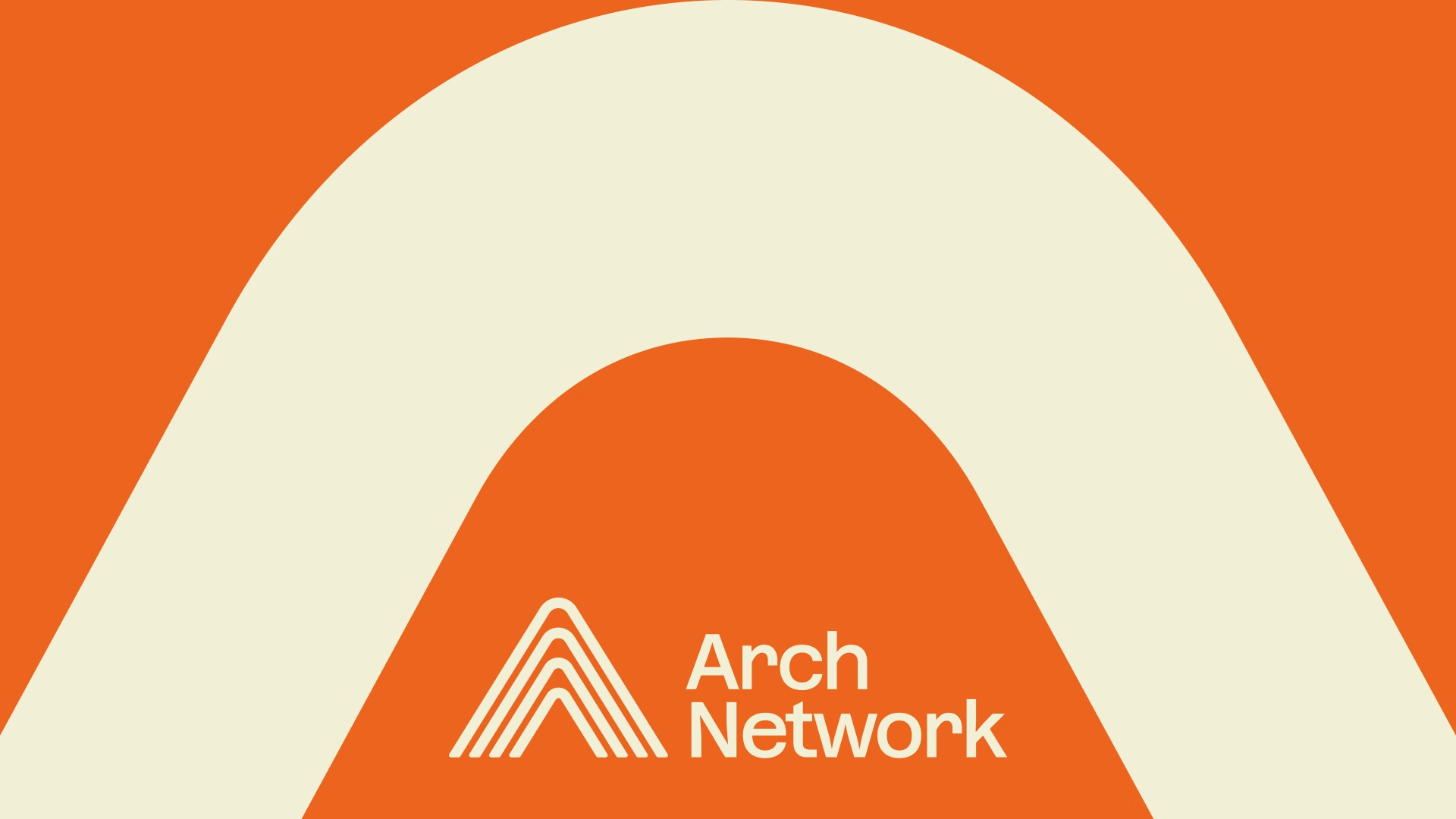
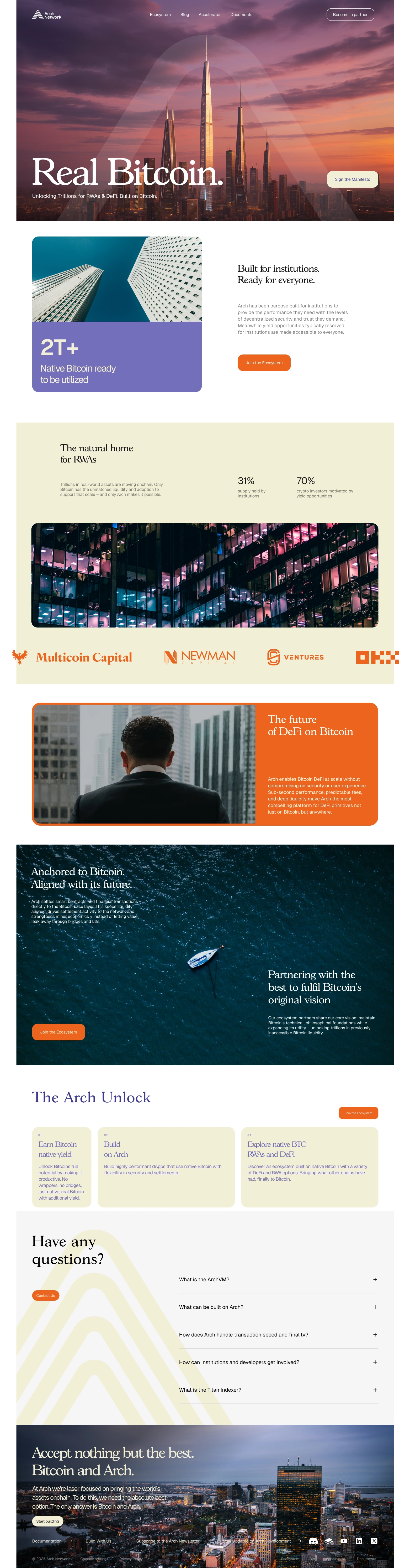
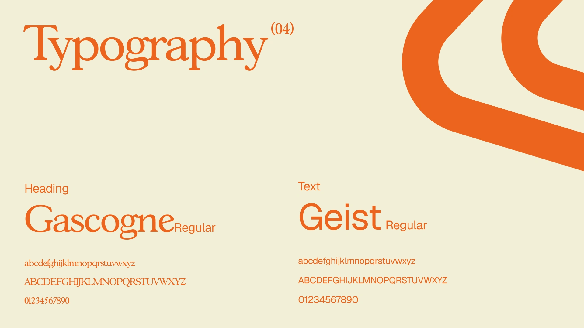
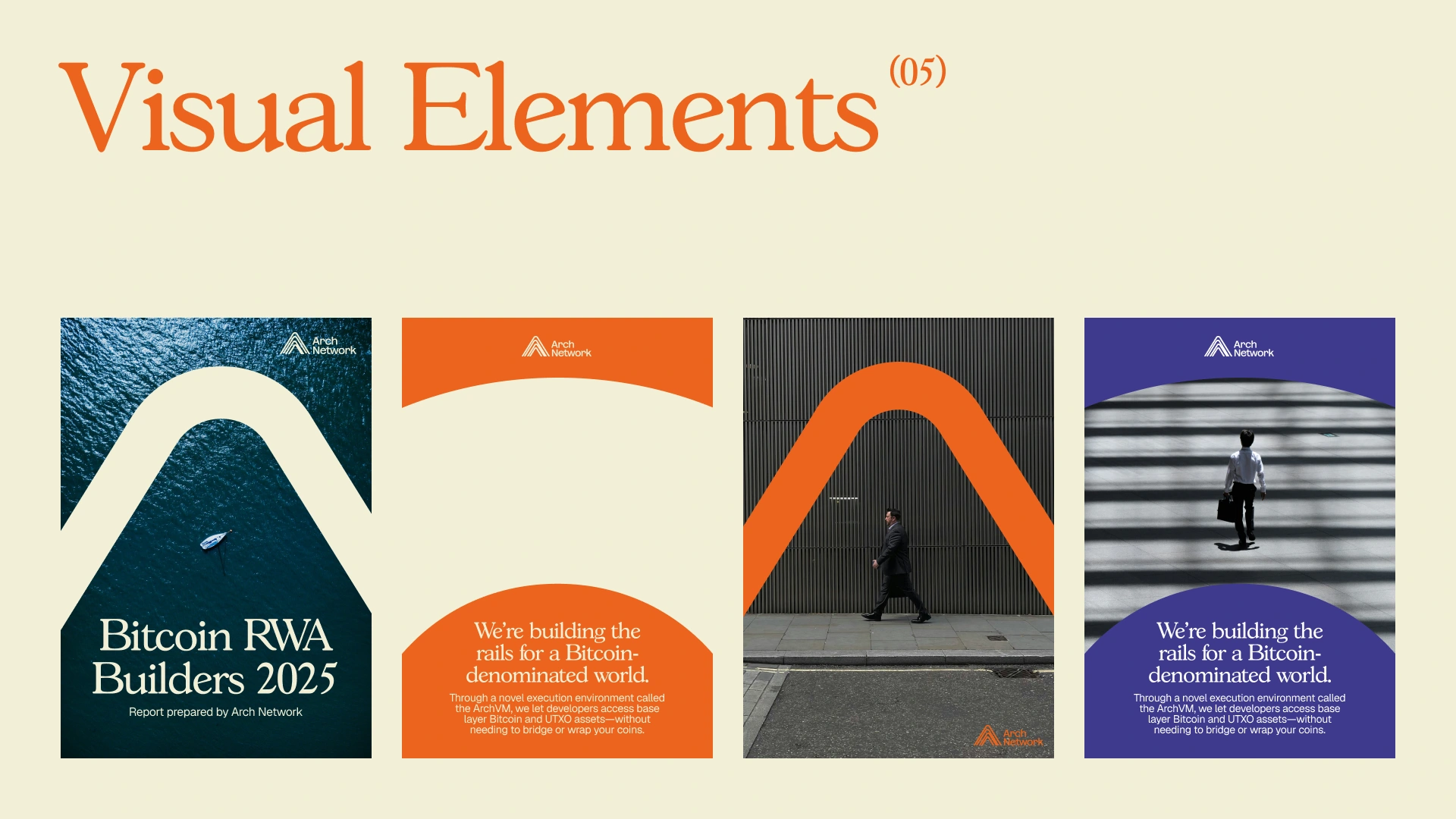
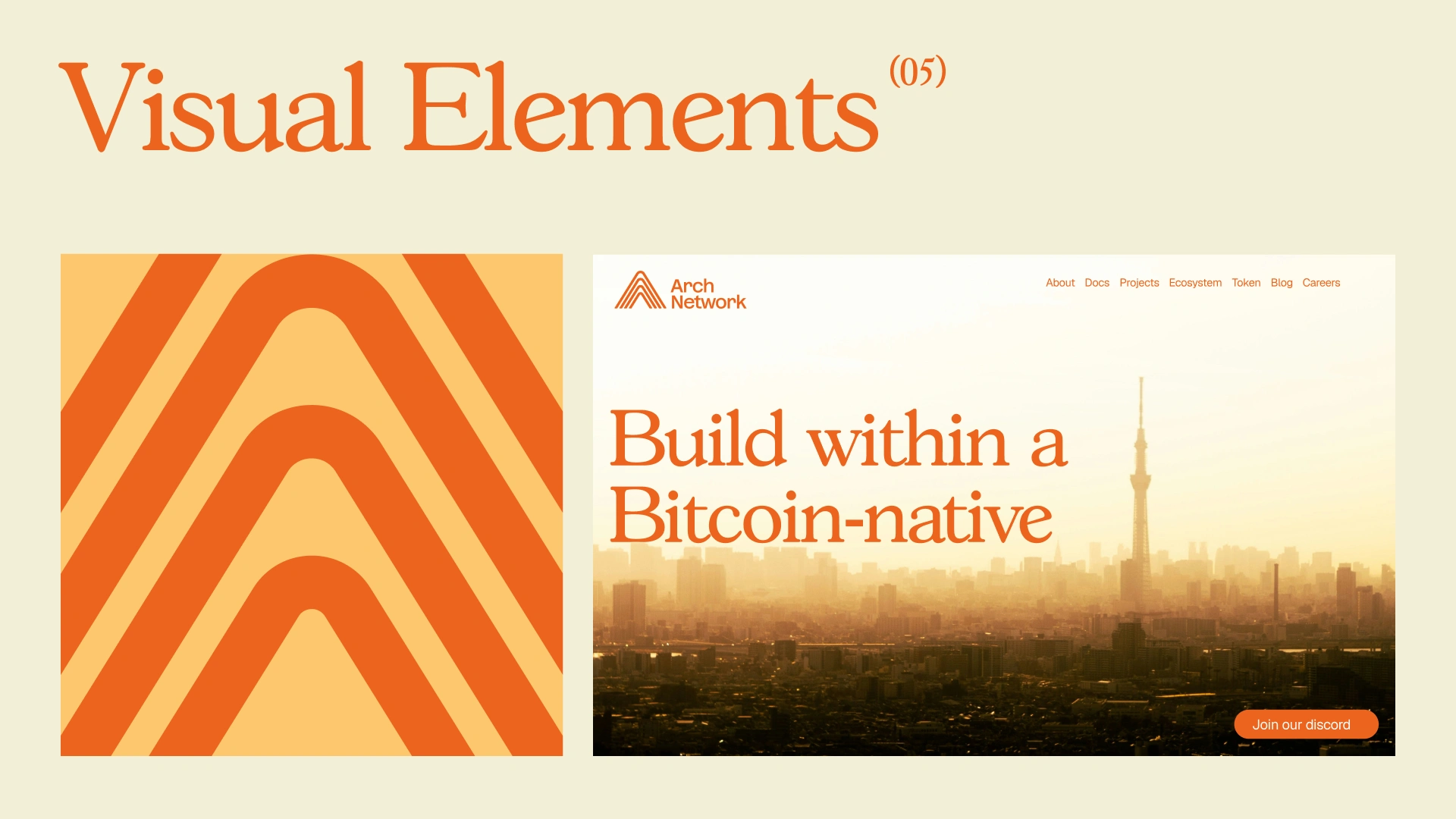
The logo becomes the anchor of the brand – an ownable mark that not only carries recognition but also provides design language. Parts of the logo extend into visuals, framing content and shaping the identity.
The color system is bold and block-based. White is the clean primary canvas, while secondary colorsin Orange, Interdimensional Blue, Bright Blue, Topaz, and Fuchsia – take turns dominating individual executions. This approach ensures clarity, energy, and distinction across every touchpoint.
Data is central to the story. Visual executions highlight key insights such as Bitcoin held by institutions, the percentage of dormant BTC, growth of institutional adoption—showing how Arch transforms Bitcoin into a productive, usable layer.


Like this project
Posted Mar 30, 2026
I worked with Arch Network at Hype to lead their brand refresh, creating a completely new look that's more aligned with their institutional focus.
Likes
1
Views
5
Clients
Arch Network