Strings: B2B Network Analysis Software
Experience Summary: 4 Years as Product Manager and lead designer of a BSS/OSS solution.
What was the challenge?
We were developing a system that is used by Internet Service Providers to manage customers' connections, and monitor the health of the network devices that are spread out in the infrastructure of a given city.
Our mission was to replace a legacy system that had been in existence for 16 years, and was designed by engineers, for engineers. In building this previous solution, they had simply replaced one problem with another.
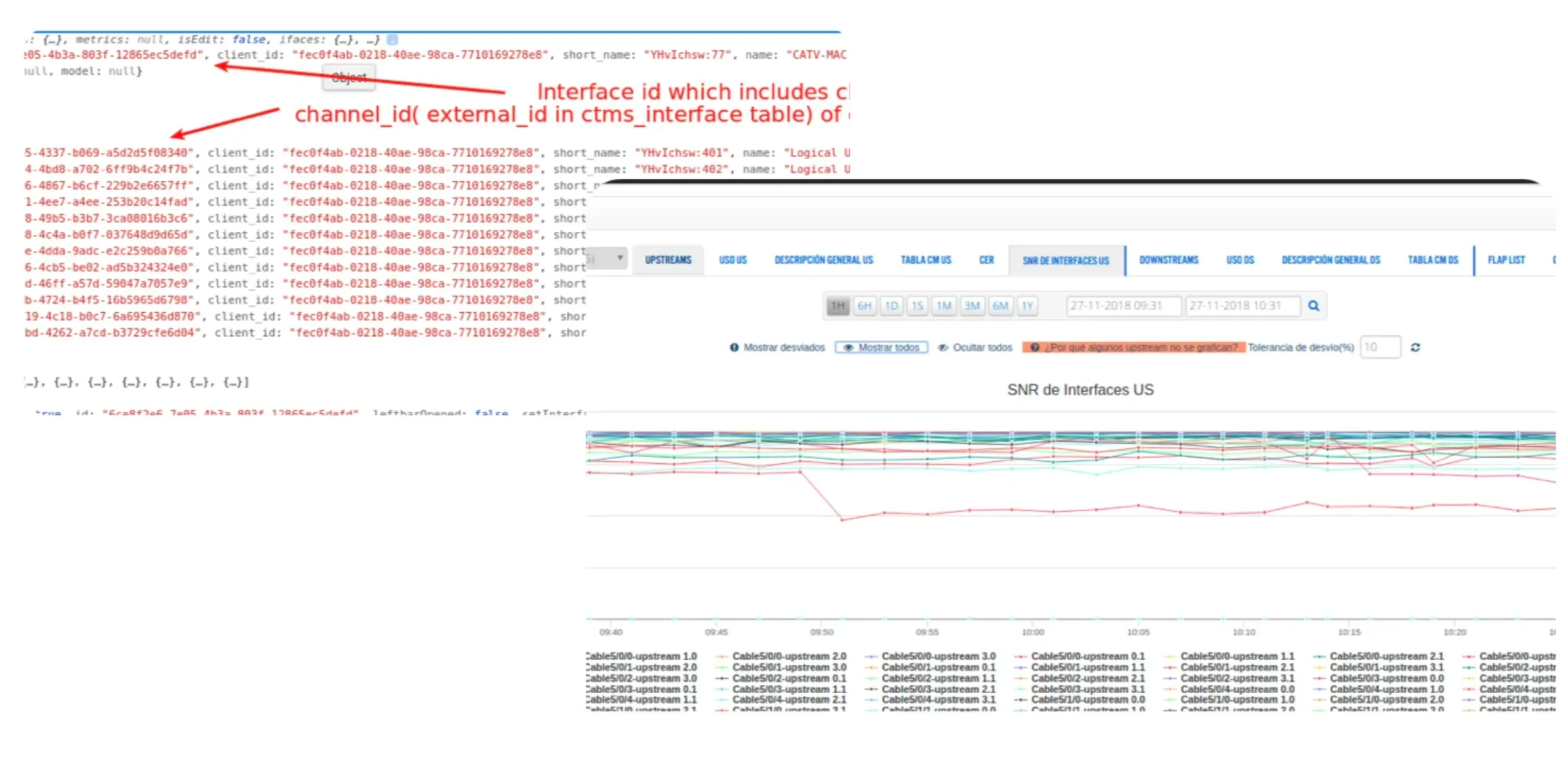
The engineering team at the core of the legacy product thought it was ok to have a chart with 64 lines.
There was a crucial metric, called SNR (Signal-to-Noise Ratio), which needed to be inspected in the context of nearby channels within a single interface. The caveat was that each interface could have up to 64 channels. The legacy solution was to make a chart with 64 lines, one for each channel.
It was madness, and yet the best way people had to find what they needed. Network analysts put up with this because there was simply no other way. Looking at those values in raw data format would not have been better. But we had an obligation to make this right.
Design Solution: A quick glance can speak volumes
I looked for different analogies from data-intensive products and built Figma prototypes to try with our most experienced network analysts. Through the research, we arrived at the possibility of using cues from the UX of music players.
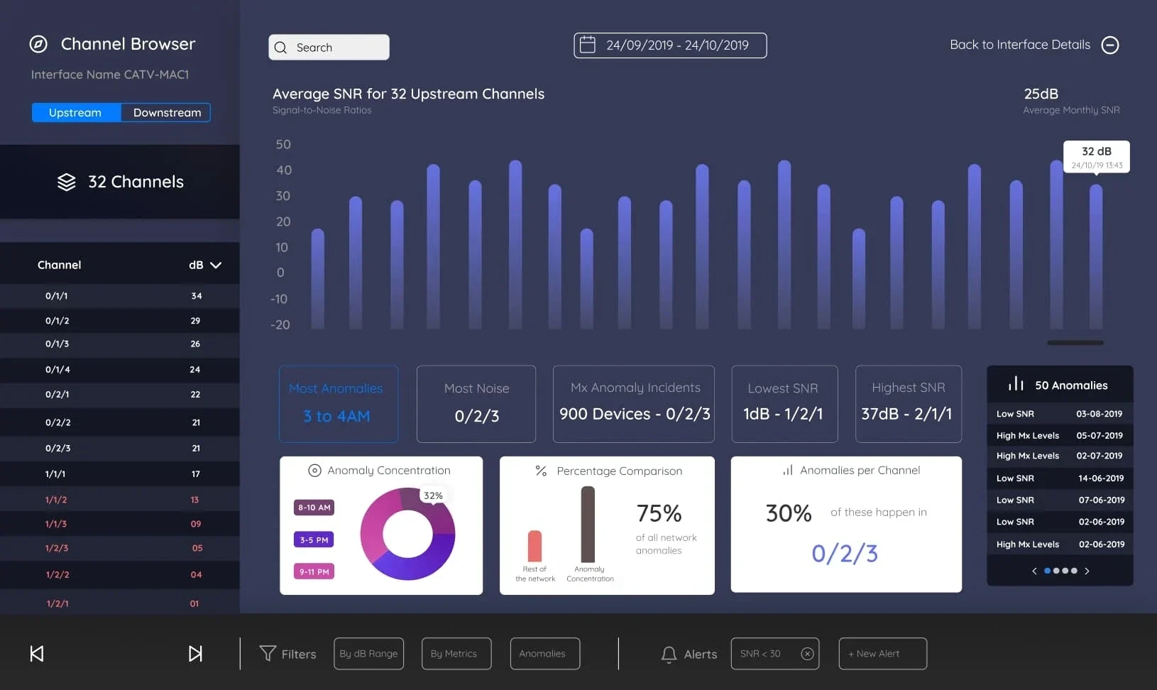
A browsing experience gives more versatility to power users, and can still guide people into discoverability.
In our case, the network devices would be like genres, the interfaces inside a device would be like artists, with the metrics serving as albums and the channels acting as songs. The appeal was that you could take a dashboard, high-level view of anything that required your attention, but you could also comb through the entire "library" of network noise expressions.
We wanted to do this because our data showed that seasoned network analysts made a difference by exploring and filtering through data. By giving them a familiar UX where they could skip channels as if they would skip a song they did not like, they were able to inspect and leave notes with their observations per each channel.
If they did not know which "song" to play, they could arrive at a list of potential entries simply by filtering metric ranges. It was like saying "show me all the songs in the library that feature these musical notes, and last for exactly 3 minutes and 32 seconds".
It was a revelation. In network analysis, this is UX gold.
Performance is Everything
We validated the design using early coded versions that would display enough data for our most loyal customers and internal staff to get a good measure of how useful the new layout was, and how the features helped get to insights quicker.
But when doing this we realized we would need to re-write a big portion of our metrics collector. The data was being fetched untreated, and there were huge datasets as we needed real-time as well as historical data for the past 3 months.
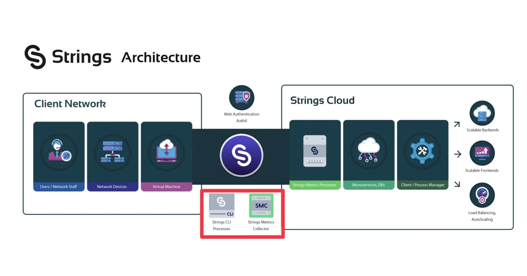
How the product works is directly linked to how it looks.
This made it so that all of the new UI/UX work was deemed irrelevant, because network analysts would have to first sit through 10 painful seconds until the data would load.
As a Product Manager, this is the type of bubble bursting you fear the most, because it means delaying something that would really set the product apart. And the kinds of unforeseen data challenges were just a field of question marks, with no precise way to estimate for deadlines.
Particularly for me at the time, it meant delaying the main driver for which a legacy user would consider switching over to our new system. But in the end we made it work, it required getting a lot more technical and making necessary changes that would compress, transform and analyze data in real-time using a data lake pipeline.
Happy Findings
It turns out, everything happens for a reason. Thanks to the new architecture and capabilities we put in place, we realized it was very practical to handle other data enrichment tasks. So instead of just displaying a metric for a particular network device, we could now display indicators such as "Good", "Bad", or "Normal".
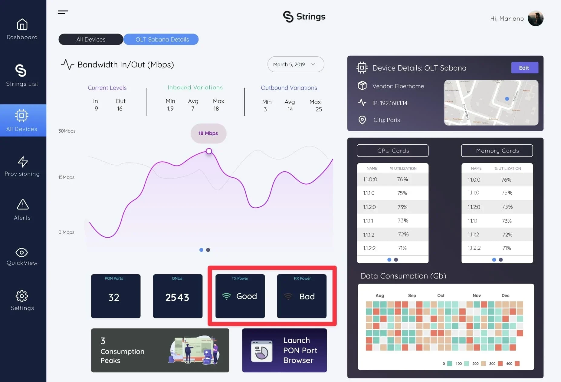
Saving people time through new UX mechanics often needs technical breakthroughs.
This is key because it helps our customers bridge the gap between their most experienced Network Analysts, and the new hires who would normally have to look at values and compare to determine if something is good or bad.
I love this as I think it is the mark of a great product, that it is conducive to best practices, while saving time and money for the users. Think of yourself as a new Network Analyst, navigating the basics of your new job, and having to look at a chart with 64 lines in it. We were all very happy with the outcome.
Like this project
Posted May 21, 2024
I had to become a rookie network analyst in order to build a superior UI/UX for a telecommunications management software.

