Website for Charity Donation
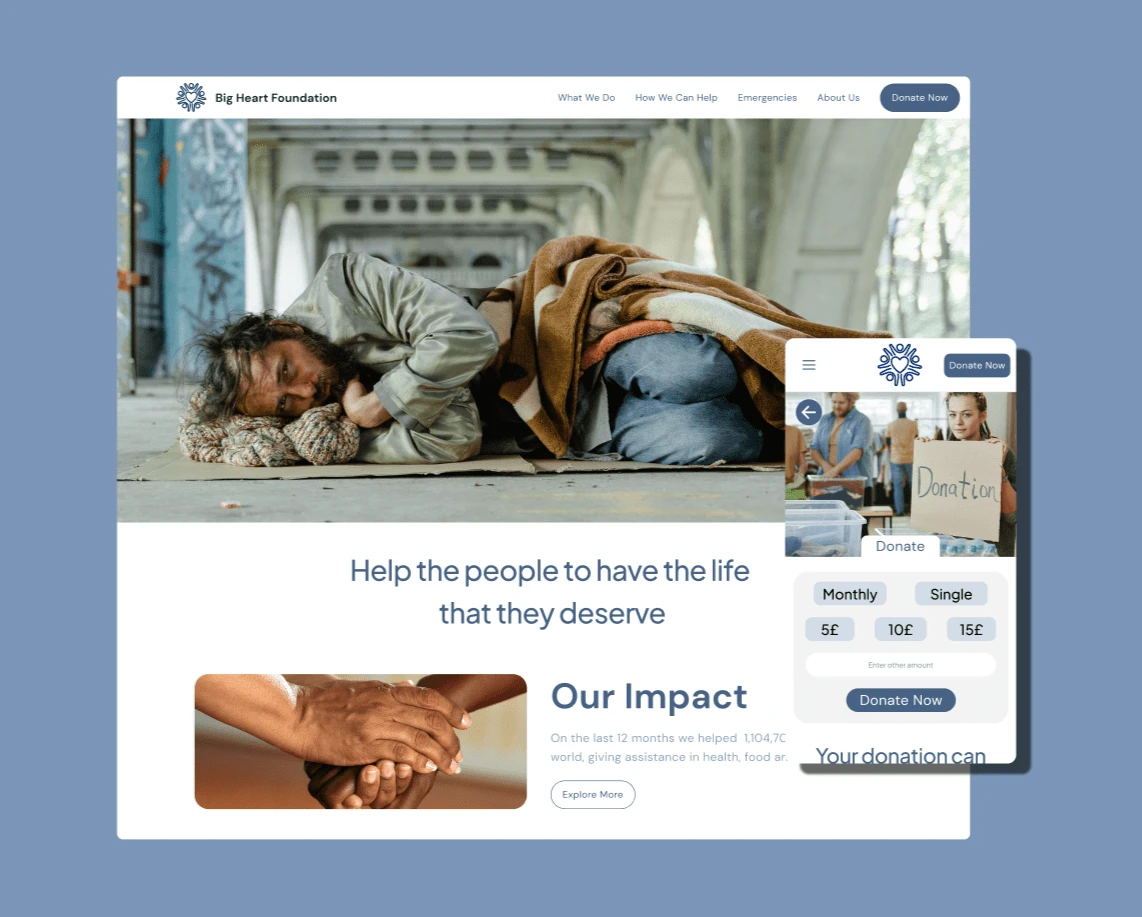
This UK-based non-profit does some incredible work supporting vulnerable communities globally, and my job was to make sure their online presence matches their impact.
Here's the lowdown: the old website wasn't quite hitting the sweet spot in conveying their mission and encouraging donations. So, my mission was to make a website that's not just informative but also super user-friendly, no matter if you're on a laptop or your phone.
As the UX Designer, I dove into talking to people, creating prototypes, and making sure the design wasn't just flashy but also practical. Let me break it down for you.
First things first, I had some chats with potential users and created empathy maps to get into their heads. Turns out, people were a bit lost on who The Big Heart Foundation really is, how their donations are used, and the impact they make.
Met folks like Jhon, a retiree worried about where his donation ends up; Sarah, a single mom working with a tight budget; Tom, a guy with disabilities wanting to help others like him, and Maria, a lawyer wanting transparency for a meaningful contribution.
To fix these issues, I mapped out the user's journey through the website. It helped me spot where people might get stuck. I then came up with a sitemap, sketched ideas on paper, and translated them into digital wireframes. All this was to make the website a breeze to navigate.
After some tweaking based on feedback, I created a low-fidelity prototype. Basically, a simplified version I tested with a bunch of people in the UK. They gave me great insights, like making text descriptions clearer, giving the donation button more spotlight, and making sure each page had the right info.
The mockups were next, showing off a more polished design. I added a donation button to the navigation bar, making it super visible, and tossed in a handy "to the top" button for smoother navigation. The final high-fidelity prototype locked down all these changes, making the website not just user-friendly but also easy on the eyes.
I also made sure the website is accessible to everyone. Messed around with different heading sizes, used bold text with better contrast, and made sure the colors passed all the accessibility tests.
People loved the changes! They found the site easy to navigate, engaging, and loved the clear visual hierarchy. Lesson learned: even small changes can make a big difference. Always keep the user's needs front and center.

Like this project
Posted Jan 21, 2024
Responsive Website for Charity organization
Likes
0
Views
3


