GREVO | BRAND IDENTITY
Dilshan Senarathna
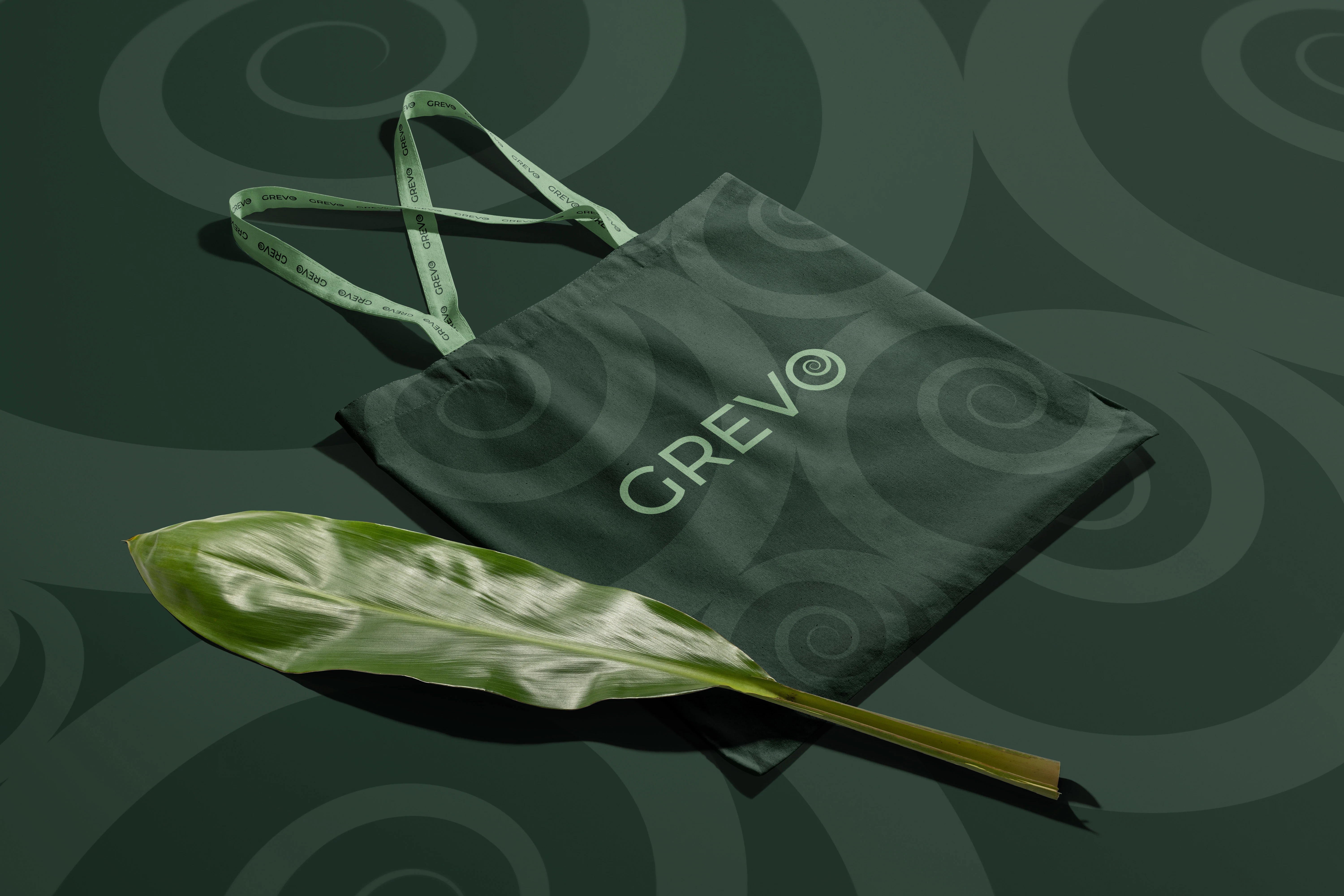
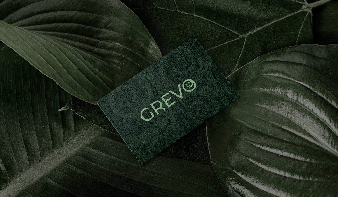
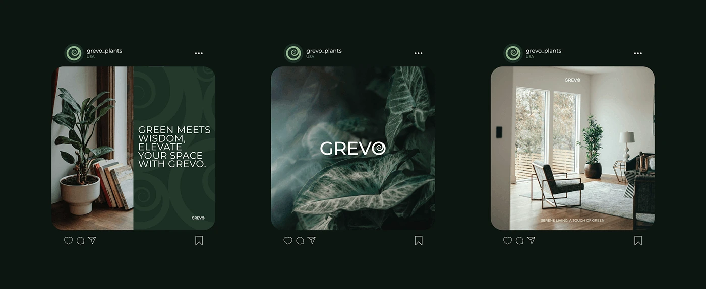
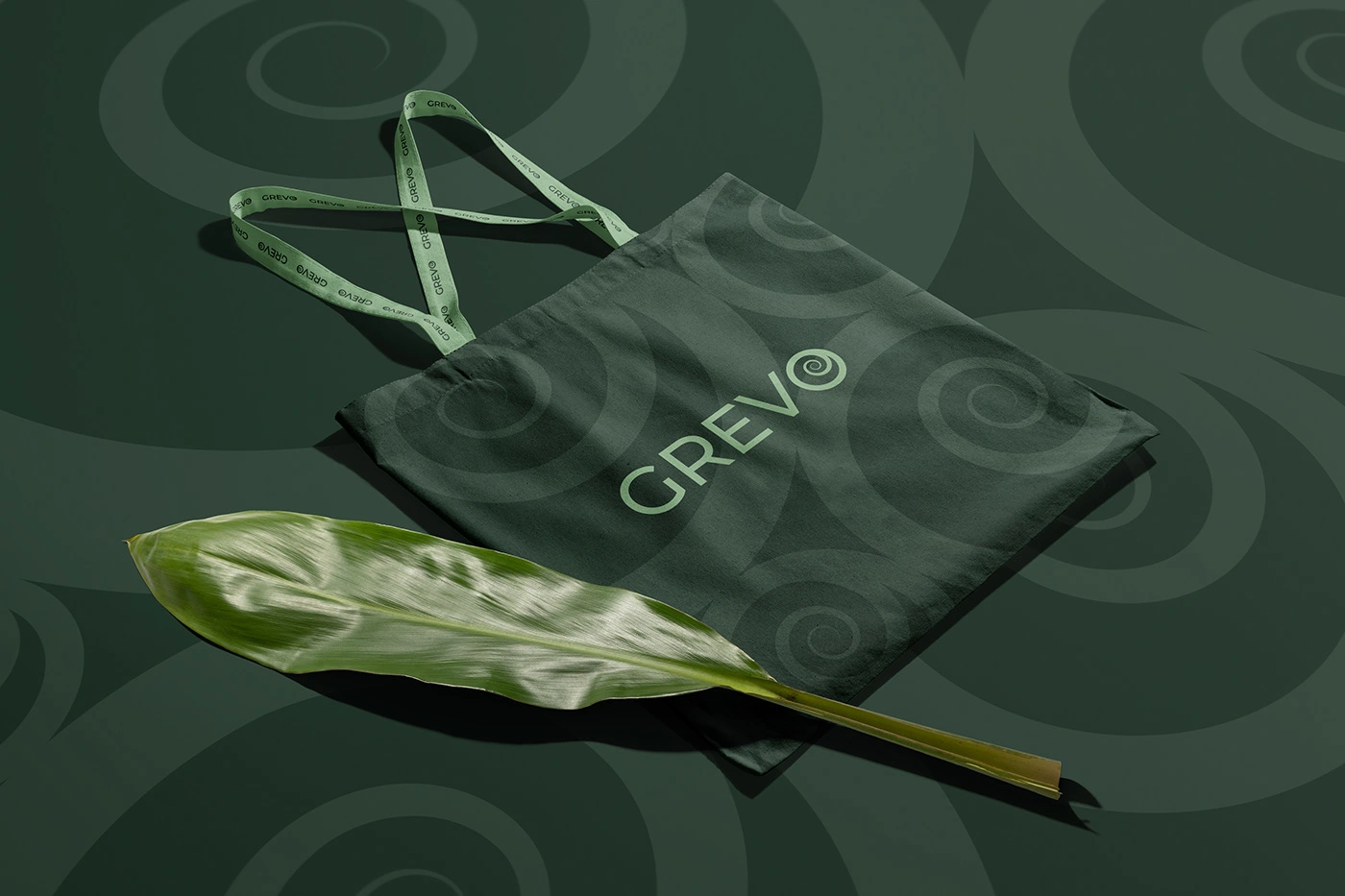
For Grevo, we crafted a refined wordmark logo that seamlessly integrates nature and modern design. The core of the design is the spiral plant incorporated into the letter "O," symbolizing growth, renewal, and a deep connection to nature. This subtle yet powerful element reflects Grevo’s mission of bringing sustainability and greenery into modern living spaces.
Our approach balanced minimalism and sophistication, ensuring that the brand remains timeless, recognizable, and versatile across various applications. The typography was carefully chosen to enhance readability while maintaining a sleek and contemporary aesthetic.


Like this project
Posted Apr 2, 2025
I designed a sleek wordmark logo for Grevo, blending nature and modernity. The spiral plant in the "O" symbolizes growth, renewal, and a strong bond with nature
Likes
0
Views
3
Timeline
Mar 2, 2025 - Mar 30, 2025