Green Basket — Grocery Shopping Mobile App UI/UX Design

Nabeel Ahmed


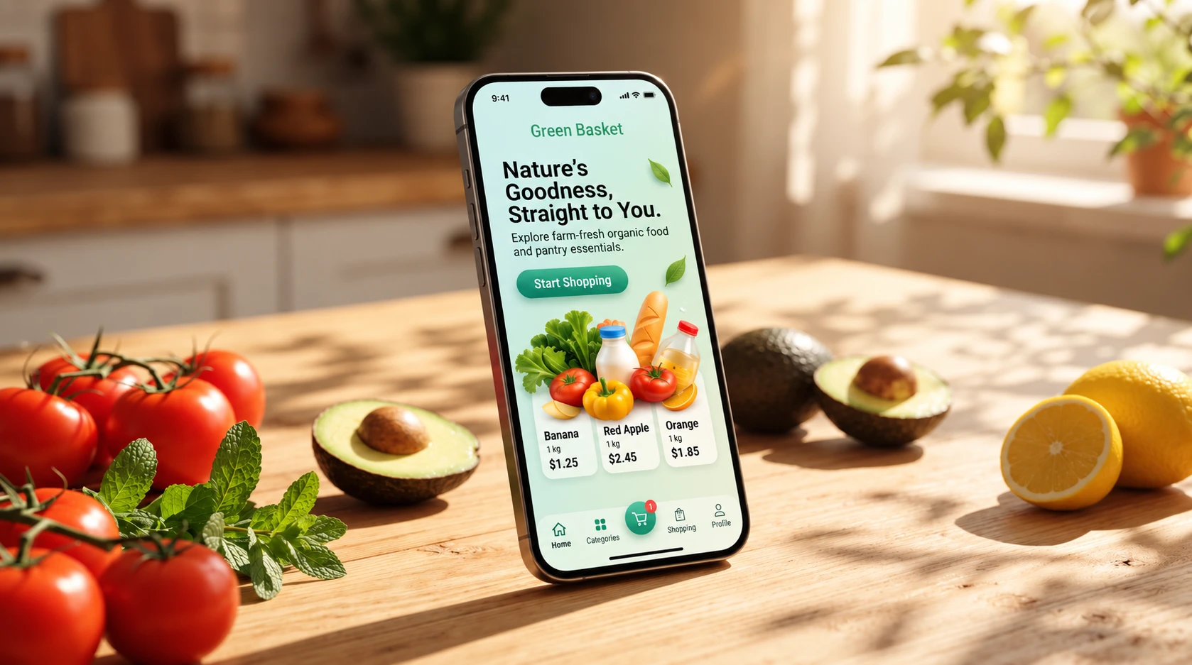
Green Basket — Fresh Grocery Shopping, Designed Around Everyday Life
Green Basket is a mobile grocery shopping experience designed to make everyday shopping feel simple, fresh, and effortless. The interface combines a clean product-focused layout with a soft natural visual language inspired by fresh food and organic ingredients. From the first interaction, users are introduced to products, pricing, and shopping actions through a clear hierarchy that keeps the experience approachable and easy to navigate.
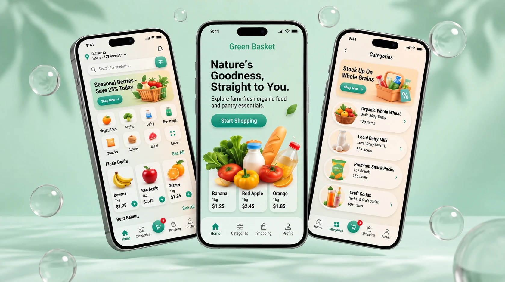
A Fresh and Intuitive Shopping Experience from the First Screen
The core interface was designed around quick product discovery and effortless navigation. The onboarding screen introduces the brand and immediately guides users toward shopping, while the home experience surfaces categories, seasonal promotions, flash deals, and popular products. Category browsing keeps large product inventories organized and accessible without overwhelming the user.
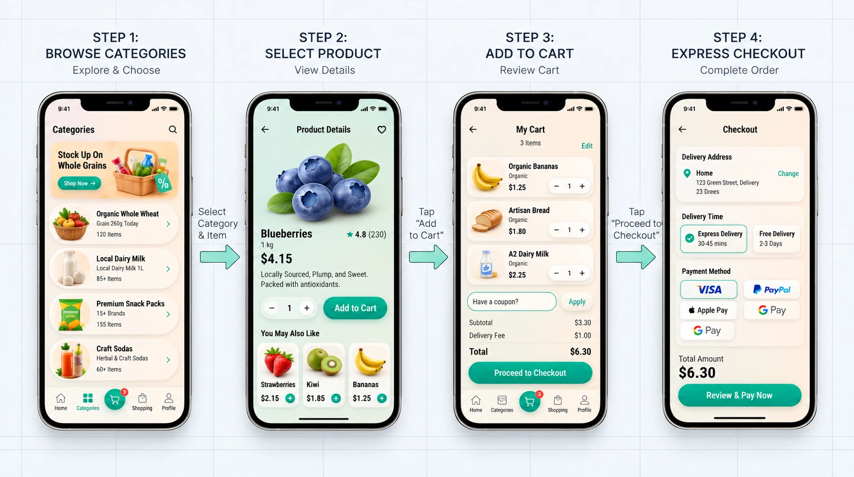
A Seamless Shopping Journey from Discovery to Checkout
The primary shopping flow was structured around four clear stages: browsing categories, exploring product details, managing the cart, and completing checkout. Each step minimizes unnecessary actions while keeping essential information such as pricing, quantities, delivery options, and payment methods immediately accessible. The result is a straightforward purchase journey designed to reduce friction from product discovery to order completion.
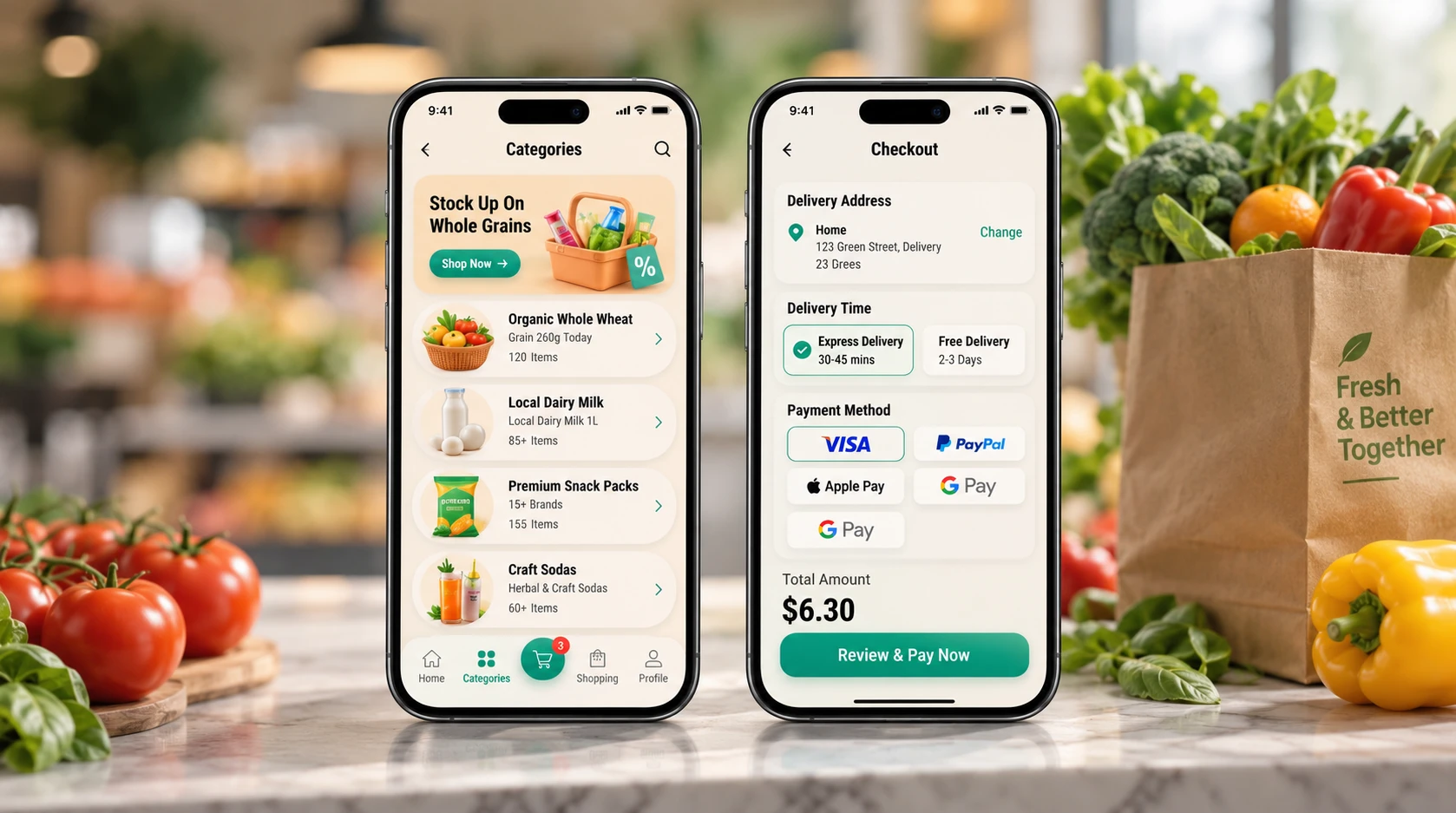
Designed for Clarity at Every Decision Point
Key transactional screens were designed to help users make decisions quickly and confidently. Product categories use clear imagery and structured information to simplify browsing, while the checkout experience organizes delivery details, delivery speed, payment methods, and order totals into clearly separated sections. Strong visual hierarchy keeps important actions prominent without making the interface feel crowded.
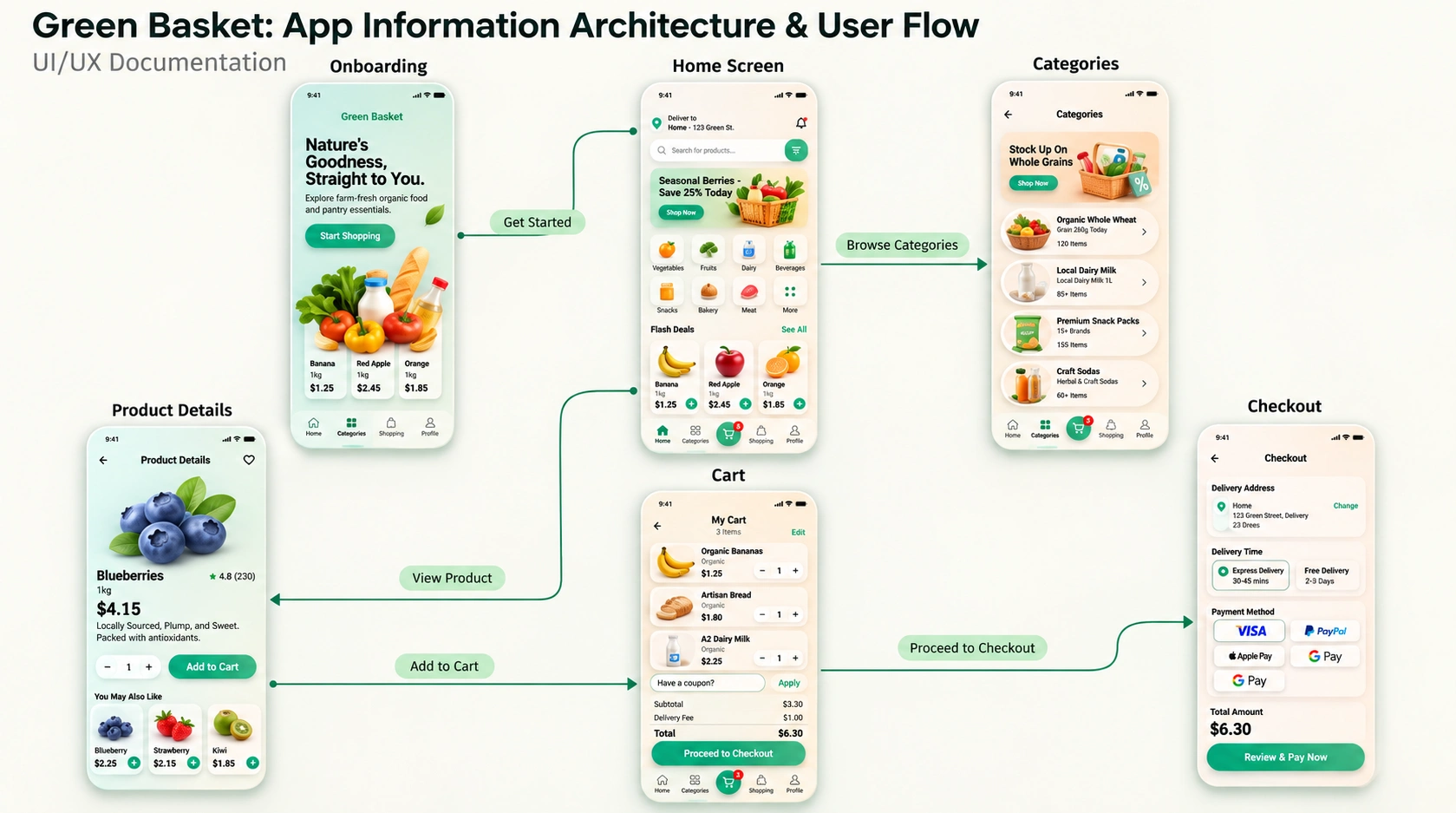
Structuring the Experience Before Designing the Interface
The experience was mapped through a clear information architecture and user flow connecting onboarding, home discovery, categories, product details, cart management, and checkout. Defining these relationships early helped create predictable navigation and ensured that every screen supported a logical next action throughout the shopping journey.
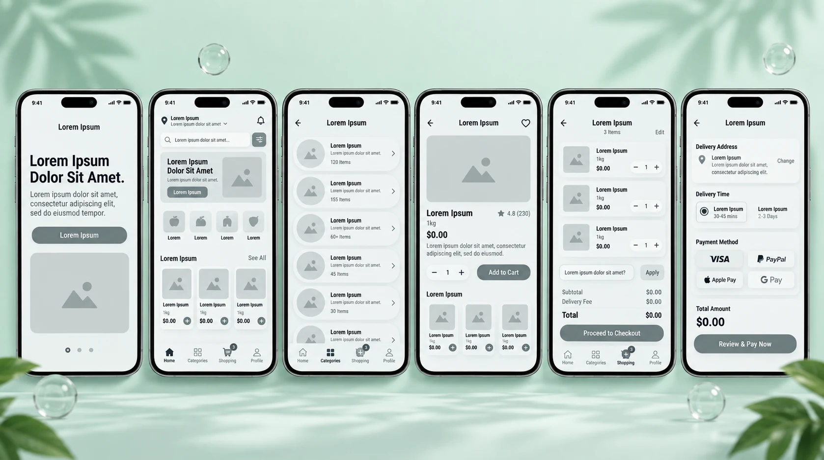
From Structure and Wireframes to the Final Experience
Low-fidelity wireframes were created to establish content hierarchy, screen structure, navigation patterns, and the placement of key shopping actions before introducing the final visual language. This stage focused on usability and consistency across the complete flow, providing a clear foundation for the polished interface that followed.
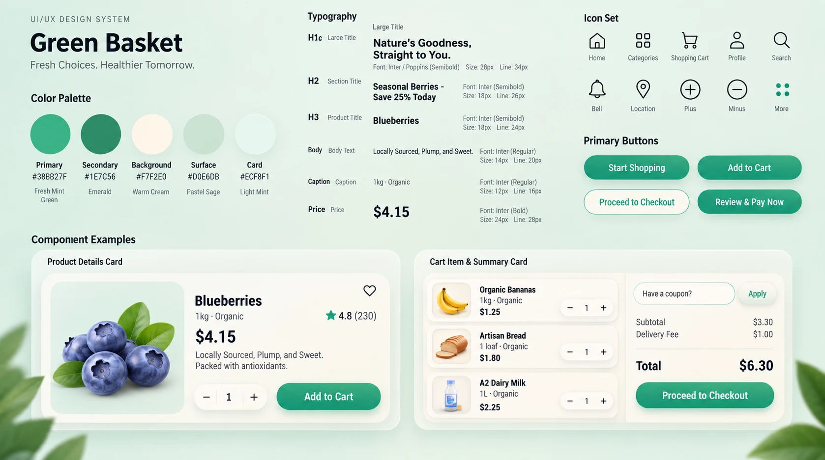
A Scalable Design System Inspired by Freshness and Simplicity
A cohesive design system was created in Figma to maintain consistency across the entire application. The system defines the natural green color palette, typography hierarchy, iconography, buttons, product cards, cart components, pricing treatments, and reusable interface patterns. These foundations make the experience visually consistent while allowing new screens and features to be added efficiently.
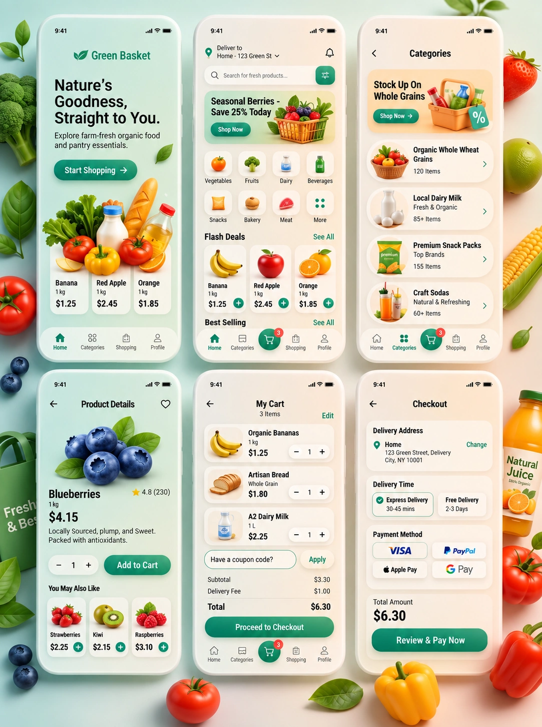
The Complete Green Basket Mobile Shopping Experience
The final interface brings the complete shopping journey together across onboarding, home discovery, category browsing, product details, cart management, and checkout. Consistent components, familiar interaction patterns, clear calls to action, and product-focused visuals create a unified experience from the moment users enter the app until they are ready to place their order.
Like this project
Posted Sep 24, 2026
Designed a fresh grocery shopping app with intuitive navigation, product discovery, cart management, checkout, user flows, and a scalable design system.
Likes
0
Views
5
Clients
Green Basket