Bem-Te-Vi Agribusiness: enhancing the brand authenticity
Laura Vendruscolo
A project close to my heart
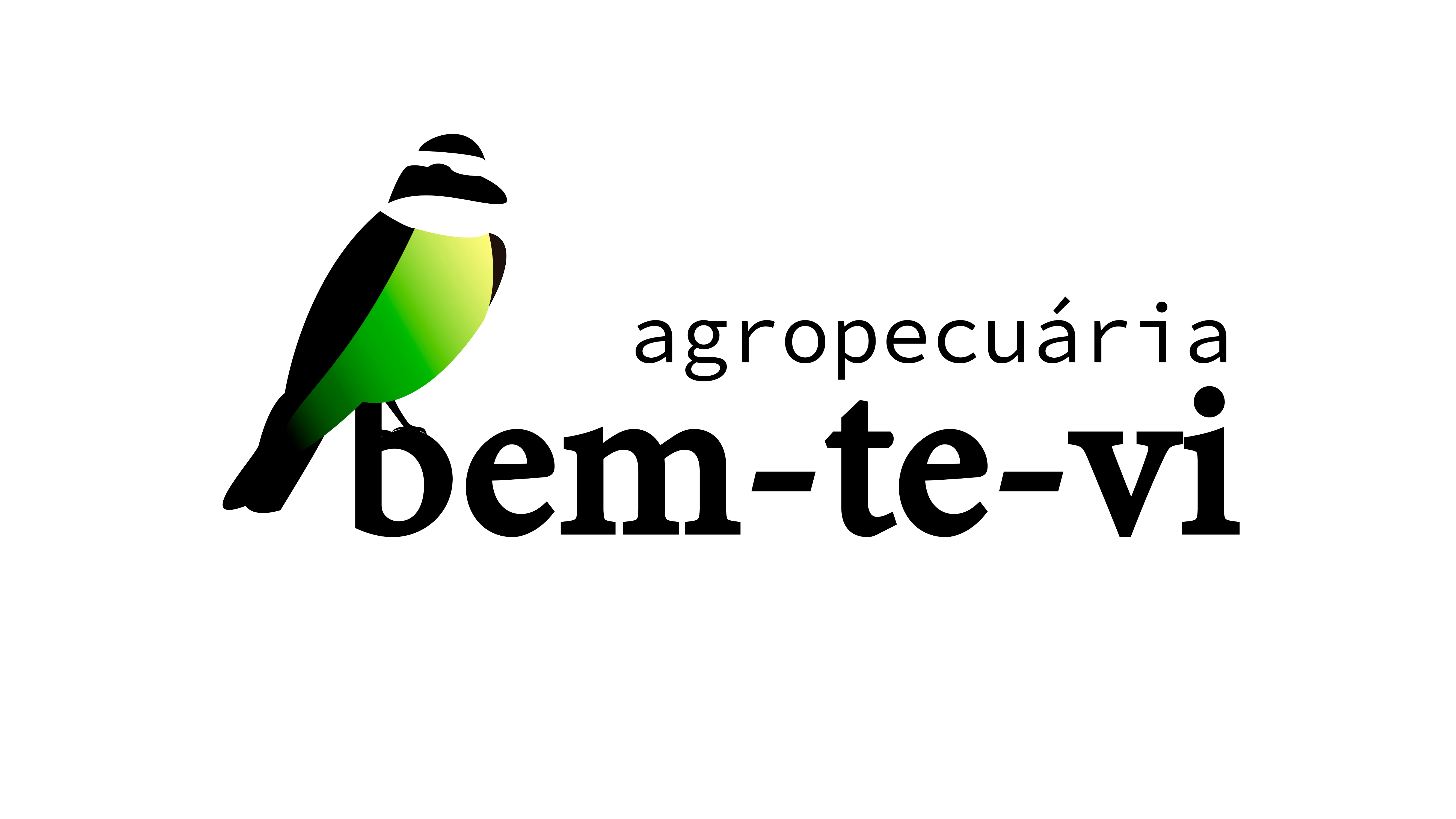
A few months ago, I was contacted by a family of farmers who manage a medium-sized plot of land in the interior of Brazil to develop a logo and visual identity for the brand. Although the business's main production is a variety of grains, the brand's point of authenticity was its name. ‘Bem-Te-Vi’ refers to the local bird that often frequents the farm's headquarters. After more than 20 years of cultivation on the land, the business owner shows enormous affection for the species. So there was no other choice but to have the bird looking on as a symbolic representation of what the company was, is and aims to be for the coming years.
Like this project
Posted Oct 2, 2024
It aimed to transform a local farming business into a credited brand by creating a logo and its visual identity.
Likes
0
Views
9