Foveros Magazine

Oluwasegun Oyeniyi

Introduction
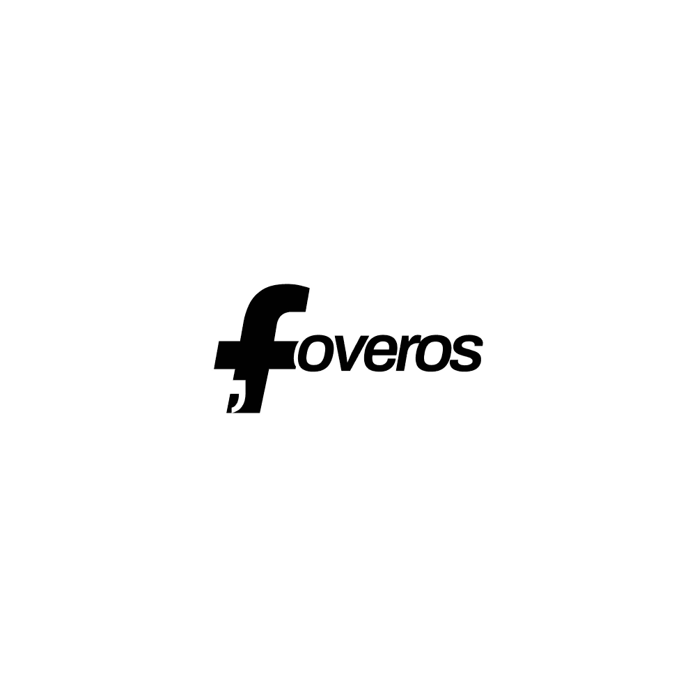
This work is about how I proposed a logo identity for Foveros Magazine (An art and culture magazine).
I was instructed to create a simple yet meaningful logo incorporating the first letter of the word Foveros (which means awesome in Greek).
Creative Direction
I pondered what typeface’s letter F could fit the description: awe, beautiful, or attractive.
Archivo typeface appeared to be a no-brainer.
I vectorized and styled the letter F of an Archivo Semibold Italics font.
The apostrophe that appears as a negative space at the rear of the letter F represents alphabets, numbers, and special characters. This is to signify Foveros is a print media publication.
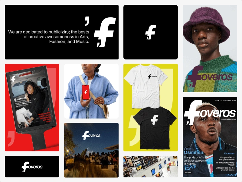
Brand Logomark
This is a brand logomark that can represent Foveros on any digital or physical medium. It is a shorter version of the Brand Logo.

Brand Pattern
This is a design pattern to add to the distinction of Foveros’s visual identity on her physical and digital media. It was created by vectoring and styling the apostrophe character of the Archivo typeface.

Images
Like this project
Posted Apr 2, 2024
Proposing a logo identity for lifestyle magazine Foveros Magazine. They cover a diverse range of topics including art, music, fashion, tips, tricks, etc.
Likes
0
Views
6