Chicken Delivery Banner Design
Nirmala Devi
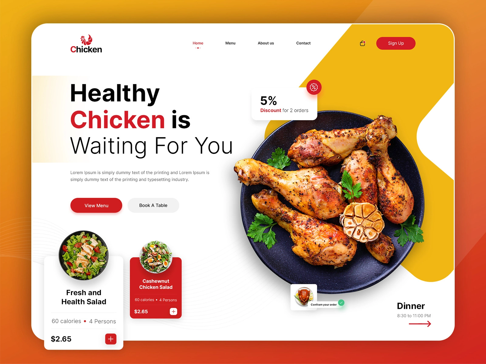
How I Cooked Up This Chicken Delivery Banner
✅ Starting with the Idea
I began by understanding the vibe the brand wanted to communicate: fast delivery, juicy chicken, and irresistible flavors. The first thing I did was sketch a quick layout that would make the visuals and text pop immediately.
✅ Bringing in the Visuals
For the colors, I went with warm tones reds, golds, and rich browns, because they instantly scream "crispy and delicious." I used Figma to lay out the core structure and Adobe Illustrator to work on the juicy chicken visuals. I wanted the food imagery to do the heavy lifting, so I made it the hero of the design.
✅ Crafting the Text
The copy was short and snappy: direct enough to push users to order, but still playful. I tested a few headline options, and settled on a CTA that felt urgent but fun.
✅ Making It Work Everywhere
Once the design was ready, I built it out in Webflow. I paid extra attention to how it looked on mobile because let’s be honest, that’s where most people order food from. Responsive tweaks made sure it looked perfect on any screen.
✅ The Final Touch
After a round of testing and tiny refinements, it was ready. A sizzling, eye-catching banner that gets the job done and makes your stomach rumble while doing it.
Like this project
Posted May 28, 2025
Created Banner with Modern and appealing look and feel, overall balance, clarity, and visual appeal. Exported for web use ready to make mouths water!
Likes
0
Views
3
Timeline
Feb 21, 2025 - Feb 28, 2025