Built with Framer
I'm MittxlDesigns
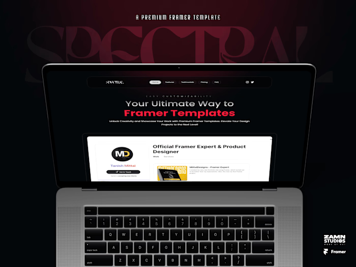
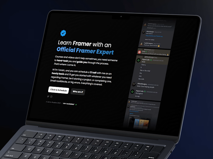
Hi. The project you're looking at right now, is my own portfolio website that I proudly present to my every client as I've poured my heart into making this as better as I could.
This website sets a perfect example of how a dark, clean yet animated portfolio site should look like. It's made natively in Framer and finished within 1 week.
Always start from scratch, else you won't run into the problems that will make you proficient in that field.
I wanted to go with Dark and animated theme for my website, so I designed the low-fidelity frames first (in my mind haha), and then brought them to life using Framer's amazing design capabilities that match Figma's honestly.
I earlier started using Webflow, but nah, not my type. I've been using Figma for quite some time now and when I heard about Framer, and started working on it, I learned the basics within 2 days on my own, it was that easy!


Like this project
Posted Aug 30, 2023
I created my very own Portfolio site using Framer, which turned out to be better than my expectations. Also, this was my first Framer project.
Likes
1
Views
251

