GIMZO | Brand Design & Identity
Abigail Garcia
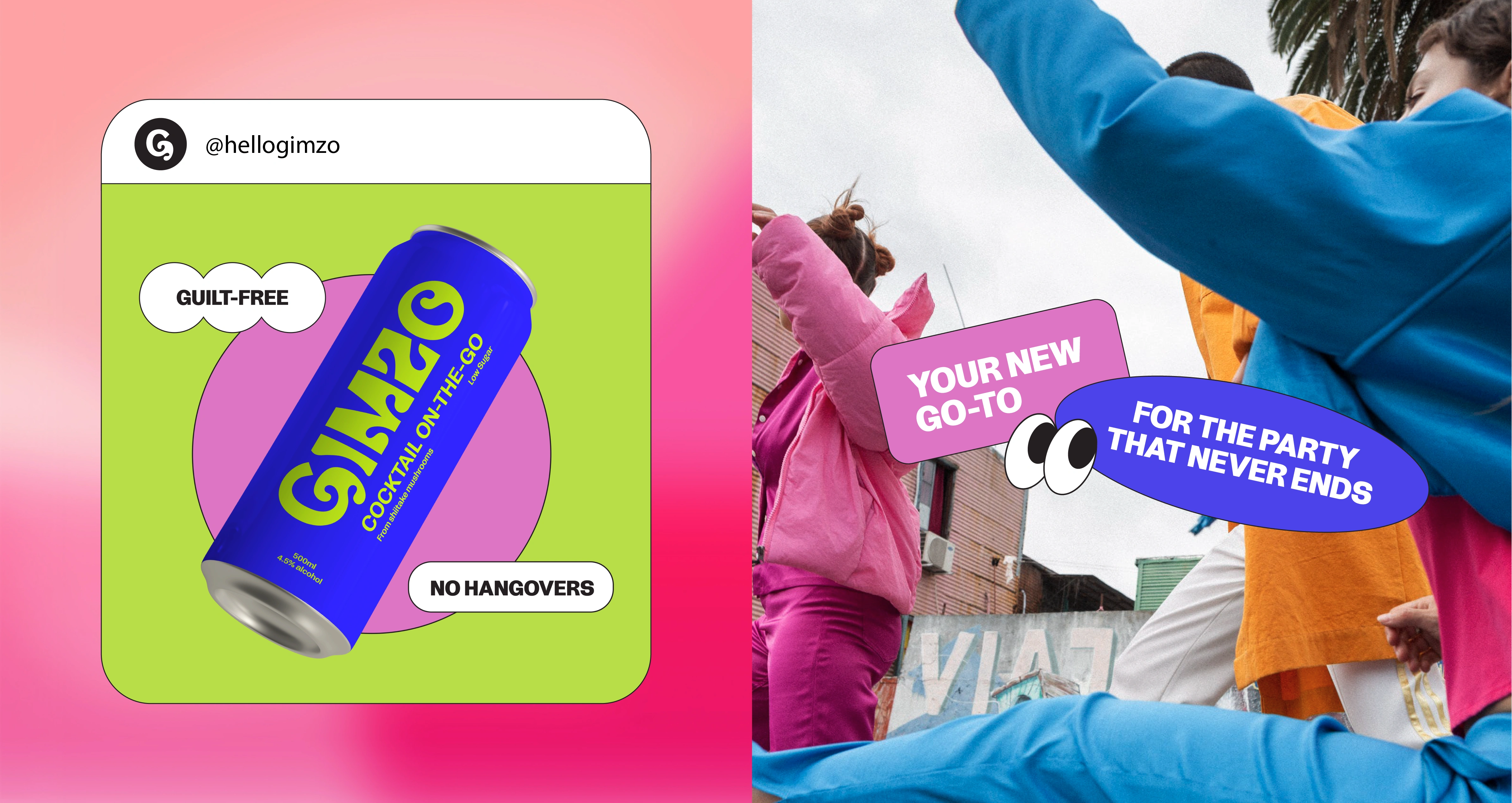
Tired of sitting at home all night, watching other people have fun? GIMZO is your ticket to guilt-free, no hangover nights.
Say hello to GIMZO, perfect for those who want to imbibe with a bit more sophistication. It’s the adult version of your favorite juice box.
PACKAGING DESIGN
GIMZO is a fresh take on pre-mixed cocktails, with multiple flavors and smaller packaging that fits in the palm of your hand.
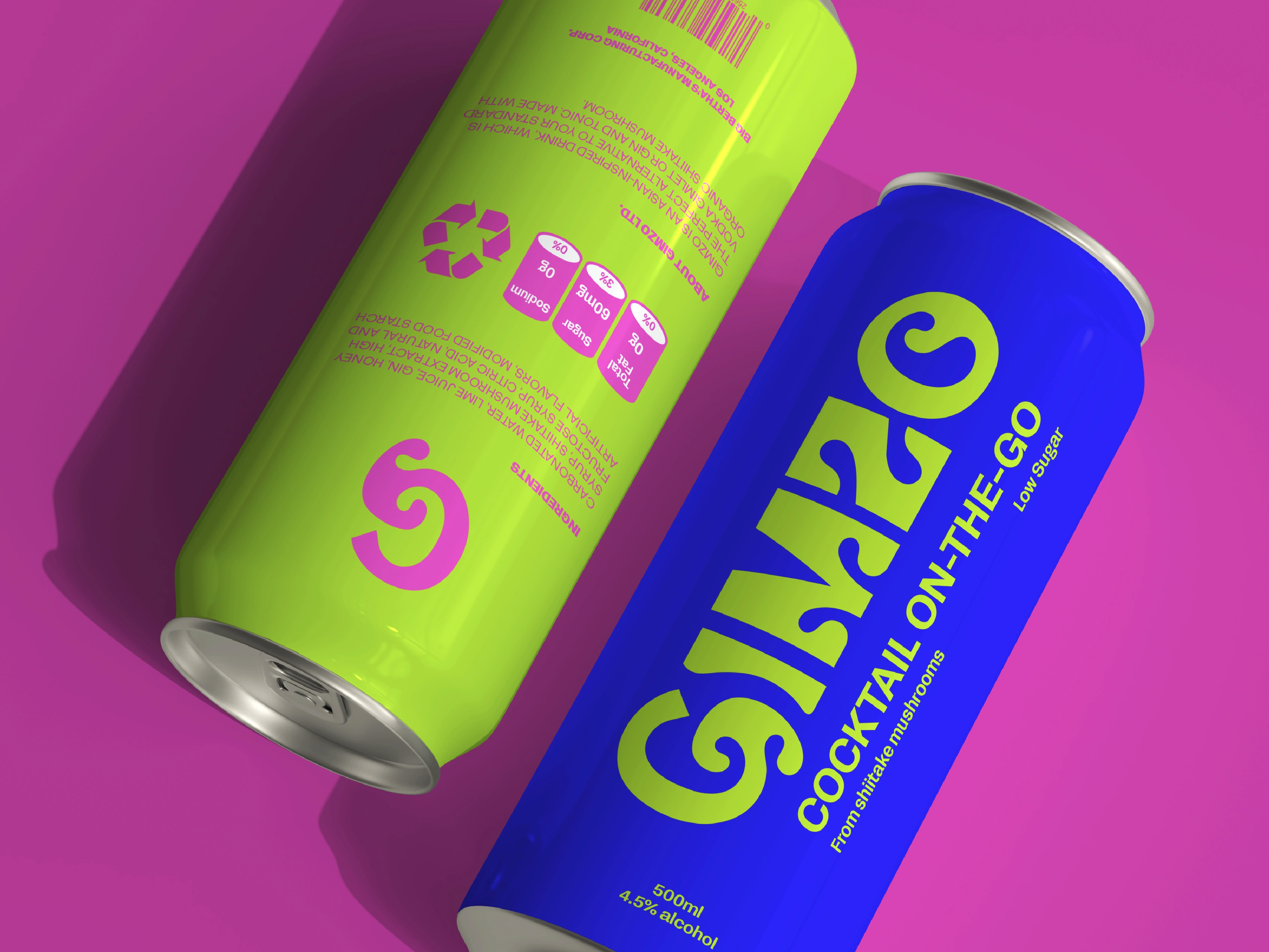
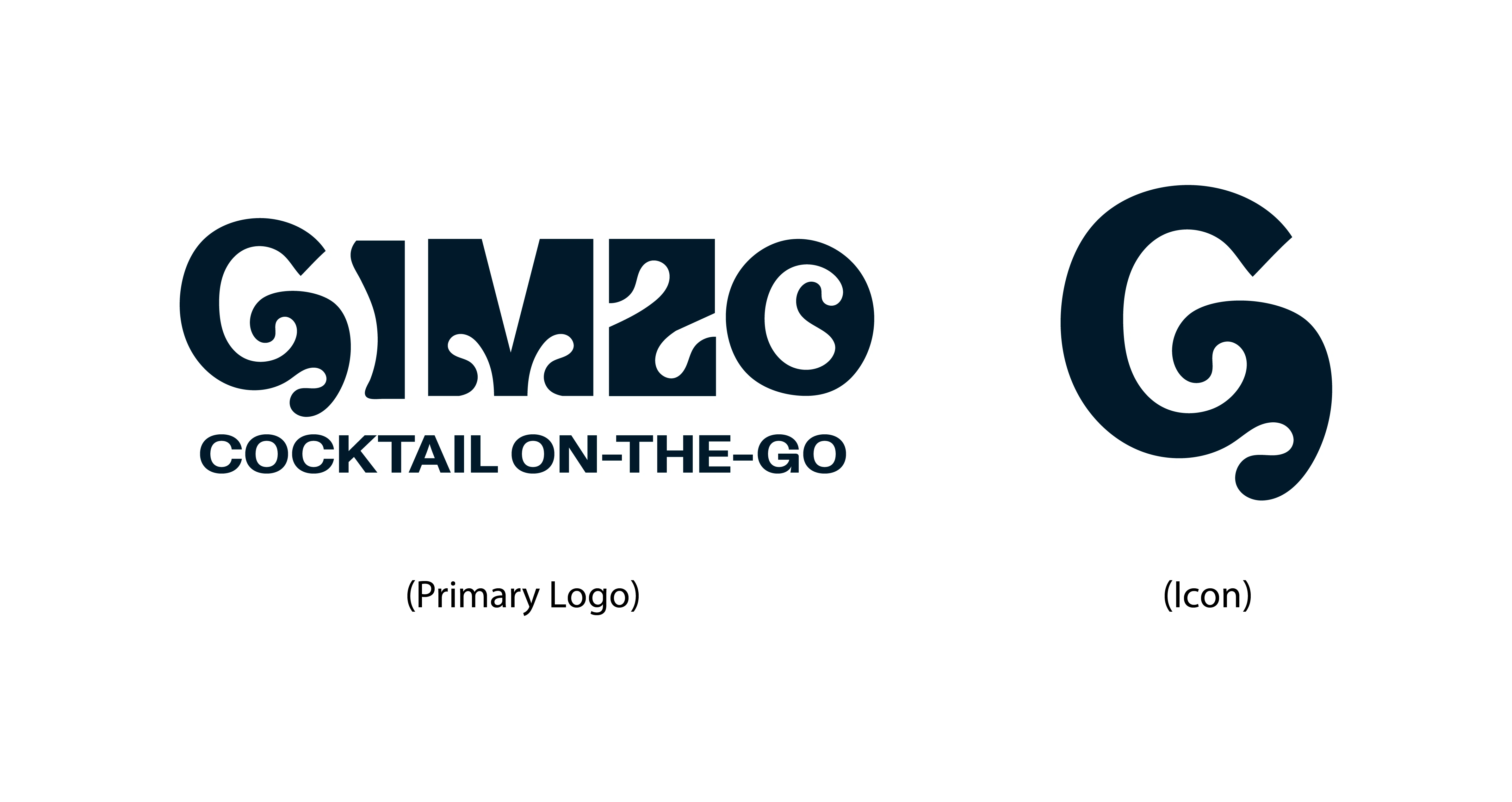
LOGO
I took inspiration from shiitake mushrooms to create the brand icon and used the distinctive curves to influence the primary logo design giving it a sleek and modern look.
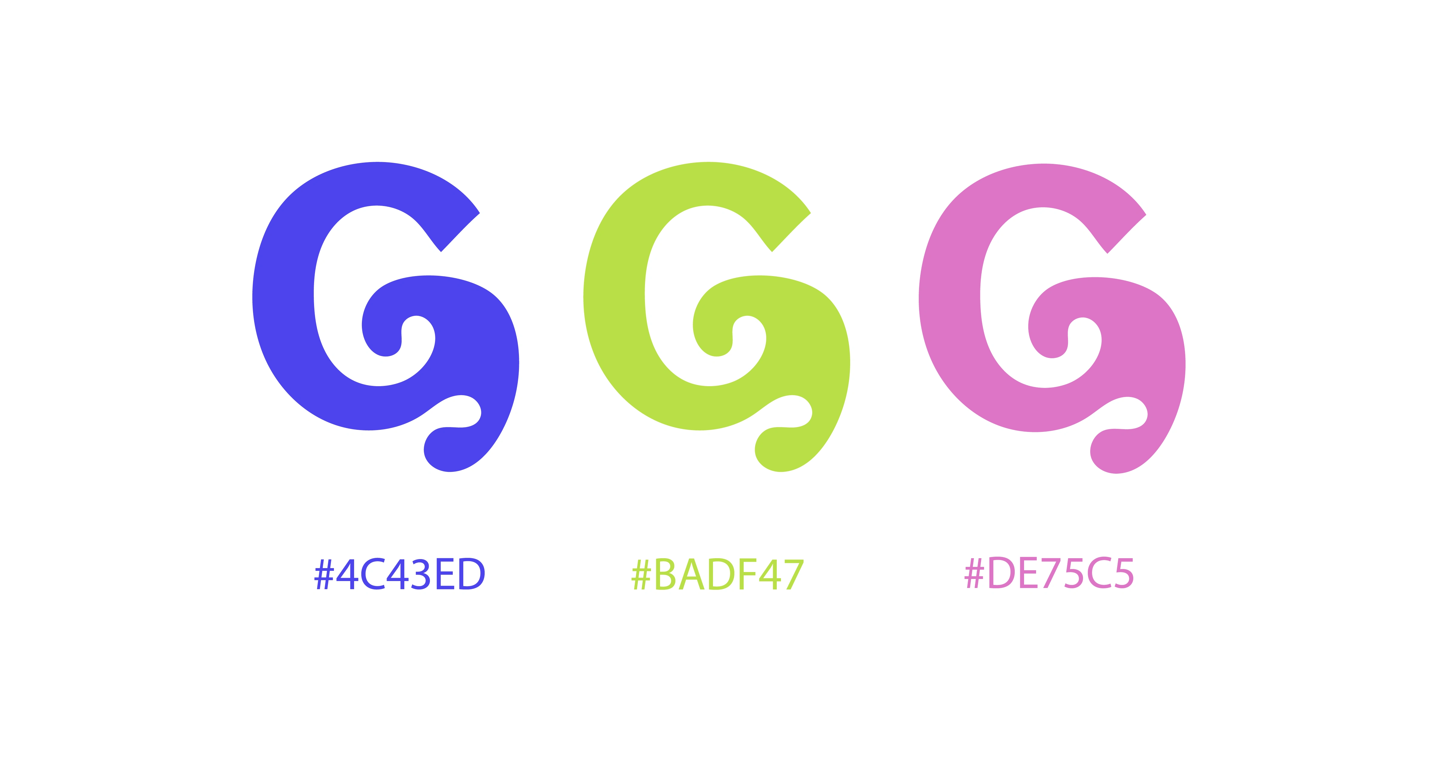
COLOR PALETTE
The younger generation is all about energy and vibrancy, which is why I chose bold, vibrant colors to represent the brand's target audience. These colors also make GIMZO out from those boring, cookie-cutter competitors.
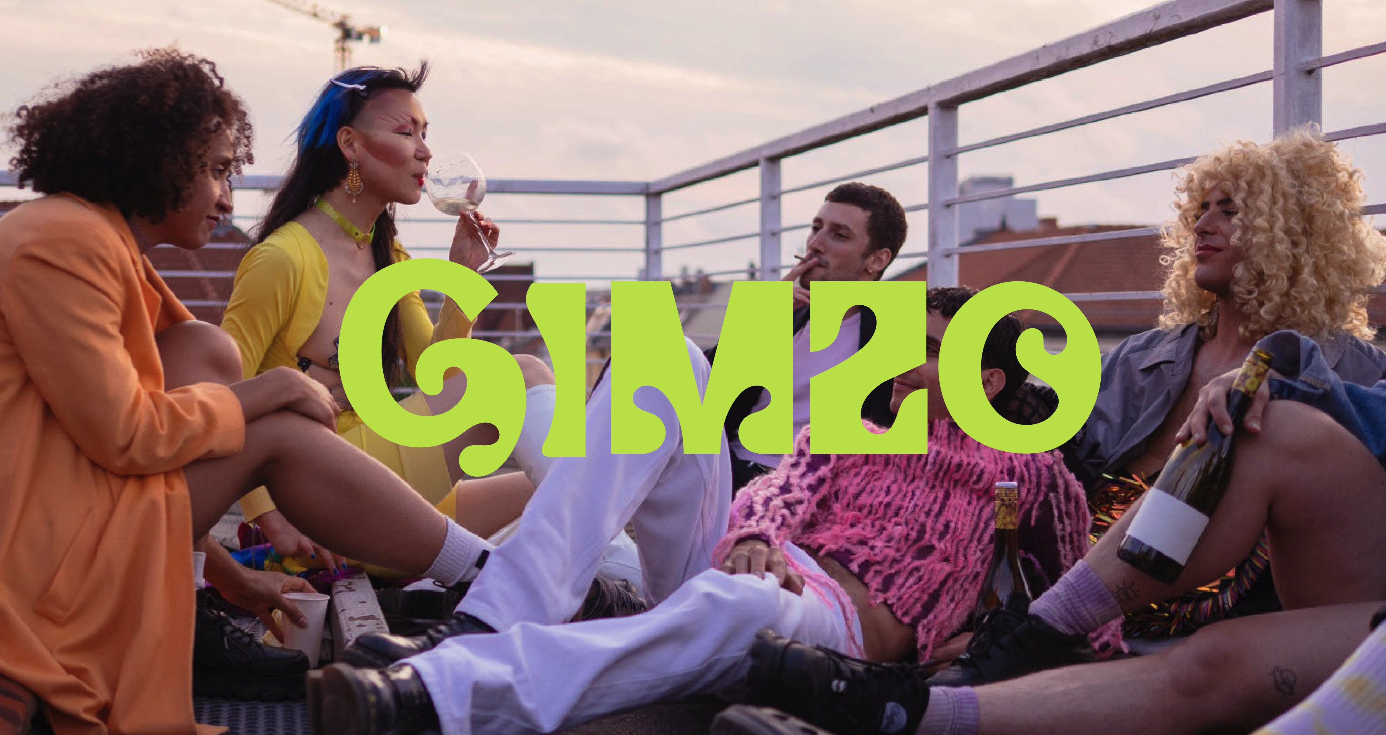
LOOK AND FEEL
The overall aesthetic is designed to be playful and welcoming, encouraging people to let loose and have a good time. The target audience should feel like they can express themselves freely and creatively with GIMZO.
Creative Services: Brand Strategy / Brand Identity / Creative Direction
Like this project
Posted Jan 7, 2023
New to the Los Angeles bar scene, GIMZO has made its mark with its unique flavor of gimlet made from shiitake mushrooms.